Convert into Qt Quick Controls
The plugin converts each Figma component into a suitable QML type and each instance into an instance of the type. After you download the converted design, developers can use design or development tools to create button states, connections, animations, and transitions, for example. To make this easier, you can create basic controls, such as button, slider, or text field, that the plugin converts into suitable Qt Quick Controls types.
You can use either templates or your own component sets to create controls. You can find all the controls you create on the Qt Quick Controls page.
You can change the values of the predefined properties in each predefined control state. You cannot change how the controls function. If you change the controls in ways that are not supported, the plugin converts them into other QML types than Qt Quick Controls.
Note: The layer structure is important, so do not change the layer names nor remove layers when you change the control properties.
Create controls from templates
To create controls from templates:
- Check that no layers are selected.
- In the plugin, go to
 (Qt Quick Controls).
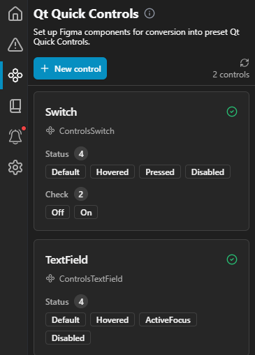
The Qt Quick Controls page in the plugin.
- Select New control.
- In Control type, select the type of the control to create.
- Select Create from template to add the control to the Qt Quick Controls page.
The plugin creates a control using the default properties from the template, so it is fully set up and ready to use in your design.
Create controls from component sets
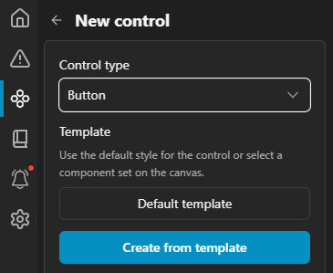
To create controls from component sets:
- Select a component set on the canvas.
- In the plugin, go to (Qt Quick Controls).
- Select New control.
- Select Create from component set to create the control.
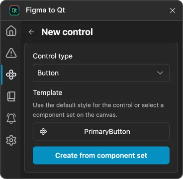
- Set values on the Control properties page.
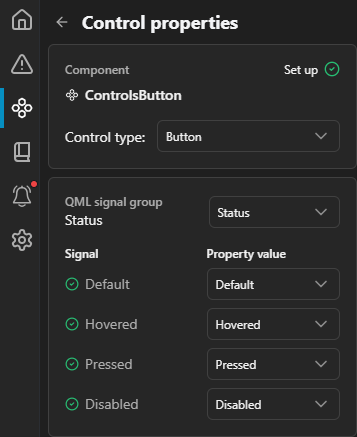
Set control properties
Check and change the properties of controls that you create from component sets.
To set control properties:
- In the plugin, go to (Qt Quick Controls).
- Select the control to set values in Control properties.
State properties
Qt Quick Controls have predefined states that describe the style of a control in a particular state.
- Default—how the control looks when no other state is active.
- Hovered—how the control looks when users move the mouse over it.
- Pressed—how the control looks when users click it.
- Disabled—how the control looks when users cannot interact with it.
CheckBox properties
The CheckBox control presents an option button that users can toggle on (checked) or off (unchecked).
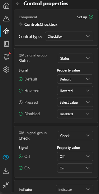
CheckBox properties.
In Check, set the style of a check box when it is On or Off.
In Indicator, select the parent of the layer that visually indicates the status of the control.
Slider properties
The Slider control is used to select a value by sliding a handle along a track.
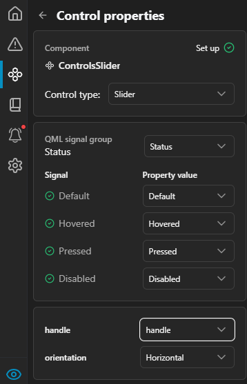
Slider properties.
In Handle, select the parent of the layer to use as the slider handle. Groove sets the slider background.
In Orientation, select whether the slider is horizontal or vertical.
Switch properties
The Switch is an option button that users can drag or toggle on (checked) or off (unchecked). Switches are typically used to select between two states.
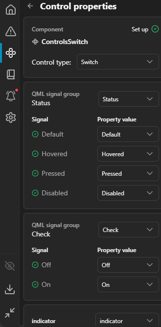
Switch properties.
In Check, set the style of a switch when it is On or Off.
In Indicator, select the parent of the layer that visually indicates the status of the control.
TextField properties
The TextField is a single line text editor.
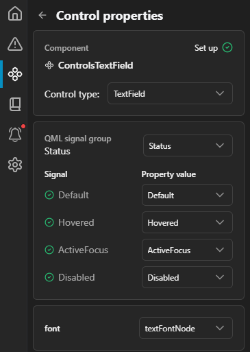
TextField properties.
In Font, select the layer that sets the font and color of the entered text, as well as the left and top padding of the position of the area cursor.
Use component instances
You can use instances of the controls in layers. However, you cannot customize or override them in all the typical ways because variant properties are controlled by bindings. For example, if you assign MyButton.Hovered to the status property, the live preview shows the button in its Default state, because a binding controls the status value.
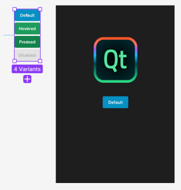
A control and its instance in Figma.
In the plugin, select  (Preview) to check the converted design and QML code in the live preview.
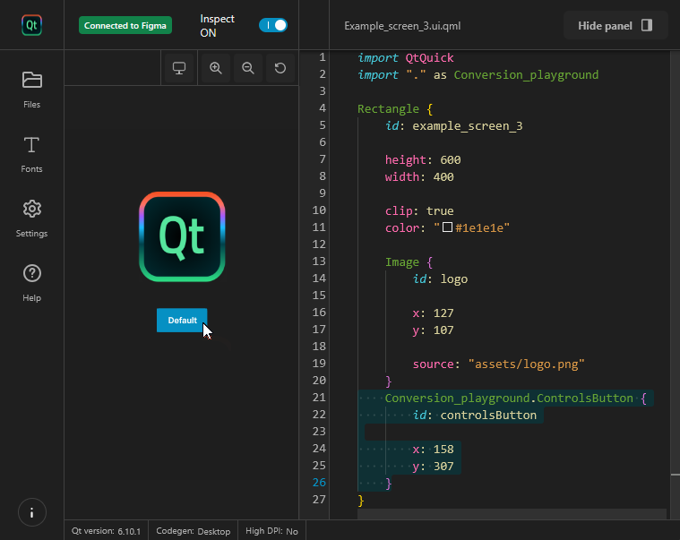
A control instance in the live preview.
Note: The controls are not interactive in the live preview. To see how they function, you need to download the project and run it from a development tool.
To add instances of a component or control to other layers:
- In Figma, go to the Assets panel.
- Browse the components created in the same file to find a component.
- Insert an instance of it.
See also Convert designs.
© 2026 The Qt Company Ltd. Documentation contributions included herein are the copyrights of their respective owners. The documentation provided herein is licensed under the terms of the GNU Free Documentation License version 1.3 as published by the Free Software Foundation. Qt and respective logos are trademarks of The Qt Company Ltd in Finland and/or other countries worldwide. All other trademarks are property of their respective owners.
