Coffee Machine
A Qt Quick application with a state-based custom user interface.
This app demonstrates a cross platform, multi screen size and responsive way of implementing a typical user interface for product ordering.
Running the Example
To run the example from Qt Creator, open the Welcome mode and select the example from Examples. For more information, see Qt Creator: Tutorial: Build and run.
UI Walkthrough
This section guides you through the typical user flow for the application.
Selecting a recipe
The coffee machine application lets you choose a type of coffee and indicates how many coffees of that type you have left to order.
Coffee customization
Once a recipe is selected, the app displays what ratio the coffee blend will contain of:
- brewed coffee
- hot milk
- milk foam
- sugar
This can be modified using sliders.
Displaying the brewing status
Once the user has acknowledged that the cup is in the machine, the brew starts.
When the brew has been started, the app shows an animated display of the brewing process.
Coffee is ready
Once the brewing process has ended, the app shows coffee cup with the desired coffee mix in it for a few seconds before returning to the starting page.
How it works
Here we discuss how these features are implemented.
Adapting to screen sizes and orientation
The application window root object has initial values for height and width, which will be used as the window size on desktop platforms. The default QWindow::AutomaticVisibility ensures that the window will be shown as maximized or fullscreen on platforms that require it, such as mobile platforms.
ApplicationWindow {
    visible: true
    width: 1000
    height: 600
    title: qsTr("Coffee")

    background: Rectangle {
        color: Colors.currentTheme.background
    }
From there child objects of the ApplicationWindow fetch the size of the ApplicationWindow to determine their own sizes accordingly.
The app uses GridLayout throughout the application page components to easily adapt to changes in screen orientation.
{Screen switches to landscape when Android device orientation is landscape}
{Landscape mode is the default orientation on Windows desktop}
Note: On the desktop version, the width must be greater than the height.
Navigating through the app pages
The application uses StackView QML type to display different pages of the app. The StackView handling the different page components is implemented in ApplicationFlowForm.ui.qml.
Navigating from one page to next triggers a state change in ApplicationFlow.qml where the needed property changes are handled by PropertyChanges QML type:
states: [
    State {
        name: "Home"
        PropertyChanges {
            target: toolbar
            backButton.opacity: 0
            backButton.enabled: false
            themeButton.opacity: 0
            themeButton.enabled: false
            logo.sourceSize.width: 70
            logo.sourceSize.height: 50
        }
The animations happening during these state changes are implemented with Transition and PropertyAnimation inside the StackView component in ApplicationFLowForm.ui.qml.
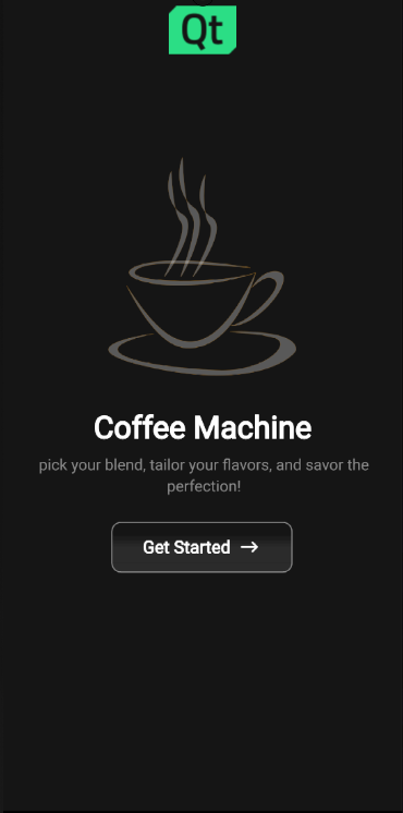
Implementing start page
The application starts by showing the Home page to the user as the initial item in the StackView:
StackView {
    id: stack
    anchors.top: parent.top
    anchors.bottom: parent.bottom
    anchors.left: parent.left
    anchors.right: parent.right
    anchors.topMargin: parent.height / 20

    pushEnter: Transition {
        PropertyAnimation {
            property: "x"
            from: stack.width
            to: 0
            duration: 400
        }
    }
The Home component is structured by placing Item component as the root object with state machine and appropriate property aliases, followed by GridLayout. This same kind of structuring will be used in all of the app page components.
The Home page displays an image of a coffee cup with Qt logo on top, Coffee Machine as a title, caption with some catchy briefing on what the user can expect and a getStartedButton button.
The user can move forward by pressing the getStartedButton, the button onClicked function is implemented ApplicationFlow.qml:
getStartedbutton.onClicked: {
    applicationFlow.state = "Coffee-selection"
    applicationFlow.stack.pushItem(applicationFlow.choosingCoffee, {appFlow: applicationFlow})
}
This will trigger the state change to "Coffee-selection" in ApplicationFlow.qml and push the choosingCoffee component on top of the Home component in StackView.
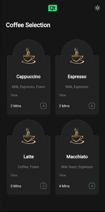
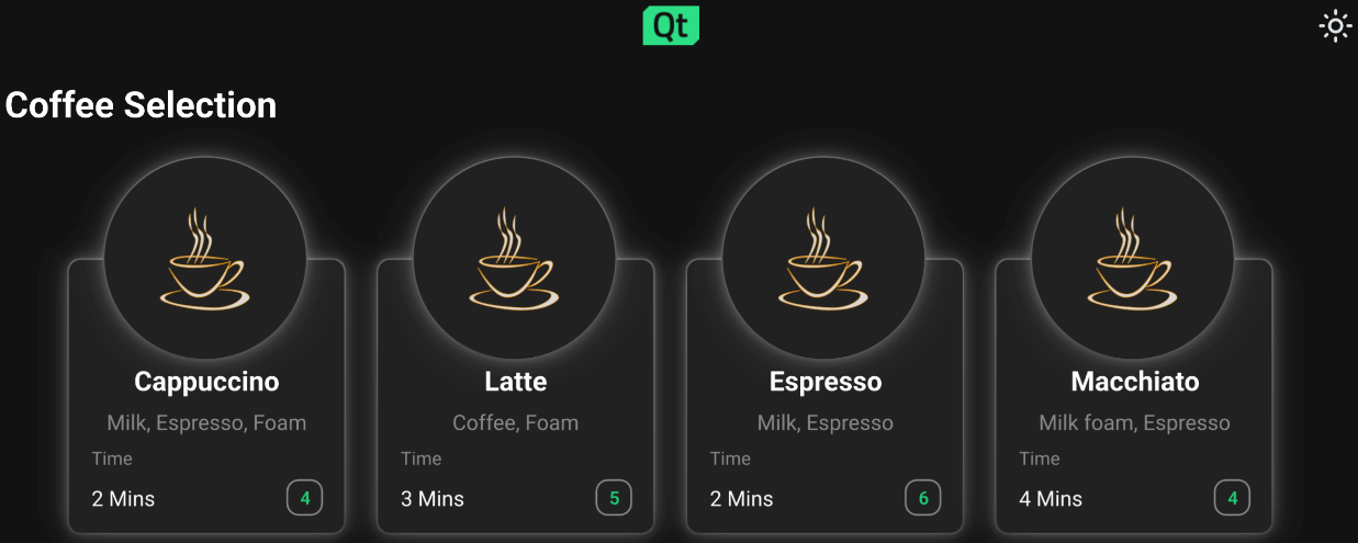
Implementing coffee selection
On the Coffee Selection page ChoosingCoffee.qml is displayed, here the user sees 4 different coffee options to choose from. These options are displayed as CoffeeCards which are located inside the GridLayout in ChoosingCoffee.qml:
GridLayout {
    id: cards
    anchors.horizontalCenter: parent.horizontalCenter
    anchors.top: parent.top
    rowSpacing: 20
    columnSpacing: 20
    CoffeeCard {
        id: cappuccino
        coffeeName: "Cappuccino"
        ingredients: "Milk, Espresso, Foam"
        time: 2
    }
    CoffeeCard {
        id: latte
        coffeeName: "Latte"
        ingredients: "Coffee, Foam"
        time: 3
    }
    CoffeeCard {
        id: espresso
        coffeeName: "Espresso"
        ingredients: "Milk, Espresso"
        time: 2
    }
    CoffeeCard {
        id: macchiato
        coffeeName: "Macchiato"
        ingredients: "Milk foam, Espresso"
        time: 4
    }
}
The implementation of the CoffeeCard is located CoffeeCard.qml.
These cards may be displayed in either grid or in a row type of way depending on the available screen width and height properties that the ApplicationWindow root object follows and passes down to the ChoosingCoffee.qml and to the GridLayout in there through the state machine.
CoffeeCards vary in their names, brewing times, ingredients and how many cups there are available at the moment.
On this page the user can also change the application theme for the first time by pressing the little sun looking icon button from the upper right corner of the screen. Pressing the theme button calls themeButton function in ApplicationFlow.qml:
function themeButton() {
    if (Colors.currentTheme == Colors.dark) {
        Colors.currentTheme = Colors.light
    } else {
        Colors.currentTheme = Colors.dark
    }
}
The function changes the currentTheme property of Colors.qml and colors change throughout the app by property bindings automatically. All the colors used in app are located in Colors.qml.
If theme is switched to light theme the theme changing icon button icon turns to represent a half moon.
Pressing on any of the coffee cards triggers a state change inside AbstractButton in CoffeeCard.qml which then triggers NumberAnimation through Transition:
AbstractButton {
    width: parent.width - 2
    height: parent.height - 2
    anchors.horizontalCenter: parent.horizontalCenter
    anchors.verticalCenter: parent.verticalCenter
    id: button
    hoverEnabled: true
    checkable: true
    enabled: (root.cupsLeft != 0) ? true : false
    transitions: Transition {
        NumberAnimation {
            properties: "scale"
            duration: 50
            easing.type: Easing.InOutQuad
        }
    }
This will scale the selected coffee card down to smaller size and turns the edges of the card to green giving user the expression that the coffee was indeed selected.
Every coffee cards button property alias onClicked function binds to a function located in ApplicationFlow.qml. When user presses any of the coffee cards the function with a name correlating with the chosen coffee option gets called. The function will set the state of ApplicationFlow.qml to Settings , push a new component to the StackView and set the ingredient properties accordingly.
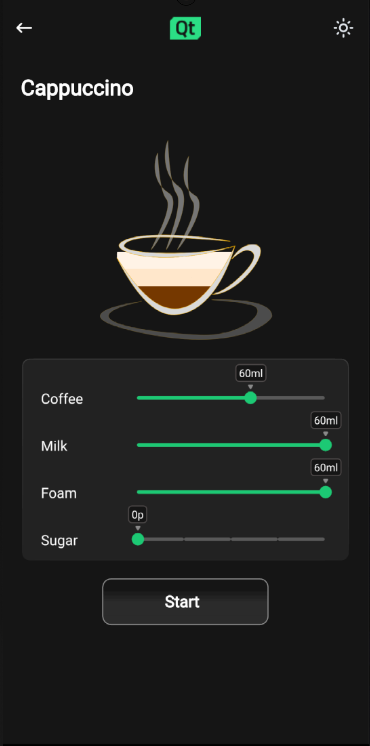
Implementing coffee settings
On this page the user can customize their coffee option to match their preference by adjusting custom Slider QML types. Changing the value of sliders will affect the liquid levels seen inside the coffee cup, this is made possible by binding the height of the liquid images inside Cup.qml to the values of corresponding sliders.
Values of the sliders in Settings page are stored in CoffeeConfig for later use using Synchronizer Qml type.
Synchronizer {
     sourceObject: settingsForm.coffeeConfig
     sourceProperty: "sugarAmount"
     targetObject: settingsForm.sugarSlider
     targetProperty: "value"
}
Clicking on Start button changes the state of ApplicationFlow.qml to "Insert", and the app displays the Insert.qml.
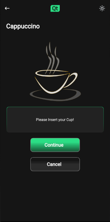
Implementing insert cup
On this page the user is instructed to insert their cup on to the machine before the brewing process can start.
Pressing the Continue button will move app to Progress page.
Implementing brewing coffee
Progress page displays a coffee cup and progress bar that will both in their own way signal the brewing process in real time.
The coffee cup here once filled will display the exact same configuration as the user selected on Settings page, this is made sure by binding the Cup property variables to the saved corresponding values in ApplicationFlow.qml.
The animation for filling the coffee cup happens with state engines Transition and SmoothedAnimation.
Cup {
    id: cup
    Layout.alignment: Qt.AlignHCenter | Qt.AlignTop
    state: "0"
}
The progress bar animation is implemented with Behavior.
Behavior on greenBar.width {
    SmoothedAnimation {
        easing.type: Easing.Linear
        velocity: (progressForm.contentItem.width / progressForm.brewTime) * 1000
    }
}
Timer will take care of updating the application state once the brewing is done.
Timer {
    id: timer
    interval: progressForm.brewTime
    running: true
    onTriggered: {
        progressForm.appFlow.onFinished()
    }
}
Implementing coffee ready
Ready page displays a coffee cup filled with whatever configuration the user selected with a "Your coffee is ready" text and a check icon.
When this page is displayed a Timer starts running and once the interval set is reached user is directed back to Home.qml.
Source files
Squish GUI testing
This application comes with Squish GUI tests targeted for Qt for Android. The tests are made with Squish for Qt and are written in Python and can be found under the application test directory.
When using Squish for Qt for Android, make sure to use the Qt built-in hook and forward Squish port with adb. If you are getting the error "Cannot load library" with dlopen failing, disable QT_USE_TARGET_ANDROID_BUILD_DIR from CMake configuration, or clear it from Projects->Build Settings->CMake->Current Configuration in Qt Creator.
If you don't have a Squish license, you can get a free trial.
See also All Qt Examples.
© 2026 The Qt Company Ltd. Documentation contributions included herein are the copyrights of their respective owners. The documentation provided herein is licensed under the terms of the GNU Free Documentation License version 1.3 as published by the Free Software Foundation. Qt and respective logos are trademarks of The Qt Company Ltd. in Finland and/or other countries worldwide. All other trademarks are property of their respective owners.
