Chapter 6 - Plot the data in the ChartView
The last step of this tutorial is to plot the CSV data inside our QChart. For this, you need to go over our data and include the data on a QLineSeries.
After adding the data to the series, you can modify the axis to properly display the QDateTime on the X-axis, and the magnitude values on the Y-axis.
Here is the updated main_widget.py that includes an additional
function to plot data using a QLineSeries:
 1from __future__ import annotations
 2
 3from PySide6.QtCore import QDateTime, Qt
 4from PySide6.QtGui import QPainter
 5from PySide6.QtWidgets import (QWidget, QHeaderView, QHBoxLayout, QTableView,
 6                               QSizePolicy)
 7from PySide6.QtCharts import QChart, QChartView, QLineSeries, QDateTimeAxis, QValueAxis
 8
 9from table_model import CustomTableModel
10
11
12class Widget(QWidget):
13    def __init__(self, data):
14        QWidget.__init__(self)
15
16        # Getting the Model
17        self.model = CustomTableModel(data)
18
19        # Creating a QTableView
20        self.table_view = QTableView()
21        self.table_view.setModel(self.model)
22
23        # QTableView Headers
24        resize = QHeaderView.ResizeToContents
25        self.horizontal_header = self.table_view.horizontalHeader()
26        self.vertical_header = self.table_view.verticalHeader()
27        self.horizontal_header.setSectionResizeMode(resize)
28        self.vertical_header.setSectionResizeMode(resize)
29        self.horizontal_header.setStretchLastSection(True)
30
31        # Creating QChart
32        self.chart = QChart()
33        self.chart.setAnimationOptions(QChart.AllAnimations)
34        self.add_series("Magnitude (Column 1)", [0, 1])
35
36        # Creating QChartView
37        self.chart_view = QChartView(self.chart)
38        self.chart_view.setRenderHint(QPainter.Antialiasing)
39
40        # QWidget Layout
41        self.main_layout = QHBoxLayout()
42        size = QSizePolicy(QSizePolicy.Preferred, QSizePolicy.Preferred)
43
44        # Left layout
45        size.setHorizontalStretch(1)
46        self.table_view.setSizePolicy(size)
47        self.main_layout.addWidget(self.table_view)
48
49        # Right Layout
50        size.setHorizontalStretch(4)
51        self.chart_view.setSizePolicy(size)
52        self.main_layout.addWidget(self.chart_view)
53
54        # Set the layout to the QWidget
55        self.setLayout(self.main_layout)
56
57    def add_series(self, name, columns):
58        # Create QLineSeries
59        self.series = QLineSeries()
60        self.series.setName(name)
61
62        # Filling QLineSeries
63        for i in range(self.model.rowCount()):
64            # Getting the data
65            t = self.model.index(i, 0).data()
66            date_fmt = "yyyy-MM-dd HH:mm:ss.zzz"
67
68            x = QDateTime().fromString(t, date_fmt).toSecsSinceEpoch()
69            y = float(self.model.index(i, 1).data())
70
71            if x > 0 and y > 0:
72                self.series.append(x, y)
73
74        self.chart.addSeries(self.series)
75
76        # Setting X-axis
77        self.axis_x = QDateTimeAxis()
78        self.axis_x.setTickCount(10)
79        self.axis_x.setFormat("dd.MM (h:mm)")
80        self.axis_x.setTitleText("Date")
81        self.chart.addAxis(self.axis_x, Qt.AlignBottom)
82        self.series.attachAxis(self.axis_x)
83        # Setting Y-axis
84        self.axis_y = QValueAxis()
85        self.axis_y.setTickCount(10)
86        self.axis_y.setLabelFormat("%.2f")
87        self.axis_y.setTitleText("Magnitude")
88        self.chart.addAxis(self.axis_y, Qt.AlignLeft)
89        self.series.attachAxis(self.axis_y)
90
91        # Getting the color from the QChart to use it on the QTableView
92        color_name = self.series.pen().color().name()
93        self.model.color = f"{color_name}"
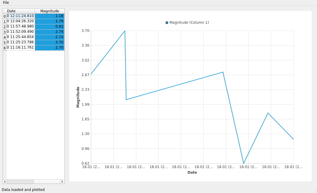
Now, run the application to visualize the earthquake magnitudes data at different times.
Try modifying the sources to get different output. For example, you could try to plot more data from the CSV.