Qt Quick Controls - Chat Tutorial
Tutorial about writing a basic chat client using Qt Quick Controls.
This tutorial shows how to write a basic chat application using Qt Quick Controls. It will also explain how to integrate an SQL database into a Qt application.
Chapter 1: Setting Up
When setting up a new project, it's easiest to use Qt Creator. For this project, we chose the Qt Quick application template, which creates a basic "Hello World" application with the following files:
MainForm.ui.qml- Defines the default UImain.qml- Embeds the default UI in a Windowqml.qrc- Lists the.qmlfiles that are built into the binarymain.cpp- Loadsmain.qmlchattutorial.pro- Provides the qmake configuration
Note: Delete the MainForm.ui.qml and qml.qrc files from the project, as we will not use them in this tutorial.
main.cpp
The default code in main.cpp has two includes:
#include <QGuiApplication>
#include <QQmlApplicationEngine>
The first gives us access to QGuiApplication. All Qt applications require an application object, but the precise type depends on what the application does. QCoreApplication is sufficient for non-graphical applications. QGuiApplication is sufficient for graphical applications that do not use Qt Widgets, while QApplication is required for those that do.
The second include makes QQmlApplicationEngine available, along with some useful functions required for making C++ types accessible from QML.
Within main(), we set up the application object and QML engine:
int main(int argc, char *argv[])
{
    QGuiApplication app(argc, argv);

    QQmlApplicationEngine engine;
    engine.load(QUrl(QStringLiteral("qrc:/chapter1/main.qml")));

    return app.exec();
}
It begins with enabling high DPI scaling, which is not part of the default code. It is necessary to do so before the application object is constructed.
After that's done, we construct the application object, passing any application arguments provided by the user.
Next, the QML engine is created. QQmlApplicationEngine is a convenient wrapper over QQmlEngine, providing the load() function to easily load QML for an application. It also adds some convenience for using file selectors.
Once we've set up things in C++, we can move on to the user interface in QML.
main.qml
Let's modify the default QML code to suit our needs.
import QtQuick
import QtQuick.Controls
First, import the Qt Quick module. This gives us access to graphical primitives such as Item, Rectangle, Text, and so on. For the full list of types, see the Qt Quick QML Types documentation.
Next, import the Qt Quick Controls module. Amongst other things, this provides access to ApplicationWindow, which will replace the existing root type, Window:
ApplicationWindow {
    width: 540
    height: 960
    visible: true
    ...
    }
ApplicationWindow is a Window with some added convenience for creating a header and a footer. It also provides the foundation for popups and supports some basic styling, such as the background color.
There are three properties that are almost always set when using ApplicationWindow: width, height, and visible. Once we've set these, we have a properly sized, empty window ready to be filled with content.
Note: The title property from the default code is removed.
The first "screen" in our application will be a list of contacts. It would be nice to have some text at the top of each screen that describes its purpose. The header and footer properties of ApplicationWindow could work in this situation. They have some characteristics that make them ideal for items that should be displayed on every screen of an application:
- They are anchored to the top and bottom of the window, respectively.
- They fill the width of the window.
However, when the contents of the header and footer varies depending on which screen the user is viewing, it is much easier to use Page. For now, we'll just add one page, but in the next chapter, we'll demonstrate how to navigate between several pages.
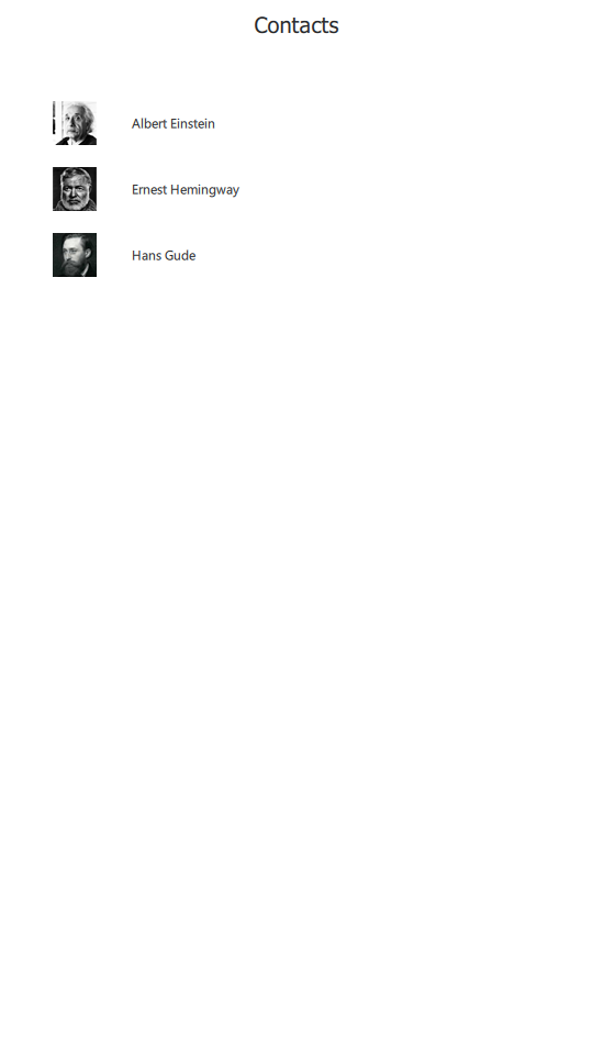
    Page {
        anchors.fill: parent
        header: Label {
            padding: 10
            text: qsTr("Contacts")
            font.pixelSize: 20
            horizontalAlignment: Text.AlignHCenter
            verticalAlignment: Text.AlignVCenter
        }
    }
We replace the default MainForm {...} code block with a Page, which is sized to occupy all the space on the window using the anchors.fill property.
Then, we assign a Label to its header property. Label extends the primitive Text item from the Qt Quick module by adding styling and font inheritance. This means that a Label can look different depending on which style is in use, and can also propagate its pixel size to its children.
We want some distance between the top of the application window and the text, so we set the padding property. This allocates extra space on each side of the label (within its bounds). We can also explicitly set the topPadding and bottomPadding properties instead.
We set the text of the label using the qsTr() function, which ensures that the text can be translated by Qt's translation system. It's a good practice to follow for text that is visible to the end users of your application.
By default, text is vertically aligned to the top of its bounds, while the horizontal alignment depends on the natural direction of the text; for example, text that is read from left to right will be aligned to the left. If we used these defaults, our text would be at the top-left corner of the window. This is not desirable for a header, so we align the text to the center of its bounds, both horizontally and vertically.
The Project File
The .pro or project file contains all of the information needed by qmake to generate a Makefile, which is then used to compile and link the application.
TEMPLATE = app
The first line tells qmake which kind of project this is. We're building an application, so we use the app template.
QT += qml quick
The next line declares the Qt libraries that we want to use from C++.
CONFIG += c++11
This line states that a C++11 compatible compiler is required to build the project.
SOURCES += main.cpp
The SOURCES variable lists all of the source files that should be compiled. A similar variable, HEADERS, is available for header files.
resources.files = main.qml
resources.prefix = chapter1/
RESOURCES += resources \
    qtquickcontrols2.conf
The next line tells qmake that we have a collection of resources that should be built into the executable.
target.path = $$[QT_INSTALL_EXAMPLES]/quickcontrols2/chattutorial/chapter1
This line replaces deployment settings that come with the default project file. It determines where the example is copied, on running "make install".
Now we can build and run the application:

Chapter 2: Lists
In this chapter, we'll explain how to create a list of interactive items using ListView and ItemDelegate.
ListView comes from the Qt Quick module, and displays a list of items populated from a model. ItemDelegate comes from the Qt Quick Controls module, and provides a standard view item for use in views and controls such as ListView and ComboBox. For example, each ItemDelegate can display text, be checked on and off, and react to mouse clicks.
Here is our ListView:
        ...

        ListView {
            id: listView
            anchors.fill: parent
            topMargin: 48
            leftMargin: 48
            bottomMargin: 48
            rightMargin: 48
            spacing: 20
            model: ["Albert Einstein", "Ernest Hemingway", "Hans Gude"]
            delegate: ItemDelegate {
                text: modelData
                width: listView.width - listView.leftMargin - listView.rightMargin
                height: avatar.implicitHeight
                leftPadding: avatar.implicitWidth + 32

                Image {
                    id: avatar
                    source: "images/" + modelData.replace(" ", "_") + ".png"
                }
            }
        }
        ...
Sizing and Positioning
The first thing we do is set a size for the view. It should fill the available space on the page, so we use anchors.fill. Note that Page ensures that its header and footer have enough of their own space reserved, so the view in this case will sit below the header, for example.
Next, we set margins around the ListView to put some distance between it and the edges of the window. The margin properties reserve space within the bounds of the view, which means that the empty areas can still be "flicked" by the user.
The items should be nicely spaced out within the view, so the spacing property is set to 20.
Model
In order to quickly populate the view with some items, we've used a JavaScript array as the model. One of the greatest strengths of QML is its ability to make prototyping an application extremely quick, and this is an example of that. It's also possible to simply assign a number to the model property to indicate how many items you need. For example, if you assign 10 to the model property, each item's display text will be a number from 0 to 9.
However, once the application gets past the prototype stage, it quickly becomes necessary to use some real data. For this, it's best to use a proper C++ model by subclassing QAbstractItemModel.
Delegate
On to the delegate. We assign the corresponding text from the model to the text property of ItemDelegate. The exact manner in which the data from the model is made available to each delegate depends on the type of model used. See Models and Views in Qt Quick for more information.
In our application, the width of each item in the view should be the same as the width of the view. This ensures that the user has a lot of room with which to select a contact from the list, which is an important factor on devices with small touch screens, like mobile phones. However, the width of the view includes our 48 pixel margins, so we must account for that in our assignment to the width property.
Next, we define an Image. This will display a picture of the user's contact. The image will be 40 pixels wide and 40 pixels high. We'll base the height of the delegate on the image's height, so that we don't have any empty vertical space.
Chapter 3: Navigation
In this chapter, you'll learn how to use StackView to navigate between pages in an application. Here's the revised main.qml:
import QtQuick
import QtQuick.Controls

ApplicationWindow {
    id: window
    width: 540
    height: 960
    visible: true

    StackView {
        id: stackView
        anchors.fill: parent
        initialItem: ContactPage {}
    }
}
Navigating with StackView
As its name suggests, StackView provides stack-based navigation. The last item to be "pushed" onto the stack is the first one to be removed, and the top-most item is always the one that is visible.
In the same manner as we did with Page, we tell the StackView to fill the application window. The only thing left to do after that is to give it an item to display, via initialItem. StackView accepts items, components and URLs.
You'll notice that we moved the code for the contact list into ContactPage.qml. It's a good idea to do this as soon as you have a general idea of which screens your application will contain. Doing so not only makes your code easier to read, but ensures that items are only instantiated from a given component when completely necessary, reducing memory usage.
Note: Qt Creator provides several convenient refactoring options for QML, one of which allows you to move a block of code into a separate file (Alt + Enter > Move Component into Separate File).
Another thing to consider when using ListView is whether to refer to it by id, or use the attached ListView.view property. The best approach depends on a few different factors. Giving the view an id will result in shorter and more efficient binding expressions, as the attached property has a very small amount of overhead. However, if you plan on reusing the delegate in other views, it is better to use the attached properties to avoid tying the delegate to a particular view. For example, using the attached properties, the width assignment in our delegate becomes:
width: ListView.view.width - ListView.view.leftMargin - ListView.view.rightMargin
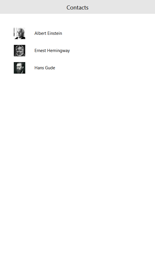
In chapter 2, we added a ListView below the header. If you run the application for that chapter, you'll see that the contents of the view can be scrolled over the top of the header:
This is not that nice, especially if the text in the delegates is long enough that it reaches the text in the header. What we ideally want to do is to have a solid block of color under the header text, but above the view. This ensures that the listview contents can't visually interfere with the header contents. Note that it's also possible to achieve this by setting the clip property of the view to true, but doing so can affect performance.
ToolBar is the right tool for this job. It is a container of both application-wide and context-sensitive actions and controls, such as navigation buttons and search fields. Best of all, it has a background color that, as usual, comes from the application style. Here it is in action:
    header: ToolBar {
        Label {
            text: qsTr("Contacts")
            font.pixelSize: 20
            anchors.centerIn: parent
        }
    }
It has no layout of its own, so we center the label within it ourselves.
The rest of the code is the same as it was in chapter 2, except that we've taken advantage of the clicked signal to push the next page onto the stackview:
onClicked: root.StackView.view.push("ConversationPage.qml", { inConversationWith: modelData })
When pushing a Component or url onto StackView, it's often necessary to initialize the (eventually) instantiated item with some variables. StackView's push() function accounts for this, by taking a JavaScript object as the second argument. We use this to provide the next page with a contact's name, which it then uses to display the relevant conversation. Note the root.StackView.view.push syntax; this is necessary because of how attached properties work.
Let's step through ConversationPage.qml, beginning with the imports:
import QtQuick
import QtQuick.Layouts
import QtQuick.Controls
These are the same as before, except for the addition of the QtQuick.Layouts import, which we'll cover shortly.
Page {
    id: root

    property string inConversationWith

    header: ToolBar {
        ToolButton {
            text: qsTr("Back")
            anchors.left: parent.left
            anchors.leftMargin: 10
            anchors.verticalCenter: parent.verticalCenter
            onClicked: root.StackView.view.pop()
        }

        Label {
            id: pageTitle
            text: inConversationWith
            font.pixelSize: 20
            anchors.centerIn: parent
        }
    }
    ...
The root item of this component is another Page, which has a custom property called inConversationWith. For now, this property will simply determine what the label in the header displays. Later on, we'll use it in the SQL query that populates the list of messages in the conversation.
To allow the user to go back to the Contact page, we add a ToolButton that calls pop() when clicked. A ToolButton is functionally similar to Button, but provides a look that is more suitable within a ToolBar.
There are two ways of laying out items in QML: Item Positioners and Qt Quick Layouts. Item positioners (Row, Column, and so on) are useful for situations where the size of items is known or fixed, and all that is required is to neatly position them in a certain formation. The layouts in Qt Quick Layouts can both position and resize items, making them well suited for resizable user interfaces. Below, we use ColumnLayout to vertically lay out a ListView and a Pane:
    ColumnLayout {
        anchors.fill: parent

        ListView {
            id: listView
            Layout.fillWidth: true
            Layout.fillHeight: true
            ...

        }
        ...

        Pane {
            id: pane
            Layout.fillWidth: true
            ...
    }
Pane is basically a rectangle whose color comes from the application's style. It is similar to Frame, with the only difference being that it has no stroke around its border.
Items that are direct children of a layout have various attached properties available to them. We use Layout.fillWidth and Layout.fillHeight on the ListView to ensure that it takes as much space within the ColumnLayout as it can. The same is done for the Pane. As ColumnLayout is a vertical layout, there aren't any items to the left or right of each child, so this will result in each item consuming the entire width of the layout.
On the other hand, the Layout.fillHeight statement in the ListView will enable it to occupy the remaining space that is left after accommodating the Pane.
Let's look at the listview in detail:
        ListView {
            id: listView
            Layout.fillWidth: true
            Layout.fillHeight: true
            Layout.margins: pane.leftPadding + messageField.leftPadding
            displayMarginBeginning: 40
            displayMarginEnd: 40
            verticalLayoutDirection: ListView.BottomToTop
            spacing: 12
            model: 10
            delegate: Row {
                readonly property bool sentByMe: index % 2 == 0

                anchors.right: sentByMe ? listView.contentItem.right : undefined
                spacing: 6

                Rectangle {
                    id: avatar
                    width: height
                    height: parent.height
                    color: "grey"
                    visible: !sentByMe
                }

                Rectangle {
                    width: 80
                    height: 40
                    color: sentByMe ? "lightgrey" : "steelblue"

                    Label {
                        anchors.centerIn: parent
                        text: index
                        color: sentByMe ? "black" : "white"
                    }
                }
            }

            ScrollBar.vertical: ScrollBar {}
        }
After filling the width and height of its parent, we also set some margins on the view. This gives us a nice alignment with the placeholder text in the "compose message" field:

Next, we set displayMarginBeginning and displayMarginEnd. These properties ensure that the delegates outside the bounds of the view do not disappear while scrolling at the edges of the view. It's easiest to understand this by commenting out the properties and seeing what happens when scrolling the view.
We then flip the vertical direction of the view, so that first items are at the bottom. The delegates are spaced out by 12 pixels, and a "dummy" model is assigned for testing purposes, until we implement the real model in chapter 4.
Within the delegate, we declare a Row as the root item, as we want the avatar to be followed by the message contents, as shown in the image above.
Messages sent by the user should be distinguished from those sent by a contact. For now, we set a dummy property sentByMe, which simply uses the index of the delegate to alternate between different authors. Using this property, we distinguish between different authors in three ways:
- Messages sent by the user are aligned to the right side of the screen by setting
anchors.righttolistView.contentItem.right. - By setting the
visibleproperty of the avatar (which is simply a Rectangle for now) based onsentByMe, we only show it if the message was sent by a contact. - We change the color of the rectangle depending on the author. Since we do not want to display dark text on a dark background, and vice versa, we also set the text color depending on who the author is. In chapter 5, we'll see how styling takes care of matters like this for us.
At the bottom of the screen, we place a TextArea item to allow multi-line text input, and a button to send the message. We use Pane to cover the area under these two items, in the same way that we use ToolBar to prevent the contents of the listview from interfering with the page header:
        Pane {
            id: pane
            Layout.fillWidth: true

            RowLayout {
                width: parent.width

                TextArea {
                    id: messageField
                    Layout.fillWidth: true
                    placeholderText: qsTr("Compose message")
                    wrapMode: TextArea.Wrap
                }

                Button {
                    id: sendButton
                    text: qsTr("Send")
                    enabled: messageField.length > 0
                }
            }
        }
The TextArea should fill the available width of the screen. We assign some placeholder text to provide a visual cue to the user as to where they should begin typing. The text within the input area is wrapped to ensure that it does not go outside of the screen.
Finally, the button is only enabled when there is actually a message to send.
Chapter 4: Models
In chapter 4, we'll take you through the process of creating both read-only and read-write SQL models in C++ and exposing them to QML to populate views.
QSqlQueryModel
In order to keep the tutorial simple, we've chosen to make the list of user contacts non-editable. QSqlQueryModel is the logical choice for this purpose, as it provides a read-only data model for SQL result sets.
Let's take a look at our SqlContactModel class that derives from QSqlQueryModel:
#include <QSqlQueryModel>

class SqlContactModel : public QSqlQueryModel
{
public:
    SqlContactModel(QObject *parent = nullptr);
};
There's not much going on here, so let's move on to the .cpp file:
#include "sqlcontactmodel.h"

#include <QDebug>
#include <QSqlError>
#include <QSqlQuery>

static void createTable()
{
    if (QSqlDatabase::database().tables().contains(QStringLiteral("Contacts"))) {
        // The table already exists; we don't need to do anything.
        return;
    }

    QSqlQuery query;
    if (!query.exec(
        "CREATE TABLE IF NOT EXISTS 'Contacts' ("
        "   'name' TEXT NOT NULL,"
        "   PRIMARY KEY(name)"
        ")")) {
        qFatal("Failed to query database: %s", qPrintable(query.lastError().text()));
    }

    query.exec("INSERT INTO Contacts VALUES('Albert Einstein')");
    query.exec("INSERT INTO Contacts VALUES('Ernest Hemingway')");
    query.exec("INSERT INTO Contacts VALUES('Hans Gude')");
}
We include the header file of our class and those that we require from Qt. We then define a static function named createTable() that we'll use to create the SQL table (if it doesn't already exist), and then populate it with some dummy contacts.
The call to database() might look a little bit confusing because we have not set up a specific database yet. If no connection name is passed to this function, it will return a "default connection", whose creation we will cover soon.
SqlContactModel::SqlContactModel(QObject *parent) :
    QSqlQueryModel(parent)
{
    createTable();

    QSqlQuery query;
    if (!query.exec("SELECT * FROM Contacts"))
        qFatal("Contacts SELECT query failed: %s", qPrintable(query.lastError().text()));

    setQuery(std::move(query));
    if (lastError().isValid())
        qFatal("Cannot set query on SqlContactModel: %s", qPrintable(lastError().text()));
}
In the constructor, we call createTable(). We then construct a query that will be used to populate the model. In this case, we are simply interested in all rows of the Contacts table.
QSqlTableModel
SqlConversationModel is more complex:
#include <QSqlTableModel>

class SqlConversationModel : public QSqlTableModel
{
    Q_OBJECT
    Q_PROPERTY(QString recipient READ recipient WRITE setRecipient NOTIFY recipientChanged)

public:
    SqlConversationModel(QObject *parent = nullptr);

    QString recipient() const;
    void setRecipient(const QString &recipient);

    QVariant data(const QModelIndex &index, int role) const override;
    QHash<int, QByteArray> roleNames() const override;

    Q_INVOKABLE void sendMessage(const QString &recipient, const QString &message);

signals:
    void recipientChanged();

private:
    QString m_recipient;
};
We use both the Q_PROPERTY and Q_INVOKABLE macros, and therefore we must let moc know by using the Q_OBJECT macro.
The recipient property will be set from QML to let the model know which conversation it should retrieve messages for.
We override the data() and roleNames() functions so that we can use our custom roles in QML.
We also define the sendMessage() function that we want to call from QML, hence the Q_INVOKABLE macro.
Let's take a look at the .cpp file:
#include "sqlconversationmodel.h"

#include <QDateTime>
#include <QDebug>
#include <QSqlError>
#include <QSqlRecord>
#include <QSqlQuery>

static const char *conversationsTableName = "Conversations";

static void createTable()
{
    if (QSqlDatabase::database().tables().contains(conversationsTableName)) {
        // The table already exists; we don't need to do anything.
        return;
    }

    QSqlQuery query;
    if (!query.exec(
        "CREATE TABLE IF NOT EXISTS 'Conversations' ("
        "'author' TEXT NOT NULL,"
        "'recipient' TEXT NOT NULL,"
        "'timestamp' TEXT NOT NULL,"
        "'message' TEXT NOT NULL,"
        "FOREIGN KEY('author') REFERENCES Contacts ( name ),"
        "FOREIGN KEY('recipient') REFERENCES Contacts ( name )"
        ")")) {
        qFatal("Failed to query database: %s", qPrintable(query.lastError().text()));
    }

    query.exec("INSERT INTO Conversations VALUES('Me', 'Ernest Hemingway', '2016-01-07T14:36:06', 'Hello!')");
    query.exec("INSERT INTO Conversations VALUES('Ernest Hemingway', 'Me', '2016-01-07T14:36:16', 'Good afternoon.')");
    query.exec("INSERT INTO Conversations VALUES('Me', 'Albert Einstein', '2016-01-01T11:24:53', 'Hi!')");
    query.exec("INSERT INTO Conversations VALUES('Albert Einstein', 'Me', '2016-01-07T14:36:16', 'Good morning.')");
    query.exec("INSERT INTO Conversations VALUES('Hans Gude', 'Me', '2015-11-20T06:30:02', 'God morgen. Har du fått mitt maleri?')");
    query.exec("INSERT INTO Conversations VALUES('Me', 'Hans Gude', '2015-11-20T08:21:03', 'God morgen, Hans. Ja, det er veldig fint. Tusen takk! "
               "Hvor mange timer har du brukt på den?')");
}
This is very similar to sqlcontactmodel.cpp, with the exception that we are now operating on the Conversations table. We also define conversationsTableName as a static const variable, as we use it in a couple of places throughout the file.
SqlConversationModel::SqlConversationModel(QObject *parent) :
    QSqlTableModel(parent)
{
    createTable();
    setTable(conversationsTableName);
    setSort(2, Qt::DescendingOrder);
    // Ensures that the model is sorted correctly after submitting a new row.
    setEditStrategy(QSqlTableModel::OnManualSubmit);
}
As with SqlContactModel, the first thing that we do in the constructor is create the table. We tell QSqlTableModel the name of the table we'll be using via the setTable() function. To ensure that the latest messages in the conversation are shown first, we sort the query results by the timestamp field in descending order. This goes hand in hand with setting ListView's verticalLayoutDirection property to ListView.BottomToTop (which we covered in chapter 3).
QString SqlConversationModel::recipient() const
{
    return m_recipient;
}

void SqlConversationModel::setRecipient(const QString &recipient)
{
    if (recipient == m_recipient)
        return;

    m_recipient = recipient;

    const QString filterString = QString::fromLatin1(
        "(recipient = '%1' AND author = 'Me') OR (recipient = 'Me' AND author='%1')").arg(m_recipient);
    setFilter(filterString);
    select();

    emit recipientChanged();
}
In setRecipient(), we set a filter over the results returned from the database.
QVariant SqlConversationModel::data(const QModelIndex &index, int role) const
{
    if (role < Qt::UserRole)
        return QSqlTableModel::data(index, role);

    const QSqlRecord sqlRecord = record(index.row());
    return sqlRecord.value(role - Qt::UserRole);
}
The data() function falls back to QSqlTableModel's implementation if the role is not a custom user role. If the role is a user role, we can subtract Qt::UserRole from it to get the index of that field and then use that to find the value that we need to return.
QHash<int, QByteArray> SqlConversationModel::roleNames() const
{
    QHash<int, QByteArray> names;
    names[Qt::UserRole] = "author";
    names[Qt::UserRole + 1] = "recipient";
    names[Qt::UserRole + 2] = "timestamp";
    names[Qt::UserRole + 3] = "message";
    return names;
}
In roleNames(), we return a mapping of our custom role values to role names. This enables us to use these roles in QML. It can be useful to declare an enum to hold all of the role values, but since we don't refer to any specific value in code outside of this function, we don't bother.
void SqlConversationModel::sendMessage(const QString &recipient, const QString &message)
{
    const QString timestamp = QDateTime::currentDateTime().toString(Qt::ISODate);

    QSqlRecord newRecord = record();
    newRecord.setValue("author", "Me");
    newRecord.setValue("recipient", recipient);
    newRecord.setValue("timestamp", timestamp);
    newRecord.setValue("message", message);
    if (!insertRecord(rowCount(), newRecord)) {
        qWarning() << "Failed to send message:" << lastError().text();
        return;
    }
The sendMessage() function uses the given recipient and a message to insert a new record into the database. Due to our usage of QSqlTableModel::OnManualSubmit, we must manually call submitAll().
Connecting to the Database and Registering Types With QML
Now that we've established the model classes, let's take a look at main.cpp:
#include <QtCore>
#include <QGuiApplication>
#include <QSqlDatabase>
#include <QSqlError>
#include <QtQml>

#include "sqlcontactmodel.h"
#include "sqlconversationmodel.h"

static void connectToDatabase()
{
    QSqlDatabase database = QSqlDatabase::database();
    if (!database.isValid()) {
        database = QSqlDatabase::addDatabase("QSQLITE");
        if (!database.isValid())
            qFatal("Cannot add database: %s", qPrintable(database.lastError().text()));
    }

    const QDir writeDir = QStandardPaths::writableLocation(QStandardPaths::AppDataLocation);
    if (!writeDir.mkpath("."))
        qFatal("Failed to create writable directory at %s", qPrintable(writeDir.absolutePath()));

    // Ensure that we have a writable location on all devices.
    const QString fileName = writeDir.absolutePath() + "/chat-database.sqlite3";
    // When using the SQLite driver, open() will create the SQLite database if it doesn't exist.
    database.setDatabaseName(fileName);
    if (!database.open()) {
        qFatal("Cannot open database: %s", qPrintable(database.lastError().text()));
        QFile::remove(fileName);
    }
}

int main(int argc, char *argv[])
{
    QGuiApplication app(argc, argv);

    qmlRegisterType<SqlContactModel>("io.qt.examples.chattutorial", 1, 0, "SqlContactModel");
    qmlRegisterType<SqlConversationModel>("io.qt.examples.chattutorial", 1, 0, "SqlConversationModel");

    connectToDatabase();

    QQmlApplicationEngine engine;
    engine.load(QUrl(QStringLiteral("qrc:/chapter4/main.qml")));
    if (engine.rootObjects().isEmpty())
        return -1;

    return app.exec();
}
connectToDatabase() creates the connection to the SQLite database, creating the actual file if it doesn't already exist.
Within main(), we call qmlRegisterType() to register our models as types within QML.
Using the Models in QML
Now that we have the models available as QML types, there are some minor changes to be done to ContactPage.qml. To be able to use the types, we must first import them using the URI we set in main.cpp:
import io.qt.examples.chattutorial
We then replace the dummy model with the proper one:
model: SqlContactModel {}
Within the delegate, we use a different syntax for accessing the model data:
text: model.display
In ConversationPage.qml, we add the same chattutorial import, and replace the dummy model:
            model: SqlConversationModel {
                recipient: inConversationWith
            }
Within the model, we set the recipient property to the name of the contact for which the page is being displayed.
The root delegate item changes from a Row to a Column, to accommodate the timestamp that we want to display below every message:
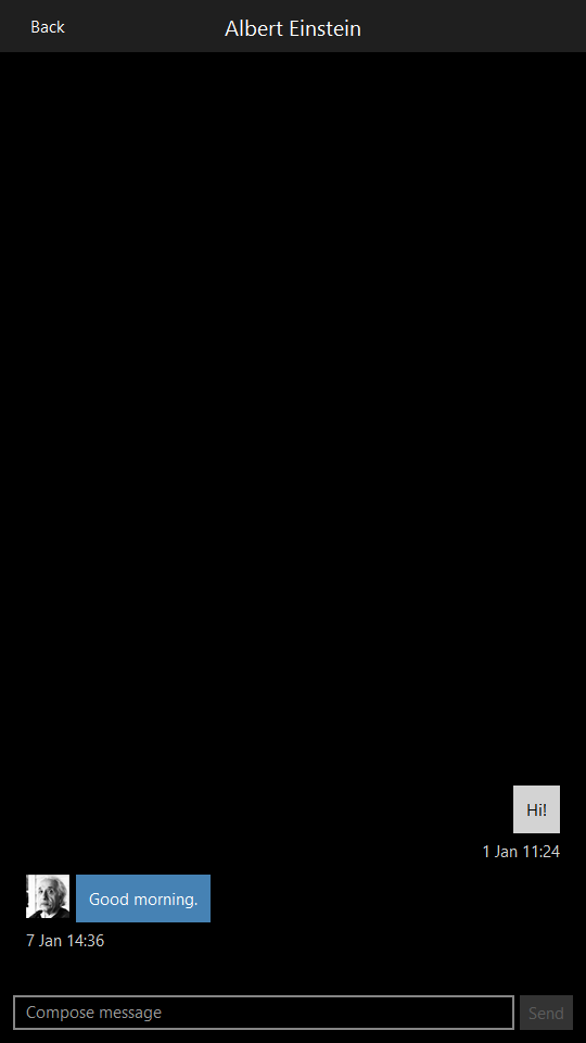
            delegate: Column {
                anchors.right: sentByMe ? listView.contentItem.right : undefined
                spacing: 6

                readonly property bool sentByMe: model.recipient !== "Me"

                Row {
                    id: messageRow
                    spacing: 6
                    anchors.right: sentByMe ? parent.right : undefined

                    Image {
                        id: avatar
                        source: !sentByMe ? "images/" + model.author.replace(" ", "_") + ".png" : ""
                    }

                    Rectangle {
                        width: Math.min(messageText.implicitWidth + 24,
                            listView.width - (!sentByMe ? avatar.width + messageRow.spacing : 0))
                        height: messageText.implicitHeight + 24
                        color: sentByMe ? "lightgrey" : "steelblue"

                        Label {
                            id: messageText
                            text: model.message
                            color: sentByMe ? "black" : "white"
                            anchors.fill: parent
                            anchors.margins: 12
                            wrapMode: Label.Wrap
                        }
                    }
                }

                Label {
                    id: timestampText
                    text: Qt.formatDateTime(model.timestamp, "d MMM hh:mm")
                    color: "lightgrey"
                    anchors.right: sentByMe ? parent.right : undefined
                }
            }

Now that we have a proper model, we can use its recipient role in the expression for the sentByMe property.
The Rectangle that was used for the avatar has been converted into an Image. The image has its own implicit size, so we don't need to specify it explicitly. As before, we only show the avatar when the author isn't the user, except this time we set the source of the image to an empty URL instead of using the visible property.
We want each message background to be slightly wider (12 pixels each side) than its text. However, if it's too long, we want to limit its width to the edge of the listview, hence the usage of Math.min(). When the message wasn't sent by us, an avatar will always come before it, so we account for that by subtracting the width of the avatar and the row spacing.
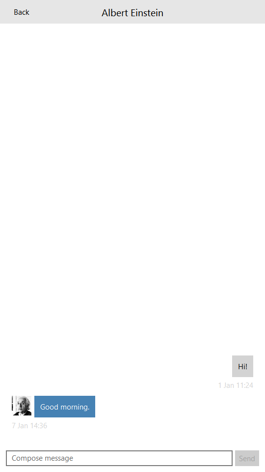
For example, in the image above, the implicit width of the message text is the smaller value. However, in the image below, the message text is quite long, so the smaller value (the width of the view) is chosen, ensuring that the text stops at the opposite edge of the screen:

In order to display the timestamp for each message that we discussed earlier, we use a Label. The date and time are formatted with Qt.formatDateTime(), using a custom format.
The "send" button must now react to being clicked:
                Button {
                    id: sendButton
                    text: qsTr("Send")
                    enabled: messageField.length > 0
                    onClicked: {
                        listView.model.sendMessage(inConversationWith, messageField.text);
                        messageField.text = "";
                    }
                }
First, we call the invokable sendMessage() function of the model, which inserts a new row into the Conversations database table. Then, we clear the text field to make way for future input.
Chapter 5: Styling
Styles in Qt Quick Controls are designed to work on any platform. In this chapter, we'll do some minor visual tweaks to make sure our application looks good when run with the Basic, Material, and Universal styles.
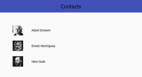
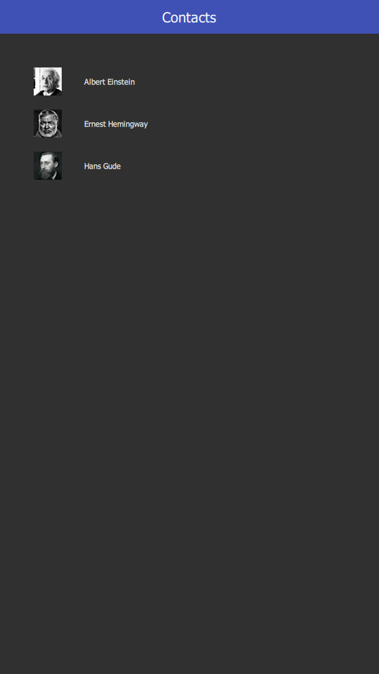
So far, we've just been testing the application with the Basic style. If we run it with the Material Style, for example, we'll immediately see some issues. Here is the Contacts page:
The header text is black on a dark blue background, which is very difficult to read. The same thing occurs with the Conversations page:

The solution is to tell the toolbar that it should use the "Dark" theme, so that this information is propagated to its children, allowing them to switch their text color to something lighter. The simplest way of doing so is to import the Material style directly and use the Material attached property:
import QtQuick.Controls.Material 2.12

// ...

header: ToolBar {
    Material.theme: Material.Dark

    // ...
}
However, this brings with it a hard dependency to the Material style; the Material style plugin must be deployed with the application, even if the target device doesn't use it, otherwise the QML engine will fail to find the import.
Instead, it is better to rely on Qt Quick Controls's built-in support for style-based file selectors. To do this, we must move the ToolBar out into its own file. We'll call it ChatToolBar.qml. This will be the "default" version of the file, which means that it will be used when the Basic style (which is the style that is used when none is specified) is in use. Here's the new file:
import QtQuick.Controls

ToolBar {
}
As we only use the ToolBar type within this file, we only need the Qt Quick Controls import. The code itself has not changed from how it was in ContactPage.qml, which is how it should be; for the default version of the file, nothing needs to be different.
Back in ContactPage.qml, we update the code to use the new type:
    header: ChatToolBar {
        Label {
            text: qsTr("Contacts")
            font.pixelSize: 20
            anchors.centerIn: parent
        }
    }
Now we need to add the Material version of the toolbar. File selectors expect variants of a file to be in appropriately named directories that exist alongside the default version of the file. This means that we need to add a folder named "+Material" in the same directory that ChatToolBar.qml is in: the root folder. The "+" is required by QFileSelector as a way of ensuring that the selection feature is not accidentally triggered.
Here's +Material/ChatToolBar.qml:
import QtQuick.Controls
import QtQuick.Controls.Material

ToolBar {
    Material.theme: Material.Dark
}
We'll make the same changes to ConversationPage.qml:
    header: ChatToolBar {
        ToolButton {
            text: qsTr("Back")
            anchors.left: parent.left
            anchors.leftMargin: 10
            anchors.verticalCenter: parent.verticalCenter
            onClicked: root.StackView.view.pop()
        }

        Label {
            id: pageTitle
            text: inConversationWith
            font.pixelSize: 20
            anchors.centerIn: parent
        }
    }
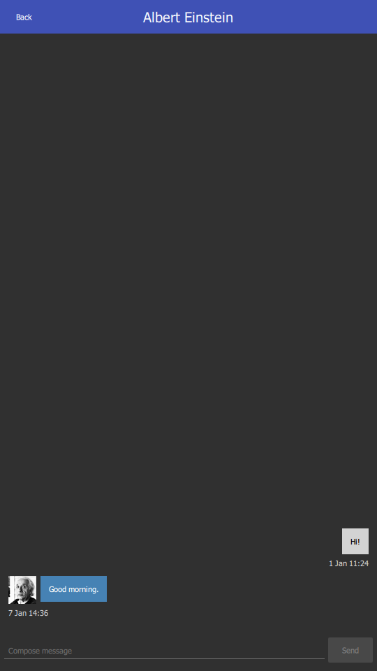
Now both pages look correct:
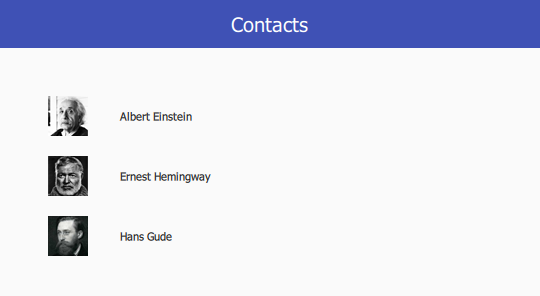

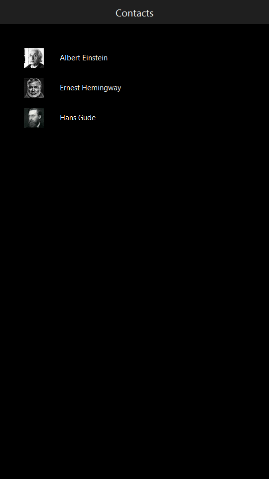
Let's try out the Universal style:
No issues there. For a relatively simple application such as this one, there should be very few adjustments necessary when switching styles.
Now let's try each style's dark theme. The Basic style has no dark theme, as it would add a slight overhead to a style that is designed to be as performant as possible. We'll test out the Material style first, so add an entry to qtquickcontrols2.conf that tells it to use its dark theme:
[Material]
Primary=Indigo
Accent=Indigo
Theme=Dark
Once this is done, build and run the application. This is what you should see:
Both pages look fine. Now add an entry for the Universal style:
[universal]
Theme=Dark
After building and running the application, you should see these results:
Summary
In this tutorial, we've taken you through the following steps of writing a basic application using Qt Quick Controls:
- Creating a new project using Qt Creator.
- Setting up a basic ApplicationWindow.
- Defining headers and footers with Page.
- Displaying content in a ListView.
- Refactoring components into their own files.
- Navigating between screens with StackView.
- Using layouts to allow an application to resize gracefully.
- Implementing both custom read-only and writable models that integrate an SQL database into the application.
- Integrating C++ with QML via Q_PROPERTY, Q_INVOKABLE, and qmlRegisterType().
- Testing and configuring multiple styles.
© 2024 The Qt Company Ltd. Documentation contributions included herein are the copyrights of their respective owners. The documentation provided herein is licensed under the terms of the GNU Free Documentation License version 1.3 as published by the Free Software Foundation. Qt and respective logos are trademarks of The Qt Company Ltd. in Finland and/or other countries worldwide. All other trademarks are property of their respective owners.
