Item QML Type
A basic visual QML type. More...
| Import Statement: | import QtQuick |
| In C++: | QQuickItem |
| Inherits: | |
| Inherited By: | 36 typesAnimatedSprite, BorderImage, Canvas, Column, ColumnLayout, DropArea, Flickable, Flipable, Flow, FocusScope, Grid, GridLayout, Image, LayoutItemProxy, Loader, MouseArea, MultiEffect, MultiPointTouchArea, ParticlePainter, PathView, PinchArea, Rectangle, RectangularShadow, Repeater, Row, RowLayout, ShaderEffect, ShaderEffectSource, Shape, SpriteSequence, StackLayout, Text, TextEdit, TextInput, VectorImage, and WindowContainer |
Properties
- activeFocus : bool
- activeFocusOnTab : bool
- anchors
- anchors.alignWhenCentered : bool
- anchors.baseline : AnchorLine
- anchors.baselineOffset : real
- anchors.bottom : AnchorLine
- anchors.bottomMargin : real
- anchors.centerIn : Item
- anchors.fill : Item
- anchors.horizontalCenter : AnchorLine
- anchors.horizontalCenterOffset : real
- anchors.left : AnchorLine
- anchors.leftMargin : real
- anchors.margins : real
- anchors.right : AnchorLine
- anchors.rightMargin : real
- anchors.top : AnchorLine
- anchors.topMargin : real
- anchors.verticalCenter : AnchorLine
- anchors.verticalCenterOffset : real
- antialiasing : bool
- baselineOffset : int
- children : list<Item>
- childrenRect
- childrenRect.height : real
- childrenRect.width : real
- childrenRect.x : real
- childrenRect.y : real
- clip : bool
- containmentMask : QObject*
- data : list<QtObject>
- enabled : bool
- focus : bool
- focusPolicy : enumeration
(since 6.7) - height : real
- implicitHeight : real
- implicitWidth : real
- layer.effect : Component
- layer.enabled : bool
- layer.format : enumeration
- layer.live : bool
(since 6.5) - layer.mipmap : bool
- layer.samplerName : string
- layer.samples : enumeration
- layer.smooth : bool
- layer.sourceRect : rect
- layer.textureMirroring : enumeration
- layer.textureSize : size
- layer.wrapMode : enumeration
- opacity : real
- palette : Palette
(since 6.0) - parent : Item
- resources : list<QtObject>
- rotation : real
- scale : real
- smooth : bool
- state : string
- states : list<State>
- transform : list<Transform>
- transformOrigin : enumeration
- transitions : list<Transition>
- visible : bool
- visibleChildren : list<Item>
- width : real
- x : real
- y : real
- z : real
Methods
- Item childAt(real x, real y)
- bool contains(point point)
- dumpItemTree()
(since 6.3) - forceActiveFocus()
- forceActiveFocus(Qt::FocusReason reason)
- bool grabToImage(callback, targetSize)
- point mapFromGlobal(real x, real y)
- point mapFromItem(Item item, point p)
- rect mapFromItem(Item item, rect r)
- point mapFromItem(Item item, real x, real y)
- rect mapFromItem(Item item, real x, real y, real width, real height)
- point mapToGlobal(real x, real y)
- point mapToItem(Item item, point p)
- rect mapToItem(Item item, rect r)
- point mapToItem(Item item, real x, real y)
- rect mapToItem(Item item, real x, real y, real width, real height)
- Item nextItemInFocusChain(bool forward)
Detailed Description
The Item type is the base type for all visual items in Qt Quick.
All visual items in Qt Quick inherit from Item. Although an Item object has no visual appearance, it defines all the attributes that are common across visual items, such as x and y position, width and height, anchoring and key handling support.
The Item type can be useful for grouping several items under a single root visual item. For example:
import QtQuick 2.0

Item {
    Image {
        source: "tile.png"
    }
    Image {
        x: 80
        width: 100
        height: 100
        source: "tile.png"
    }
    Image {
        x: 190
        width: 100
        height: 100
        fillMode: Image.Tile
        source: "tile.png"
    }
}
Event Handling
All Item-based visual types can use Input Handlers to handle incoming input events (subclasses of QInputEvent), such as mouse, touch and key events. This is the preferred declarative way to handle events.
An alternative way to handle touch events is to subclass QQuickItem, call setAcceptTouchEvents() in the constructor, and override touchEvent(). Accept the entire event to stop delivery to items underneath, and to exclusively grab for all the event's touch points. Use QPointerEvent::setExclusiveGrabber() to grab only certain touchpoints, and allow the event to be delivered further.
Likewise, a QQuickItem subclass can call setAcceptedMouseButtons() to register to receive mouse button events, setAcceptHoverEvents() to receive hover events (mouse movements while no button is pressed), and override the virtual functions mousePressEvent(), mouseMoveEvent(), and mouseReleaseEvent(). Those can also accept the event to prevent further delivery and get an implicit grab at the same time; or explicitly grab the single QEventPoint that the QMouseEvent carries.
Key handling is available to all Item-based visual types via the Keys attached property. The Keys attached property provides basic signals such as pressed and released, as well as signals for specific keys, such as spacePressed. The example below assigns keyboard focus to the item and handles the left key via the general onPressed handler and the return key via the onReturnPressed handler:
import QtQuick 2.0

Item {
    focus: true
    Keys.onPressed: (event)=> {
        if (event.key == Qt.Key_Left) {
            console.log("move left");
            event.accepted = true;
        }
    }
    Keys.onReturnPressed: console.log("Pressed return");
}
See the Keys attached property for detailed documentation.
Layout Mirroring
Item layouts can be mirrored using the LayoutMirroring attached property. This causes anchors to be horizontally reversed, and also causes items that lay out or position their children (such as ListView or Row) to horizontally reverse the direction of their layouts.
See LayoutMirroring for more details.
Item Layers
An Item will normally be rendered directly into the window it belongs to. However, by setting layer.enabled, it is possible to delegate the item and its entire subtree into an offscreen surface. Only the offscreen surface, a texture, will be then drawn into the window.
If it is desired to have a texture size different from that of the item, this is possible using layer.textureSize. To render only a section of the item into the texture, use layer.sourceRect. It is also possible to specify layer.sourceRect so it extends beyond the bounds of the item. In this case, the exterior will be padded with transparent pixels.
The item will use linear interpolation for scaling if layer.smooth is set to true and will use mipmap for downsampling if layer.mipmap is set to true. Mipmapping may improve visual quality of downscaled items. For mipmapping of single Image items, prefer Image::mipmap.
Layer Opacity vs Item Opacity
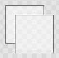
When applying opacity to an item hierarchy the opacity is applied to each item individually. This can lead to undesired visual results when the opacity is applied to a subtree. Consider the following example:
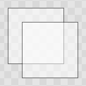 | Non-layered Opacity |
A layer is rendered with the root item's opacity being 1, and then the root item's opacity is applied to the texture when it is drawn. This means that fading in a large item hierarchy from transparent to opaque, or vice versa, can be done without the overlap artifacts that the normal item by item alpha blending has. Here is the same example with layer enabled:
| Layered Opacity |
Combined with ShaderEffects
Setting layer.enabled to true will turn the item into a texture provider, making it possible to use the item directly as a texture, for instance in combination with the ShaderEffect type.
It is possible to apply an effect on a layer at runtime using layer.effect:
Item {
    id: layerRoot
    layer.enabled: true
    layer.effect: ShaderEffect {
        fragmentShader: "effect.frag.qsb"
    }
}
See ShaderEffect for more information about using effects.
Note: layer.enabled is actually just a more convenient way of using ShaderEffectSource.
Memory and Performance
When an item's layer is enabled, the scene graph will allocate memory in the GPU equal to width x height x 4. In memory constrained configurations, large layers should be used with care.
In the QPainter / QWidget world, it is sometimes favorable to cache complex content in a pixmap, image or texture. In Qt Quick, because of the techniques already applied by the scene graph renderer, this will in most cases not be the case. Excessive draw calls are already reduced because of batching and a cache will in most cases end up blending more pixels than the original content. The overhead of rendering to an offscreen and the blending involved with drawing the resulting texture is therefore often more costly than simply letting the item and its children be drawn normally.
Also, an item using a layer can not be batched during rendering. This means that a scene with many layered items may have performance problems.
Layering can be convenient and useful for visual effects, but should in most cases be enabled for the duration of the effect and disabled afterwards.
Property Documentation
The children property contains the list of visual children of this item. The resources property contains non-visual resources that you want to reference by name.
It is not generally necessary to refer to these properties when adding child items or resources, as the default data property will automatically assign child objects to the children and resources properties as appropriate. See the data documentation for details.
Defines the preferred width or height of the Item.
If width or height is not specified, an item's effective size will be determined by its implicitWidth or implicitHeight.
However, if an item is the child of a layout, the layout will determine the item's preferred size using its implicit size. In such a scenario, the explicit width or height will be ignored.
The default implicit size for most items is 0x0, however some items have an inherent implicit size which cannot be overridden, for example, Image and Text.
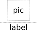
Setting the implicit size is useful for defining components that have a preferred size based on their content, for example:
// Label.qml
import QtQuick 2.0

Item {
    property alias icon: image.source
    property alias label: text.text
    implicitWidth: text.implicitWidth + image.implicitWidth
    implicitHeight: Math.max(text.implicitHeight, image.implicitHeight)
    Image { id: image }
    Text {
        id: text
        wrapMode: Text.Wrap
        anchors.left: image.right; anchors.right: parent.right
        anchors.verticalCenter: parent.verticalCenter
    }
}
Note: Using implicitWidth of Text or TextEdit and setting the width explicitly incurs a performance penalty as the text must be laid out twice.
activeFocus : bool |
This read-only property indicates whether the item has active focus.
If activeFocus is true, either this item is the one that currently receives keyboard input, or it is a FocusScope ancestor of the item that currently receives keyboard input.
Usually, activeFocus is gained by setting focus on an item and its enclosing FocusScope objects. In the following example, the input and focusScope objects will have active focus, while the root rectangle object will not.
import QtQuick 2.0

Rectangle {
    width: 100; height: 100

    FocusScope {
        id: focusScope
        focus: true

        TextInput {
            id: input
            focus: true
        }
    }
}
See also focus and Keyboard Focus in Qt Quick.
activeFocusOnTab : bool |
This property holds whether the item wants to be in the tab focus chain. By default, this is set to false.
The tab focus chain traverses elements by first visiting the parent, and then its children in the order they occur in the children property. Pressing the tab key on an item in the tab focus chain will move keyboard focus to the next item in the chain. Pressing BackTab (normally Shift+Tab) will move focus to the previous item.
To set up a manual tab focus chain, see KeyNavigation. Tab key events used by Keys or KeyNavigation have precedence over focus chain behavior; ignore the events in other key handlers to allow it to propagate.
Note: {QStyleHints::tabFocusBehavior}{tabFocusBehavior} can further limit focus to only specific types of controls, such as only text or list controls. This is the case on macOS, where focus to particular controls may be restricted based on system settings.
See also QStyleHints::tabFocusBehavior and focusPolicy.
anchors group |
|---|
anchors.alignWhenCentered : bool |
anchors.baseline : AnchorLine |
anchors.baselineOffset : real |
anchors.bottom : AnchorLine |
anchors.bottomMargin : real |
anchors.centerIn : Item |
anchors.fill : Item |
anchors.horizontalCenter : AnchorLine |
anchors.horizontalCenterOffset : real |
anchors.left : AnchorLine |
anchors.leftMargin : real |
anchors.margins : real |
anchors.right : AnchorLine |
anchors.rightMargin : real |
anchors.top : AnchorLine |
anchors.topMargin : real |
anchors.verticalCenter : AnchorLine |
anchors.verticalCenterOffset : real |
Anchors provide a way to position an item by specifying its relationship with other items.
Margins apply to top, bottom, left, right, and fill anchors. The anchors.margins property can be used to set all of the various margins at once, to the same value. It will not override a specific margin that has been previously set; to clear an explicit margin set its value to undefined. Note that margins are anchor-specific and are not applied if an item does not use anchors.
Offsets apply for horizontal center, vertical center, and baseline anchors.
| Text anchored to Image, horizontally centered and vertically below, with a margin. |
| Left of Text anchored to right of Image, with a margin. The y property of both defaults to 0. |
anchors.fill provides a convenient way for one item to have the same geometry as another item, and is equivalent to connecting all four directional anchors.
To clear an anchor value, set it to undefined.
anchors.alignWhenCentered (default true) forces centered anchors to align to a whole pixel; if the item being centered has an odd width or height, the item will be positioned on a whole pixel rather than being placed on a half-pixel. This ensures the item is painted crisply. There are cases where this is not desirable, for example when rotating the item jitters may be apparent as the center is rounded.
Note: You can only anchor an item to siblings or a parent.
For more information see Anchor Layouts.
antialiasing : bool |
Used by visual elements to decide if the item should use antialiasing or not. In some cases items with antialiasing require more memory and are potentially slower to render (see Antialiasing for more details).
The default is false, but may be overridden by derived elements.
baselineOffset : int |
Specifies the position of the item's baseline in local coordinates.
The baseline of a Text item is the imaginary line on which the text sits. Controls containing text usually set their baseline to the baseline of their text.
For non-text items, a default baseline offset of 0 is used.
This read-only property holds the collective position and size of the item's children.
This property is useful if you need to access the collective geometry of an item's children in order to correctly size the item.
The geometry that is returned is local to the item. For example:
clip : bool |
This property holds whether clipping is enabled. The default clip value is false.
If clipping is enabled, an item will clip its own painting, as well as the painting of its children, to its bounding rectangle.
Note: Clipping can affect rendering performance. See Clipping for more information.
containmentMask : QObject* |
This property holds an optional mask for the Item to be used in the contains() method. Its main use is currently to determine whether a pointer event has landed into the item or not.
By default the contains() method will return true for any point within the Item's bounding box. containmentMask allows for more fine-grained control. For example, if a custom C++ QQuickItem subclass with a specialized contains() method is used as containmentMask:
Item { id: item; containmentMask: AnotherItem { id: anotherItem } }
item's contains method would then return true only if anotherItem's contains() implementation returns true.
A Shape can be used as a mask, to make an item react to pointer events only within a non-rectangular region:
Rectangle { width: 90; height: 100 color: hoverHandler.hovered ? "wheat" : "lightgray" containmentMask: shape HoverHandler { id: hoverHandler } Shape { id: shape containsMode: Shape.FillContains ShapePath { fillColor: "lightsteelblue" startX: 10; startY: 20 PathArc { x: 10; y: 80 radiusX: 40; radiusY: 40 useLargeArc: true } PathLine { x: 10; y: 20 } } } } |
It is also possible to define the contains method in QML. For example, to create a circular item that only responds to events within its actual bounds:
Rectangle { id: circle width: 100; height: width radius: width / 2 color: tapHandler.pressed ? "tomato" : hoverHandler.hovered ? "darkgray" : "lightgray" TapHandler { id: tapHandler } HoverHandler { id: hoverHandler } containmentMask: QtObject { property alias radius: circle.radius function contains(point: point) : bool { return (Math.pow(point.x - radius, 2) + Math.pow(point.y - radius, 2)) < Math.pow(radius, 2) } } } |
See also Qt Quick Examples - Shapes.
The data property allows you to freely mix visual children and resources in an item. If you assign a visual item to the data list it becomes a child and if you assign any other object type, it is added as a resource.
So you can write:
instead of:
It should not generally be necessary to refer to the data property, as it is the default property for Item and thus all child items are automatically assigned to this property.
enabled : bool |
This property holds whether the item receives mouse and keyboard events. By default, this is true.
When set to false, the item does not receive keyboard or pointing device events, such as press, release, or click, but can still receive hover events.
Note: In Qt 5, setting enabled to false also blocked hover events. This was changed in Qt 6 to allow tooltips and similar features to work on disabled items.
Setting this property directly affects the enabled value of child items. When set to false, the enabled values of all child items also become false. When set to true, the enabled values of child items are returned to true, unless they have explicitly been set to false.
Setting this property to false automatically causes activeFocus to be set to false, and this item will no longer receive keyboard events.
See also visible.
focus : bool |
This property holds whether the item has focus within the enclosing FocusScope. If true, this item will gain active focus when the enclosing FocusScope gains active focus.
In the following example, input will be given active focus when scope gains active focus:
import QtQuick 2.0

Rectangle {
    width: 100; height: 100

    FocusScope {
        id: scope

        TextInput {
            id: input
            focus: true
        }
    }
}
For the purposes of this property, the scene as a whole is assumed to act like a focus scope. On a practical level, that means the following QML will give active focus to input on startup.
See also activeFocus and Keyboard Focus in Qt Quick.
focusPolicy : enumeration |
This property determines the way the item accepts focus.
| Constant | Description |
|---|---|
Qt.TabFocus | The item accepts focus by tabbing. |
Qt.ClickFocus | The item accepts focus by clicking. |
Qt.StrongFocus | The item accepts focus by both tabbing and clicking. |
Qt.WheelFocus | The item accepts focus by tabbing, clicking, and using the mouse wheel. |
Qt.NoFocus | The item does not accept focus. |
Note: This property was a member of the Control QML type in Qt 6.6 and earlier.
This property was introduced in Qt 6.7.
layer.effect : Component |
Holds the effect that is applied to this layer.
The effect is typically a ShaderEffect component, although any Item component can be assigned. The effect should have a source texture property with a name matching layer.samplerName.
See also layer.samplerName and Item Layers.
layer.enabled : bool |
Holds whether the item is layered or not. Layering is disabled by default.
A layered item is rendered into an offscreen surface and cached until it is changed. Enabling layering for complex QML item hierarchies can sometimes be an optimization.
None of the other layer properties have any effect when the layer is disabled.
See also Item Layers.
layer.format : enumeration |
This property defines the format of the backing texture. Modifying this property makes most sense when the layer.effect is also specified.
| Constant | Description |
|---|---|
ShaderEffectSource.RGBA8 | |
ShaderEffectSource.RGBA16F | |
ShaderEffectSource.RGBA32F | |
ShaderEffectSource.Alpha | Starting with Qt 6.0, this value is not in use and has the same effect as RGBA8 in practice. |
ShaderEffectSource.RGB | Starting with Qt 6.0, this value is not in use and has the same effect as RGBA8 in practice. |
ShaderEffectSource.RGBA | Starting with Qt 6.0, this value is not in use and has the same effect as RGBA8 in practice. |
See also Item Layers.
layer.live : bool |
When this property is true the layer texture is updated whenever the item updates. Otherwise it will always be a frozen image.
By default, this property is set to true.
This property was introduced in Qt 6.5.
See also Item Layers.
layer.mipmap : bool |
If this property is true, mipmaps are generated for the texture.
Note: Some OpenGL ES 2 implementations do not support mipmapping of non-power-of-two textures.
See also Item Layers.
layer.samplerName : string |
Holds the name of the effect's source texture property.
This value must match the name of the effect's source texture property so that the Item can pass the layer's offscreen surface to the effect correctly.
See also layer.effect, ShaderEffect, and Item Layers.
layer.samples : enumeration |
This property allows requesting multisampled rendering in the layer.
By default multisampling is enabled whenever multisampling is enabled for the entire window, assuming the scenegraph renderer in use and the underlying graphics API supports this.
By setting the value to 2, 4, etc. multisampled rendering can be requested for a part of the scene without enabling multisampling for the entire scene. This way multisampling is applied only to a given subtree, which can lead to significant performance gains since multisampling is not applied to other parts of the scene.
Note: Enabling multisampling can be potentially expensive regardless of the layer's size, as it incurs a hardware and driver dependent performance and memory cost.
Note: This property is only functional when support for multisample renderbuffers and framebuffer blits is available. Otherwise the value is silently ignored.
layer.smooth : bool |
Holds whether the layer is smoothly transformed. When enabled, sampling the layer's texture is performed using linear interpolation, while non-smooth results in using the nearest filtering mode.
By default, this property is set to false.
See also Item Layers.
layer.sourceRect : rect |
This property defines the rectangular area of the item that should be rendered into the texture. The source rectangle can be larger than the item itself. If the rectangle is null, which is the default, then the whole item is rendered to the texture.
See also Item Layers.
layer.textureMirroring : enumeration |
This property defines how the generated texture should be mirrored. The default value is ShaderEffectSource.MirrorVertically. Custom mirroring can be useful if the generated texture is directly accessed by custom shaders, such as those specified by ShaderEffect. If no effect is specified for the layered item, mirroring has no effect on the UI representation of the item.
| Constant | Description |
|---|---|
ShaderEffectSource.NoMirroring | No mirroring |
ShaderEffectSource.MirrorHorizontally | The generated texture is flipped along X-axis. |
ShaderEffectSource.MirrorVertically | The generated texture is flipped along Y-axis. |
layer.textureSize : size |
This property holds the requested pixel size of the layers texture. If it is empty, which is the default, the size of the item is used.
Note: Some platforms have a limit on how small framebuffer objects can be, which means the actual texture size might be larger than the requested size.
See also Item Layers.
layer.wrapMode : enumeration |
This property defines the wrap modes associated with the texture. Modifying this property makes most sense when the layer.effect is specified.
| Constant | Description |
|---|---|
ShaderEffectSource.ClampToEdge | GL_CLAMP_TO_EDGE both horizontally and vertically |
ShaderEffectSource.RepeatHorizontally | GL_REPEAT horizontally, GL_CLAMP_TO_EDGE vertically |
ShaderEffectSource.RepeatVertically | GL_CLAMP_TO_EDGE horizontally, GL_REPEAT vertically |
ShaderEffectSource.Repeat | GL_REPEAT both horizontally and vertically |
Note: Some OpenGL ES 2 implementations do not support the GL_REPEAT wrap mode with non-power-of-two textures.
See also Item Layers.
opacity : real |
This property holds the opacity of the item. Opacity is specified as a number between 0.0 (fully transparent) and 1.0 (fully opaque). The default value is 1.0.
When this property is set, the specified opacity is also applied individually to child items. This may have an unintended effect in some circumstances. For example in the second set of rectangles below, the red rectangle has specified an opacity of 0.5, which affects the opacity of its blue child rectangle even though the child has not specified an opacity.
| |
|
Changing an item's opacity does not affect whether the item receives user input events. (In contrast, setting visible property to false stops mouse events, and setting the enabled property to false stops mouse and keyboard events, and also removes active focus from the item.)
See also visible.
palette : Palette |
This property holds the palette currently set for the item.
This property describes the item's requested palette. The palette is used by the item's style when rendering all controls, and is available as a means to ensure that custom controls can maintain consistency with the native platform's native look and feel. It's common that different platforms, or different styles, define different palettes for an application.
The default palette depends on the system environment. ApplicationWindow maintains a system/theme palette which serves as a default for all controls. There may also be special palette defaults for certain types of controls. You can also set the default palette for controls by either:
- passing a custom palette to QGuiApplication::setPalette(), before loading any QML; or
- specifying the colors in the qtquickcontrols2.conf file.
Items propagate explicit palette properties from parents to children. If you change a specific property on a items's palette, that property propagates to all of the item's children, overriding any system defaults for that property.
This property was introduced in Qt 6.0.
See also Window::palette, Popup::palette, ColorGroup, Palette, and SystemPalette.
parent : Item |
This property holds the visual parent of the item.
Note: The concept of the visual parent differs from that of the QObject parent. An item's visual parent may not necessarily be the same as its object parent. See Concepts - Visual Parent in Qt Quick for more details.
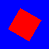
rotation : real |
This property holds the rotation of the item in degrees clockwise around its transformOrigin.
The default value is 0 degrees (that is, no rotation).
|
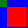
scale : real |
This property holds the scale factor for this item.
A scale of less than 1.0 causes the item to be rendered at a smaller size, and a scale greater than 1.0 renders the item at a larger size. A negative scale causes the item to be mirrored when rendered.
The default value is 1.0.
Scaling is applied from the transformOrigin.
|
smooth : bool |
Primarily used in image based items to decide if the item should use smooth sampling or not. Smooth sampling is performed using linear interpolation, while non-smooth is performed using nearest neighbor.
In Qt Quick 2.0, this property has minimal impact on performance.
By default, this property is set to true.
state : string |
This property holds the name of the current state of the item.
If the item is in its default state, that is, no explicit state has been set, then this property holds an empty string. Likewise, you can return an item to its default state by setting this property to an empty string.
See also Qt Quick States.
This property holds the list of possible states for this item. To change the state of this item, set the state property to one of these states, or set the state property to an empty string to revert the item to its default state.
This property is specified as a list of State objects. For example, below is an item with "red_color" and "blue_color" states:
import QtQuick 2.0

Rectangle {
    id: root
    width: 100; height: 100

    states: [
        State {
            name: "red_color"
            PropertyChanges { root.color: "red" }
        },
        State {
            name: "blue_color"
            PropertyChanges { root.color: "blue" }
        }
    ]
}
See Qt Quick States and Animation and Transitions in Qt Quick for more details on using states and transitions.
See also transitions.
This property holds the list of transformations to apply.
This property is specified as a list of Transform-derived objects. For example:
import QtQuick

Image {
    source: "images/qt-logo.png"
    transform: [
        Scale { origin.x: 25; origin.y: 25; xScale: 1.25 },
        Rotation { origin.x: 45; origin.y: 55; angle: 45 }
    ]
}
For more information see Transform.
transformOrigin : enumeration |
This property holds the origin point around which scale and rotation transform.
Nine transform origins are available, as shown in the image below. The default transform origin is Item.Center.
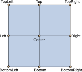
This example rotates an image around its bottom-right corner.
Image {
    source: "myimage.png"
    transformOrigin: Item.BottomRight
    rotation: 45
}
To set an arbitrary transform origin point use the Scale or Rotation transform types with transform.
transitions : list<Transition> |
This property holds the list of transitions for this item. These define the transitions to be applied to the item whenever it changes its state.
This property is specified as a list of Transition objects. For example:
import QtQuick 2.0

Item {
    transitions: [
        Transition {
            //...
        },
        Transition {
            //...
        }
    ]
}
See Qt Quick States and Animation and Transitions in Qt Quick for more details on using states and transitions.
See also states.
visible : bool |
This property holds whether the item is visible. By default this is true.
Setting this property directly affects the visible value of child items. When set to false, the visible values of all child items also become false. When set to true, the visible values of child items are returned to true, unless they have explicitly been set to false.
(Because of this flow-on behavior, using the visible property may not have the intended effect if a property binding should only respond to explicit property changes. In such cases it may be better to use the opacity property instead.)
If this property is set to false, the item will no longer receive mouse events, but will continue to receive key events and will retain the keyboard focus if it has been set. (In contrast, setting the enabled property to false stops both mouse and keyboard events, and also removes focus from the item.)
Note: This property's value is only affected by changes to this property or the parent's visible property. It does not change, for example, if this item moves off-screen, or if the opacity changes to 0.
This read-only property lists all of the item's children that are currently visible. Note that a child's visibility may have changed explicitly, or because the visibility of this (it's parent) item or another grandparent changed.
z : real |
Sets the stacking order of sibling items. By default the stacking order is 0.
Items with a higher stacking value are drawn on top of siblings with a lower stacking order. Items with the same stacking value are drawn bottom up in the order they appear. Items with a negative stacking value are drawn under their parent's content.
The following example shows the various effects of stacking order.
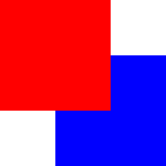
| Same z - later children above earlier children:
|
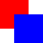
| Higher z on top:
|
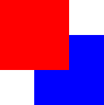
| Same z - children above parents:
|
| Lower z below:
|
Method Documentation
Maps the point (x, y) or rect (x, y, width, height), which is in item's coordinate system, to this item's coordinate system, and returns a point or rect matching the mapped coordinate.
The following properties of the item are used in the mapping: x, y, scale, rotation, transformOrigin, and transform.
If the items are part of different scenes, the mapping includes the relative position of the two scenes.
If item is a null value, this maps the point or rect from the coordinate system of the scene.
The versions accepting point and rect are since Qt 5.15.
Maps the point (x, y) or rect (x, y, width, height), which is in this item's coordinate system, to item's coordinate system, and returns a point or rect matching the mapped coordinate.
The following properties of the item are used in the mapping: x, y, scale, rotation, transformOrigin, and transform.
If the items are part of different scenes, the mapping includes the relative position of the two scenes.
If item is a null value, this maps the point or rect to the coordinate system of the scene.
The versions accepting point and rect are since Qt 5.15.
Returns the first visible child item found at point (x, y) within the coordinate system of this item.
Returns null if there is no such item.
Returns true if this item contains point, which is in local coordinates; returns false otherwise. This is the same check that is used for hit-testing a QEventPoint during event delivery, and is affected by containmentMask if it is set.
|
Dumps some details about the visual tree of Items starting with this item and its children, recursively.
The output looks similar to that of this QML code:
function dump(object, indent) {
    console.log(indent + object)
    for (const i in object.children)
        dump(object.children[i], indent + "    ")
}

dump(myItem, "")
So if you want more details, you can implement your own function and add extra output to the console.log, such as values of specific properties.
This method was introduced in Qt 6.3.
See also QObject::dumpObjectTree().
forceActiveFocus() |
Forces active focus on the item.
This method sets focus on the item and ensures that all ancestor FocusScope objects in the object hierarchy are also given focus.
The reason for the focus change will be Qt::OtherFocusReason. Use the overloaded method to specify the focus reason to enable better handling of the focus change.
See also activeFocus.
forceActiveFocus(Qt::FocusReason reason) |
Forces active focus on the item with the given reason.
This method sets focus on the item and ensures that all ancestor FocusScope objects in the object hierarchy are also given focus.
This is an overloaded function.
See also activeFocus and Qt::FocusReason.
bool grabToImage(callback, targetSize) |
Grabs the item into an in-memory image.
The grab happens asynchronously and the JavaScript function callback is invoked when the grab is completed. The callback takes one argument, which is the result of the grab operation; an ItemGrabResult object.
Use targetSize to specify the size of the target image. By default, the result will have the same size as the item.
If the grab could not be initiated, the function returns false.
The following snippet shows how to grab an item and store the results in a file:
Rectangle {
    id: sourceRectangle
    width: 100
    height: 100
    focus: true
    gradient: Gradient {
        GradientStop { position: 0; color: "steelblue" }
        GradientStop { position: 1; color: "black" }
    }

    Keys.onSpacePressed: {
        sourceRectangle.grabToImage(function(result) {
           result.saveToFile("something.png")
        })
    }
}
The following snippet shows how to grab an item and use the results in another image element:
Image {
    id: image
}

Keys.onSpacePressed: {
    sourceRectangle.grabToImage(function(result) {
        image.source = result.url
    }, Qt.size(50, 50))
}
Note: This function will render the item to an offscreen surface and copy that surface from the GPU's memory into the CPU's memory, which can be quite costly. For "live" preview, use layers or ShaderEffectSource.
Maps the point (x, y), which is in the global coordinate system, to the item's coordinate system, and returns a point matching the mapped coordinate.
The following properties of the item are used in the mapping: x, y, scale, rotation, transformOrigin, and transform.
If the items are part of different scenes, the mapping includes the relative position of the two scenes.
Maps the point (x, y), which is in this item's coordinate system, to the global coordinate system, and returns a point matching the mapped coordinate.
The following properties of the item are used in the mapping: x, y, scale, rotation, transformOrigin, and transform.
If the items are part of different scenes, the mapping includes the relative position of the two scenes.
Returns the item in the focus chain which is next to this item. If forward is true, or not supplied, it is the next item in the forwards direction. If forward is false, it is the next item in the backwards direction.
© 2025 The Qt Company Ltd. Documentation contributions included herein are the copyrights of their respective owners. The documentation provided herein is licensed under the terms of the GNU Free Documentation License version 1.3 as published by the Free Software Foundation. Qt and respective logos are trademarks of The Qt Company Ltd. in Finland and/or other countries worldwide. All other trademarks are property of their respective owners.

