HelloGraphs
Using Graphs for 2D in a Qt Quick application.
HelloGraphs shows how to make a simple 2D bar graph and line graph.
The following sections describe how to create a bar graph using BarSeries and a line graph using LineSeries.
Running the Example
You can run the example from:
- Qt Creator
Open the Welcome mode and select the example from Examples. For more information, see Qt Creator: Tutorial: Build and run.
- Qt Extension for Visual Studio Code
Run the Qt: Open Qt examples command from the Command Palette, and select the example from the list. For more information, see Qt Extension for Visual Studio Code: Tutorial: Build and run.
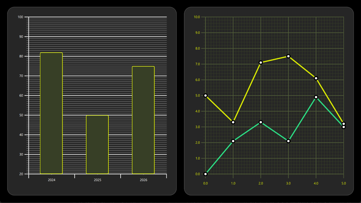
BarGraph
The first graph in the example is a bar graph. Creating it starts with a GraphsView component, setting the X axis, Y axis and theme. X axis is a BarCategoryAxis with 3 categories. Both the vertical grid and the axis lines are hidden. Y axis is a ValueAxis with visible range between 20 and 100. Major ticks with labels will be shown on every 10 values using tickInterval. Subticks will be shown on every 1 values using subTickCount 9, which means that between every major tick there will be 9 minor ones. Lastly, theme is added to one which is suitable on dark backgrounds. This theme adjusts the graph background grid, axis lines and labels.
GraphsView {
    anchors.fill: parent
    anchors.margins: 16
    axisX: BarCategoryAxis {
        categories: [2024, 2025, 2026]
        gridVisible: false
        subGridVisible: false
    }
    axisY: ValueAxis {
        min: 20
        max: 100
        tickInterval: 10
        subTickCount: 9
    }
    theme: GraphsTheme {
        colorScheme: GraphsTheme.ColorScheme.Dark
        theme: GraphsTheme.Theme.QtGreen
    }
    ...
To make this a bar graph, add a BarSeries.
BarSeries {
    ...
Then data is added into BarSeries using BarSet. There are 3 bars with defined custom bars color and border properties. These properties will override the possible seriesColors set for the GraphsTheme.
BarSet {
    values: [82, 50, 75]
    borderWidth: 2
    color: "#373F26"
    borderColor: "#DBEB00"
}
LineGraph
The second graph of the example is a line graph. It also starts by defining a GraphsView element. Custom GraphsTheme is created to get a custom appearance. GraphsTheme offers quite a wide range of customization possibilities for the background grid and axis, which get applied after the theme.
The GraphsView defines axisX and axisY suitable for this graph.
GraphsView {
    anchors.fill: parent
    anchors.margins: 16
    theme: GraphsTheme {
        readonly property color c1: "#DBEB00"
        readonly property color c2: "#373F26"
        readonly property color c3: Qt.lighter(c2, 1.5)
        colorScheme: GraphsTheme.ColorScheme.Dark
        seriesColors: ["#2CDE85", "#DBEB00"]
        grid.mainColor: c3
        grid.subColor: c2
        axisX.mainColor: c3
        axisY.mainColor: c3
        axisX.subColor: c2
        axisY.subColor: c2
        axisX.labelTextColor: c1
        axisY.labelTextColor: c1
    }
    axisX: ValueAxis {
        max: 5
        tickInterval: 1
        subTickCount: 9
        labelDecimals: 1
    }
    axisY: ValueAxis {
        max: 10
        tickInterval: 1
        subTickCount: 4
        labelDecimals: 1
    }
    ...
Custom Delegate component is used to visualize the data points.
component Marker : Rectangle {
    width: 16
    height: 16
    color: "#ffffff"
    radius: width * 0.5
    border.width: 4
    border.color: "#000000"
}
To make this a line graph, add a LineSeries. This sets the pointDelegate to use the custom Delegate component that was created earlier. Data points are added using XYPoint elements.
LineSeries {
    id: lineSeries1
    width: 4
    pointDelegate: Marker { }
    XYPoint { x: 0; y: 0 }
    XYPoint { x: 1; y: 2.1 }
    XYPoint { x: 2; y: 3.3 }
    XYPoint { x: 3; y: 2.1 }
    XYPoint { x: 4; y: 4.9 }
    XYPoint { x: 5; y: 3.0 }
}
The second line series is similar to the first. As this is second LineSeries inside the GraphsView, second color from the seriesColors gets automatically picked.
© 2026 The Qt Company Ltd. Documentation contributions included herein are the copyrights of their respective owners. The documentation provided herein is licensed under the terms of the GNU Free Documentation License version 1.3 as published by the Free Software Foundation. Qt and respective logos are trademarks of The Qt Company Ltd. in Finland and/or other countries worldwide. All other trademarks are property of their respective owners.
