StyleKit Example
Shows how to style Qt Quick Controls using StyleKit.
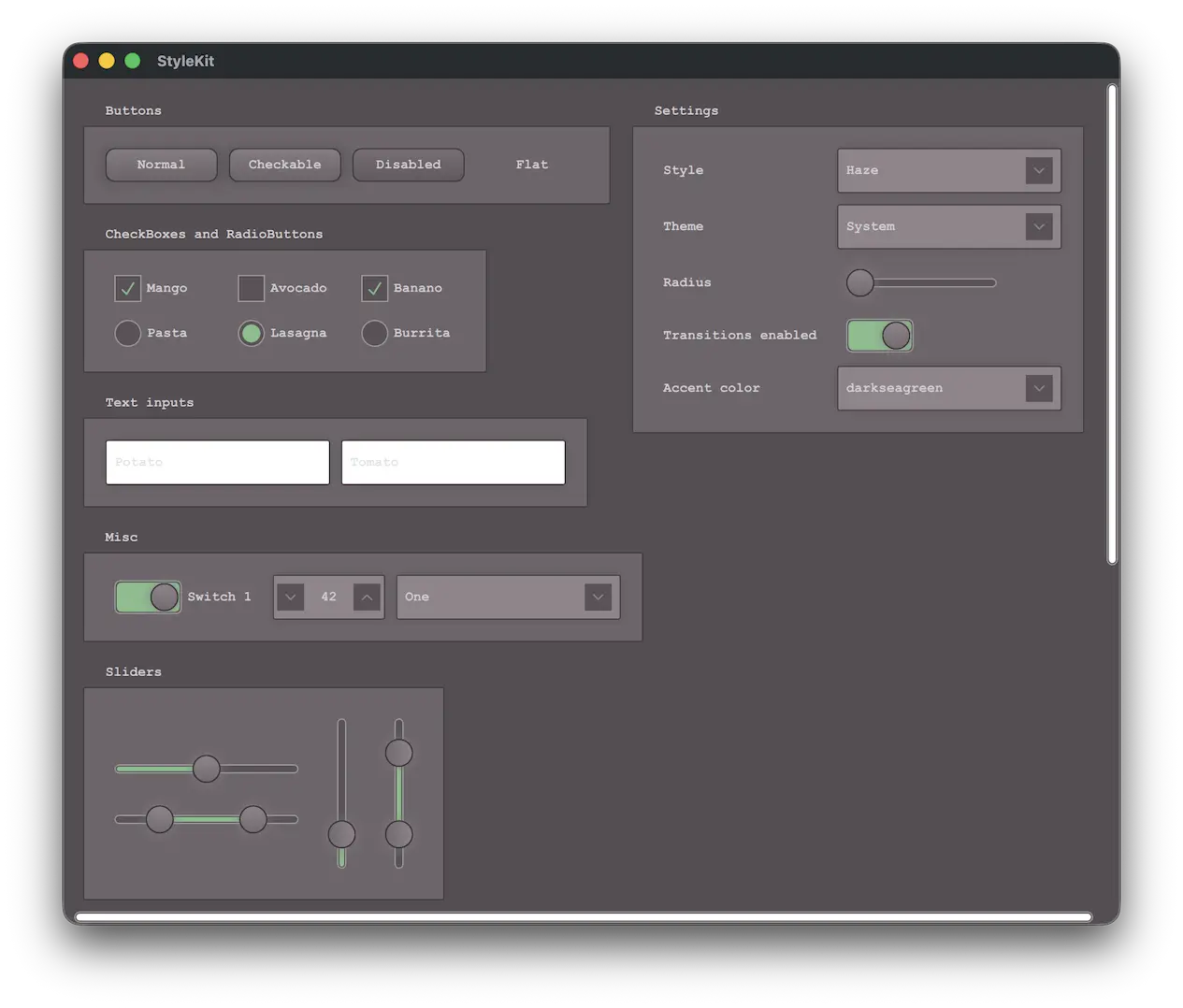
This example shows how to style applications with StyleKit. It includes several styles that each demonstrate different aspects of styling:
- Plain - A minimal style with only the basics
- Haze - An advanced style with multiple themes
- Vitrum - A style targeting VR environments
- CustomDelegates - A style demonstrating how to create overlays, underlays, and shader effects
The example demonstrates, among other things, how to:
- Implement and switch between different styles.
- Implement support for light and dark themes, as well as additional themes such as high-contrast.
- Use StyleVariation to provide alternative styling for parts of the application.
- Implement custom delegates to add overlay and underlay effects.
- Apply shader-based visual effects to the controls.
- Build custom controls using CustomControl and StyleReader.
- Interact with a style at runtime, for example to change the theme or adjust style properties like the background radius.
Running the Example
To run the example from Qt Creator, open the Welcome mode and select the example from Examples. For more information, see Qt Creator: Tutorial: Build and run.
Note: This example requires Qt Shader Tools, an optional library available through the Qt Maintenance Tool.
See also Qt Labs StyleKit, Style, and Theme.
© 2026 The Qt Company Ltd. Documentation contributions included herein are the copyrights of their respective owners. The documentation provided herein is licensed under the terms of the GNU Free Documentation License version 1.3 as published by the Free Software Foundation. Qt and respective logos are trademarks of The Qt Company Ltd. in Finland and/or other countries worldwide. All other trademarks are property of their respective owners.
