C
Qt Quick Ultralite styling Example
Demonstrates how to use styles in Qt Quick Ultralite.
Overview
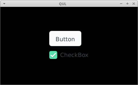
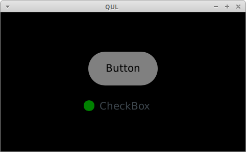
This example shows how to define and use a custom QtQuick.Controls style. The same code is compiled twice, once as styling_default with the default style, and once as styling_custom with the custom style. The switch between styles is done only in the project's CMakeLists.txt.
You can read more about custom styles in Styling Controls.
Project structure
CMake project file
The CMakeLists.txt file defines two targets:
...
qul_add_target(styling_default QML_PROJECT styling_default.qmlproject GENERATE_ENTRYPOINT)
app_target_setup_os(styling_default)
...
First one uses the default styling, and is linked to Qul::Controls
...
# qul_add_target(styling_custom QML_PROJECT styling_custom.qmlproject GENERATE_ENTRYPOINT)
# app_target_setup_os(styling_custom)
...
While the second target (styling_custom) uses styles from the styles/custom directory. It's linked to CustomControls, which is also set as the MCU.Config.controlsStyle QmlProject property. These two operations switch the default style to CustomControls through its URI.
The CustomControls style has its own QmlProject file:
        MCU.Module {
                uri: "CustomControls"
        }

        QmlFiles {
                files: ["Button.qml", "CheckBox.qml"]
        }

        ModuleFiles {
                MCU.qulModules: [
                        "Qul::ControlsTemplates",
        // This style links StyleDefault because one of the components is based
        // on a default style component. If it didn't depend on the default style
        // that would be unnecessary.
                        "Qul::Controls"
                ]
        }
}
Which, defines CustomStyleLib with URI CustomControls and is linked to Qul::Controls only because it is used in CheckBox.qml. If CheckBox would be implemented from scratch, linking to this library wouldn't be necessary.
Default style
This styling.qml file uses QML types from the QtQuick.Controls module. For the styling_default target, definitions are taken from the Qul::Controls library. For the styling_custom target, objects from CustomStyleLib are used.
Custom style
The Button.qml and CheckBox.qml files reimplement Button and CheckBox controls with the custom style.
import QtQuick 2.15
import QtQuick.Controls.StyleDefault 1.0 as Base

Base.CheckBox {
    id: control

    indicator: Rectangle {
        x: control.leftPadding
        y: control.topPadding + (control.availableHeight - height) / 2
        width: control.availableHeight / 2
        height: control.availableHeight / 2
        radius: width / 2
        color: !control.enabled
            ? "gray"
            : (control.checked ? "green" : "red")
    }
}
For example, the CheckBox indicator is different compared to to a CheckBox control using a default style. It uses a new circular indicator.
Files:
Available under certain Qt licenses.
Find out more.
