
Table of Contents
- QAbstractButton
- Synopsis
- Detailed Description
PySide2.QtWidgets.QAbstractButtonPySide2.QtWidgets.QAbstractButton.animateClick()PySide2.QtWidgets.QAbstractButton.autoExclusive()PySide2.QtWidgets.QAbstractButton.autoRepeat()PySide2.QtWidgets.QAbstractButton.autoRepeatDelay()PySide2.QtWidgets.QAbstractButton.autoRepeatInterval()PySide2.QtWidgets.QAbstractButton.checkStateSet()PySide2.QtWidgets.QAbstractButton.click()PySide2.QtWidgets.QAbstractButton.clicked()PySide2.QtWidgets.QAbstractButton.group()PySide2.QtWidgets.QAbstractButton.hitButton()PySide2.QtWidgets.QAbstractButton.icon()PySide2.QtWidgets.QAbstractButton.iconSize()PySide2.QtWidgets.QAbstractButton.isCheckable()PySide2.QtWidgets.QAbstractButton.isChecked()PySide2.QtWidgets.QAbstractButton.isDown()PySide2.QtWidgets.QAbstractButton.nextCheckState()PySide2.QtWidgets.QAbstractButton.pressed()PySide2.QtWidgets.QAbstractButton.released()PySide2.QtWidgets.QAbstractButton.setAutoExclusive()PySide2.QtWidgets.QAbstractButton.setAutoRepeat()PySide2.QtWidgets.QAbstractButton.setAutoRepeatDelay()PySide2.QtWidgets.QAbstractButton.setAutoRepeatInterval()PySide2.QtWidgets.QAbstractButton.setCheckable()PySide2.QtWidgets.QAbstractButton.setChecked()PySide2.QtWidgets.QAbstractButton.setDown()PySide2.QtWidgets.QAbstractButton.setIcon()PySide2.QtWidgets.QAbstractButton.setIconSize()PySide2.QtWidgets.QAbstractButton.setShortcut()PySide2.QtWidgets.QAbstractButton.setText()PySide2.QtWidgets.QAbstractButton.shortcut()PySide2.QtWidgets.QAbstractButton.text()PySide2.QtWidgets.QAbstractButton.toggle()PySide2.QtWidgets.QAbstractButton.toggled()
Previous topic
Next topic
QAbstractButton
The
QAbstractButtonclass is the abstract base class of button widgets, providing functionality common to buttons. More…
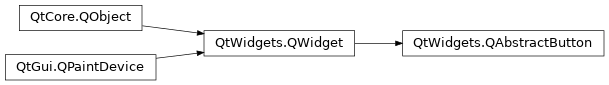
Inherited by: QCheckBox, QCommandLinkButton, QPushButton, QRadioButton, QToolButton
Synopsis
Functions
def
autoExclusive()def
autoRepeat()def
autoRepeatDelay()def
autoRepeatInterval()def
group()def
icon()def
iconSize()def
isCheckable()def
isChecked()def
isDown()def
setAutoExclusive(arg__1)def
setAutoRepeat(arg__1)def
setAutoRepeatDelay(arg__1)def
setAutoRepeatInterval(arg__1)def
setCheckable(arg__1)def
setDown(arg__1)def
setIcon(icon)def
setShortcut(key)def
setText(text)def
shortcut()def
text()
Virtual functions
def
checkStateSet()def
hitButton(pos)def
nextCheckState()
Slots
def
animateClick([msec=100])def
click()def
setChecked(arg__1)def
setIconSize(size)def
toggle()
Signals
Detailed Description
This class implements an abstract button. Subclasses of this class handle user actions, and specify how the button is drawn.
QAbstractButtonprovides support for both push buttons and checkable (toggle) buttons. Checkable buttons are implemented in theQRadioButtonandQCheckBoxclasses. Push buttons are implemented in theQPushButtonandQToolButtonclasses; these also provide toggle behavior if required.Any button can display a label containing text and an icon.
setText()sets the text;setIcon()sets the icon. If a button is disabled, its label is changed to give the button a “disabled” appearance.If the button is a text button with a string containing an ampersand (’&’),
QAbstractButtonautomatically creates a shortcut key. For example:button = QPushButton(QObject.tr("Ro&ck && Roll"), self)The Alt+C shortcut is assigned to the button, i.e., when the user presses Alt+C the button will call
animateClick(). See theQShortcutdocumentation for details. To display an actual ampersand, use ‘&&’.You can also set a custom shortcut key using the
setShortcut()function. This is useful mostly for buttons that do not have any text, and therefore can’t have any automatic shortcut.button.setIcon(QIcon(":/images/print.png")) button.setShortcut(tr("Alt+F7"))All the buttons provided by Qt (
QPushButton,QToolButton,QCheckBox, andQRadioButton) can display bothtextand icons .A button can be made the default button in a dialog by means of
setDefault()andsetAutoDefault().
QAbstractButtonprovides most of the states used for buttons:
isDown()indicates whether the button is pressed down.
isChecked()indicates whether the button is checked. Only checkable buttons can be checked and unchecked (see below).
isEnabled()indicates whether the button can be pressed by the user.Note
As opposed to other widgets, buttons derived from
QAbstractButtonaccept mouse and context menu events when disabled.
setAutoRepeat()sets whether the button will auto-repeat if the user holds it down.autoRepeatDelayandautoRepeatIntervaldefine how auto-repetition is done.
setCheckable()sets whether the button is a toggle button or not.The difference between
isDown()andisChecked()is as follows. When the user clicks a toggle button to check it, the button is first pressed then released into the checked state. When the user clicks it again (to uncheck it), the button moves first to the pressed state, then to the unchecked state (isChecked()andisDown()are both false).
QAbstractButtonprovides four signals:
pressed()is emitted when the left mouse button is pressed while the mouse cursor is inside the button.
released()is emitted when the left mouse button is released.
clicked()is emitted when the button is first pressed and then released, when the shortcut key is typed, or whenclick()oranimateClick()is called.
toggled()is emitted when the state of a toggle button changes.To subclass
QAbstractButton, you must reimplement at leastpaintEvent()to draw the button’s outline and its text or pixmap. It is generally advisable to reimplementsizeHint()as well, and sometimeshitButton()(to determine whether a button press is within the button). For buttons with more than two states (like tri-state buttons), you will also have to reimplementcheckStateSet()andnextCheckState().See also
- class PySide2.QtWidgets.QAbstractButton([parent=None])
- param parent:
Constructs an abstract button with a
parent.
- PySide2.QtWidgets.QAbstractButton.animateClick([msec=100])
- Parameters:
msec – int
Performs an animated click: the button is pressed immediately, and released
msecmilliseconds later (the default is 100 ms).Calling this function again before the button is released resets the release timer.
All signals associated with a click are emitted as appropriate.
This function does nothing if the button is
PySide2.QtWidgets.QWidget.setEnabled()See also
- PySide2.QtWidgets.QAbstractButton.autoExclusive()
- Return type:
bool
This property holds whether auto-exclusivity is enabled.
If auto-exclusivity is enabled, checkable buttons that belong to the same parent widget behave as if they were part of the same exclusive button group. In an exclusive button group, only one button can be checked at any time; checking another button automatically unchecks the previously checked one.
The property has no effect on buttons that belong to a button group.
is off by default, except for radio buttons.
See also
- PySide2.QtWidgets.QAbstractButton.autoRepeat()
- Return type:
bool
This property holds whether is enabled.
If is enabled, then the
pressed(),released(), andclicked()signals are emitted at regular intervals when the button is down. is off by default. The initial delay and the repetition interval are defined in milliseconds byautoRepeatDelayandautoRepeatInterval.Note: If a button is pressed down by a shortcut key, then auto-repeat is enabled and timed by the system and not by this class. The
pressed(),released(), andclicked()signals will be emitted like in the normal case.
- PySide2.QtWidgets.QAbstractButton.autoRepeatDelay()
- Return type:
int
This property holds the initial delay of auto-repetition.
If
autoRepeatis enabled, then defines the initial delay in milliseconds before auto-repetition kicks in.See also
- PySide2.QtWidgets.QAbstractButton.autoRepeatInterval()
- Return type:
int
This property holds the interval of auto-repetition.
If
autoRepeatis enabled, then defines the length of the auto-repetition interval in millisecons.See also
- PySide2.QtWidgets.QAbstractButton.checkStateSet()
This virtual handler is called when
setChecked()is used, unless it is called from withinnextCheckState(). It allows subclasses to reset their intermediate button states.See also
- PySide2.QtWidgets.QAbstractButton.click()
Performs a click.
All the usual signals associated with a click are emitted as appropriate. If the button is checkable, the state of the button is toggled.
This function does nothing if the button is
PySide2.QtWidgets.QWidget.setEnabled()See also
- PySide2.QtWidgets.QAbstractButton.clicked([checked=false])
- Parameters:
checked – bool
- PySide2.QtWidgets.QAbstractButton.group()
- Return type:
Returns the group that this button belongs to.
If the button is not a member of any
QButtonGroup, this function returnsNone.See also
- PySide2.QtWidgets.QAbstractButton.hitButton(pos)
- Parameters:
pos –
PySide2.QtCore.QPoint- Return type:
bool
Returns
trueifposis inside the clickable button rectangle; otherwise returnsfalse.By default, the clickable area is the entire widget. Subclasses may reimplement this function to provide support for clickable areas of different shapes and sizes.
- PySide2.QtWidgets.QAbstractButton.icon()
- Return type:
This property holds the icon shown on the button.
The icon’s default size is defined by the GUI style, but can be adjusted by setting the
iconSizeproperty.
- PySide2.QtWidgets.QAbstractButton.iconSize()
- Return type:
This property holds the icon size used for this button..
The default size is defined by the GUI style. This is a maximum size for the icons. Smaller icons will not be scaled up.
- PySide2.QtWidgets.QAbstractButton.isCheckable()
- Return type:
bool
This property holds whether the button is checkable.
By default, the button is not checkable.
See also
checked
- PySide2.QtWidgets.QAbstractButton.isChecked()
- Return type:
bool
This property holds whether the button is checked.
Only checkable buttons can be checked. By default, the button is unchecked.
See also
checkable
- PySide2.QtWidgets.QAbstractButton.isDown()
- Return type:
bool
This property holds whether the button is pressed down.
If this property is
true, the button is pressed down. The signalspressed()andclicked()are not emitted if you set this property to true. The default is false.
- PySide2.QtWidgets.QAbstractButton.nextCheckState()
This virtual handler is called when a button is clicked. The default implementation calls
setChecked(!isChecked()) if the buttonisCheckable(). It allows subclasses to implement intermediate button states.See also
- PySide2.QtWidgets.QAbstractButton.pressed()
- PySide2.QtWidgets.QAbstractButton.released()
- PySide2.QtWidgets.QAbstractButton.setAutoExclusive(arg__1)
- Parameters:
arg__1 – bool
This property holds whether auto-exclusivity is enabled.
If auto-exclusivity is enabled, checkable buttons that belong to the same parent widget behave as if they were part of the same exclusive button group. In an exclusive button group, only one button can be checked at any time; checking another button automatically unchecks the previously checked one.
The property has no effect on buttons that belong to a button group.
is off by default, except for radio buttons.
See also
- PySide2.QtWidgets.QAbstractButton.setAutoRepeat(arg__1)
- Parameters:
arg__1 – bool
This property holds whether is enabled.
If is enabled, then the
pressed(),released(), andclicked()signals are emitted at regular intervals when the button is down. is off by default. The initial delay and the repetition interval are defined in milliseconds byautoRepeatDelayandautoRepeatInterval.Note: If a button is pressed down by a shortcut key, then auto-repeat is enabled and timed by the system and not by this class. The
pressed(),released(), andclicked()signals will be emitted like in the normal case.
- PySide2.QtWidgets.QAbstractButton.setAutoRepeatDelay(arg__1)
- Parameters:
arg__1 – int
This property holds the initial delay of auto-repetition.
If
autoRepeatis enabled, then defines the initial delay in milliseconds before auto-repetition kicks in.See also
- PySide2.QtWidgets.QAbstractButton.setAutoRepeatInterval(arg__1)
- Parameters:
arg__1 – int
This property holds the interval of auto-repetition.
If
autoRepeatis enabled, then defines the length of the auto-repetition interval in millisecons.See also
- PySide2.QtWidgets.QAbstractButton.setCheckable(arg__1)
- Parameters:
arg__1 – bool
This property holds whether the button is checkable.
By default, the button is not checkable.
See also
checked
- PySide2.QtWidgets.QAbstractButton.setChecked(arg__1)
- Parameters:
arg__1 – bool
This property holds whether the button is checked.
Only checkable buttons can be checked. By default, the button is unchecked.
See also
checkable
- PySide2.QtWidgets.QAbstractButton.setDown(arg__1)
- Parameters:
arg__1 – bool
This property holds whether the button is pressed down.
If this property is
true, the button is pressed down. The signalspressed()andclicked()are not emitted if you set this property to true. The default is false.
- PySide2.QtWidgets.QAbstractButton.setIcon(icon)
- Parameters:
icon –
PySide2.QtGui.QIcon
This property holds the icon shown on the button.
The icon’s default size is defined by the GUI style, but can be adjusted by setting the
iconSizeproperty.
- PySide2.QtWidgets.QAbstractButton.setIconSize(size)
- Parameters:
size –
PySide2.QtCore.QSize
This property holds the icon size used for this button..
The default size is defined by the GUI style. This is a maximum size for the icons. Smaller icons will not be scaled up.
- PySide2.QtWidgets.QAbstractButton.setShortcut(key)
- Parameters:
This property holds the mnemonic associated with the button.
- PySide2.QtWidgets.QAbstractButton.setText(text)
- Parameters:
text – str
This property holds the text shown on the button.
If the button has no text, the function will return an empty string.
If the text contains an ampersand character (’&’), a shortcut is automatically created for it. The character that follows the ‘&’ will be used as the shortcut key. Any previous shortcut will be overwritten or cleared if no shortcut is defined by the text. See the
QShortcutdocumentation for details. To display an actual ampersand, use ‘&&’.There is no default text.
- PySide2.QtWidgets.QAbstractButton.shortcut()
- Return type:
This property holds the mnemonic associated with the button.
- PySide2.QtWidgets.QAbstractButton.text()
- Return type:
str
This property holds the text shown on the button.
If the button has no text, the function will return an empty string.
If the text contains an ampersand character (’&’), a shortcut is automatically created for it. The character that follows the ‘&’ will be used as the shortcut key. Any previous shortcut will be overwritten or cleared if no shortcut is defined by the text. See the
QShortcutdocumentation for details. To display an actual ampersand, use ‘&&’.There is no default text.
- PySide2.QtWidgets.QAbstractButton.toggle()
Toggles the state of a checkable button.
See also
checked
- PySide2.QtWidgets.QAbstractButton.toggled(checked)
- Parameters:
checked – bool
© 2022 The Qt Company Ltd. Documentation contributions included herein are the copyrights of their respective owners. The documentation provided herein is licensed under the terms of the GNU Free Documentation License version 1.3 as published by the Free Software Foundation. Qt and respective logos are trademarks of The Qt Company Ltd. in Finland and/or other countries worldwide. All other trademarks are property of their respective owners.