Widgets Classes
The Widget Classes
The following sections list the widget classes. See the Qt Widget Gallery for some examples.
Basic Widget Classes
These basic widgets (controls), e.g. buttons, comboboxes and scroll bars, are designed for direct use.
|
|
|
|
|
|
Checkbox with a text label | |
Combined button and popup list | |
Vista style command link button | |
Widget for editing dates based on the QDateTimeEdit widget | |
Widget for editing dates and times | |
Rounded range control (like a speedometer or potentiometer) | |
Spin box widget that takes doubles | |
Focus frame which can be outside of a widget's normal paintable area | |
Combobox that lets the user select a font family | |
Displays a number with LCD-like digits | |
Text or image display | |
One-line text editor | |
Menu widget for use in menu bars, context menus, and other popup menus | |
Horizontal or vertical progress bar | |
Command button | |
Radio button with a text label | |
Scrolling view onto another widget | |
Vertical or horizontal scroll bar | |
Resize handle for resizing top-level windows | |
Vertical or horizontal slider | |
Spin box widget | |
Tab bar, e.g. for use in tabbed dialogs | |
Stack of tabbed widgets | |
Widget for editing times based on the QDateTimeEdit widget | |
Column of tabbed widget items | |
Quick-access button to commands or options, usually used inside a QToolBar | |
The base class of all user interface objects |
Advanced Widget Classes
Advanced GUI widgets, e.g. tab widgets and progress bars, provide more complex user interface controls.
|
|
|
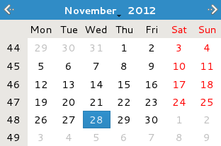
Monthly based calendar widget allowing the user to select a date | |
Model/view implementation of a column view | |
Mapping between a section of a data model to widgets | |
List or icon view onto a model | |
Default model/view implementation of a table view | |
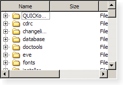
Default model/view implementation of a tree view | |
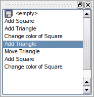
Displays the contents of a QUndoStack |
Abstract Widget Classes
The abstract widget classes are base classes. They are not usable as standalone classes but provide functionality when they are subclassed.
The abstract base class of button widgets, providing functionality common to buttons | |
Scrolling area with on-demand scroll bars | |
Integer value within a range | |
Spinbox and a line edit to display values | |
The base class of dialog windows | |
The base class of widgets that can have a frame |
Organizer Widget Classes
Classes like splitters, tab bars, button groups, etc are used for organizing and grouping GUI primitives into more complex applications and dialogs.
Container to organize groups of button widgets | |
Group box frame with a title | |
Implements a splitter widget | |
Handle functionality for the splitter | |
Stack of widgets where only one widget is visible at a time | |
Stack of tabbed widgets |
Graphics View Classes
Common base for all path items | |
Represents an anchor between two items in a QGraphicsAnchorLayout | |
Layout where one can anchor widgets together in Graphics View | |
The base class for all graphics effects | |
Ellipse item that you can add to a QGraphicsScene | |
Grid layout for managing widgets in Graphics View | |
The base class for all graphical items in a QGraphicsScene | |
Container that treats a group of items as a single item | |
The base class for all layouts in Graphics View | |
Can be inherited to allow your custom items to be managed by layouts | |
Line item that you can add to a QGraphicsScene | |
Horizontal or vertical layout for managing widgets in Graphics View | |
Base class for all graphics items that require signals, slots and properties | |
Path item that you can add to a QGraphicsScene | |
Pixmap item that you can add to a QGraphicsScene | |
Polygon item that you can add to a QGraphicsScene | |
Proxy layer for embedding a QWidget in a QGraphicsScene | |
Rectangle item that you can add to a QGraphicsScene | |
Surface for managing a large number of 2D graphical items | |
Context menu events in the graphics view framework | |
Events for drag and drop in the graphics view framework | |
Base class for all graphics view related events | |
Events when a tooltip is requested | |
Hover events in the graphics view framework | |
Mouse events in the graphics view framework | |
Events for widget moving in the graphics view framework | |
Events for widget resizing in the graphics view framework | |
Wheel events in the graphics view framework | |
Simple text path item that you can add to a QGraphicsScene | |
QGraphicsItem that can be used to render the contents of SVG files | |
Text item that you can add to a QGraphicsScene to display formatted text | |
Abstract base class for building advanced transformations on QGraphicsItems | |
Widget for displaying the contents of a QGraphicsScene | |
The base class for all widget items in a QGraphicsScene | |
Used to describe the parameters needed to draw a QGraphicsItem |
Model/View Classes
Used to display and edit data items from a model | |
The abstract interface for item model classes | |
The basic functionality for item view classes | |
Abstract model that can be subclassed to create one-dimensional list models | |
Base class for proxy item models that can do sorting, filtering or other data processing tasks | |
Abstract model that can be subclassed to create table models | |
Model/view implementation of a column view | |
Proxies multiple source models, concatenating their rows | |
Mapping between a section of a data model to widgets | |
Data model for the local filesystem | |
Header row or header column for item views | |
Proxies its source model unmodified | |
Display and editing facilities for data items from a model | |
Makes it possible to create item editor creator bases without subclassing QItemEditorCreatorBase | |
Abstract base class that must be subclassed when implementing new item editor creators | |
Widgets for editing item data in views and delegates | |
Manages information about selected items in a model | |
Keeps track of a view's selected items | |
Manages information about a range of selected items in a model | |
List or icon view onto a model | |
Item-based list widget | |
Item for use with the QListWidget item view class | |
Used to locate data in a data model | |
Used to locate data in a data model | |
Support for sorting and filtering data passed between another model and a view | |
Item for use with the QStandardItemModel class | |
The possibility to register widgets without having to subclass QItemEditorCreatorBase | |
Generic model for storing custom data | |
Model that supplies strings to views | |
Display and editing facilities for data items from a model | |
Default model/view implementation of a table view | |
Item-based table view with a default model | |
Item for use with the QTableWidget class | |
Way to interact with selection in a model without using model indexes and a selection model | |
Default model/view implementation of a tree view | |
Tree view that uses a predefined tree model | |
Item for use with the QTreeWidget convenience class | |
Way to iterate over the items in a QTreeWidget instance |
Main Window and Related Classes
Abstract user interface action that can be inserted into widgets | |
Groups actions together | |
Widget that can be docked inside a QMainWindow or floated as a top-level window on the desktop | |
Main application window | |
Area in which MDI windows are displayed | |
Subwindow class for QMdiArea | |
Menu widget for use in menu bars, context menus, and other popup menus | |
Horizontal menu bar | |
Resize handle for resizing top-level windows | |
Horizontal bar suitable for presenting status information | |
Movable panel that contains a set of controls | |
Extends QAction by an interface for inserting custom widgets into action based containers, such as toolbars |
Widget Appearance and Style-Related Classes
Classes used for customizing UI appearance and style.
Colors based on RGB, HSV or CMYK values | |
Color space abstraction | |
Transformation between color spaces | |
Encapsulates the common Look and Feel of a GUI | |
Mouse cursor with an arbitrary shape | |
Specifies a query for a font used for drawing text | |
Information about the fonts available in the underlying window system | |
General information about fonts | |
Represents an anchor between two items in a QGraphicsAnchorLayout | |
Layout where one can anchor widgets together in Graphics View | |
Contains color groups for each widget state | |
Abstract base class that encapsulates the look and feel of a GUI | |
Creates QStyle objects | |
Style hints that return more than basic data types | |
Style hints that return a QRegion | |
Style hints that return a QVariant | |
Stores the parameters used by QStyle functions | |
Convenience class for drawing QStyle elements inside a widget |
Layout Classes
Lines up child widgets horizontally or vertically | |
Container to organize groups of button widgets | |
Manages forms of input widgets and their associated labels | |
Represents an anchor between two items in a QGraphicsAnchorLayout | |
Layout where one can anchor widgets together in Graphics View | |
Lays out widgets in a grid | |
Group box frame with a title | |
Lines up widgets horizontally | |
The base class of geometry managers | |
Abstract item that a QLayout manipulates | |
Layout attribute describing horizontal and vertical resizing policy | |
Blank space in a layout | |
Stack of widgets where only one widget is visible at a time | |
Stack of widgets where only one widget is visible at a time | |
Lines up widgets vertically | |
Layout item that represents a widget |
© 2024 The Qt Company Ltd. Documentation contributions included herein are the copyrights of their respective owners. The documentation provided herein is licensed under the terms of the GNU Free Documentation License version 1.3 as published by the Free Software Foundation. Qt and respective logos are trademarks of The Qt Company Ltd. in Finland and/or other countries worldwide. All other trademarks are property of their respective owners.


