
How a Style Draws a Widget
The QStyle API has three kinds of functions: functions that draw the widgets, static helpers for common and difficult tasks such as calculating the position of a slider handle, and functions for the calculations that widgets need while drawing, for example, to compute their size hints. The style also helps some widgets lay out their contents, and it can adjust the QPalette that the widgets draw with.
This page describes the building blocks that a style implementation works with. Widget Style Reference lists which of them each widget uses.
Style elements
QStyle draws graphical elements. An element is a widget or a widget part, such as a push button bevel, a window frame, or a scroll bar. Most drawing functions take four arguments:
- An enum value that specifies which graphical element to draw.
- A QStyleOption that specifies how and where to render that element.
- A QPainter to draw the element with.
- The QWidget that the drawing is performed on. This argument is optional.
When a widget asks a style to draw an element, it provides the style with a QStyleOption, a class that contains the information necessary for drawing. Because the option carries everything the style needs, the style can draw widgets without linking any widget code. You can draw a combo box on any paint device, not only on a QComboBox.
The widget is passed as the last argument in case the style needs it for special effects, such as animated default buttons on macOS, but the style can't rely on it. Widgets that draw several elements themselves pass themselves, and so does QStylePainter. Code that draws directly on a paint device may pass nullptr.
A widget consists of a hierarchy, or tree, of style elements. For instance, when a style receives a request to draw a push button, it draws a label (text and icon), a button bevel, and a focus frame. The button bevel in turn consists of a frame around the bevel and the panel. The following conceptual tree shows the push button elements in drawing order, with nested elements drawn by the element above them:
- Push button
- Button bevel
- Default button frame
- Button panel
- Label (icon and text)
- Focus frame
- Button bevel
Push buttons in the reference shows the actual tree for QPushButton, with the element names.
Widgets don't necessarily ask the style to draw only one element. A widget can make several calls to the style to draw different elements. An example is QTabWidget, which draws its tabs and frame individually.
There are three element types: primitive elements, control elements, and complex control elements. The PrimitiveElement, ControlElement, and ComplexControl enums define them. The values of each enum have a prefix that identifies their type: PE_ for primitive elements, CE_ for control elements, and CC_ for complex controls. The QStyle class documentation lists these elements and their roles in styling widgets.
Primitive elements
Primitive elements are GUI elements that are common and often used by several widgets. Examples are frames, button bevels, and arrows for spin boxes, scroll bars, and combo boxes. Primitive elements can't exist on their own; they are always part of a larger construct. They take no part in the interaction with the user but are passive decorations in the GUI.
Control elements
A control element performs an action or displays information to the user. Examples of control elements are push buttons, checkboxes, and header sections in tables and tree views. A control element isn't always a complete widget such as a push button; it can also be a widget part such as a tab bar tab or a scroll bar slider. Control elements differ from primitive elements in that they aren't passive: they take part in the interaction with the user.
Controls that consist of several elements often use the style to calculate the bounding rectangles of the elements. The SubElement enum defines the available subelements. This enum is only used for calculating bounding rectangles. Subelements aren't graphical elements to be drawn like primitive, control, and complex elements.
Complex control elements
Complex control elements contain subcontrols. Complex controls behave differently depending on where the user handles them with the mouse and which keyboard keys are pressed. This depends on which subcontrol, if any, the mouse is over or pressed on. Examples of complex controls are scroll bars and combo boxes. With a scroll bar, you can use the mouse to move the slider and press the line up and line down buttons. The SubControl enum defines the available subcontrols.
In addition to drawing, the style tells the widgets which subcontrol, if any, the user pressed. For instance, a QScrollBar needs to know whether the user pressed the slider, the slider groove, or one of the buttons.
Subcontrols aren't the same as control elements. You can't use the style to draw a subcontrol; the style only calculates the bounding rectangle in which the subcontrol should be drawn. It's common, though, for complex elements to use control and primitive elements to draw their subcontrols. Qt's built-in styles do this frequently. For instance, QCommonStyle uses PE_IndicatorCheckBox to draw the checkbox in group boxes, which is a sub control of CC_GroupBox. Some subcontrols have an equivalent control element, for example, the scroll bar slider (SC_ScrollBarSlider and CE_ScrollBarSlider).
Subelements, subcontrols, and pixel metrics
The style elements and the widgets use the style to calculate the bounding rectangles of subelements and subcontrols. Pixel metrics, which are style-dependent sizes in screen pixels, are also used for measurements when drawing. Three enums in QStyle represent the available rectangles and pixel metrics: SubElement, SubControl, and PixelMetric. Their values start with SE_, SC_, and PM_.
Style hints
The style also answers a set of style hints, represented by the values of the StyleHint enum. Not all widgets have the same functionality and look in the different styles. For instance, when the menu items in a menu don't fit in a single column on the screen, some styles support scrolling while others draw more than one column to fit all items. Widgets query hints with styleHint().
Standard icons
A style usually has a set of standard icons, such as warning, question, and error images, for message boxes, file dialogs, and title bar buttons. The StandardPixmap enum names them, and standardIcon() returns the QIcon for a value. Qt's widgets use these icons, so when you implement a style, supply them.
Layout spacing
The style calculates the spacing between widgets in layouts. There are two ways to handle these calculations. You can return the spacing from pixelMetric() for PM_LayoutHorizontalSpacing and PM_LayoutVerticalSpacing, which QCommonStyle does. Alternatively, you can reimplement layoutSpacing() if you need more control. In that function, you can calculate the spacing based on the control types (QSizePolicy::ControlType) of the two adjacent widgets, their size policies (QSizePolicy::Policy), and the style option for the widget in question.
Style options
The subclasses of QStyleOption contain all information necessary to style the individual elements. The caller of the QStyle function instantiates a style option, usually on the stack, and fills it out. Depending on what is drawn, the style expects a different style option class. For example, the PE_FrameFocusRect element expects a QStyleOptionFocusRect argument. You can also create your own subclasses for a custom style to use. The style options keep public variables for performance reasons.
Widgets can be in a number of different states, defined by the State enum. Some of the state flags have different meanings depending on the widget, but others are common for all widgets, such as State_Enabled. QStyleOption::initFrom() sets the common states; the individual widgets set the rest.
Most notably, the style options contain the palette and bounding rectangle of the widget to be drawn. Most widgets have specialized style options. QPushButton and QCheckBox, for instance, use QStyleOptionButton, which contains the text, the icon, and the size of the icon. Widget Style Reference describes the exact contents of each option.
When you reimplement QStyle functions that take a QStyleOption parameter, you often need to cast the option to a subclass, such as QStyleOptionFocusRect. Use qstyleoption_cast() to ensure that the pointer type is correct. If the object isn't of the right type, qstyleoption_cast() returns nullptr:
const QStyleOptionFocusRect *focusRectOption =
        qstyleoption_cast<const QStyleOptionFocusRect *>(option);
if (focusRectOption) {
    //...
}
Common state flags and members
Some states and variables are common for all widgets. Widgets set them with QStyleOption::initFrom(). Not all elements use this function. The widgets create the style options, and for some elements the information from initFrom() isn't necessary.
| State | Set when |
|---|---|
State_Enabled | The widget isn't disabled (see QWidget::isEnabled()). |
State_HasFocus | The widget has focus (see QWidget::hasFocus()). |
State_KeyboardFocusChange | The user changed focus with the keyboard (see WA_KeyboardFocusChange). |
State_MouseOver | The mouse cursor is over the widget. |
State_Active | The widget is a child of the active window. |
The other common members are:
| Member | Description |
|---|---|
| rect | The bounding rectangle of the element to draw. initFrom() sets it to the widget's bounding rectangle (QWidget::rect()). |
| direction | The layout direction, a value of the Qt::LayoutDirection enum. |
| palette | The QPalette to use when drawing the element. initFrom() sets it to the widget's palette (QWidget::palette()). |
| fontMetrics | The QFontMetrics to use when drawing text on the widget. |
| styleObject | The object that the option describes, usually the widget. Styles use it to store animation state. |
The complex style options (classes that inherit QStyleOptionComplex) share two more variables: subControls and activeSubControls. Both are OR combinations of QStyle::SubControl values. They indicate which subcontrols the complex control consists of and which of them are currently active.
QStyle functions
QStyle defines three functions for drawing the primitive, control, and complex elements: drawPrimitive(), drawControl(), and drawComplexControl(). They take the arguments listed under Style elements.
Not all widgets pass a pointer to themselves. If the style option sent to the function doesn't contain the information you need, check the widget implementation to see whether it passes itself.
QStyle also provides helper functions for drawing elements. drawItemText() draws text within a specified rectangle, taking a QPalette as a parameter. drawItemPixmap() aligns a pixmap within a specified bounding rectangle.
Other QStyle functions do calculations for the drawing functions. The widgets also use them to calculate size hints and bounding rectangles when they draw several style elements themselves. These functions typically take the same arguments as the drawing functions.
- subElementRect() takes a SubElement value and calculates the bounding rectangle of a subelement. The style uses this function to know where to draw the different parts of an element. If you create a new style, you can reuse the subelement positions of the base class.
- subControlRect() calculates the bounding rectangles of the subcontrols in complex controls. When you implement a new style, reimplement it for the rectangles that differ from the base class.
- pixelMetric() returns a pixel metric, a style-dependent size given in screen pixels. It takes a value of the PixelMetric enum. Pixel metrics don't have to be static measurements; you can calculate them from the style option.
- sizeFromContents() returns the size of a widget for a given contents size. Widgets use it to calculate their size hints.
- hitTestComplexControl() returns the subcontrol that the mouse pointer is over in a complex control. Usually, this is a matter of using subControlRect() to get the bounding rectangles of the subcontrols and finding the one that contains the position of the cursor.
QStyle also has the functions polish() and unpolish(). Qt polishes every widget before it's shown for the first time and again when the style changes, and unpolishes it when the style changes or the widget is destroyed. Use these functions to set attributes on the widgets or to do other work that your style requires. For instance, if you need to know when the mouse is hovering over a widget, set the WA_Hover widget attribute in polish(). The widget then sets State_MouseOver in its style options. Overloads of polish() also let the style prepare the QApplication and adjust the application palette; see The palette.
Finally, QStyle has static helper functions for common and difficult tasks. sliderPositionFromValue() and sliderValueFromPosition() convert between slider values and pixel positions. visualRect(), visualPos(), and visualAlignment() translate logical coordinates and alignments to their mirrored counterparts in right-to-left layouts, and alignedRect() aligns a rectangle for the current direction. For details, see Right-to-Left Desktops in the QStyle class documentation.
When you reimplement QStyle virtual functions, handle the elements that differ from the base class and call the base class implementation for everything else.
The palette
Each style draws with a palette of brushes, provided by QPalette. There is one set of colors, a QPalette::ColorGroup, for each widget state: active for widgets in the window that has keyboard focus, inactive for widgets in other windows, and disabled for widgets that are disabled. The State_Active and State_Enabled state flags tell you which group to use. Each group contains the color roles that QPalette::ColorRole defines. The roles describe the situations the colors are meant for, such as painting widget backgrounds, text, or buttons.
Each style decides how to use the color roles. For instance, if the style uses gradients, it can take a palette color and make it darker or lighter with QColor::darker() and QColor::lighter() to create the gradient. In general, if you need a brush that the palette doesn't provide, derive it from one that it does.
When you set a style on the application, Qt builds the application palette from the style's standardPalette(), lets the platform theme override the roles it provides, and passes the result to QStyle::polish(). Reimplement that overload to adjust the colors your style needs. Qt doesn't override a palette that the application set explicitly with QApplication::setPalette().
Don't hard-code colors. Applications and individual widgets can set their own palette, and a style that draws from the palette follows them. It also gets a light and a dark variant from two palettes, without any extra code. Qt's Fusion style works this way:
|
|
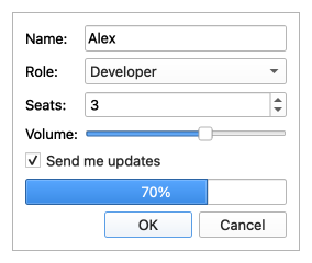
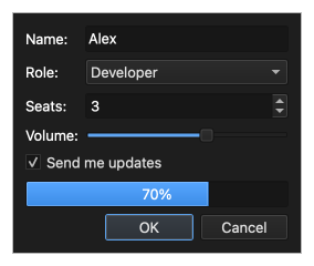
A style doesn't have to look good with every conceivable palette, but it should honor the palette it's given.
Item views
Delegates paint the items in item views. Qt's default delegate, QStyledItemDelegate, draws CE_ItemViewItem and calculates item sizes with CT_ItemViewItem, so a style controls how items look without an accompanying delegate. The style draws the item view headers, the tree branch indicators, and the row backgrounds directly. To support new data types or item data roles, you need a custom delegate; see Model/View Programming.
Implementation advice
When you implement a style, read the code of the widgets and of the base class. The widgets use the style in different ways, and the base class implementation can affect the state of the drawing, for example, by altering the QPainter state without restoring it, or by drawing some elements without using the appropriate pixel metrics and subelements.
Don't change the proposed size of widgets in sizeFromContents() unless you have to; let the QCommonStyle implementation handle it. If you make changes, keep them small. Application development is difficult when the layout of widgets differs considerably between styles.
Test your style with the -reverse command-line option, or with QGuiApplication::setLayoutDirection(), so that asymmetric elements also look correct in a right-to-left layout.
See also QStyle, QStyleOption, QStylePainter, Widget Style Reference, and Styling a Checkbox: A Walkthrough.
© 2026 The Qt Company Ltd. Documentation contributions included herein are the copyrights of their respective owners. The documentation provided herein is licensed under the terms of the GNU Free Documentation License version 1.3 as published by the Free Software Foundation. Qt and respective logos are trademarks of The Qt Company Ltd. in Finland and/or other countries worldwide. All other trademarks are property of their respective owners.
