
Styling Buttons and Input Widgets
This page is part of the Widget Style Reference. For an explanation of the element trees, screenshots, and tables, see that page. The common state flags and members that every widget sets are listed in How a Style Draws a Widget.
Push buttons
QPushButton draws a single control element, CE_PushButton, with a QStyleOptionButton. QCommonStyle splits it into the bevel, the label, and the focus frame:
CE_PushButtonCE_PushButtonBevel(PM_ButtonDefaultIndicator,PM_MenuButtonIndicator)PE_FrameDefaultButton, for the default buttonPE_PanelButtonCommandPE_IndicatorArrowDown, for a button with a menu
CE_PushButtonLabel(SE_PushButtonContents,PM_ButtonShiftHorizontal,PM_ButtonShiftVertical,PM_ButtonIconSize)PE_FrameFocusRect(SE_PushButtonFocusRect)
The button calculates its size hint with CT_PushButton and PM_ButtonMargin. Element bounds vary between styles. In QCommonStyle, PE_FrameDefaultButton gets the whole bevel rectangle, and so does PE_PanelButtonCommand, except on an auto-default button, where the panel shrinks by PM_ButtonDefaultIndicator on each side.
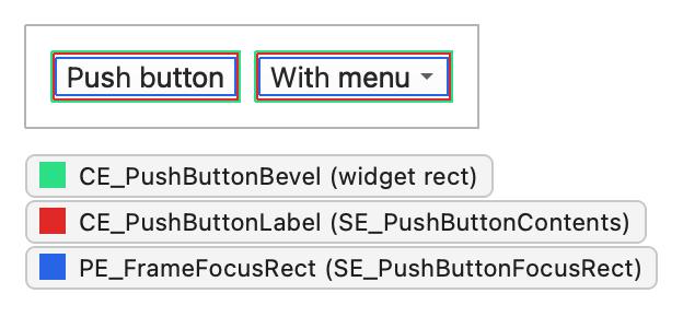
QPushButton sets these state flags:
| State | Set when |
|---|---|
State_Sunken | The button is pressed, or its menu is shown. |
State_On | The button is checked. |
State_Raised | The button isn't flat and isn't pressed. |
The other members of QStyleOptionButton are:
| Member | Description |
|---|---|
| features | Flags of the QStyleOptionButton::ButtonFeature enum that describe the button: flat, default, auto-default, with a menu, or a command link button. |
| icon | The button's QIcon, if any. |
| iconSize | The size of the icon. |
| text | The button text. |
Checkboxes and radio buttons
QCheckBox and QRadioButton have identical structures. Both use QStyleOptionButton and draw one control element, CE_CheckBox or CE_RadioButton. QCommonStyle draws the indicator, the label, and the focus frame:
CE_CheckBoxPE_IndicatorCheckBox(SE_CheckBoxIndicator,PM_IndicatorWidth,PM_IndicatorHeight)CE_CheckBoxLabel(SE_CheckBoxContents,PM_CheckBoxLabelSpacing)PE_FrameFocusRect(SE_CheckBoxFocusRect)
CE_RadioButtonPE_IndicatorRadioButton(SE_RadioButtonIndicator,PM_ExclusiveIndicatorWidth,PM_ExclusiveIndicatorHeight)CE_RadioButtonLabel(SE_RadioButtonContents,PM_RadioButtonLabelSpacing)PE_FrameFocusRect(SE_RadioButtonFocusRect)
The size hints use CT_CheckBox and CT_RadioButton. Styling a Checkbox: A Walkthrough traces the drawing of a checkbox through the widget and QCommonStyle code.
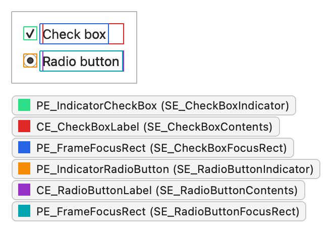
The buttons set these state flags:
| State | Set when |
|---|---|
State_Sunken | The button is pressed. The clickable area is SE_CheckBoxClickRect or SE_RadioButtonClickRect, which in QCommonStyle covers the label as well as the indicator. |
State_NoChange | The checkbox is partially checked (a tristate checkbox). |
State_On | The button is checked. |
State_Off | The button is unchecked. |
The other members of QStyleOptionButton are listed under Push buttons.
Tool buttons
QToolButton draws one complex control, CC_ToolButton, with a QStyleOptionToolButton. It has two subcontrols: the button itself and, for a button with a menu button, the menu indicator.
CC_ToolButtonSC_ToolButtonPE_PanelButtonTool(PM_DefaultFrameWidth)PE_FrameFocusRectCE_ToolButtonLabel(PM_ButtonShiftHorizontal,PM_ButtonShiftVertical)
SC_ToolButtonMenu(PM_MenuButtonIndicator)PE_IndicatorButtonDropDownPE_IndicatorArrowDown
For instant and delayed popups there is no menu subcontrol, so QCommonStyle draws PE_IndicatorArrowDown in the corner of the button rectangle instead. The size hint uses CT_ToolButton, and the button consults SH_ToolButton_PopupDelay and SH_ToolButtonStyle. Tool buttons in a toolbar take their icon size from the toolbar. Standalone buttons use PM_ButtonIconSize.
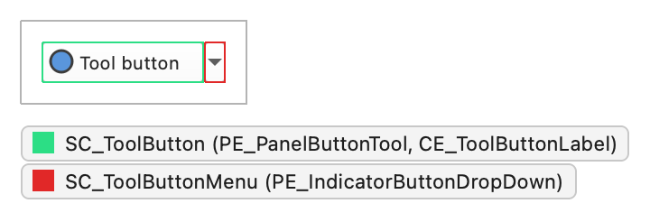
QToolButton sets these state flags:
| State | Set when |
|---|---|
State_AutoRaise | The autoRaise property is set. |
State_Raised | The button isn't checked or pressed. QCommonStyle then clears the flag again if State_AutoRaise is set and the mouse isn't over the button. |
State_Sunken | The button is pressed, or its menu is shown. |
State_On | The button is checkable and checked. |
The other members of QStyleOptionToolButton are:
| Member | Description |
|---|---|
| arrowType | A Qt::ArrowType value that gives the direction of the arrow drawn instead of an icon, if any. |
| features | Flags of the QStyleOptionToolButton::ToolButtonFeature enum: whether the button shows an arrow, has a menu button, or has a delayed popup. |
| font | The QFont of the button label. |
| icon | The QIcon of the button. |
| iconSize | The size of the icon. |
| pos | The position of the button, as given by QWidget::pos(). |
| text | The button text. |
| toolButtonStyle | A Qt::ToolButtonStyle value that decides whether the button shows the icon, the text, or both. |
Combo boxes
QComboBox draws the button and the label with CC_ComboBox and CE_ComboBoxLabel, both with a QStyleOptionComboBox. QCommonStyle omits the text of the label for an editable box, where the QLineEdit child draws it. The popup list is an item view drawn by a delegate, but the style controls its size and position with SC_ComboBoxListBoxPopup. For an editable box, the style decides where the line edit goes with SC_ComboBoxEditField; the field itself is a QLineEdit child.
CC_ComboBox(PM_ComboBoxFrameWidth)SC_ComboBoxFrameSC_ComboBoxArrow(PE_IndicatorArrowDown)SC_ComboBoxEditFieldSC_ComboBoxListBoxPopup, for positioning the popup
CE_ComboBoxLabel(SC_ComboBoxEditField)
The size hint uses CT_ComboBox. Style hints such as SH_ComboBox_Popup, SH_ComboBox_PopupFrameStyle, and SH_ComboBox_UseNativePopup decide how the popup looks and behaves.
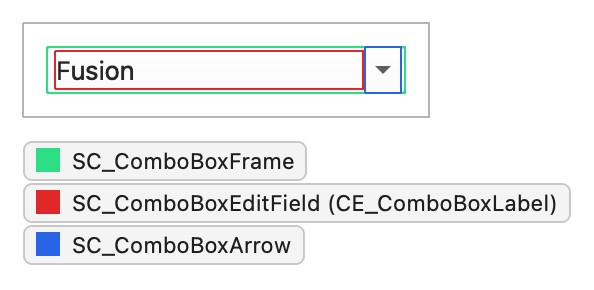
QComboBox sets these state flags:
| State | Set when |
|---|---|
State_Selected | The box isn't editable and has focus. |
State_Sunken | SC_ComboBoxArrow is active. |
State_On | The popup list is visible. |
The other members of QStyleOptionComboBox are:
| Member | Description |
|---|---|
| currentIcon | The icon of the current item. |
| currentText | The text of the current item. |
| editable | Whether the combo box is editable. |
| frame | Whether the combo box has a frame. |
| iconSize | The size of the current item's icon. |
| popupRect | The bounding rectangle of the popup list. |
| textAlignment | The alignment of the text in the label. |
Spin boxes
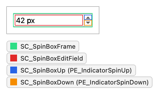
QSpinBox, QDoubleSpinBox, and QDateTimeEdit draw CC_SpinBox with a QStyleOptionSpinBox. The edit field is a QLineEdit child whose geometry the style returns for SC_SpinBoxEditField.
CC_SpinBox(PM_SpinBoxFrameWidth)SC_SpinBoxFrameSC_SpinBoxUpPE_PanelButtonBevelPE_IndicatorSpinUporPE_IndicatorSpinPlus, depending on buttonSymbols
SC_SpinBoxDownPE_PanelButtonBevelPE_IndicatorSpinDownorPE_IndicatorSpinMinus
SC_SpinBoxEditField
A style doesn't have to draw the button panels with PE_PanelButtonBevel. The size hint uses CT_SpinBox, and the widget consults hints such as SH_SpinBox_ButtonsInsideFrame, SH_SpinBox_StepModifier, and SH_SpinControls_DisableOnBounds.
The spin box sets this state flag:
| State | Set when |
|---|---|
State_Sunken | The SC_SpinBoxUp or SC_SpinBoxDown subcontrol is pressed. |
The other members of QStyleOptionSpinBox are:
| Member | Description |
|---|---|
| frame | Whether the spin box draws a frame. |
| buttonSymbols | A QAbstractSpinBox::ButtonSymbols value that selects the symbols on the buttons: arrows, plus and minus, or none. |
| stepEnabled | QAbstractSpinBox::StepEnabled flags that tell which of the buttons can step the value. A button that can't step is drawn disabled. |
Sliders
QSlider draws CC_Slider with a QStyleOptionSlider. It calculates its size hint from PM_SliderThickness and CT_Slider, and its minimum size hint from PM_SliderLength.
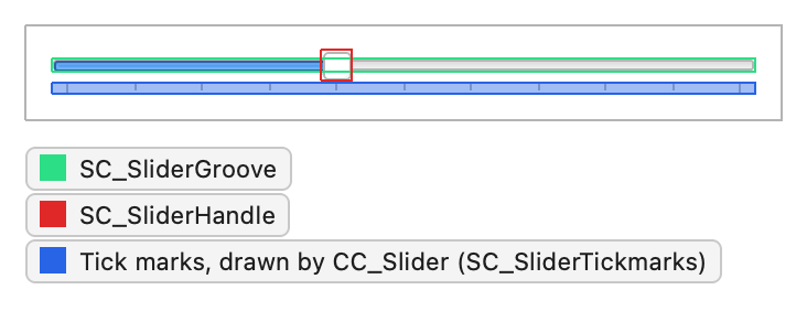
CC_Slider(PM_SliderLength,PM_SliderControlThickness,PM_SliderTickmarkOffset,PM_SliderSpaceAvailable)SC_SliderGrooveSC_SliderHandleSC_SliderTickmarks
QCommonStyle draws only the tick marks; the groove and the handle are always style specific. Styles don't have to return a rectangle for SC_SliderTickmarks. Fusion returns an empty one and draws the ticks below the handle, in the area outlined in the screenshot. The widget consults SH_Slider_AbsoluteSetButtons, SH_Slider_PageSetButtons, and SH_Slider_SnapToValue.
QDial uses the same option and draws CC_Dial with the subcontrols SC_DialGroove, SC_DialHandle, and SC_DialTickmarks.
QSlider sets these state flags:
| State | Set when |
|---|---|
State_Horizontal | The slider is horizontal. |
State_Sunken | Any subcontrol is pressed, including the groove. activeSubControls tells which one. |
QStyleOptionSlider serves all QAbstractSliders. Its members are:
| Member | Description |
|---|---|
| orientation | A Qt::Orientation value: vertical or horizontal. |
| minimum | The minimum value. |
| maximum | The maximum value. |
| tickPosition | A QSlider::TickPosition value that tells where the tick marks are drawn. |
| tickInterval | The distance between tick marks, in slider values. |
| upsideDown | The direction in which the value increases. All abstract sliders use this member instead of QStyleOption::direction. |
| sliderPosition | The position of the handle, as a slider value. It equals sliderValue while tracking is on; otherwise the value only updates when the handle is released. |
| sliderValue | The current value. |
| singleStep | The amount the value changes on a single step, such as an arrow key press. |
| pageStep | The amount the value changes on a page step, such as a click in the groove. |
| notchTarget | The preferred distance between notches, in pixels. Used by QDial. |
| dialWrapping | Whether the dial wraps around. Used by QDial. |
| keyboardModifiers | The modifier keys that were held during the last mouse event, for styles that let modifiers change the drag behavior. |
Scroll bars
QScrollBar draws CC_ScrollBar with a QStyleOptionSlider. While the user drags the slider, the bar snaps the value back if the pointer moves farther than PM_MaximumDragDistance outside the bar.
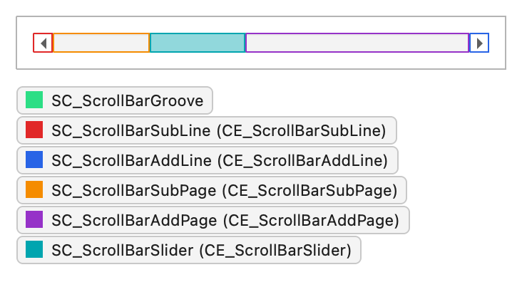
CC_ScrollBar(PM_ScrollBarExtent,PM_ScrollBarSliderMin)SC_ScrollBarGrooveSC_ScrollBarSubLine(CE_ScrollBarSubLine)SC_ScrollBarAddLine(CE_ScrollBarAddLine)SC_ScrollBarSubPage(CE_ScrollBarSubPage)SC_ScrollBarAddPage(CE_ScrollBarAddPage)SC_ScrollBarFirst(CE_ScrollBarFirst)SC_ScrollBarLast(CE_ScrollBarLast)SC_ScrollBarSlider(CE_ScrollBarSlider)PE_FrameFocusRect
QCommonStyle draws each subcontrol with the control element of the same name. Some styles draw the line indicators with PE_IndicatorArrowUp and the other arrow primitives, and the page areas with PE_PanelButtonBevel; that is up to the individual style. SC_ScrollBarFirst and SC_ScrollBarLast are optional buttons that jump to the ends; most styles return an empty rectangle for them. The size hint uses CT_ScrollBar, and behavior hints include SH_ScrollBar_LeftClickAbsolutePosition, SH_ScrollBar_ContextMenu, and SH_ScrollBar_Transient.
QScrollBar sets these state flags:
| State | Set when |
|---|---|
State_Horizontal | The scroll bar is horizontal. |
State_Sunken | A subcontrol is pressed and the pointer hasn't left it. |
State_On | The bar is a transient scroll bar that is currently shown. |
The members of QStyleOptionSlider are listed under Sliders. sliderPosition, sliderValue, pageStep, and upsideDown decide the size and position of the handle.
Progress bars
QProgressBar draws one control element, CE_ProgressBar, with a QStyleOptionProgressBar. QCommonStyle splits it into the groove, the contents, and the label:
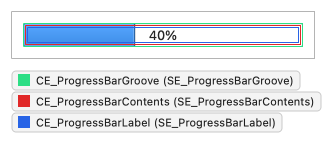
CE_ProgressBarCE_ProgressBarGroove(SE_ProgressBarGroove)CE_ProgressBarContents(SE_ProgressBarContents,PM_ProgressBarChunkWidth)CE_ProgressBarLabel(SE_ProgressBarLabel)
Styles that draw the contents as a row of chunks use PE_IndicatorProgressChunk. In QCommonStyle and Fusion, the groove, the contents, and the label all get the whole bar; the label is centered text drawn over the contents, so its rectangle isn't a separate area. The size hint uses CT_ProgressBar. A busy indicator, a bar whose minimum and maximum are both zero, is animated by the style.
QProgressBar sets this state flag:
| State | Set when |
|---|---|
State_Horizontal | The bar is horizontal. |
The other members of QStyleOptionProgressBar are:
| Member | Description |
|---|---|
| minimum | The minimum value. |
| maximum | The maximum value. |
| progress | The current value. |
| text | The label text. |
| textAlignment | The alignment of the text in the label. |
| textVisible | Whether the label is drawn. |
| invertedAppearance | Whether the bar fills from the opposite end, for example, from right to left in a horizontal bar. |
| bottomToTop | Whether the label of a vertical bar is rotated to read from bottom to top. |
See also Widget Style Reference, Styling Containers and Windows, and Styling Menus and Item Views.
© 2026 The Qt Company Ltd. Documentation contributions included herein are the copyrights of their respective owners. The documentation provided herein is licensed under the terms of the GNU Free Documentation License version 1.3 as published by the Free Software Foundation. Qt and respective logos are trademarks of The Qt Company Ltd. in Finland and/or other countries worldwide. All other trademarks are property of their respective owners.
