
Styling Containers and Windows
This page is part of the Widget Style Reference. For an explanation of the element trees, screenshots, and tables, see that page. The common state flags and members that every widget sets are listed in How a Style Draws a Widget.
Tab widgets and tab bars
QTabBar draws its tabs through the style. A tab bar is either part of a QTabWidget or standalone. A standalone bar draws its own base line. In a tab widget, the widget draws the frame around the pane and the bar sits on top of it.
QTabWidget draws PE_FrameTabWidget with a QStyleOptionTabWidgetFrame. It asks the style where to put the tab bar, the pane, the contents, and the corner widgets with SE_TabWidgetTabPane, SE_TabWidgetTabContents, SE_TabWidgetTabBar, SE_TabWidgetLeftCorner, and SE_TabWidgetRightCorner, and it overlaps the bar and the pane by PM_TabBarBaseOverlap.
QTabBar lays out the tabs itself, so the style has no control over tab placement. While laying out, the bar asks for CT_TabBarTab, which includes PM_TabBarTabHSpace and PM_TabBarTabVSpace, the extra width and height around the label. It then draws each tab with CE_TabBarTab and a QStyleOptionTab. The selected tab is drawn last so that a style can draw it over its neighbors.
PE_FrameTabBarBase(PM_TabBarBaseHeight,PM_TabBarBaseOverlap), for a standalone bar, with a QStyleOptionTabBarBaseCE_TabBarTab, once per tabCE_TabBarTabShape(PM_TabBarTabOverlap)CE_TabBarTabLabel(SE_TabBarTabText,SE_TabBarTabLeftButton,SE_TabBarTabRightButton,PM_TabBarTabShiftHorizontal,PM_TabBarTabShiftVertical,PM_TabBarIconSize)
PE_IndicatorTabClose, drawn by the close button of a closable tab (SH_TabBar_CloseButtonPosition,PM_TabCloseIndicatorWidth,PM_TabCloseIndicatorHeight)PE_IndicatorTabTearLeftandPE_IndicatorTabTearRight, where tabs are cut off by the scroll buttons (SE_TabBarTearIndicatorLeft,SE_TabBarTearIndicatorRight)
The scroll buttons that appear when the tabs don't fit are tool buttons; the style places them with SE_TabBarScrollLeftButton and SE_TabBarScrollRightButton and sizes them with PM_TabBarScrollButtonWidth. The bar also consults SH_TabBar_Alignment, SH_TabBar_ElideMode, and SH_TabBar_PreferNoArrows.
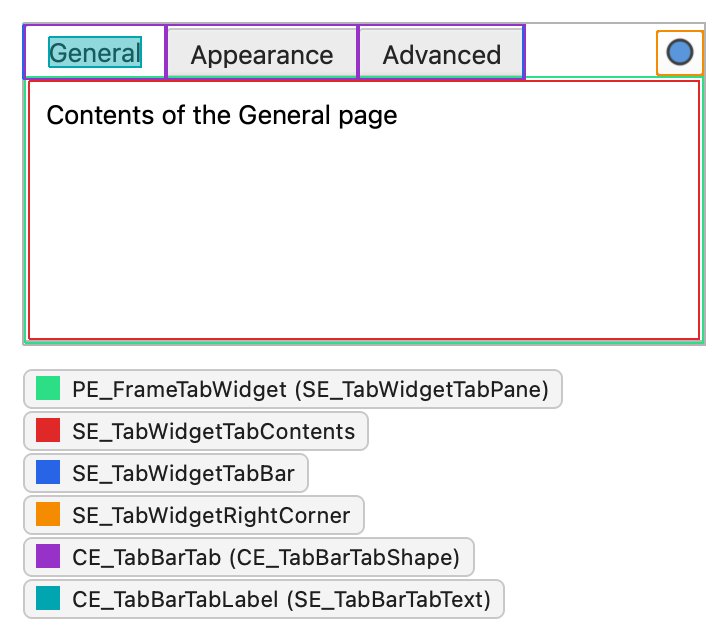
QTabBar sets these state flags on each tab:
| State | Set when |
|---|---|
State_Sunken | The tab is pressed. |
State_Selected | The tab is the current tab. |
State_HasFocus | The tab bar has focus and the tab is selected. |
State_MouseOver | The mouse is over the tab. |
Individual tabs can be disabled even when the tab bar is enabled. The tab is active when the tab bar is active. The members of QStyleOptionTab are:
| Member | Description |
|---|---|
| shape | A QTabBar::Shape value: rounded or triangular tabs, and the side of the widget the bar is on. |
| text | The tab text. |
| icon | The tab icon. |
| iconSize | The size of the icon. |
| row | The row the tab is in. Qt's tab bars have one row. |
| position | A TabPosition value: the tab's position relative to the other tabs, or Moving while the user drags it. |
| selectedPosition | A SelectedPosition value that tells whether the selected tab is next to this tab, and on which side. |
| cornerWidgets | Flags of the CornerWidget enum that tell which corner widgets the tab bar has. |
| documentMode | Whether the tab bar is in document mode. |
| leftButtonSize, rightButtonSize | The sizes of the buttons on the left and right side of the tab, such as the close button. |
| features | Flags of the TabFeature enum: whether the tab has a frame and whether it uses its minimum size hint. |
| tabIndex | The index of the tab in the bar. |
The members of QStyleOptionTabWidgetFrame are:
| Member | Description |
|---|---|
| lineWidth | The line width for drawing the panel. |
| midLineWidth | Always 0. |
| shape | The shape of the tabs on the tab bar. |
| tabBarSize | The size of the tab bar. |
| tabBarRect | The rectangle of the tab bar. |
| selectedTabRect | The rectangle of the selected tab, so that the frame can connect to it. |
| leftCornerWidgetSize, rightCornerWidgetSize | The sizes of the corner widgets, if any. |
QStyleOptionTabBarBase, used for PE_FrameTabBarBase, has the members shape, tabBarRect, selectedTabRect, and documentMode with the same meaning.
Group boxes
QGroupBox draws one complex control, CC_GroupBox, with a QStyleOptionGroupBox. It calculates its size hint from PM_IndicatorWidth, PM_IndicatorHeight, and PM_CheckBoxLabelSpacing.
CC_GroupBoxSC_GroupBoxFrame(PE_FrameGroupBox)SC_GroupBoxLabel, drawn with drawItemText(), plusPE_FrameFocusRectwhen the box has focusSC_GroupBoxCheckBox(PE_IndicatorCheckBox), for a checkable boxSC_GroupBoxContents, the area for the child widgets
The style hints SH_GroupBox_TextLabelVerticalAlignment and SH_GroupBox_TextLabelColor control the title. Qt doesn't dictate how the checkbox is drawn; QCommonStyle uses PE_IndicatorCheckBox, so the element tree under Checkboxes and radio buttons applies.
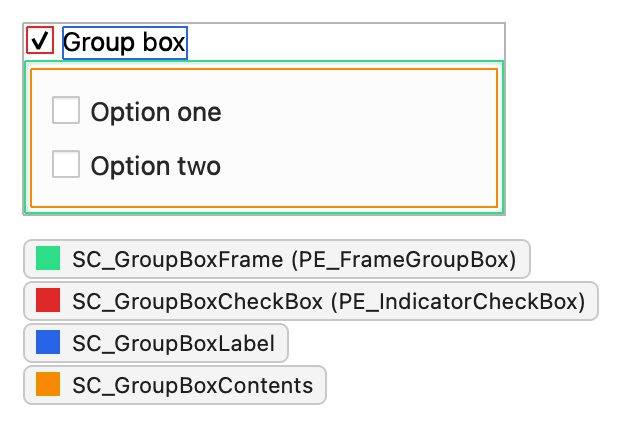
QGroupBox sets these state flags:
| State | Set when |
|---|---|
State_On | The checkbox is checked. |
State_Off | The checkbox is unchecked. A group box that isn't checkable sets neither State_On nor State_Off. |
State_Sunken | The checkbox or the title label is pressed. |
The other members of QStyleOptionGroupBox are:
| Member | Description |
|---|---|
| features | QStyleOptionFrame::FrameFeatures flags that describe the frame, such as Flat for a flat group box. |
| lineWidth | The line width of the frame. Always 1. |
| midLineWidth | Always 0. |
| text | The title. |
| textAlignment | The alignment of the title. |
| textColor | The SH_GroupBox_TextLabelColor value. The group box only fills it in when the application hasn't set a WindowText brush in the palette; otherwise it stays invalid and QCommonStyle uses the palette instead. |
Splitters
QSplitterHandle draws one control element, CE_Splitter, with a plain QStyleOption. The splitter sizes its handles with CT_Splitter and PM_SplitterWidth and asks for SH_Splitter_OpaqueResize to decide whether to resize the children while the user drags.
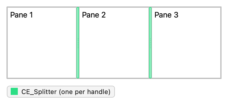
The handle fills in the option itself rather than calling initFrom(). It sets these state flags:
| State | Set when |
|---|---|
State_Horizontal | The splitter is horizontal, so the handle is vertical. |
State_MouseOver | The mouse is over the handle. |
State_Sunken | The handle is pressed. |
State_Enabled | The handle is enabled. |
Toolboxes
QToolBox keeps a collection of widgets and shows one at a time, with one tab button per widget in a vertical layout. Each button draws CE_ToolBoxTab with a QStyleOptionToolBox, and the buttons use PM_SmallIconSize for their icons.
CE_ToolBoxTab, once per pageCE_ToolBoxTabShapeCE_ToolBoxTabLabel(SE_ToolBoxTabContents)
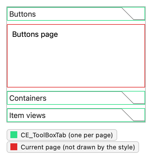
The tab button sets these state flags:
| State | Set when |
|---|---|
State_Selected | The tab is the current tab. |
State_Sunken | The tab is pressed. |
The other members of QStyleOptionToolBox are:
| Member | Description |
|---|---|
| icon | The icon on the tab. |
| text | The text on the tab. |
| position | A TabPosition value: the tab's position relative to the other tabs. |
| selectedPosition | A SelectedPosition value that tells whether the selected tab is next to this tab, and on which side. |
Toolbars
Toolbars are part of the main window framework. A main window has four toolbar areas, one along each side, and each area can hold several lines of toolbars. QMainWindow positions the toolbars and fills in the position members of their style option.
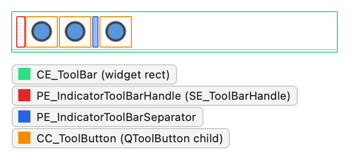
QToolBar draws CE_ToolBar with a QStyleOptionToolBar. When the toolbar floats in its own window, it also draws PE_FrameMenu around it. A movable toolbar draws its handle, and the separators between actions are small widgets that draw PE_IndicatorToolBarSeparator.
CE_ToolBar(PM_ToolBarFrameWidth,PM_ToolBarItemMargin,PM_ToolBarItemSpacing)PE_PanelToolBar
PE_FrameMenu, for a floating toolbarPE_IndicatorToolBarHandle(SE_ToolBarHandle,PM_ToolBarHandleExtent)PE_IndicatorToolBarSeparator(PM_ToolBarSeparatorExtent), drawn by each separator
The tool buttons in the bar draw CC_ToolButton; see Tool buttons. Their icon size defaults to PM_ToolBarIconSize. When the actions don't fit, the bar shows an extension button with the SP_ToolBarHorizontalExtensionButton or SP_ToolBarVerticalExtensionButton icon, sized by PM_ToolBarExtensionExtent.
QToolBar sets this state flag:
| State | Set when |
|---|---|
State_Horizontal | The toolbar is horizontal, that is, in the top or bottom toolbar area. |
The separators use a plain QStyleOption with State_Horizontal set when the toolbar is horizontal. The other members of QStyleOptionToolBar are:
| Member | Description |
|---|---|
| features | ToolBarFeature flags: Movable if the toolbar can be moved. |
| lineWidth | The width of the toolbar frame. |
| midLineWidth | Always 0. |
| positionOfLine | A ToolBarPosition value: the position of the toolbar's line within its toolbar area. |
| positionWithinLine | A ToolBarPosition value: the position of the toolbar within its line. |
| toolBarArea | The Qt::ToolBarArea the toolbar is in. |
Dock widgets
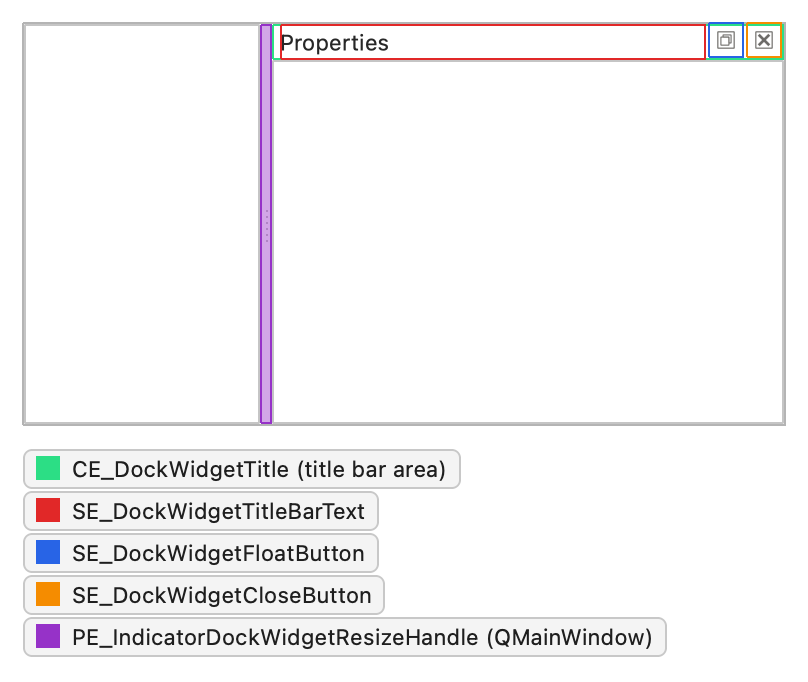
QDockWidget draws its title bar with CE_DockWidgetTitle and a QStyleOptionDockWidget, unless the application installed a custom title bar widget or the dock widget floats with native window decorations. A floating dock widget without native decorations also draws PE_FrameDockWidget. The float and close buttons are tool buttons that draw PE_PanelButtonTool and show the SP_TitleBarNormalButton and SP_TitleBarCloseButton icons.
PE_FrameDockWidget(PM_DockWidgetFrameWidth), when floatingCE_DockWidgetTitle(SE_DockWidgetTitleBarText,SE_DockWidgetIcon,PM_DockWidgetTitleMargin)SE_DockWidgetFloatButtonandSE_DockWidgetCloseButton(PM_DockWidgetTitleBarButtonMargin), the button positions
QMainWindow draws the separators between docked widgets with PE_IndicatorDockWidgetResizeHandle, sized by PM_DockWidgetSeparatorExtent. The hint SH_DockWidget_ButtonsHaveFrame decides whether the title bar buttons have a frame.
The title bar option sets no state flags beyond the common ones. The members of QStyleOptionDockWidget are:
| Member | Description |
|---|---|
| title | The title text. |
| closable | Whether the dock widget can be closed. |
| movable | Whether the dock widget can be moved to another area. |
| floatable | Whether the dock widget can float, that is, detach from its main window. |
| verticalTitleBar | Whether the title bar is drawn vertically along the left side. |
Title bars
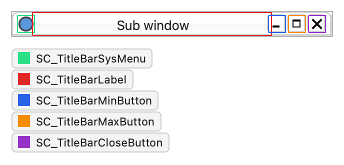
The title bar complex control, CC_TitleBar, draws the title bars of the subwindows in a QMdiArea. It consists of a window title and the system menu, minimize, maximize, and close buttons. Some styles also provide buttons for shading the window and for context-sensitive help.
CC_TitleBar(PM_TitleBarHeight,PM_TitleBarButtonSize,PM_TitleBarButtonIconSize)SC_TitleBarSysMenuSC_TitleBarLabelSC_TitleBarMinButton,SC_TitleBarMaxButton,SC_TitleBarCloseButton,SC_TitleBarNormalButtonSC_TitleBarShadeButton,SC_TitleBarUnshadeButton,SC_TitleBarContextHelpButton
QCommonStyle draws each button with PE_PanelButtonTool and the matching standard icon, from SP_TitleBarMenuButton to SP_TitleBarContextHelpButton. When a subwindow is maximized, QMdiSubWindow moves its buttons into the menu bar of the main window and draws them with CC_MdiControls and the subcontrols SC_MdiMinButton, SC_MdiNormalButton, and SC_MdiCloseButton.
The members of QStyleOptionTitleBar are:
| Member | Description |
|---|---|
| text | The title text. |
| icon | The window icon. |
| titleBarFlags | Qt::WindowFlags that tell which buttons the title bar has. |
| titleBarState | The QWidget::windowState() of the window, which decides whether the maximize or the restore button is shown. |
Size grips
QSizeGrip draws one control element, CE_SizeGrip, with a QStyleOptionSizeGrip, and calculates its size hint with CT_SizeGrip. QStatusBar shows a size grip in its corner by default.
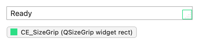
The size grip sets no state flags beyond the common ones. QStyleOptionSizeGrip has one member of its own:
| Member | Description |
|---|---|
| corner | A Qt::Corner value: the corner of the window the grip is in. |
Rubber bands
QRubberBand draws one control element, CE_RubberBand, with a QStyleOptionRubberBand. The style can shape the band through the SH_RubberBand_Mask style hint.
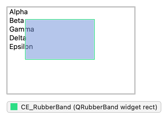
The band sets no state flags beyond the common ones. The members of QStyleOptionRubberBand are:
| Member | Description |
|---|---|
| shape | A QRubberBand::Shape value: a rectangle or a line. |
| opaque | Whether the band must be drawn opaquely. |
See also Widget Style Reference, Styling Buttons and Input Widgets, and Styling Menus and Item Views.
© 2026 The Qt Company Ltd. Documentation contributions included herein are the copyrights of their respective owners. The documentation provided herein is licensed under the terms of the GNU Free Documentation License version 1.3 as published by the Free Software Foundation. Qt and respective logos are trademarks of The Qt Company Ltd. in Finland and/or other countries worldwide. All other trademarks are property of their respective owners.
