
StyleKit Widgets Example
Shows how to style Qt Widgets using StyleKit.
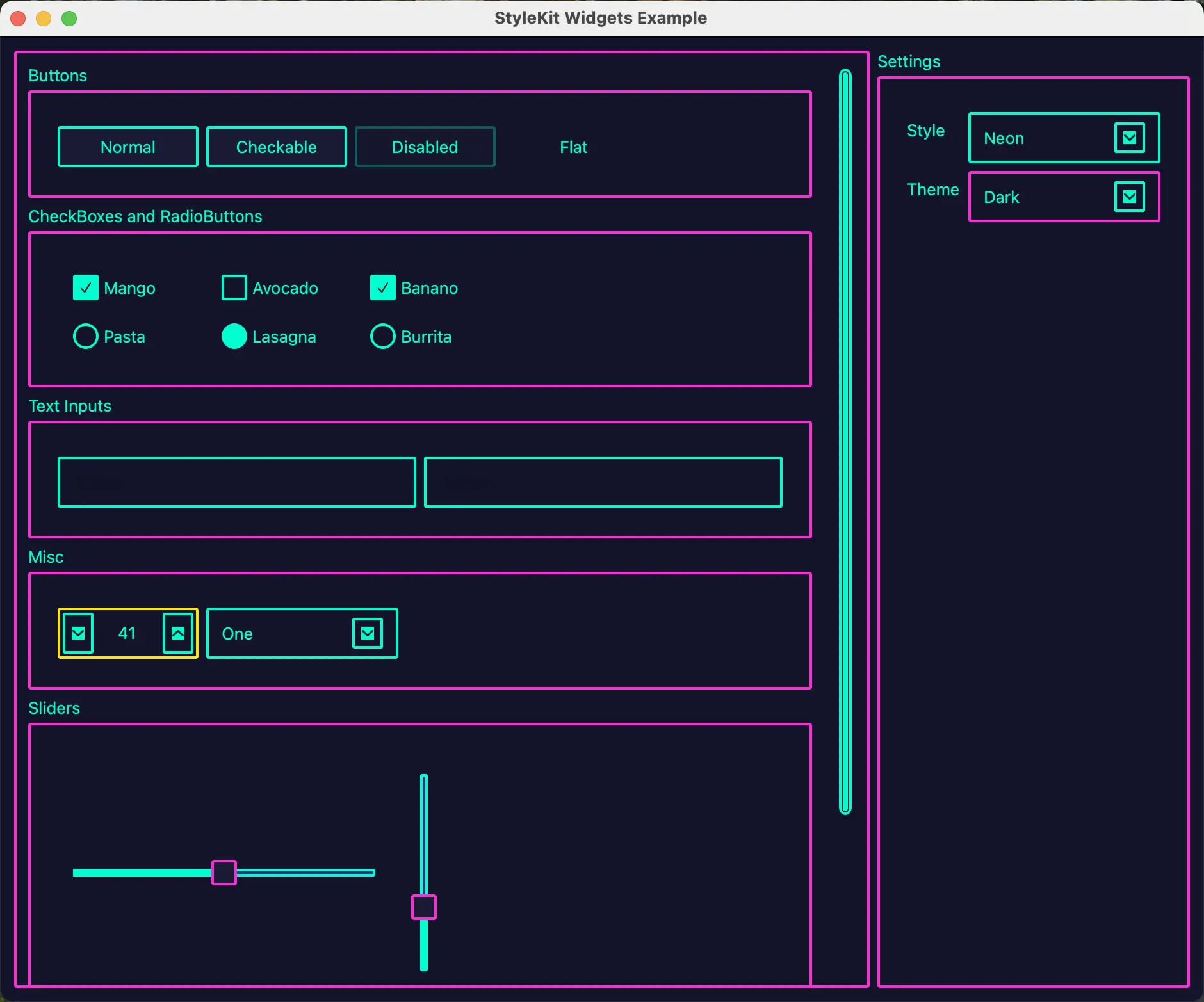
This example shows how to style a Qt Widgets application with StyleKit. It demonstrates how to apply QML-defined styles to standard Qt Widgets controls using QStyleKitStyle, and how to switch between styles and themes at runtime.
The example includes three styles:
- Classic - A gradient-based style with multiple themes including light, dark, high-contrast, and green.
- Flat - A flat, Material Design-inspired style with light and dark themes.
- Neon - A cyberpunk-inspired dark style with neon accent colors.
The example demonstrates how to:
- Apply a QStyleKitStyle to a QApplication.
- Switch between QML-defined styles at runtime using setStylePath().
- Switch between themes within a style using setThemeName().
- Organize widgets into labeled sections using QGroupBox.
Running the Example
You can run the example from:
- Qt Creator
Open the Welcome mode and select the example from Examples. For more information, see Qt Creator: Tutorial: Build and run.
- Qt Extension for Visual Studio Code
Run the Qt: Open Qt examples command from the Command Palette, and select the example from the list. For more information, see Qt Extension for Visual Studio Code: Tutorial: Build and run.
See also Qt Labs StyleKit and StyleKit Quick Controls Example.
© 2026 The Qt Company Ltd. Documentation contributions included herein are the copyrights of their respective owners. The documentation provided herein is licensed under the terms of the GNU Free Documentation License version 1.3 as published by the Free Software Foundation. Qt and respective logos are trademarks of The Qt Company Ltd. in Finland and/or other countries worldwide. All other trademarks are property of their respective owners.
