Tutorial: Qt Quick application
This tutorial illustrates basic concepts of Qt Quick. With the Qt Quick module, you can build fluid animated user interfaces in QML and connect them to back-end C++ libraries.
The Qt Quick module provides all the basic types necessary for creating user interfaces with QML. It provides a visual canvas and includes types for creating and animating visual components, receiving user input, and so on. For more information about the UI choices you have, see User Interfaces.
This tutorial describes the example application that the New Project wizard generates. It imports QML types from the Qt Quick, Qt Quick Controls, and Qt Quick Layouts modules. It also creates a main C++ source file for building and running the application using the CMake build configuration system.
You will use the Edit mode to inspect the QML and the C++ code and the CMake build configuration of the project. You will then run the application on an Android or iOS device.
For more examples, see Qt Quick Examples and Tutorials.
Set up the development environment
To build the application for and run it on a mobile device, you must set up the development environment for the device platform and configure a connection between Qt Creator and the mobile device.
To develop for Android devices, you must install Qt for Android and set up the development environment, as instructed in Developing for Android.
To develop for iOS devices, you must install Qt for iOS. You also need to install Xcode and use it to configure a device. For this, you need an Apple developer account and iOS Developer Program certificate that you receive from Apple. For more information, see Developing for iOS.
Create the project
- Go to File > New Project > Application (Qt) > Qt Quick Application.
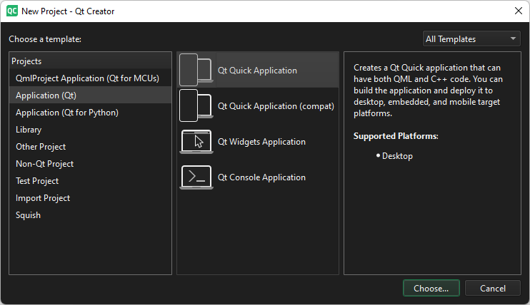
- Select Choose to open the Project Location dialog.
- In Name, enter a name for the application. When naming your own projects, keep in mind that you cannot easily rename them later.
- In Create in, enter the path for the project files. You can move project folders later without problems.
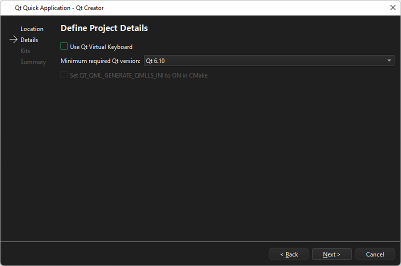
- Select Next to open the Define Project Details dialog.
- Select Next to open the Kit Selection dialog.
- Select kits for the platforms that you want to build the application for. To build applications for mobile devices, select kits also for Android and iOS.
Note: The list shows kits that you specify in Preferences > Kits. For more information, see Add kits and Managing kits.
- Select Next to open the Project Management dialog.
- Review the project settings, and select Finish (or Done on macOS) to create the project.
Qt Creator generates a component file, Main.qml, and opens it in the Edit mode.
Preview the application
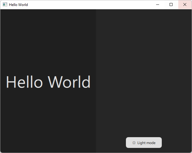
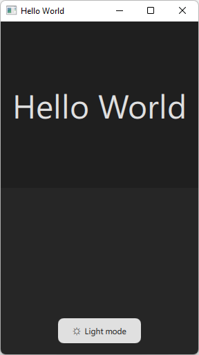
The main view of the application shows two rectangles with background color, text, and a button. Selecting the button toggles the application between light and dark mode.
- To preview the application, select
 on the top toolbar.
 - To run the application on the desktop, select
 .
.
Inspect the QML code
Open Main.qml to inspect the generated QML code.
QML imports
The file has import statements for the Qt modules that contain the QML types used in the application:
import QtQuick
import QtQuick.Layouts
import QtQuick.Controls.Basics
Main window
The file contains an instance of the ApplicationWindow QML type, which creates a main window. The window properties set an initial and minimum size, as well as a window title. Also, they determine that the window is visible on the screen.
ApplicationWindow {
    id: window
    width: 640
    height: 480
    minimumWidth: 200
    minimumHeight: 250
    visible: true
    title: qsTr("Hello World")

    property bool lightMode: Application.styleHints.colorScheme === Qt.Light
    property color reallyDark: "#1f1f1f"
    property color dark: "#262626"
    property color reallyLight: "#e7e7e7"
    property color light: "#e0e0e0"
The custom properties set the application colors in the light and dark modes.
Layout
The window contains an instance of the GridLayout QML type from the Qt Quick Layouts module, which positions two instances of the Rectangle type in a grid. The grid properties set the column width and the spacing between rows and columns, as well as bind the grid size to the window size.
GridLayout {
    id: grid
    columns: width < 400 ? 1 : 2
    rowSpacing: 0
    columnSpacing: 0
    anchors.fill: parent
If the column width becomes less than 400 pixels in the running application, the rectangles are positioned in one column.
Basic QML types
Each instance of the Rectangle type has properties that set the type ID and the color. The rectangle color is bound to the window color in the current mode. The Layout properties make the rectagle fit the grid cell.
Rectangle {
    id: rectangle1
    color: window.lightMode ? window.reallyLight : window.reallyDark
    Layout.fillHeight: true
    Layout.fillWidth: true
Both rectangles contain a ColumnLayout, which position instances of the Label and Button types from the Qt Quick Controls module.
ColumnLayout {
    anchors.fill: parent
    Layout.alignment: Qt.AlignHCenter | Qt.AlignTop
The Layout properties align the column at the top center of the rectangle, and set top and bottom margins for the layout to position the text and the button.
Change the properties
When you preview the application, you can change the values of the properties in the code and see the changes immediately.
Experiment by changing the colors, margins, and alignment.
Qt Quick Controls
The Qt Quick Controls module provides a set of controls for building complete user interfaces in Qt Quick. The application contains instaces of Label and Button controls.
Label
The Label properties set the heading text, as well as its color and its size in pixels. Also, they center the label text horizontally and vertically within the element's width and height, as well as adjust the font size to fit the text within the label when the column width changes.
The Layout properties make the label fit the grid cell with 16 pixel margins.
Label {
    id: text1
    color: window.lightMode ? window.dark : window.light
    font.pixelSize: 120
    fontSizeMode: Text.Fit
    text: qsTr("Hello World")
    Layout.fillWidth: true
    Layout.fillHeight: true
    Layout.margins: 16
    horizontalAlignment: Text.AlignHCenter
    verticalAlignment: Text.AlignVCenter
}
Button
The Button text property sets the button icon and text depending on the window mode.
The Layout properties align the button at the bottom center of the rectangle, and set the bottom margin for the layout to position the button.
Button {
    id: button1
    text: window.lightMode ? qsTr("\u263D  Dark mode")
                           : qsTr("\u263C  Light mode")

        Layout.bottomMargin: 16
        Layout.alignment: Qt.AlignHCenter | Qt.AlignBottom
    ...
}
The Text properties bind the button text, as well as its color and font to the window mode.
...
contentItem: Text {
    text: button1.text
    color: window.lightMode ? window.light : window.dark
    font: button1.font
    horizontalAlignment: Text.AlignHCenter
    verticalAlignment: Text.AlignVCenter
}
The background item holds an instance of the Rectangle type. The rectangle properties make the button corners round and set the button background color according to the window mode.
    ...
    background: Rectangle {
        implicitWidth: 120
        implicitHeight: 36
        radius: 8
        color: window.lightMode ? window.dark : window.light
    }
    ...
}
Change the styling
The example application uses the Basic styling for Qt Quick Controls. It is a simple and light-weight all-round style that offers the maximum performance.
There are several other styles that you can choose based on your target platform, such as iOS, macOS, or Material for Android. To experiment with different styles, add a style name to import QtQuick.Controls. For example: import QtQuick.Controls.Material.
Since Qt 6.12, you can import QtQuick.Controls.Native, which imports the default style for the target platform.
For more information about the available styles, see Styling Qt Quick Controls.
Signals and signal handlers
The onClicked signal handler of the Button type reacts to button clicks. In the example application, selecting the button toggles the light and dark mode.
            Button {
                id: button1
                text: window.lightMode ? qsTr("\u263D  Dark mode")
                                       : qsTr("\u263C  Light mode")
                Layout.bottomMargin: 16
                Layout.alignment: Qt.AlignHCenter | Qt.AlignBottom

                contentItem: Text {
                    text: button1.text
                    color: window.lightMode ? window.light : window.dark
                    font: button1.font
                    horizontalAlignment: Text.AlignHCenter
                    verticalAlignment: Text.AlignVCenter
                }

                background: Rectangle {
                    implicitWidth: 120
                    implicitHeight: 36
                    radius: 8
                    color: window.lightMode ? window.dark : window.light
                }

                onClicked: window.lightMode = !window.lightMode
            }
        }
    }
}
Inspect the C++ source code
Open the main.cpp file to inspect the generated C++ code. It declares the application, app, and the application engine, engine. The engine loads the main QML file when you run the application.
#include <QGuiApplication>
#include <QQmlApplicationEngine>

int main(int argc, char *argv[])
{
    QGuiApplication app(argc, argv);

    QQmlApplicationEngine engine;
    QObject::connect(
        &engine,
        &QQmlApplicationEngine::objectCreationFailed,
        &app,
        []() { QCoreApplication::exit(-1); },
        Qt::QueuedConnection);
    engine.loadFromModule("HelloWorld", "Main");

    return QGuiApplication::exec();
}
Inspect the CMake configuration file
The wizard generates a CMakeLists.txt configuration file for building the application.
The RESOURCES section lists the source files for the application. If you add source files to the project, Qt Creator automatically adds them to the section.
For more information, see Build with CMake.
Run the application on a device
You can now deploy the application to a device and run it there:
- Enable USB Debugging on the Android device or developer mode on the iOS device.
- Connect the device to the development PC.
- Go to Projects, and activate the appropriate kit for the project.
- Go to Preferences > Kits > Kits, and select the device from the list in Run device, Device.
- To run the application on the device, select Ctrl+R.
See also Activate kits for a project, Deploy applications to Android, How to: Build with CMake, How to: Design Qt Quick UIs, Qt Quick UI design, Designing Qt Quick UIs, and Getting Started programming with Qt Quick: An Alarm Application.
Copyright © The Qt Company Ltd. and other contributors. Documentation contributions included herein are the copyrights of their respective owners. The documentation provided herein is licensed under the terms of the GNU Free Documentation License version 1.3 as published by the Free Software Foundation. Qt and respective logos are trademarks of The Qt Company Ltd in Finland and/or other countries worldwide. All other trademarks are property of their respective owners.
