QMessageBox
The
QMessageBoxclass provides a modal dialog for informing the user or for asking the user a question and receiving an answer. More…

Synopsis
Functions
def
addButton(button)def
addButton(button, role)def
addButton(text, role)def
button(which)def
buttonRole(button)def
buttonText(button)def
buttons()def
checkBox()def
clickedButton()def
defaultButton()def
detailedText()def
escapeButton()def
icon()def
iconPixmap()def
informativeText()def
open(receiver, member)def
removeButton(button)def
setButtonText(button, text)def
setCheckBox(cb)def
setDefaultButton(button)def
setDefaultButton(button)def
setDetailedText(text)def
setEscapeButton(button)def
setEscapeButton(button)def
setIcon(arg__1)def
setIconPixmap(pixmap)def
setInformativeText(text)def
setStandardButtons(buttons)def
setText(text)def
setTextFormat(format)def
setTextInteractionFlags(flags)def
setWindowModality(windowModality)def
setWindowTitle(title)def
standardButton(button)def
standardButtons()def
text()def
textFormat()def
textInteractionFlags()
Signals
def
buttonClicked(button)
Static functions
def
about(parent, title, text)def
aboutQt(parent[, title=””])def
critical(parent, title, text, button0, button1)def
critical(parent, title, text[, buttons=QMessageBox.Ok[, defaultButton=NoButton]])def
information(parent, title, text, button0[, button1=NoButton])def
information(parent, title, text[, buttons=QMessageBox.Ok[, defaultButton=NoButton]])def
question(parent, title, text, button0, button1)def
question(parent, title, text[, buttons=QMessageBox.StandardButtons(Yes | No)[, defaultButton=NoButton]])def
standardIcon(icon)def
warning(parent, title, text, button0, button1)def
warning(parent, title, text[, buttons=QMessageBox.Ok[, defaultButton=NoButton]])
Detailed Description
A message box displays a primary
textto alert the user to a situation, aninformative textto further explain the alert or to ask the user a question, and an optionaldetailed textto provide even more data if the user requests it. A message box can also display aniconandstandard buttonsfor accepting a user response.Two APIs for using
QMessageBoxare provided, the property-based API, and the static functions. Calling one of the static functions is the simpler approach, but it is less flexible than using the property-based API, and the result is less informative. Using the property-based API is recommended.
The Property-based API
To use the property-based API, construct an instance of
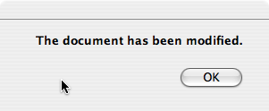
QMessageBox, set the desired properties, and callexec()to show the message. The simplest configuration is to set only themessage textproperty.QMessageBox msgBox; msgBox.setText("The document has been modified."); msgBox.exec();The user must click the OK button to dismiss the message box. The rest of the GUI is blocked until the message box is dismissed.

A better approach than just alerting the user to an event is to also ask the user what to do about it. Store the question in the
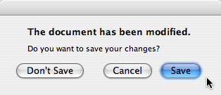
informative textproperty, and set thestandard buttonsproperty to the set of buttons you want as the set of user responses. The buttons are specified by combining values fromStandardButtonsusing the bitwise OR operator. The display order for the buttons is platform-dependent. For example, on Windows, Save is displayed to the left of Cancel, whereas on Mac OS, the order is reversed.Mark one of your standard buttons to be your
default button.QMessageBox msgBox; msgBox.setText("The document has been modified."); msgBox.setInformativeText("Do you want to save your changes?"); msgBox.setStandardButtons(QMessageBox::Save | QMessageBox::Discard | QMessageBox::Cancel); msgBox.setDefaultButton(QMessageBox::Save); int ret = msgBox.exec();This is the approach recommended in the macOS Guidelines . Similar guidelines apply for the other platforms, but note the different ways the
informative textis handled for different platforms.
The
exec()slot returns theStandardButtonsvalue of the button that was clicked.switch (ret) { case QMessageBox::Save: // Save was clicked break; case QMessageBox::Discard: // Don't Save was clicked break; case QMessageBox::Cancel: // Cancel was clicked break; default: // should never be reached break; }To give the user more information to help him answer the question, set the
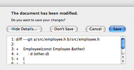
detailed textproperty. If thedetailed textproperty is set, the Show Details… button will be shown.
Clicking the Show Details… button displays the detailed text.

Rich Text and the Text Format Property
The
detailed textproperty is always interpreted as plain text. Themain textandinformative textproperties can be either plain text or rich text. These strings are interpreted according to the setting of thetext formatproperty. The default setting isauto-text.Note that for some plain text strings containing XML meta-characters, the auto-text
rich text detection testmay fail causing your plain text string to be interpreted incorrectly as rich text. In these rare cases, useconvertFromPlainText()to convert your plain text string to a visually equivalent rich text string, or set thetext formatproperty explicitly withsetTextFormat().
Severity Levels and the Icon and Pixmap Properties
QMessageBoxsupports four predefined message severity levels, or message types, which really only differ in the predefined icon they each show. Specify one of the four predefined message types by setting theiconproperty to one of thepredefined icons. The following rules are guidelines:

QuestionFor asking a question during normal operations.

InformationFor reporting information about normal operations.

WarningFor reporting non-critical errors.

CriticalFor reporting critical errors.
Predefined iconsare not defined byQMessageBox, but provided by the style. The default value isNo Icon. The message boxes are otherwise the same for all cases. When using a standard icon, use the one recommended in the table, or use the one recommended by the style guidelines for your platform. If none of the standard icons is right for your message box, you can use a custom icon by setting theicon pixmapproperty instead of setting theiconproperty.In summary, to set an icon, use either
setIcon()for one of the standard icons, orsetIconPixmap()for a custom icon.
The Static Functions API
Building message boxes with the static functions API, although convenient, is less flexible than using the property-based API, because the static function signatures lack parameters for setting the
informative textanddetailed textproperties. One work-around for this has been to use thetitleparameter as the message box main text and thetextparameter as the message box informative text. Because this has the obvious drawback of making a less readable message box, platform guidelines do not recommend it. The Microsoft Windows User Interface Guidelines recommend using theapplication nameas thewindow's title, which means that if you have an informative text in addition to your main text, you must concatenate it to thetextparameter.Note that the static function signatures have changed with respect to their button parameters, which are now used to set the
standard buttonsand thedefault button.Static functions are available for creating
information(),question(),warning(), andcritical()message boxes.int ret = QMessageBox::warning(this, tr("My Application"), tr("The document has been modified.\n" "Do you want to save your changes?"), QMessageBox::Save | QMessageBox::Discard | QMessageBox::Cancel, QMessageBox::Save);The Standard Dialogs example shows how to use
QMessageBoxand the other built-in Qt dialogs.
Advanced Usage
If the
standard buttonsare not flexible enough for your message box, you can use theaddButton()overload that takes a text and aButtonRoleto add custom buttons. TheButtonRoleis used byQMessageBoxto determine the ordering of the buttons on screen (which varies according to the platform). You can test the value ofclickedButton()after callingexec(). For example,QMessageBox msgBox; QPushButton *connectButton = msgBox.addButton(tr("Connect"), QMessageBox::ActionRole); QPushButton *abortButton = msgBox.addButton(QMessageBox::Abort); msgBox.exec(); if (msgBox.clickedButton() == connectButton) { // connect } else if (msgBox.clickedButton() == abortButton) { // abort }
Default and Escape Keys
The default button (i.e., the button activated when Enter is pressed) can be specified using
setDefaultButton(). If a default button is not specified,QMessageBoxtries to find one based on thebutton rolesof the buttons used in the message box.The escape button (the button activated when Esc is pressed) can be specified using
setEscapeButton(). If an escape button is not specified,QMessageBoxtries to find one using these rules:
If there is only one button, it is the button activated when Esc is pressed.
If there is a
Cancelbutton, it is the button activated when Esc is pressed.If there is exactly one button having either
the Reject roleor thethe No role, it is the button activated when Esc is pressed.When an escape button can’t be determined using these rules, pressing Esc has no effect.
See also
QDialogButtonBoxGUI Design Handbook: Message Box Standard Dialogs Example Application Example
- class PySide2.QtWidgets.QMessageBox(icon, title, text[, buttons=QMessageBox.NoButton[, parent=None[, flags=Qt.Dialog | Qt.MSWindowsFixedSizeDialogHint]]])
PySide2.QtWidgets.QMessageBox([parent=None])
- param parent:
- param title:
str
- param buttons:
StandardButtons- param flags:
WindowFlags- param icon:
- param text:
str
Constructs a message box with the given
icon,title,text, and standardbuttons. Standard or custom buttons can be added at any time usingaddButton(). Theparentandfarguments are passed to theQDialogconstructor.The message box is an
application modaldialog box.On macOS, if
parentis notNoneand you want your message box to appear as aSheetof that parent, set the message box’swindow modalitytoWindowModal(default). Otherwise, the message box will be a standard dialog.Constructs a message box with no text and no buttons.
parentis passed to theQDialogconstructor.On macOS, if you want your message box to appear as a
Sheetof itsparent, set the message box’swindow modalitytoWindowModalor useopen(). Otherwise, the message box will be a standard dialog.
- PySide2.QtWidgets.QMessageBox.Icon
This enum has the following values:
Constant
Description
QMessageBox.NoIcon
the message box does not have any icon.
QMessageBox.Question
an icon indicating that the message is asking a question.
QMessageBox.Information
an icon indicating that the message is nothing out of the ordinary.
QMessageBox.Warning
an icon indicating that the message is a warning, but can be dealt with.
QMessageBox.Critical
an icon indicating that the message represents a critical problem.
- PySide2.QtWidgets.QMessageBox.ButtonRole
This enum describes the roles that can be used to describe buttons in the button box. Combinations of these roles are as flags used to describe different aspects of their behavior.
Constant
Description
QMessageBox.InvalidRole
The button is invalid.
QMessageBox.AcceptRole
Clicking the button causes the dialog to be accepted (e.g. OK).
QMessageBox.RejectRole
Clicking the button causes the dialog to be rejected (e.g. Cancel).
QMessageBox.DestructiveRole
Clicking the button causes a destructive change (e.g. for Discarding Changes) and closes the dialog.
QMessageBox.ActionRole
Clicking the button causes changes to the elements within the dialog.
QMessageBox.HelpRole
The button can be clicked to request help.
QMessageBox.YesRole
The button is a “Yes”-like button.
QMessageBox.NoRole
The button is a “No”-like button.
QMessageBox.ApplyRole
The button applies current changes.
QMessageBox.ResetRole
The button resets the dialog’s fields to default values.
See also
StandardButton
- PySide2.QtWidgets.QMessageBox.StandardButton
These enums describe flags for standard buttons. Each button has a defined
ButtonRole.Constant
Description
QMessageBox.Ok
An “OK” button defined with the
AcceptRole.QMessageBox.Open
An “Open” button defined with the
AcceptRole.QMessageBox.Save
A “Save” button defined with the
AcceptRole.QMessageBox.Cancel
A “Cancel” button defined with the
RejectRole.QMessageBox.Close
A “Close” button defined with the
RejectRole.QMessageBox.Discard
A “Discard” or “Don’t Save” button, depending on the platform, defined with the
DestructiveRole.QMessageBox.Apply
An “Apply” button defined with the
ApplyRole.QMessageBox.Reset
A “Reset” button defined with the
ResetRole.QMessageBox.RestoreDefaults
A “Restore Defaults” button defined with the
ResetRole.QMessageBox.Help
A “Help” button defined with the
HelpRole.QMessageBox.SaveAll
A “Save All” button defined with the
AcceptRole.QMessageBox.Yes
A “Yes” button defined with the
YesRole.QMessageBox.YesToAll
A “Yes to All” button defined with the
YesRole.QMessageBox.No
A “No” button defined with the
NoRole.QMessageBox.NoToAll
A “No to All” button defined with the
NoRole.QMessageBox.Abort
An “Abort” button defined with the
RejectRole.QMessageBox.Retry
A “Retry” button defined with the
AcceptRole.QMessageBox.Ignore
An “Ignore” button defined with the
AcceptRole.QMessageBox.NoButton
An invalid button.
The following values are obsolete:
Constant
Description
QMessageBox.YesAll
Use instead.
QMessageBox.NoAll
Use instead.
QMessageBox.Default
Use the
defaultButtonargument ofinformation(),warning(), etc. instead, or callsetDefaultButton().QMessageBox.Escape
Call
setEscapeButton()instead.QMessageBox.FlagMask
QMessageBox.ButtonMask
See also
ButtonRolestandardButtons
- static PySide2.QtWidgets.QMessageBox.about(parent, title, text)
- Parameters:
parent –
PySide2.QtWidgets.QWidgettitle – str
text – str
Displays a simple about box with title
titleand texttext. The about box’s parent isparent.looks for a suitable icon in four locations:
It prefers
parent->icon()if that exists.If not, it tries the top-level widget containing
parent.If that fails, it tries the
PySide2.QtWidgets.QApplication.activeWindow()As a last resort it uses the Information icon.
The about box has a single button labelled “OK”. On macOS, the about box is popped up as a modeless window; on other platforms, it is currently application modal.
See also
- static PySide2.QtWidgets.QMessageBox.aboutQt(parent[, title=""])
- Parameters:
parent –
PySide2.QtWidgets.QWidgettitle – str
Displays a simple message box about Qt, with the given
titleand centered overparent(ifparentis notNone). The message includes the version number of Qt being used by the application.This is useful for inclusion in the Help menu of an application, as shown in the Menus example.
QApplicationprovides this functionality as a slot.On macOS, the about box is popped up as a modeless window; on other platforms, it is currently application modal.
See also
- PySide2.QtWidgets.QMessageBox.addButton(button, role)
- Parameters:
button –
PySide2.QtWidgets.QAbstractButtonrole –
ButtonRole
Adds the given
buttonto the message box with the specifiedrole.See also
- PySide2.QtWidgets.QMessageBox.addButton(button)
- Parameters:
button –
StandardButton- Return type:
This is an overloaded function.
Adds a standard
buttonto the message box if it is valid to do so, and returns the push button.See also
- PySide2.QtWidgets.QMessageBox.addButton(text, role)
- Parameters:
text – str
role –
ButtonRole
- Return type:
- PySide2.QtWidgets.QMessageBox.button(which)
- Parameters:
which –
StandardButton- Return type:
Returns a pointer corresponding to the standard button
which, orNoneif the standard button doesn’t exist in this message box.See also
- PySide2.QtWidgets.QMessageBox.buttonClicked(button)
- Parameters:
button –
PySide2.QtWidgets.QAbstractButton
- PySide2.QtWidgets.QMessageBox.buttonRole(button)
- Parameters:
button –
PySide2.QtWidgets.QAbstractButton- Return type:
Returns the button role for the specified
button. This function returnsInvalidRoleifbuttonisNoneor has not been added to the message box.See also
- PySide2.QtWidgets.QMessageBox.buttonText(button)
- Parameters:
button – int
- Return type:
str
Returns the text of the message box button
button, or an empty string if the message box does not contain the button.Use
button()andtext()instead.See also
- PySide2.QtWidgets.QMessageBox.buttons()
- Return type:
Returns a list of all the buttons that have been added to the message box.
See also
- PySide2.QtWidgets.QMessageBox.checkBox()
- Return type:
Returns the checkbox shown on the dialog. This is
Noneif no checkbox is set.See also
- PySide2.QtWidgets.QMessageBox.clickedButton()
- Return type:
Returns the button that was clicked by the user, or
Noneif the user hit the Esc key and noescape buttonwas set.If
exec()hasn’t been called yet, returns nullptr.Example:
QMessageBox messageBox(this);
QAbstractButton *disconnectButton =
      messageBox.addButton(tr("Disconnect"), QMessageBox::ActionRole);
...
messageBox.exec();
if (messageBox.clickedButton() == disconnectButton) {
    ...
}
See also
- static PySide2.QtWidgets.QMessageBox.critical(parent, title, text[, buttons=QMessageBox.Ok[, defaultButton=NoButton]])
- Parameters:
parent –
PySide2.QtWidgets.QWidgettitle – str
text – str
buttons –
StandardButtonsdefaultButton –
StandardButton
- Return type:
- static PySide2.QtWidgets.QMessageBox.critical(parent, title, text, button0, button1)
- Parameters:
parent –
PySide2.QtWidgets.QWidgettitle – str
text – str
button0 –
StandardButtonbutton1 –
StandardButton
- Return type:
int
- PySide2.QtWidgets.QMessageBox.defaultButton()
- Return type:
Returns the button that should be the message box’s
default button. Returns nullptr if no default button was set.See also
- PySide2.QtWidgets.QMessageBox.detailedText()
- Return type:
str
This property holds the text to be displayed in the details area..
The text will be interpreted as a plain text.
By default, this property contains an empty string.
See also
- PySide2.QtWidgets.QMessageBox.escapeButton()
- Return type:
Returns the button that is activated when escape is pressed.
By default,
QMessageBoxattempts to automatically detect an escape button as follows:If there is only one button, it is made the escape button.
If there is a
Cancelbutton, it is made the escape button.On macOS only, if there is exactly one button with the role
RejectRole, it is made the escape button.
When an escape button could not be automatically detected, pressing Esc has no effect.
See also
- PySide2.QtWidgets.QMessageBox.icon()
- Return type:
This property holds the message box’s icon.
The icon of the message box can be specified with one of the values:
NoIconQuestionInformationWarningCritical
The default is
NoIcon.The pixmap used to display the actual icon depends on the current
GUI style. You can also set a custom pixmap for the icon by setting theicon pixmapproperty.See also
- PySide2.QtWidgets.QMessageBox.iconPixmap()
- Return type:
This property holds the current icon.
The icon currently used by the message box. Note that it’s often hard to draw one pixmap that looks appropriate in all GUI styles; you may want to supply a different pixmap for each platform.
By default, this property is undefined.
See also
- static PySide2.QtWidgets.QMessageBox.information(parent, title, text[, buttons=QMessageBox.Ok[, defaultButton=NoButton]])
- Parameters:
parent –
PySide2.QtWidgets.QWidgettitle – str
text – str
buttons –
StandardButtonsdefaultButton –
StandardButton
- Return type:
- static PySide2.QtWidgets.QMessageBox.information(parent, title, text, button0[, button1=NoButton])
- Parameters:
parent –
PySide2.QtWidgets.QWidgettitle – str
text – str
button0 –
StandardButtonbutton1 –
StandardButton
- Return type:
- PySide2.QtWidgets.QMessageBox.informativeText()
- Return type:
str
This property holds the informative text that provides a fuller description for the message.
Infromative text can be used to expand upon the
text()to give more information to the user. On the Mac, this text appears in small system font below thetext(). On other platforms, it is simply appended to the existing text.By default, this property contains an empty string.
See also
- PySide2.QtWidgets.QMessageBox.open(receiver, member)
- Parameters:
receiver –
PySide2.QtCore.QObjectmember – str
Opens the dialog and connects its
finished()orbuttonClicked()signal to the slot specified byreceiverandmember. If the slot inmemberhas a pointer for its first parameter the connection is tobuttonClicked(), otherwise the connection is tofinished().The signal will be disconnected from the slot when the dialog is closed.
- static PySide2.QtWidgets.QMessageBox.question(parent, title, text, button0, button1)
- Parameters:
parent –
PySide2.QtWidgets.QWidgettitle – str
text – str
button0 –
StandardButtonbutton1 –
StandardButton
- Return type:
int
- static PySide2.QtWidgets.QMessageBox.question(parent, title, text[, buttons=QMessageBox.StandardButtons(Yes | No)[, defaultButton=NoButton]])
- Parameters:
parent –
PySide2.QtWidgets.QWidgettitle – str
text – str
buttons –
StandardButtonsdefaultButton –
StandardButton
- Return type:
- PySide2.QtWidgets.QMessageBox.removeButton(button)
- Parameters:
button –
PySide2.QtWidgets.QAbstractButton
Removes
buttonfrom the button box without deleting it.See also
- PySide2.QtWidgets.QMessageBox.setButtonText(button, text)
- Parameters:
button – int
text – str
Sets the text of the message box button
buttontotext. Setting the text of a button that is not in the message box is silently ignored.Use
addButton()instead.See also
- PySide2.QtWidgets.QMessageBox.setCheckBox(cb)
- Parameters:
Sets the checkbox
cbon the message dialog. The message box takes ownership of the checkbox. The argumentcbcan beNoneto remove an existing checkbox from the message box.See also
- PySide2.QtWidgets.QMessageBox.setDefaultButton(button)
- Parameters:
button –
StandardButton
Sets the message box’s
default buttontobutton.See also
- PySide2.QtWidgets.QMessageBox.setDefaultButton(button)
- Parameters:
button –
PySide2.QtWidgets.QPushButton
Sets the message box’s
default buttontobutton.See also
- PySide2.QtWidgets.QMessageBox.setDetailedText(text)
- Parameters:
text – str
This property holds the text to be displayed in the details area..
The text will be interpreted as a plain text.
By default, this property contains an empty string.
See also
- PySide2.QtWidgets.QMessageBox.setEscapeButton(button)
- Parameters:
button –
PySide2.QtWidgets.QAbstractButton
Sets the button that gets activated when the Escape key is pressed to
button.See also
- PySide2.QtWidgets.QMessageBox.setEscapeButton(button)
- Parameters:
button –
StandardButton
Sets the buttons that gets activated when the Escape key is pressed to
button.See also
- PySide2.QtWidgets.QMessageBox.setIcon(arg__1)
- Parameters:
arg__1 –
Icon
This property holds the message box’s icon.
The icon of the message box can be specified with one of the values:
NoIconQuestionInformationWarningCritical
The default is
NoIcon.The pixmap used to display the actual icon depends on the current
GUI style. You can also set a custom pixmap for the icon by setting theicon pixmapproperty.See also
- PySide2.QtWidgets.QMessageBox.setIconPixmap(pixmap)
- Parameters:
pixmap –
PySide2.QtGui.QPixmap
This property holds the current icon.
The icon currently used by the message box. Note that it’s often hard to draw one pixmap that looks appropriate in all GUI styles; you may want to supply a different pixmap for each platform.
By default, this property is undefined.
See also
- PySide2.QtWidgets.QMessageBox.setInformativeText(text)
- Parameters:
text – str
This property holds the informative text that provides a fuller description for the message.
Infromative text can be used to expand upon the
text()to give more information to the user. On the Mac, this text appears in small system font below thetext(). On other platforms, it is simply appended to the existing text.By default, this property contains an empty string.
See also
- PySide2.QtWidgets.QMessageBox.setStandardButtons(buttons)
- Parameters:
buttons –
StandardButtons
See also
- PySide2.QtWidgets.QMessageBox.setText(text)
- Parameters:
text – str
This property holds the message box text to be displayed..
The text will be interpreted either as a plain text or as rich text, depending on the text format setting (
textFormat). The default setting isAutoText, i.e., the message box will try to auto-detect the format of the text.The default value of this property is an empty string.
See also
- PySide2.QtWidgets.QMessageBox.setTextFormat(format)
- Parameters:
format –
TextFormat
This property holds the format of the text displayed by the message box.
The current text format used by the message box. See the
TextFormatenum for an explanation of the possible options.The default format is
AutoText.See also
- PySide2.QtWidgets.QMessageBox.setTextInteractionFlags(flags)
- Parameters:
flags –
TextInteractionFlags
Specifies how the label of the message box should interact with user input.
The default value depends on the style.
See also
SH_MessageBox_TextInteractionFlags
- PySide2.QtWidgets.QMessageBox.setWindowModality(windowModality)
- Parameters:
windowModality –
WindowModality
This function shadows
setWindowModality().Sets the modality of the message box to
windowModality.On macOS, if the modality is set to
WindowModaland the message box has a parent, then the message box will be aSheet, otherwise the message box will be a standard dialog.
- PySide2.QtWidgets.QMessageBox.setWindowTitle(title)
- Parameters:
title – str
This function shadows
setWindowTitle().Sets the title of the message box to
title. On macOS, the window title is ignored (as required by the macOS Guidelines).
- PySide2.QtWidgets.QMessageBox.standardButton(button)
- Parameters:
button –
PySide2.QtWidgets.QAbstractButton- Return type:
Returns the standard button enum value corresponding to the given
button, orNoButtonif the givenbuttonisn’t a standard button.See also
- PySide2.QtWidgets.QMessageBox.standardButtons()
- Return type:
StandardButtons
See also
- static PySide2.QtWidgets.QMessageBox.standardIcon(icon)
- Parameters:
icon –
Icon- Return type:
Returns the pixmap used for a standard icon. This allows the pixmaps to be used in more complex message boxes.
iconspecifies the required icon, e.g.Question,Information,WarningorCritical.Call
standardIcon()withSP_MessageBoxInformationetc. instead.
- PySide2.QtWidgets.QMessageBox.text()
- Return type:
str
This property holds the message box text to be displayed..
The text will be interpreted either as a plain text or as rich text, depending on the text format setting (
textFormat). The default setting isAutoText, i.e., the message box will try to auto-detect the format of the text.The default value of this property is an empty string.
See also
- PySide2.QtWidgets.QMessageBox.textFormat()
- Return type:
This property holds the format of the text displayed by the message box.
The current text format used by the message box. See the
TextFormatenum for an explanation of the possible options.The default format is
AutoText.See also
- PySide2.QtWidgets.QMessageBox.textInteractionFlags()
- Return type:
TextInteractionFlags
Specifies how the label of the message box should interact with user input.
The default value depends on the style.
See also
SH_MessageBox_TextInteractionFlags
- static PySide2.QtWidgets.QMessageBox.warning(parent, title, text[, buttons=QMessageBox.Ok[, defaultButton=NoButton]])
- Parameters:
parent –
PySide2.QtWidgets.QWidgettitle – str
text – str
buttons –
StandardButtonsdefaultButton –
StandardButton
- Return type:
- static PySide2.QtWidgets.QMessageBox.warning(parent, title, text, button0, button1)
- Parameters:
parent –
PySide2.QtWidgets.QWidgettitle – str
text – str
button0 –
StandardButtonbutton1 –
StandardButton
- Return type:
int
© 2022 The Qt Company Ltd. Documentation contributions included herein are the copyrights of their respective owners. The documentation provided herein is licensed under the terms of the GNU Free Documentation License version 1.3 as published by the Free Software Foundation. Qt and respective logos are trademarks of The Qt Company Ltd. in Finland and/or other countries worldwide. All other trademarks are property of their respective owners.
