BorderItem QML Type
A border drawn in four segments: left, top, right, and bottom. More...
| Import Statement: | import QtQuick.Studio.Components |
| Since: | QtQuick.Studio.Components 1.0 |
| Inherits: |
Properties
- adjustBorderRadius : bool
- bevel : bool
- borderMode : int
- bottomLeftBevel : bool
- bottomLeftRadius : int
- bottomRightBevel : bool
- bottomRightRadius : int
- capStyle : int
- dashOffset : alias
- dashPattern : alias
- drawBottom : bool
- drawLeft : bool
- drawRight : bool
- drawTop : bool
- joinStyle : int
- radius : int
- strokeColor : alias
- strokeStyle : int
- strokeWidth : alias
- topLeftBevel : bool
- topLeftRadius : int
- topRightBevel : bool
- topRightRadius : int
Detailed Description
The Border type is used to create borders out of four segments: left, top, right, and bottom. The drawLeft, drawTop, drawRight, and drawBottom properties can be used to determine whether each of the segments is visible.
The borderMode property determines whether the border is drawn along the inside or outside edge of the item, or on top of the edge.
The radius property specifies whether the border corners are rounded. The radius can also be specified separately for each corner. Because this introduces curved edges to the corners, it may be appropriate to set the antialiasing property that is inherited from Item to improve the appearance of the border.
The joinStyle property specifies how to connect two border line segments.
The strokeColor, strokeWidth, and strokeStyle properties specify the appearance of the border line. The dashPattern and dashOffset properties specify the appearance of dashed lines.
The capStyle property specifies whether line ends are square or rounded.
Example Usage
You can use the Border component in Qt Design Studio to create different kinds of borders.
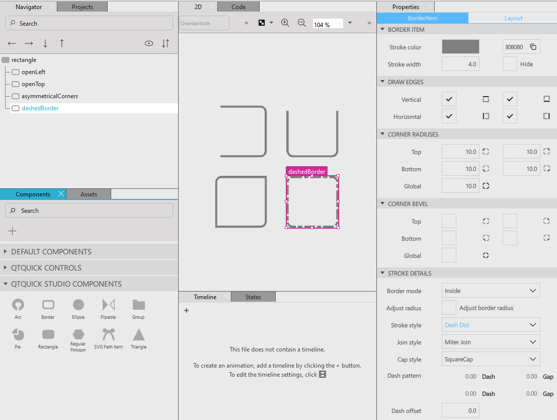
The QML code looks as follows:
BorderItem {
    id: openLeft
    width: 99
    height: 99
    antialiasing: true
    drawLeft: false
    strokeColor: "gray"
}

BorderItem {
    id: openTop
    width: 99
    height: 99
    antialiasing: true
    strokeColor: "#808080"
    drawTop: false
}

BorderItem {
    id: asymmetricalCorners
    width: 99
    height: 99
    antialiasing: true
    bottomLeftRadius: 0
    topRightRadius: 0
    strokeColor: "#808080"
}

BorderItem {
    id: dashedBorder
    width: 99
    height: 99
    antialiasing: true
    strokeStyle: 4
    strokeColor: "#808080"
}
Property Documentation
adjustBorderRadius : bool
It defines how the border radius is calculated for the corners.
bevel : bool
Whether the border corner is beveled.
borderMode : int
It defines where the border is drawn.
| Constant | Description |
|---|---|
Border.Inside | The border is drawn along the inside edge of the item and does not affect the item width. This is the default value. |
Border.Middle | The border is drawn over the edge of the item and does not affect the item width. |
Border.Outside | The border is drawn along the outside edge of the item and increases the item width by the value of strokeWidth. |
The default value is 0, which sets the border along the inside edge of the Item.
See also strokeWidth.
bottomLeftBevel : bool
The bevel of the bottom left border corner.
See also bevel.
bottomLeftRadius : int
The radius of the bottom left border corner.
See also radius.
bottomRightBevel : bool
The bevel of the bottom right border corner.
See also bevel.
bottomRightRadius : int
The radius of the bottom right border corner.
See also radius.
capStyle : int
The cap style defines how the end points of lines are drawn using QPainter. The cap style only applies to lines with width 1 or greater. The cap style can be square, flat, or round.
The default is Qt::SquareCap
See also QPen::capStyle().
dashOffset : alias
The starting point of the dash pattern for the border line.
The offset is measured in terms of the units used to specify the dash pattern. For example, a pattern where each stroke is four units long, followed by a gap of two units, will begin with the stroke when drawn as a line. However, if the dash offset is set to 4.0, any line drawn will begin with the gap. Values of the offset up to 4.0 will cause part of the stroke to be drawn first, and values of the offset between 4.0 and 6.0 will cause the line to begin with part of the gap.
The default value is 0.
See also QPen::setDashOffset().
dashPattern : alias
The dash pattern of the border line specified as the dashes and the gaps between them.
The dash pattern is specified in units of the pen's width. That is, a dash with the length 5 and width 10 is 50 pixels long.
Each dash is also subject to cap styles, and therefore a dash of 1 with square cap set will extend 0.5 pixels out in each direction resulting in a total width of 2.
The default capStyle is ShapePath.SquareCap, meaning that a square line end covers the end point and extends beyond it by half the line width.
The default value is (4, 2), meaning a dash of 4 * strokeWidth pixels followed by a space of 2 * strokeWidth pixels.
See also QPen::setDashPattern().
drawBottom : bool
Whether the bottom border is visible.
The border segment is drawn if this property is set to true.
drawLeft : bool
Whether the left border is visible.
The border segment is drawn if this property is set to true.
drawRight : bool
Whether the right border is visible.
The border segment is drawn if this property is set to true.
drawTop : bool
Whether the top border is visible.
The border segment is drawn if this property is set to true.
joinStyle : int
The join style is used to connect two border line segments.
| Constant | Description |
|---|---|
ShapePath.MiterJoin | The outer edges of the lines are extended to meet at an angle, and this area is filled. |
ShapePath.BevelJoin | The triangular notch between the two lines is filled. This is the default value. |
ShapePath.RoundJoin | A circular arc between the two lines is filled. |
See also Qt::PenJoinStyle.
radius : int
The radius used to draw rounded corners. The default value is 10. If radius is non-zero, the corners will be rounded, otherwise they will be sharp.
If radius is non-zero, the corners will be rounded, otherwise they will be sharp. The radius can also be specified separately for each corner by using the bottomLeftRadius, bottomRightRadius, topLeftRadius, and topRightRadius properties.
strokeColor : alias
The color used to draw the border of the border. When set to transparent, no line is drawn. The default value is red.
See also QColor.
strokeStyle : int
The style of the border stroke.
When set to None, no stroke is drawn.
The stroke can be set to have a Solid, Dash, Dot, Dash Dot, or Dash Dot Dot pattern.
The default value is Solid.
strokeWidth : alias
The width of the border line. The default value is 4. A width of 1 creates a thin line. For no line, use a negative value or a transparent color.
Note: The width of the border does not affect its position relative to other items if anchors are used.
topLeftBevel : bool
The bevel of the top left border corner.
See also bevel.
topLeftRadius : int
The radius of the top left border corner.
See also radius.
topRightBevel : bool
The bevel of the top right border corner.
See also bevel.
topRightRadius : int
The radius of the top right border corner.
See also radius.
© 2026 The Qt Company Ltd. Documentation contributions included herein are the copyrights of their respective owners. The documentation provided herein is licensed under the terms of the GNU Free Documentation License version 1.3 as published by the Free Software Foundation. Qt and respective logos are trademarks of The Qt Company Ltd. in Finland and/or other countries worldwide. All other trademarks are property of their respective owners.
