TriangleItem QML Type
A triangle. More...
| Import Statement: | import QtQuick.Studio.Components |
| Since: | QtQuick.Studio.Components 1.0 |
| Inherits: |
Properties
- arcRadius : real
- bottomMargin : real
- capStyle : int
- dashOffset : alias
- dashPattern : alias
- fillColor : alias
- gradient : alias
- joinStyle : int
- leftMargin : real
- radius : int
- rightMargin : real
- strokeColor : alias
- strokeStyle : int
- strokeWidth : alias
- topMargin : real
Detailed Description
The Triangle type can be used to draw triangles with different dimensions and shapes. The type is enclosed in an invisible Rectangle type. The size of the triangle is determined by the size of the bounding rectangle. The dimensions of the triangle can be changed to make it elongated or squat with space around it by using the leftMargin, topMargin, rightMargin, and bottomMargin properties. The margins are set between the triangle and the edges of the parent rectangle.
Each Triangle item is painted using either a solid fill color, specified using the fillColor property, or a gradient, defined using one of the ShapeGradient subtypes and set using the gradient property. If both a color and a gradient are specified, the gradient is used.
An optional border can be added to a triangle with its own color and thickness by setting the strokeColor and strokeWidth properties. Setting the color to transparent creates a border without a fill color.
Example Usage
You can use the Triangle component in Qt Design Studio to create triangles in different shapes and colors.
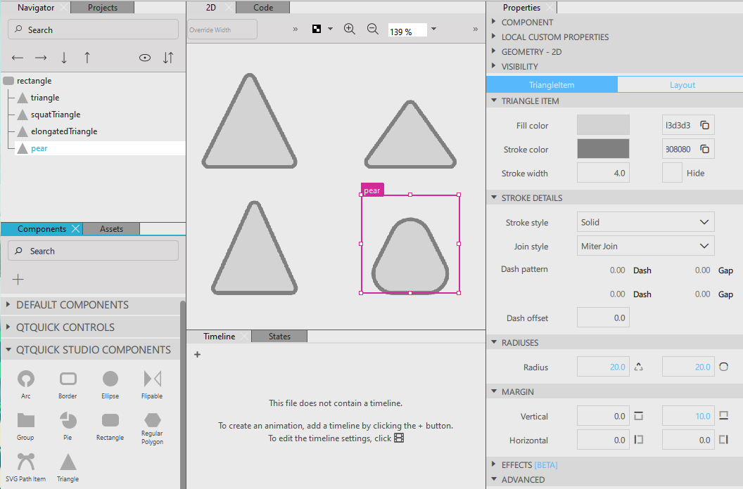
The QML code looks as follows:
TriangleItem {
    id: triangle
    x: 845
    y: 265
    strokeColor: "gray"
    fillColor: "light gray"
}

TriangleItem {
    id: squatTriangle
    x: 1009
    y: 265
    bottomMargin: 10
    topMargin: 30
    fillColor: "#d3d3d3"
    strokeColor: "#808080"
}

TriangleItem {
    id: elongatedTriangle
    x: 845
    y: 394
    rightMargin: 10
    leftMargin: 10
    fillColor: "#d3d3d3"
    strokeColor: "#808080"
}

TriangleItem {
    id: pear
    x: 1009
    y: 394
    radius: 20
    fillColor: "light gray"
    bottomMargin: 10
    arcRadius: 20
    strokeColor: "#808080"
}
Property Documentation
arcRadius : real
The radius used to draw rounded corners. The default value is 5. If radius is non-zero, the corners will be rounded, otherwise they will be sharp.
This property can be used together with the radius property to determine the shape of the triangle.
bottomMargin : real
The top margin between the triangle and the bounding rectangle. Setting the top and bottom margins makes the triangle shorter and moves it away from the edge.
See also topMargin, leftMargin, and rightMargin.
capStyle : int
The cap style defines how the end points of lines are drawn using QPainter. The cap style only applies to lines with width 1 or greater. The cap style can be square, flat, or round.
The default is Qt::SquareCap
See also QPen::capStyle().
dashOffset : alias
The starting point of the dash pattern for the triangle border.
The offset is measured in terms of the units used to specify the dash pattern. For example, a pattern where each stroke is four units long, followed by a gap of two units, will begin with the stroke when drawn as a line. However, if the dash offset is set to 4.0, any line drawn will begin with the gap. Values of the offset up to 4.0 will cause part of the stroke to be drawn first, and values of the offset between 4.0 and 6.0 will cause the line to begin with part of the gap.
The default value is 0.
See also QPen::setDashOffset().
dashPattern : alias
The dash pattern of the triangle border specified as the dashes and the gaps between them.
The dash pattern is specified in units of the pen's width. That is, a dash with the length 5 and width 10 is 50 pixels long.
Each dash is also subject to cap styles, and therefore a dash of 1 with square cap set will extend 0.5 pixels out in each direction resulting in a total width of 2.
The default value is (4, 2), meaning a dash of 4 * strokeWidth pixels followed by a space of 2 * strokeWidth pixels.
See also QPen::setDashPattern().
fillColor : alias
The triangle fill color.
A triangle can be filled with a solid color or with any of the linear, radial, or conical gradients.
When set to transparent, no filling occurs.
The default value is white.
gradient : alias
The gradient of the triangle fill color.
By default, no gradient is enabled and the value is null. In this case, the fill uses a solid color based on the value of fillColor.
When set, fillColor is ignored and filling is done using one of the ShapeGradient subtypes.
joinStyle : int
The join style is used to connect two border line segments.
| Constant | Description |
|---|---|
ShapePath.MiterJoin | The outer edges of the lines are extended to meet at an angle, and this area is filled. |
ShapePath.BevelJoin | The triangular notch between the two lines is filled. This is the default value. |
ShapePath.RoundJoin | A circular arc between the two lines is filled. |
See also Qt::PenJoinStyle.
leftMargin : real
The left margin between the triangle and the bounding rectangle. Setting the left and right margins makes the triangle thinner and moves it away from the edge.
See also rightMargin, topMargin, and bottomMargin.
radius : int
The radius used to draw rounded corners. The default value is 5. If radius is non-zero, the corners will be rounded, otherwise they will be sharp.
This property can be used together with the arcRadius property to determine the shape of the triangle.
See also arcRadius.
rightMargin : real
The right margin between the triangle and the bounding rectangle. Setting the left and right margins makes the triangle thinner and moves it away from the edge.
See also leftMargin, topMargin, and bottomMargin.
strokeColor : alias
The color used to draw the border of the triangle. When set to transparent, no line is drawn. The default value is red.
See also QColor.
strokeStyle : int
The style of the triangle stroke.
When set to None, no stroke is drawn.
The stroke can be set to have a Solid, Dash, Dot, Dash Dot, or Dash Dot Dot pattern.
The default value is Solid.
strokeWidth : alias
The width of the border of the triangle. The default value is 4. A width of 1 creates a thin line. For no line, use a negative value or a transparent color.
Note: The width of the triangle's border does not affect the geometry of the triangle itself or its position relative to other items if anchors are used.
The border is rendered within the triangle's boundaries.
topMargin : real
The top margin between the triangle and the bounding rectangle. Setting the top and bottom margins makes the triangle lower and moves it away from the edge.
See also bottomMargin, leftMargin, and rightMargin.
© 2026 The Qt Company Ltd. Documentation contributions included herein are the copyrights of their respective owners. The documentation provided herein is licensed under the terms of the GNU Free Documentation License version 1.3 as published by the Free Software Foundation. Qt and respective logos are trademarks of The Qt Company Ltd. in Finland and/or other countries worldwide. All other trademarks are property of their respective owners.
