Qt Interface Framework Vehicle Dashboard Example
Demonstrates the simulation control panel with a vehicle dashboard.
Introduction
This example shows how to enable the auto-generated Simulation Control Panel using the controlPanel annotation. The control panel opens a separate window at runtime where developers can inspect and modify all simulation backend properties without writing custom UI code.
The example defines a vehicle dashboard module with two interfaces:
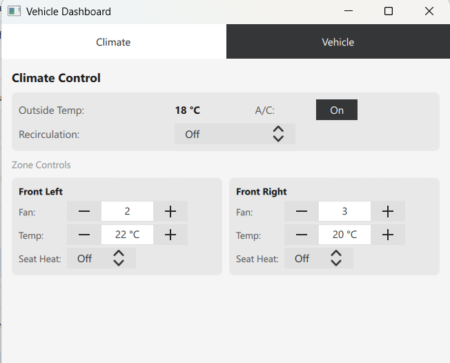
- ClimateControl - a zoned interface with per-zone properties (fan speed, target temperature, seat heating) and shared properties (air conditioning, recirculation mode, outside temperature).
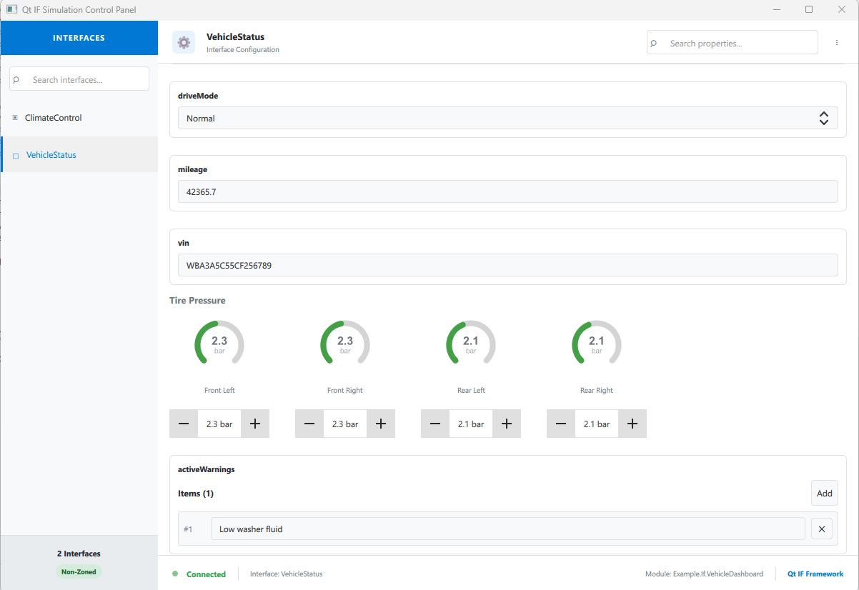
- VehicleStatus - a non-zoned interface demonstrating booleans, enums, strings, reals, structs, lists, and models.
Together these interfaces exercise every control type that the control panel can render, including SpinControl, BooleanControl, ComboBoxControl, TextControl, StructControl, ListControl, ModelControl, and UnsupportedControl.
The IDL File
The IDL file defines a module with two interfaces, two enums, and two structs. The key annotation that enables the control panel is at the module level:
@config_simulator: { controlPanel: true }
module Example.If.VehicleDashboard 1.0;
Zoned Interface with Shared Properties
The ClimateControl interface uses @config: { zoned: true } to enable zone support (see Zoned Features). Some properties are marked as shared using @config_simulator: { zoned: false } at the property level:
@config: { zoned: true }
interface ClimateControl {
    @config_simulator: { range: [0, 5] }
    int fanSpeedLevel;

    @config_simulator: { zoned: false }
    bool airConditioning;

    // ...
}
This demonstrates how the control panel handles both per-zone and shared properties in the same interface. Shared properties appear in a separate "Non-Zoned Properties" section in the control panel.
Annotations for Control Types
Different config_simulator annotations cause the control panel to select different editor controls:
| Annotation | Control Type |
|---|---|
@config_simulator: { range: [0, 5] } | SpinControl with min/max bounds |
@config_simulator: { minimum: 16, maximum: 30 } | SpinControl with separate min and max |
@config_simulator: { domain: [0, 1, 2, 3] } | ComboBoxControl with discrete values |
@config_simulator: { unsupported: true } | UnsupportedControl placeholder |
Properties without boundary annotations use a default control based on their type: BooleanControl for bool, ComboBoxControl for enum, TextControl for string / int / real, StructControl for structs, ListControl for lists, and ModelControl for models.
The TirePressure Struct
The VehicleStatus interface includes a tirePressure property of type TirePressure, which holds per-wheel readings:
struct TirePressure {
    real frontLeft;
    real frontRight;
    real rearLeft;
    real rearRight;
}
By default, the control panel renders this as a StructControl. This example replaces it with a custom arc-gauge editor described in the next section.
Simulation Data
A YAML file provides default values for the simulation backend, including per-zone defaults for the zoned interface:
Example.If.VehicleDashboard.ClimateControl#fanSpeedLevel:
    config_simulator:
        default:
            FrontLeft: 2
            FrontRight: 3
Custom Property Editors
The control panel selects a built-in control for each property type automatically. For cases where the default editor is not sufficient, you can replace it with a custom component that inherits CustomControlPanelComponent.
A custom component has two responsibilities:
- Read the current value from backendProperty, which is a JavaScript object whose fields match the IDL struct.
- Write changes back to the backend by calling setValue() with a new JavaScript object containing all struct fields.
This example provides TirePressureControl as a custom editor for the tirePressure property. It displays an arc gauge for each wheel with color-coded pressure state (red for critically low or over-inflated, amber for slightly low, green for nominal range), and a SpinBox to edit each wheel's value directly.
Wiring the Custom Editor
To use a custom panel file instead of the auto-generated one, add the controlPanelFile annotation to the module:
@config_simulator: { controlPanel: true, controlPanelFile: "qrc:///simulation/VehicleDashboardCustomPanel.qml" }
module Example.If.VehicleDashboard 1.0;
The custom panel file extends the auto-generated base class and assigns the custom component to the generated property for that specific struct field. The property follows the naming convention custom<InterfaceName><PropertyName>Component:
VehicleDashboardControlPanelBase {
    customVehicleStatusTirepressureComponent: Component {
        TirePressureControl {}
    }
}
Demo Application
When you run the example, two windows appear: the vehicle dashboard and the auto-generated control panel. Use the control panel to select an interface, switch between zones, and edit property values. Any change made in the control panel is immediately reflected in the dashboard, and vice versa, demonstrating two-way property binding through the shared simulation backend.
© 2026 The Qt Company Ltd. Documentation contributions included herein are the copyrights of their respective owners. The documentation provided herein is licensed under the terms of the GNU Free Documentation License version 1.3 as published by the Free Software Foundation. Qt and respective logos are trademarks of The Qt Company Ltd. in Finland and/or other countries worldwide. All other trademarks are property of their respective owners.
