Wind Turbine Dashboard
A wind turbine dashboard with 2D and 3D graphs.
The Wind Turbine Dashboard example demonstrates how to use both 2D and 3D graphs in a simulated real-world application.
Running the Example
You can run the example from:
- Qt Creator
Open the Welcome mode and select the example from Examples. For more information, see Qt Creator: Tutorial: Build and run.
- Qt Extension for Visual Studio Code
Run the Qt: Open Qt examples command from the Command Palette, and select the example from the list. For more information, see Qt Extension for Visual Studio Code: Tutorial: Build and run.
Overview of the Application
The example demonstrates a wind turbine monitoring dashboard, referred to as the Aerospace Hub, which displays simulated data from an imaginary wind turbine field. A variety of graph types are employed to visualize different kinds of data. For example, a 2D graph with a spline series illustrates hourly power output, while an accompanying area series represents the accumulated power over the same period. Multiple data views are available, allowing users to explore and analyze the information from different perspectives.
The main interface features a settings toolbar on the left. Depending on the selected mode, the layout may include a status pane, a dashboard of smaller graphs, a primary large graph, or a detailed settings panel - either individually or in combination. This flexible design enables users to customize their view and focus on the most relevant data for their current analysis.
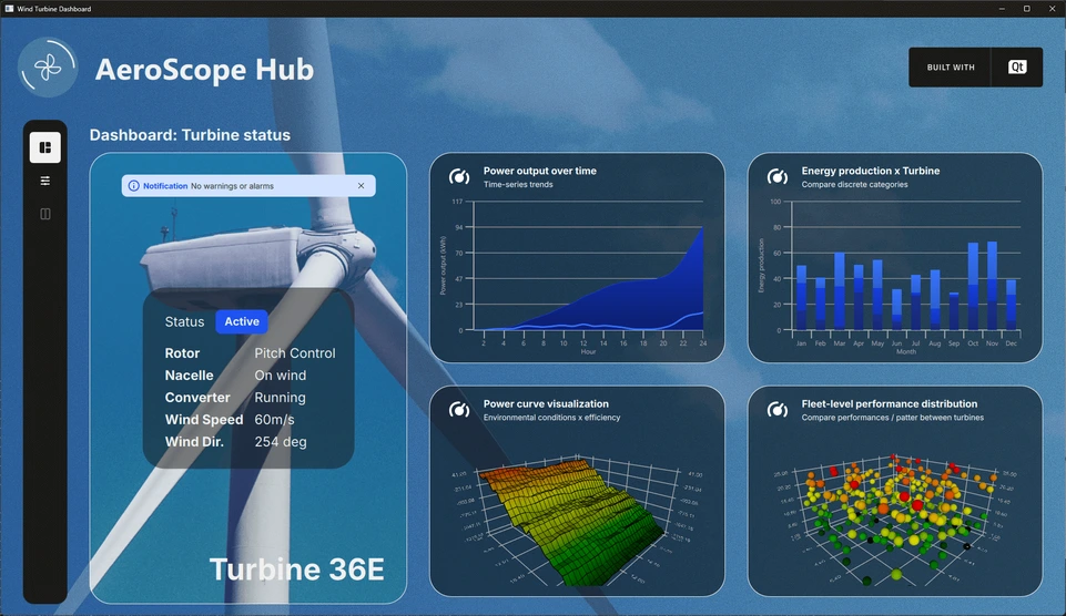
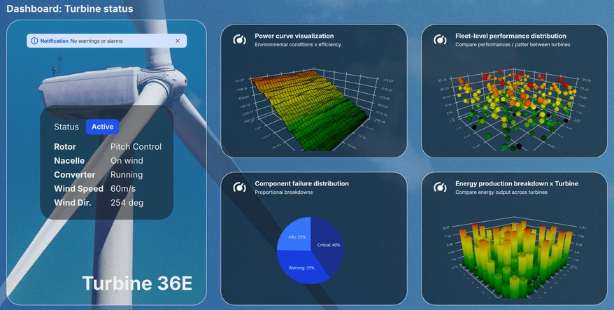
Dashboard View
The dashboard view presents the current system status alongside a scrollable pane that displays miniature previews of the various graphs. Up to four graphs are shown simultaneously, allowing users to conveniently browse through all six available visualizations and quickly assess key performance metrics at a glance.
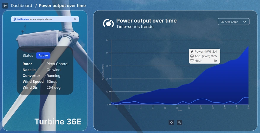
Detail View
The detail view, accessible by selecting a miniature graph from the dashboard, enables users to examine the chosen visualization in greater depth and at a larger scale. Depending on the graph type, users can zoom, pan, or rotate the view to explore the data interactively. Additionally, individual data points can be hovered over or clicked to reveal more detailed information about the specific item of interest.
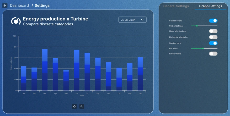
Settings View
The settings view, accessible by clicking either the settings button in the toolbar or in a miniature graph, allows users to adjust the visual theme of the graphs and modify settings specific to each graph type. Certain configurations persist after exiting the settings view, while others apply only within the current view, providing flexibility for both temporary and permanent adjustments.
Implementation Details
Everything in the application has been designed in a modular fashion. Main view, which is the Main.qml file, is an ApplicationWindow, which instantiates the data simulators for each graph, as well as the root Item holding all of the UI elements.
The FontLoader is used for applying a global font for the whole UI.
ApplicationWindow {
    ...

    FontLoader { ... }
    font.family: interFont.name

    // Data simulators
    PieSimulator {
        id: piesim
        ...
    }

    BarSimulator {
        id: barsim
        ...
    }

    LineSimulator {
        id: linesim
        ...
    }

    Data3DSimulator {
        id: barDataSimulator
        ...
    }

    Data3DSimulator {
        id: scatterDataSimulator
        ...
    }

    Data3DSimulator {
        id: surfaceDataSimulator
        ...
    }

    // Root item
    Item {...}
}
The root item holds the background graphics and a Layout handling the placement of each UI element in the view:
// Background image
Image {
    anchors.fill: parent
    source: root.state === "ShowSettings" ? "images/settings-bg.png"
                                          : "images/dashboard-bg.png"
    fillMode: Image.PreserveAspectCrop
}

// Everything except background image
ColumnLayout {
    anchors.fill: parent
    ...
Most of the elements have been taken out of the Main.qml file itself into their own QML components to be used in the layouts, like the ToolBarItem in the snippet below:
// Vertical toolbar
ToolBarItem {
    Layout.preferredWidth: GlobalSettings.toolbarwidth
    Layout.fillHeight: true
}

// Everything except vertical toolbar, header, and background image
ColumnLayout {
    id: maincontentview
    Layout.fillWidth: true
    Layout.fillHeight: true
    ...
Transitions between different view is handled using states and transitions:
states: [
    State {
        name: "ShowDashboard"
    },
    State {
        name: "ShowSettings"
        PropertyChanges {
            maincontent.opacity: 0
            settingscontent.opacity: 1
        }
        PropertyChanges {
            viewtextdesc.text: "/  Settings"
        }
    },
    ...
// Use transitions to bring the selected view to the front
transitions: [
    Transition {
        NumberAnimation {
            properties: "opacity"
            easing.type: Easing.InOutCubic
            duration: 1000
        }
    }
]
Dashboard
Dashboard is a part of the main content, another RowLayout inside the Layout hierarchy:
// Main content
RowLayout {
    id: maincontent
    Layout.fillWidth: true
    Layout.fillHeight: true
    ...
It is made up of a status pane and a dashboard pane:
// Status area; turbine image, notification, status texts, and turbine name
StatusPane {
    id: statuspane
    Layout.preferredWidth: GlobalSettings.statusimagewidth
    Layout.fillHeight: true
}

// Scrollable dashboard graph area, shown when in ShowDashboard state
DashboardPane {
    id: dashboardpane
    contentheight: statuspane.height * 1.5
    Layout.preferredWidth: GlobalSettings.dashboardwidth
    Layout.fillHeight: true
}
Status Pane
Status pane has also been made up of smaller elements, implemented in their own QML components:
// Masking the turbine image of the background image
ImageItem {
    anchors.fill: parent
}

// Notification
NotificationItem {
    anchors.top: turbineimage.top
    anchors.horizontalCenter: turbineimage.horizontalCenter
    anchors.topMargin: GlobalSettings.doublespacing
    width: turbineimage.width / 1.25
}

// Status
StatusItem {
    anchors.centerIn: turbineimage
    width: turbineimage.width / 1.5
    height: turbineimage.width / 1.75
}

// Turbine name
Label {
    ...
The implementation of these is not relevant, so that part will be skipped.
Dashboard Pane
Dashboard is the element holding the six small graph previews. Only four of those are visible at a time, so they have to be added inside an element that can be scrolled. In this case, it is done with a Flickable, which holds a GridLayout:
Flickable {
    property alias contentheight: content.height

    clip: true

    contentHeight: contentheight

    boundsBehavior: Flickable.StopAtBounds
    interactive: true
    visible: opacity > 0.5

    Item {
        id: content
        width: parent.width

        GridLayout {
            id: grid
            columns: 2
    ...
The graph previews are added inside the grid layout, and like most other elements, they have been implemented inside their own elements:
// Graph 1: Power output over time
SmallGraphItem {
    Layout.fillWidth: true
    Layout.fillHeight: true
    state: "Area2D"
    linesimulator: linesim
}

// Graph 2: Energy production x Turbine
SmallGraphItem {
    Layout.fillWidth: true
    Layout.fillHeight: true
    state: "Bar2D"
    barsimulator: barsim
}
...
The SmallGraphItem element is a generic one, holding all different graph types inside it, and the required type is given to it as a state.
SmallGraphItem has:
- A header element
- An instance of each graph type, for which visibility is set to false by default using an opacity trigger
- A rectangle to darken the preview
- A mouse area to handle hover and mouse clicks on the preview
Pie2DGraph {
    id: pie2d
    anchors.topMargin: header.height + GlobalSettings.defaultspacing
    anchors.rightMargin: GlobalSettings.defaultspacing
    anchors.fill: parent
    opacity: 0
    piesimulator: smallgraph.piesimulator
}

Bar3DGraph {
    id: bar3d
    anchors.topMargin: header.height + GlobalSettings.defaultspacing
    anchors.bottomMargin: GlobalSettings.defaultspacing
    anchors.fill: parent
    opacity: 0
    cameraZoomLevel: GlobalSettings.defaultzoom
    cameraPreset: GlobalSettings.defaultpreset
}
...
Opacities are used for transition animations, which is why they have been set to 0 in the previews by default. When opacity is animated above 0.5, the preview graph itself is set visible:
Bars3D {
    id: graph
    visible: opacity > 0.5
    ...
Details
Details is also a part of the main content, using the same RowLayout inside the Layout hierarchy. It is made up of the same status pane as the Dashboard, and a details pane:
// Details graph, shown when in correct state
BigGraphItem {
    id: detailspane
    Layout.preferredWidth: GlobalSettings.dashboardwidth
    Layout.fillHeight: true
    state: root.state
    radius: GlobalSettings.defaultradius
    piesimulator: piesim
    barsimulator: barsim
    linesimulator: linesim
    detailsview: true
}
The details pane, BigGraphItem, is similar to the SmallGraphItem in a sense that it also holds an instance of each graph in it, in addition to other elements:
// Graphs
Area2DGraph {
    id: area2dbig
    Layout.fillWidth: true
    Layout.fillHeight: true
    Layout.margins: GlobalSettings.defaultmargin
    opacity: 0
    panStyle: GraphsView.PanStyle.Drag
    zoomStyle: GraphsView.ZoomStyle.Center
    linesimulator: biggraph.linesimulator
    onVisibleChanged: {
        if (visible)
            biggraph.activegraph = area2dbig
    }
}

Bar2DGraph {
    id: bar2dbig
    Layout.fillWidth: true
    Layout.fillHeight: true
    Layout.margins: GlobalSettings.defaultmargin
    opacity: 0
    panStyle: GraphsView.PanStyle.Drag
    zoomStyle: GraphsView.ZoomStyle.Center
    barsimulator: biggraph.barsimulator
    onVisibleChanged: {
        if (visible)
            biggraph.activegraph = bar2dbig
    }
}
...
Other elements included are a dropdown combobox for selecting the graph type, control buttons for rotating, panning, and zooming - depending on the graph type - and a tooltip for the buttons. Like SmallGraphItem, the graph type shown is decided based on the state.
Settings
Settings has been taken outside the main content Layout, as it is not using any parts of the Dashboard or Details views:
// Settings
SettingsItem {
    id: settingscontent
    anchors.fill: parent
    ...
Settings view holds another BigGraphItem for displaying the graph, and a settings pane for adjusting either the GraphsTheme properties or some properties sepcific to the selected graph type.
// Graph detail
BigGraphItem {
    id: settingsgraph
    width: GlobalSettings.settingsgraphwidth
    anchors.top: parent.top
    anchors.bottom: parent.bottom
    anchors.topMargin: GlobalSettings.graphdetailmargin
    radius: GlobalSettings.defaultradius
    opacity: parent.opacity
    piesimulator: settingsitem.piesimulator
    barsimulator: settingsitem.barsimulator
    linesimulator: settingsitem.linesimulator
}

// Settings pane
Loader {
    active: settingsitem.visible
    asynchronous: true
    anchors.left: settingsgraph.right
    anchors.right: parent.right
    anchors.top: parent.top
    anchors.bottom: parent.bottom
    anchors.leftMargin: GlobalSettings.doublespacing

    sourceComponent: Item {
        StackLayout {
            id: settingspane
            anchors.fill: parent
    ...
Global Theme
The settings on the General Settings tab affect all graphs in the application. A global GraphsTheme has been implemented as a Singleton in GlobalSettings.qml:
pragma Singleton
...
QtObject {
    id: global
    ...
// Common graph theme
property var theme: GraphsTheme {
    plotAreaBackgroundVisible: false
    backgroundVisible: false
    colorScheme: GraphsTheme.ColorScheme.Dark
    theme: GraphsTheme.Theme.BlueSeries
    labelTextColor: "#AEAEAE"
    labelBackgroundVisible: true
    labelFont.pointSize: global.fontsize28px
    grid.mainColor: "#AEAEAE"
    grid.mainWidth: 1
    baseGradients: [ global.customgradient ]
}
This global shared theme is set to each graph as the theme:
theme: GlobalSettings.theme
As a singleton, the GlobalSettings.qml needs to be tagged as one in the CMakeLists.txt as well, to be usable in the application:
set_source_files_properties(qml/GlobalSettings.qml
    PROPERTIES QT_QML_SINGLETON_TYPE TRUE)
Graph Settings
The settings in the Graph Settings tab only affect the currently selected graph. These settings do not change the global theme, but the series in the active graph only.
© 2026 The Qt Company Ltd. Documentation contributions included herein are the copyrights of their respective owners. The documentation provided herein is licensed under the terms of the GNU Free Documentation License version 1.3 as published by the Free Software Foundation. Qt and respective logos are trademarks of The Qt Company Ltd. in Finland and/or other countries worldwide. All other trademarks are property of their respective owners.
