
PathRectangle QML Type
Defines a rectangle with settable corner styles. More...
| Import Statement: | import QtQuick |
| Since: | QtQuick 6.8 |
Properties
- bevel : bool
(since 6.10) - bottomLeftBevel : bool
(since 6.10) - bottomLeftRadius : real
- bottomRightBevel : bool
(since 6.10) - bottomRightRadius : real
- cornerShape : enumeration
(since 6.13) - height : real
- radius : real
- relativeX : real
- relativeY : real
- strokeAdjustment : real
- topLeftBevel : bool
(since 6.10) - topLeftRadius : real
- topRightBevel : bool
(since 6.10) - topRightRadius : real
- width : real
- x : real
- y : real
Detailed Description
PathRectangle provides an easy way to specify a rectangle, optionally with rounded, beveled or squircle-style corners. The API corresponds to that of the Rectangle item.

    Shape {
        id: rectangleShape
        width: 200
        height: 150
        anchors.centerIn: parent
        preferredRendererType: Shape.CurveRenderer

        ShapePath {
            fillColor: "#3ad23c"

            PathRectangle {
                width: rectangleShape.width
                height: rectangleShape.height
                topLeftRadius: 30
                bottomRightRadius: 30
                bevel: true
            }
        }
    }
In addition to the plain circular-arc rounding controlled by radius, corners can be rendered as a "squircle" (a curve whose curvature changes gradually rather than switching abruptly from a straight line into a circular arc, popularized by app icons and UI designs) by setting cornerShape to PathRectangle.Squircle. This gives the corners a softer, more organic look than PathRectangle.Rounded.
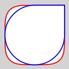
The image above compares a squircle (red) to a rounded rectangle (blue) with the same radius, half the width of the shape. The squircle corners are approximated using cubic Bezier curves rather than being derived from the mathematical definition of a squircle (a superellipse). This gives a close visual approximation of that curve, but the result is not an exact match to it.
See also Path, PathLine, PathQuad, PathCubic, PathArc, PathAngleArc, PathCurve, and PathSvg.
Property Documentation
bevel : bool [since 6.10]
This property defines whether the corners of the rectangle are beveled.
Setting it to false results in either sharp or rounded corners, depending on the values of the individual radius properties.
This property may be overridden by the individual bevel properties.
    Shape {
        id: rectangleShape
        width: 200
        height: 150
        anchors.centerIn: parent
        preferredRendererType: Shape.CurveRenderer

        ShapePath {
            fillColor: "#3ad23c"

            PathRectangle {
                width: rectangleShape.width
                height: rectangleShape.height
                topLeftRadius: 30
                bottomRightRadius: 30
                bevel: true
            }
        }
    }
This property is a convenience form of cornerShape: setting it to true is equivalent to setting cornerShape to PathRectangle.Bevel, and setting it to false is equivalent to setting cornerShape to PathRectangle.Rounded. Reading it returns true only when cornerShape is PathRectangle.Bevel.
Use cornerShape directly to select any of the other corner shapes.
This property was introduced in Qt 6.10.
See also topLeftBevel, topRightBevel, bottomLeftBevel, bottomRightBevel, and cornerShape.
bottomLeftBevel : bool [since 6.10]
bottomRightBevel : bool [since 6.10]
topLeftBevel : bool [since 6.10]
topRightBevel : bool [since 6.10]
If set, these properties define the individual corner bevels. Setting them to false results in either sharp or rounded corners, depending on the values of the individual radius properties. Setting them to true results in bevelled corners. When unset, the value of bevel is used instead.
These properties are unset by default. Assign undefined to them to return them to the unset state.
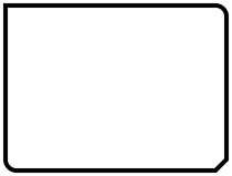
In the following example, bottomRightBevel is set to true:
    Shape {
        id: rectangleShape
        width: 200
        height: 150
        anchors.centerIn: parent
        preferredRendererType: Shape.CurveRenderer

        ShapePath {
            strokeColor: "black"
            strokeWidth: 4
            joinStyle: ShapePath.MiterJoin

            PathRectangle {
                width: rectangleShape.width
                height: rectangleShape.height
                radius: 10
                topLeftRadius: 0
                bottomRightBevel: true
            }
        }
    }
These properties are convenience forms of the individual corner shape properties: setting one to true is equivalent to setting the corresponding corner shape to PathRectangle.Bevel, while setting it to false returns that corner to the unset state, so that it follows cornerShape again.
Use the individual corner shape properties directly to select any of the other corner shapes.
These properties were introduced in Qt 6.10.
See also bevel, topLeftCornerShape, topRightCornerShape, bottomLeftCornerShape, and bottomRightCornerShape.
If set, these properties define the individual corner radii. A zero value defines that corner to be sharp, while a positive value defines it to be rounded. When unset, the value of radius is used instead.
These properties are unset by default. Assign undefined to them to return them to the unset state.
In the following example, radius is set to 10, and topLeftRadius to 0:
    Shape {
        id: rectangleShape
        width: 200
        height: 150
        anchors.centerIn: parent
        preferredRendererType: Shape.CurveRenderer

        ShapePath {
            strokeColor: "black"
            strokeWidth: 4
            joinStyle: ShapePath.MiterJoin

            PathRectangle {
                width: rectangleShape.width
                height: rectangleShape.height
                radius: 10
                topLeftRadius: 0
                bottomRightBevel: true
            }
        }
    }
Since Qt 6.13, a negative value defines that corner to be "inverted" (concave), as described for radius.
See also radius.
cornerShape : enumeration [since 6.13]
This property defines how the corners of the rectangle are rendered: sharp/rounded (PathRectangle.Rounded, the default), cut off in a straight line (PathRectangle.Bevel), or rendered as a smooth "squircle"-style curve (PathRectangle.Squircle).
| Constant | Description |
|---|---|
PathRectangle.Rounded | The corner is a plain circular arc (or sharp, if radius is 0). This is the default. |
PathRectangle.Bevel | The corner is cut off in a straight line. |
PathRectangle.Squircle | The corner is rounded using a curve whose curvature changes gradually, rather than switching abruptly from a straight line into a circular arc. This gives the corner a softer, more organic look, popularized by app icons and UI designs (sometimes called "squircle" or "continuous" corners). |
This property may be overridden by the individual corner shape properties.
    Shape {
        id: rectangleShape
        width: 200
        height: 150
        anchors.centerIn: parent
        preferredRendererType: Shape.CurveRenderer

        ShapePath {
            strokeColor: "black"
            strokeWidth: 4
            joinStyle: ShapePath.MiterJoin

            PathRectangle {
                width: rectangleShape.width
                height: rectangleShape.height
                radius: 40
                cornerShape: PathRectangle.Squircle
            }
        }
    }
This property was introduced in Qt 6.13.
See also topLeftCornerShape, topRightCornerShape, bottomLeftCornerShape, and bottomRightCornerShape.
Defines the width and height of the rectangle.
radius : real
This property defines the corner radius used to define a rounded rectangle.
This property may be overridden by the individual corner radius properties.
If radius is a positive value, the rectangle path will be defined as a rounded rectangle. If radius is zero, it will be defined as a normal rectangle.
Since Qt 6.13, if radius is negative, the corners are "inverted": instead of the usual convex curve, a concave, scooped-out curve of the same magnitude is used, for both the PathRectangle.Rounded and PathRectangle.Squircle corner shapes. This has no visible effect on PathRectangle.Bevel corners, since a straight bevel cut looks the same either way. Before Qt 6.13, a negative radius was treated like zero.
The effective radius is limited to half of the smaller of the rectangle's width and height, in both the positive and the negative direction.
Note: This differs from Rectangle, which draws a normal rectangle for a negative radius.
The default value is 0.
See also topLeftRadius, topRightRadius, bottomLeftRadius, and bottomRightRadius.
Defines the top left corner of the rectangle relative to the path's start point.
If both a relative and absolute end position are specified for a single axis, the relative position will be used.
Relative and absolute positions can be mixed, for example it is valid to set a relative x and an absolute y.
strokeAdjustment : real
This property defines the stroke width adjustment to the rectangle coordinates.
When used in a ShapePath with stroking enabled, the actual stroked rectangle will by default extend beyond the defined rectangle by half the stroke width on all sides. This is the expected behavior since the path defines the midpoint line of the stroking, and corresponds to QPainter and SVG rendering.
If one instead wants the defined rectangle to be the outer edge of the stroked rectangle, like a Rectangle item with a border, one can set strokeAdjustment to the stroke width. This will effectively shift all edges inwards by half the stroke width. Like in the following example:
ShapePath {
    id: myRec
    fillColor: "white"
    strokeColor: "black"
    strokeWidth: 16
    joinStyle: ShapePath.MiterJoin

    PathRectangle { x: 10; y: 10; width: 200; height: 100; strokeAdjustment: myRec.strokeWidth }
}Defines the top left corner of the rectangle.
Unless that corner is rounded, this will also be the start and end point of the path.
© 2026 The Qt Company Ltd. Documentation contributions included herein are the copyrights of their respective owners. The documentation provided herein is licensed under the terms of the GNU Free Documentation License version 1.3 as published by the Free Software Foundation. Qt and respective logos are trademarks of The Qt Company Ltd. in Finland and/or other countries worldwide. All other trademarks are property of their respective owners.
