Navigate component files
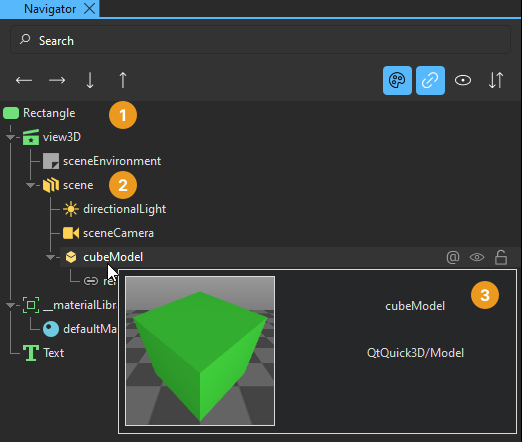
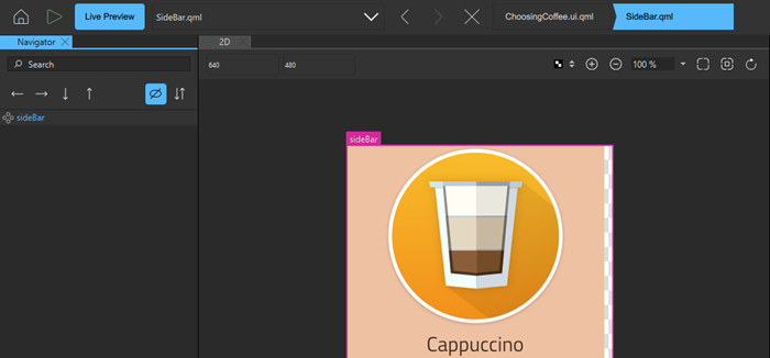
The Navigator view displays the components in the current component file and their relationships. Components (1) are listed in a tree structure, below their parent (2). To preview components, hover the mouse over them (3).
Select components in the Navigator view to edit their properties in the Properties view. Components can access the properties of their parent component. To select components in the 2D view, right-click a component, and select another component in the Selection submenu.
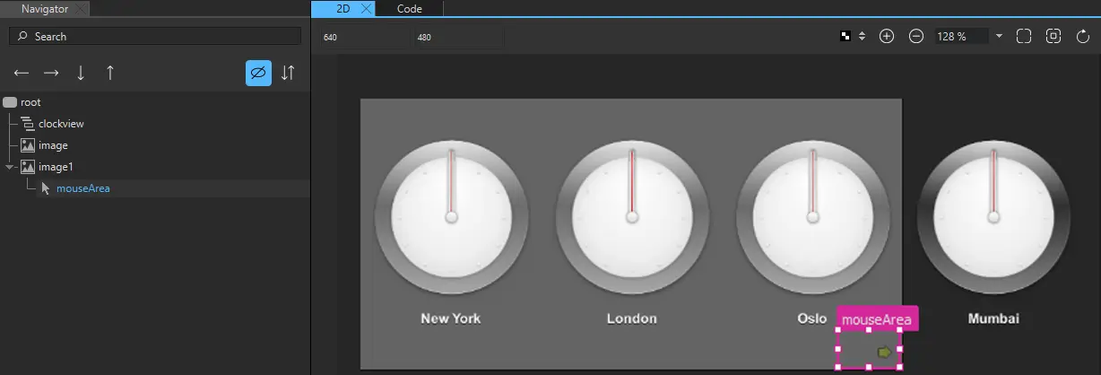
Typically, child components are located within the parent component in the 2D view. However, they do not necessarily have to fit inside the parent component. For example, you might want to make a mouse area larger than the rectangle or image beneath it.
When you copy a component, all its child components are also copied. When you remove a component, the child components are also removed.
Select context menu commands to apply commands to components. The availability of the commands depends on the component type. For example, you can change the source of an Image component by selecting Change Source URL in the context menu.
Colorize component icons
Colorize component icons to visually distinguish between different types of components in Navigator.
To toggle colorizing the component icons listed in Navigator, select  (Colorize Component Icons). The colorizing feature uses the following colors:
- Green for 2D components.
- Yellow for 3D components.
- Blue for materials and textures.
- Gray for other types of components.
Show and hide components in Navigator
Use the following methods to show and hide components in Navigator.
Show and hide reference nodes
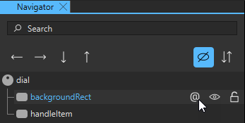
You can choose to show or hide reference nodes in Navigator. Click on a reference node to select the referenced node.
A component in Navigator may have nodes that are bound to one or more of its properties, which are referred to as reference nodes. Toggle on the visibility of reference nodes to show them as child nodes of each component. The referenced nodes appear nested under the current node, making it easier to trace bindings and inter-node dependencies.
To toggle the visibility of reference nodes, select  (Show reference nodes).
Show and hide other components
To show and hide components in the 2D view when focusing on specific parts of the application, select  and
and  in Navigator.
To change the visibility of a component in the application code, set its Visibility in the Properties view or select Visibility in the context menu.
You can also set the Opacity field to 0 in Properties to hide components in the UI that you want to apply animation to.
As all properties, visibility and opacity are inherited from the parent component. To hide or show child components, edit the properties of the parent component.
To show and hide invisible components in Navigator, select  .
.
Isolate nodes
You can isolate selected 2D nodes in Navigator to only show the nodes you need. Isolating nodes is useful when you have many nodes in Navigator you wish to hide, and do not wish to select and hide them one by one.
To isolate nodes:
- Select the nodes you wish to hide in Navigator.
- Right-click the selected nodes to access the context menu, and select Isolate Selection or Shift + B.
Note: You can only use the Isolate Selection command if all the selected nodes are either 2D or 3D. You cannot use the command with a mixed selection of 2D and 3D nodes.
To show all nodes in Navigator, right-click the selected nodes and select Show All Nodes or select Alt/Option + B.
Lock components
When designing complex applications, it is easy to accidentally modify the properties of a component in one of the Qt Quick Designer views in ways that lead to surprising results. For example, the 2D view can become crowded and other components can get in the way when you are trying to select or transform a particular component, so that you end up transforming more components than you wanted to.
To lock components that you are not currently editing and their children, select  in Navigator. Locked components cannot be handled in any Qt Quick Designer views. Unlock the components when you want to edit them again.
You cannot select locked components in 2D nor access their properties in Properties.
If you attempt to remove a state that changes the properties of a locked component, you are prompted to confirm the removal.
If you have added easing curves to keyframe animations, you can lock and unlock them in the Curves view. If you lock the components that contain the easing curves, the lock status is synchronized between Navigator and Curves.
Arrange components
You can view the order of components in a component file in the Navigator or Code view or in the Edit mode. The order of components in the file also determines the order in which they are drawn in the 2D view. By default, components that are located at the top of the file are listed at the bottom of the Navigator tree and behind overlapping components in the 2D view. To list the components in the order in which they appear in the file, as some other tools do, select  .
.
To move a component to the top or bottom of the tree within its parent, right-click it in the Navigator, and select Arrange > Bring to Front or Send to Back. To move a component up or down, select Bring Forward or Send Backward.
To reverse the order of the selected components, select Arrange > Reverse.
You can also drag the component to another position in the tree or use the  and
and  buttons to move the component in the tree. You can use the
  and
and  buttons to change the parent of the component.
When you drag instances of components to the 2D view, the new component is added as a child of the component beneath it. When you move the components, it is not possible to determine whether you want to adjust their position or attach them to a new parent component. Therefore, the parent component is not automatically changed.
Add property aliases
A property alias is a property that you can use from outside the component. When you view the code in the Code view or Edit mode, a property alias declaration looks like an ordinary property definition, except that it requires the alias keyword instead of a property type, and the right-hand-side of the property declaration must be a valid alias reference:
property alias <name>: <alias reference>For example, the following alias refers to a button component instance within an item component instance:
property alias button: item.buttonA valid alias reference:
- Can only point to a component instance or property within the component where the property alias is declared.
- Cannot contain arbitrary JavaScript expressions.
- Cannot point to components of another type than the component where the property alias is declared.
- Must be defined when the alias is first declared.
- Cannot point to attached properties.
- Cannot point to properties of nested component instances below the third level.
You can use the  (Export) button in Navigator to export a component as a property alias with a valid alias reference.
You can then use the property alias in other components to create connections to this component.
Move within components
The files that specify components (ui.qml, .qml) can contain instances of other components specified in separate files. You can open the file that specifies a component in different ways from different views:
- In the 2D or Navigator view, right-click an instance of a component and then select Edit Component in the context menu or select F2.
- In Properties, select Edit Base Component.
The component hierarchy is displayed as a bread crumb path, where you can select the component names to open the respective files. This enables you to easily navigate back to the top level when you are done editing the component.
See also How to: Design Qt Quick UIs, Qt Quick UI design, and Designing Qt Quick UIs.
Copyright © The Qt Company Ltd. and other contributors. Documentation contributions included herein are the copyrights of their respective owners. The documentation provided herein is licensed under the terms of the GNU Free Documentation License version 1.3 as published by the Free Software Foundation. Qt and respective logos are trademarks of The Qt Company Ltd in Finland and/or other countries worldwide. All other trademarks are property of their respective owners.
