Create shapes
Qt Quick Designer is a UI design tool rather than a generic drawing tool, and therefore, the focus is on providing ready-made UI controls that you can modify according to your needs. The values of some properties of the controls are specified by using styling, and therefore you cannot change them.
However, you can use some of the components in Components to draw basic shapes, such as rectangles. In addition, you can install the Qt Quick Shapes Design Helpers module to create more complex shapes, such as ellipse, polygon, and star in the 2D view.
Most visual components in Components are based on the Item component. Even though it has no visual appearance itself (similarly to a mouse area, for example), it defines all the properties that are common across visual components, such as position, size, and visibility. For more information, see Set basic component properties.
In addition, each component has a set of properties that specify its visual appearance and behavior. You can modify the property values to set fill and border colors, stroke width, and other characteristics of the shapes.
The following sections describe the available shapes and their properties in more detail. You can modify the values of the properties in the Properties view.
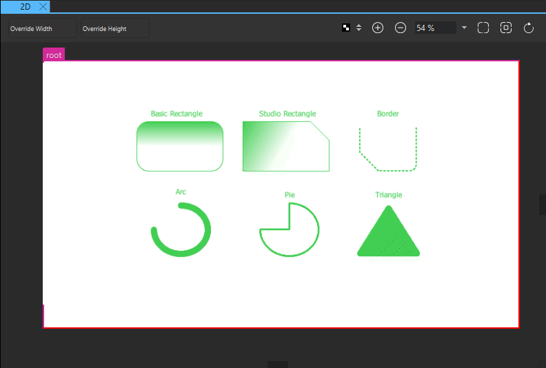
Rectangle
The basic Rectangle component is used for drawing shapes with four sides and corners, as well as a solid border.
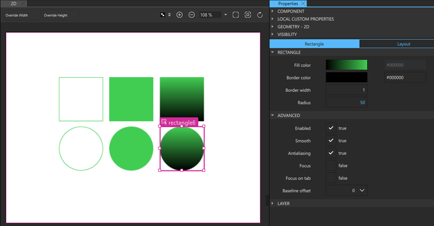
Rectangles can be filled either with a solid fill color or a linear gradient that you set in the Fill color field. You can also use a color picker to select colors and a gradient picker to select gradients from a predefined set of WebGradients.
An optional solid border can be added to a rectangle with its own color and thickness by setting the values of the Border color and Border width fields. To create a border without a fill color, select the  button that sets the color to transparent.
By setting the value of the Radius field, you can create shapes with rounded corners. With the right combination of the values of the rectangle width, height, and radius properties, you can create oval and circular shapes. For example, to draw a full circle, first draw a rectangle with all four sides equal, and then set its radius to half the side length.
When drawing curved edges, consider enabling Antialiasing in the Advanced section to improve the appearance of your shape.
RectangleShape
If you want to modify each corner of the rectangle independently or use a dashed border, create an instance of the RectangleShape component available in Components > Qt Quick Shapes Design Helpers instead of the basic Rectangle component available in Default Components > Basic.
By setting the values of properties in the Corner Radiuses section, you can draw each corner independently. By using radius values in combination with the values in the Corner Bevel section, you can create shapes with cut corners.
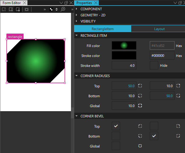
In addition to linear gradients, you can specify conical and radial gradients in the Fill color field.
In the Stroke Details section, you can specify the border mode, line style, and dash pattern for dashed and dotted lines.
EllipseShape
To add a full ellipse, an arc, or a filled pie slice, create an instance of the EllipseShape component available in Components > Qt Quick Shapes Design Helpers. Set Start angle and Sweep angle to control the appearance of the shape.
By default, the type renders a full ellipse. The interior is filled with the Fill color, and the outline is drawn according to Stroke color, Stroke width, and Stroke style.
To create an arc or a pie slice, set Start angle and Sweep angle to 0-360 degrees to define the segment of the ellipse to draw.
To create a simple arc (just the outline), set Fill color to Transparent. The arc's line style can be customized with Dash pattern and Dash offset.
To create a filled pie slice (a segment connected to the center), set Fill color. The outline of the slice will also be stroked.
To create a donut ring (a hollow ellipse), set Inner arc ratio to a value between 0.0 and 1.0. This defines the ratio of the inner ellipse's radius to the outer ellipse's radius.
The area inside the stroke is painted using either a solid fill color set in Fill color or a gradient defined using one of the Shape gradient types and set in Fill gradient. If you set both a color and a gradient, the gradient is used.
To add an optional border with its own color and thickness, set Stroke color and Stroke width. Set the color to transparent to create a border without a fill color.
To draw an ellipse with rounded corners, set Corner radius.
RegularPolygonShape
A regular polygon can be just a 2D polygon shaped stroke, a filling, or a stroke with filling. Set Stroke Details to change the appearance of the outline.
The area inside the stroke is painted using either a solid fill color or a gradient. If you set both a color and a gradient, the gradient is used.
To create a polygon with a stroke, set Side count between 3 to 100 and Stroke width to greater than 0.
To draw a polygon with rounded corners, set Corner radius.
StarShape
A star can be a star shaped stroke, a filling, or a stroke with filling. Set Stroke Details to change the appearance of the outline.
Set Point count between 3 and 60 to specify the number of points of the star. Set the ratio between 0.1 and 1 to specify the distance of the inner points of the star from the center.
The area inside the stroke is painted using either a solid fill color or a gradient. If you set both a color and a gradient, the gradient is used.
To create a star with a stroke, set Side count between 3 to 100 and Stroke width to greater than 0.
To draw a star with rounded corners, set Corner radius.
Summary of the shape components
The following table lists the components that you can use to draw shapes. The Location column indicates the location of the component in Components. The MCU support column indicates which components are supported on MCUs.
| Icon | Name | Location | MCU support | Purpose |
|---|---|---|---|---|
 | EllipseShape | A shape component that can render an ellipse, an arc, or a pie slice. | No | |
 | Rectangle | Default Components - Basic | Yes | A rectangle that is painted with a solid fill color or linear gradient and an optional border. You can use the radius property to draw circles. |
 | RectangleShape | Qt Quick Shapes Design Helpers | No | An extended rectangle that is painted with a solid fill color or linear, conical, or radial gradients, and corners that you can shape independently of each other. |
| RegularPolygonShape | Qt Quick Shapes Design Helpers | No | A filled regular polygon with an optional border. | |
| StarShape | Qt Quick Shapes Design Helpers | No | A filled star-shaped polygon with an optional border. |
See also How to: Use UI components, Qt Quick UI design, and Designing Qt Quick UIs.
Copyright © The Qt Company Ltd. and other contributors. Documentation contributions included herein are the copyrights of their respective owners. The documentation provided herein is licensed under the terms of the GNU Free Documentation License version 1.3 as published by the Free Software Foundation. Qt and respective logos are trademarks of The Qt Company Ltd in Finland and/or other countries worldwide. All other trademarks are property of their respective owners.
