Chapter 6 - Plot the data in the GraphsView
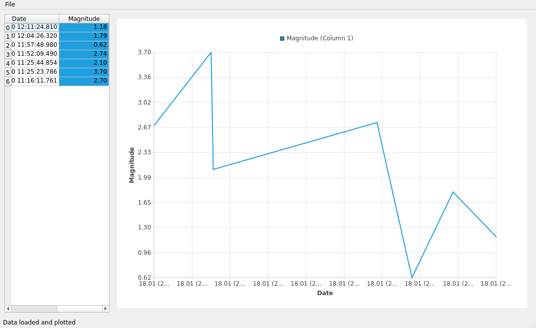
The last step of this tutorial is to plot the CSV data inside our GraphsView. For this, you need to go over our data and include the data on a QLineSeries.
After adding the data to the series, you can modify the axis to properly display the QDateTime on the X-axis, and the magnitude values on the Y-axis.
Here is the updated main_widget.py that includes an additional
function to plot data using a QLineSeries:
  1from math import floor, ceil
  2
  3from PySide6.QtCore import QDateTime, QTime, QTimeZone
  4from PySide6.QtWidgets import (QWidget, QHeaderView, QHBoxLayout, QTableView,
  5                               QSizePolicy)
  6from PySide6.QtQuickWidgets import QQuickWidget
  7from PySide6.QtGraphs import QLineSeries, QDateTimeAxis, QValueAxis, QGraphsTheme
  8
  9from table_model import CustomTableModel
 10
 11
 12class Widget(QWidget):
 13    def __init__(self, data):
 14        super().__init__()
 15
 16        # Getting the Model
 17        self.model = CustomTableModel(data)
 18
 19        # Creating a QTableView
 20        self.table_view = QTableView()
 21        self.table_view.setModel(self.model)
 22
 23        # QTableView Headers
 24        resize = QHeaderView.ResizeMode.ResizeToContents
 25        self.horizontal_header = self.table_view.horizontalHeader()
 26        self.vertical_header = self.table_view.verticalHeader()
 27        self.horizontal_header.setSectionResizeMode(resize)
 28        self.vertical_header.setSectionResizeMode(resize)
 29        self.horizontal_header.setStretchLastSection(True)
 30
 31        # Create QGraphView via QML
 32        self.populate_series()
 33        self.quick_widget = QQuickWidget(self)
 34        self.quick_widget.setResizeMode(QQuickWidget.ResizeMode.SizeRootObjectToView)
 35        self.theme = QGraphsTheme()
 36        self.theme.setTheme(QGraphsTheme.Theme.BlueSeries)
 37        initial_properties = {"theme": self.theme,
 38                              "axisX": self.axis_x,
 39                              "axisY": self.axis_y,
 40                              "seriesList": self.series}
 41        self.quick_widget.setInitialProperties(initial_properties)
 42        self.quick_widget.loadFromModule("QtGraphs", "GraphsView")
 43
 44        # QWidget Layout
 45        self.main_layout = QHBoxLayout(self)
 46        size = QSizePolicy(QSizePolicy.Policy.Preferred, QSizePolicy.Policy.Preferred)
 47
 48        # Left layout
 49        size.setHorizontalStretch(1)
 50        self.table_view.setSizePolicy(size)
 51        self.main_layout.addWidget(self.table_view)
 52
 53        # Right Layout
 54        size.setHorizontalStretch(4)
 55        self.quick_widget.setSizePolicy(size)
 56        self.main_layout.addWidget(self.quick_widget)
 57
 58    def populate_series(self):
 59        def seconds(qtime: QTime):
 60            return qtime.minute() * 60 + qtime.second()
 61
 62        self.series = QLineSeries()
 63        self.series.setName("Magnitude (Column 1)")
 64
 65        # Filling QLineSeries
 66        time_min = QDateTime(2100, 1, 1, 0, 0, 0)
 67        time_max = QDateTime(1970, 1, 1, 0, 0, 0)
 68        time_zone = QTimeZone(QTimeZone.Initialization.UTC)
 69        y_min = 1e37
 70        y_max = -1e37
 71        date_fmt = "yyyy-MM-dd HH:mm:ss.zzz"
 72        for i in range(self.model.rowCount()):
 73            t = self.model.index(i, 0).data()
 74            time = QDateTime.fromString(t, date_fmt)
 75            time.setTimeZone(time_zone)
 76            y = float(self.model.index(i, 1).data())
 77            if time.isValid() and y > 0:
 78                if time > time_max:
 79                    time_max = time
 80                if time < time_min:
 81                    time_min = time
 82                if y > y_max:
 83                    y_max = y
 84                if y < y_min:
 85                    y_min = y
 86                self.series.append(time.toMSecsSinceEpoch(), y)
 87
 88        # Setting X-axis
 89        self.axis_x = QDateTimeAxis()
 90        self.axis_x.setLabelFormat("dd.MM (h:mm)")
 91        self.axis_x.setTitleText("Date")
 92        self.axis_x.setMin(time_min.addSecs(-seconds(time_min.time())))
 93        self.axis_x.setMax(time_max.addSecs(3600 - seconds(time_max.time())))
 94        self.series.setAxisX(self.axis_x)
 95
 96        # Setting Y-axis
 97        self.axis_y = QValueAxis()
 98        self.axis_y.setLabelFormat("%.2f")
 99        self.axis_y.setTitleText("Magnitude")
100        self.axis_y.setMin(floor(y_min))
101        self.axis_y.setMax(ceil(y_max))
102        self.series.setAxisY(self.axis_y)
Now, run the application to visualize the earthquake magnitudes data at different times.
Try modifying the sources to get different output. For example, you could try to plot more data from the CSV.