Styles and Style Aware Widgets
Styles (classes that inherit QStyle) draw on behalf of widgets and encapsulate the look and feel of a GUI. The QStyle class is an abstract base class that encapsulates the look and feel of a GUI. Qt's built-in widgets use it to perform nearly all of their drawing, ensuring that they look exactly like the equivalent native widgets.
Qt comes with a selection of built-in styles. Certain styles are only available on specific platforms. Custom styles are made available as plugins or by creating an instance of a specific style class with QStyleFactory::create() and setting it with QApplication::setStyle().
Customizing a Style
In order to customize an existing style, inherit QProxyStyle and reimplement the desired virtual methods. QProxyStyle allows one to specify a certain base style, or it will automatically use the application style when the base style is left unspecified. The former gives a full control on the base style and works best if the customization expects a certain style behavior, whereas the latter provides a platform agnostic way to customize the application style that defaults to the native platform style.
Implementing a Custom Style
QCommonStyle provides a convenient base for full custom style implementations. The approach is same than with QProxyStyle, but inherit QCommonStyle instead and reimplement the appropriate virtual methods. Implementing a full custom style is somewhat involved, and we therefore provide this overview. We give a step-by-step walkthrough of how to style individual Qt widgets. We will examine the QStyle virtual functions, member variables, and enumerations.
The part of this document that does not concern the styling of individual widgets is meant to be read sequentially because later sections tend to depend on earlier ones. The description of the widgets can be used for reference while implementing a style. However, you may need to consult the Qt source code in some cases. The sequence in the styling process should become clear after reading this document, which will aid you in locating relevant code.
To develop style aware widgets (i.e., widgets that conform to the style in which they are drawn), you need to draw them using the current style. This document shows how widgets draw themselves and which possibilities the style gives them.
Classes for Widget Styling
These classes are used to customize an application's appearance and style.
Colors based on RGB, HSV or CMYK values | |
Color space abstraction | |
Transformation between color spaces | |
Encapsulates the common Look and Feel of a GUI | |
Mouse cursor with an arbitrary shape | |
Specifies a query for a font used for drawing text | |
Information about the fonts available in the underlying window system | |
General information about fonts | |
Represents an anchor between two items in a QGraphicsAnchorLayout | |
Layout where one can anchor widgets together in Graphics View | |
Contains color groups for each widget state | |
Abstract base class that encapsulates the look and feel of a GUI | |
Creates QStyle objects | |
Style hints that return more than basic data types | |
Style hints that return a QRegion | |
Style hints that return a QVariant | |
Stores the parameters used by QStyle functions | |
Convenience class for drawing QStyle elements inside a widget |
The QStyle Implementation
The API of QStyle contains functions that draw the widgets, static helper functions to do common and difficult tasks (e.g., calculating the position of slider handles) and functions to do the various calculations necessary while drawing (e.g., for the widgets to calculate their size hints). The style also helps some widgets with the layout of their contents. In addition, it creates a QPalette that contains QBrushes to draw with.
QStyle draws graphical elements; an element is a widget or a widget part like a push button bevel, a window frame, or a scroll bar. Most draw functions now take four arguments:
- an enum value specifying which graphical element to draw
- a QStyleOption specifying how and where to render that element
- a QPainter that should be used to draw the element
- a QWidget on which the drawing is performed (optional)
When a widget asks a style to draw an element, it provides the style with a QStyleOption, which is a class that contains the information necessary for drawing. Thanks to QStyleOption, it is possible to make QStyle draw widgets without linking in any code for the widget. This makes it possible to use QStyle's draw functions on any paint device, i.e., you can draw a combobox on any widget, not just on a QComboBox.
The widget is passed as the last argument in case the style needs it to perform special effects (such as animated default buttons on macOS), but it isn't mandatory.
In the course of this section, we will look at the style elements, the style options, and the functions of QStyle. Finally, we describe how the palette is used.
Items in item views are drawn by delegates in Qt. The item view headers are still drawn by the style. Qt's default delegate, QStyledItemDelegate, draws its items partially through the current style; it draws the check box indicators and calculates bounding rectangles for the elements of which the item consists. In this document, we only describe how to implement a QStyle subclass. If you wish to add support for other datatypes than those supported by the QStyledItemDelegate, you need to implement a custom delegate. Note that delegates must be set programmatically for each individual widget (i.e., default delegates cannot be provided as plugins).
The Style Elements
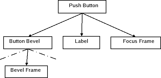
A style element is a graphical part of a GUI. A widget consists of a hierarchy (or tree) of style elements. For instance, when a style receives a request to draw a push button (from QPushButton, for example), it draws a label (text and icon), a button bevel, and a focus frame. The button bevel, in turn, consists of a frame around the bevel and two other elements, which we will look at later. Below is a conceptual illustration of the push button element tree. We will see the actual tree for QPushButton when we go through the individual widgets.
Widgets are not necessarily drawn by asking the style to draw only one element. Widgets can make several calls to the style to draw different elements. An example is QTabWidget, which draws its tabs and frame individually.
There are three element types: primitive elements, control elements, and complex control elements. The elements are defined by the ComplexControl, ControlElement, and PrimitiveElement enums. The values of each element enum has a prefix to identify their type: CC_ for complex elements, CE_ for control elements, and PE_ for primitive elements. We will in the following three sections see what defines the different elements and see examples of widgets that use them.
The QStyle class description contains a list of these elements and their roles in styling widgets. We will see how they are used when we style individual widgets.
Primitive Elements
Primitive elements are GUI elements that are common and often used by several widgets. Examples of these are frames, button bevels, and arrows for spin boxes, scroll bars, and combo boxes. Primitive elements cannot exist on their own: they are always part of a larger construct. They take no part in the interaction with the user, but are passive decorations in the GUI.
Control Elements
A control element performs an action or displays information to the user. Examples of control elements are push buttons, check boxes, and header sections in tables and tree views. Control elements are not necessarily complete widgets such as push buttons, but can also be widget parts such as tab bar tabs and scroll bar sliders. They differ from primitive elements in that they are not passive, but fill a function in the interaction with the user. Controls that consist of several elements often use the style to calculate the bounding rectangles of the elements. The available sub elements are defined by the SubElement enum. This enum is only used for calculating bounding rectangles; sub elements are not graphical elements to be drawn like primitive, control, and complex elements.
Complex Control Elements
Complex control elements contain sub controls. Complex controls behave differently depending on where the user handles them with the mouse and which keyboard keys are pressed. This is dependent on which sub control (if any) the mouse is over or pressed on. Examples of complex controls are scroll bars and combo boxes. With a scroll bar, you can use the mouse to move the slider and press the line up and line down buttons. The available sub controls are defined by the SubControl enum.
In addition to drawing, the style needs to provide the widgets with information on which sub control (if any) a mouse press was made on. For instance, a QScrollBar needs to know if the user pressed the slider, the slider groove, or one of the buttons.
Note that sub controls are not the same as the control elements described in the previous section. You cannot use the style to draw a sub control; the style will only calculate the bounding rectangle in which the sub control should be drawn. It is common, though, that complex elements use control and primitive elements to draw their sub controls, which is an approach that is frequently used by the built-in styles in Qt and also the Java style. For instance, the Java style uses PE_IndicatorCheckBox to draw the check box in group boxes (which is a sub control of CC_GroupBox). Some sub controls have an equivalent control element, e.g., the scroll bar slider (SC_SCrollBarSlider and CE_ScrollBarSlider).
Other QStyle Tasks
The style elements and widgets, as mentioned, use the style to calculate bounding rectangles of sub elements and sub controls. Pixel metrics, which are style-dependent sizes in screen pixels, are also used for measurements when drawing. The available rectangles and pixel metrics are represented by three enums in QStyle: SubElement, SubControl, and PixelMetric. Values of the enums can easily by identified as they start with SE_, SC_ and PM_.
The style also contains a set of style hints, which is represented as values in the StyleHint enum. All widgets do not have the same functionality and look in the different styles. For instance, when the menu items in a menu do not fit in a single column on the screen, some styles support scrolling while others draw more than one column to fit all items.
A style usually has a set of standard images (such as a warning, a question, and an error image) for message boxes, file dialogs, etc. QStyle provides the StandardPixmap enum. Its values represent the standard images. Qt's widgets use these, so when you implement a custom style you should supply the images used by the style that is being implemented.
The style calculates the spacing between widgets in layouts. There are two ways the style can handle these calculations. You can set the PM_LayoutHorizontalSpacing and PM_LayoutVerticalSpacing, which is the way the Java style does it (through QCommonStyle). Alternatively, you can implement QStyle::layoutSpacing() and QStyle::layoutSpacingImplementation() if you need more control over this part of the layout. In these functions you can calculate the spacing based on control types (QSizePolicy::ControlType) for different size policies (QSizePolicy::Policy) and also the style option for the widget in question.
Style Options
The sub-classes of QStyleOption contain all information necessary to style the individual elements. Style options are instantiated - usually on the stack - and filled out by the caller of the QStyle function. Depending on what is drawn the style will expect different a different style option class. For example, the QStyle::PE_FrameFocusRect element expects a QStyleOptionFocusRect argument, and it's possible to create custom subclasses that a custom style can use. The style options keep public variables for performance reasons.
The widgets can be in a number of different states, which are defined by the State enum. Some of the state flags have different meanings depending on the widget, but others are common for all widgets like State_Disabled. It is QStyleOption that sets the common states with QStyleOption::initFrom(); the rest of the states are set by the individual widgets.
Most notably, the style options contain the palette and bounding rectangles of the widgets to be drawn. Most widgets have specialized style options. QPushButton and QCheckBox, for instance, use QStyleOptionButton as their style option, which contains the text, icon, and the size of their icon. The exact contents of all options are described when we go through the individual widgets.
When reimplementing QStyle functions that take a QStyleOption parameter, you often need to cast the QStyleOption to a subclass (e.g., QStyleOptionFocusRect). For safety, you can use qstyleoption_cast() to ensure that the pointer type is correct. If the object isn't of the right type, qstyleoption_cast() returns nullptr. For example:
const QStyleOptionFocusRect *focusRectOption =
        qstyleoption_cast<const QStyleOptionFocusRect *>(option);
if (focusRectOption) {
    //...
}
The following code snippet illustrates how to use QStyle to draw the focus rectangle from a custom widget's paintEvent():
void MyWidget::paintEvent(QPaintEvent *event)
{
    QPainter painter(this);
    //...

    QStyleOptionFocusRect option;
    option.initFrom(this);
    option.backgroundColor = palette().color(QPalette::Window);

    style()->drawPrimitive(QStyle::PE_FrameFocusRect, &option, &painter,
                          this);
}
The next example shows how to derive from an existing style to customize the look of a graphical element:
class CustomStyle : public QProxyStyle
{
    Q_OBJECT

public:
    explicit CustomStyle(const QWidget *widget = nullptr);
    ~CustomStyle() {}

    void drawPrimitive(PrimitiveElement element, const QStyleOption *option,
                       QPainter *painter, const QWidget *widget) const override;
};

void CustomStyle::drawPrimitive(PrimitiveElement element, const QStyleOption *option,
                                QPainter *painter, const QWidget *widget) const
{
    if (element == PE_IndicatorSpinUp || element == PE_IndicatorSpinDown) {
        QPolygon points(3);
        int x = option->rect.x();
        int y = option->rect.y();
        int w = option->rect.width() / 2;
        int h = option->rect.height() / 2;
        x += (option->rect.width() - w) / 2;
        y += (option->rect.height() - h) / 2;

        if (element == PE_IndicatorSpinUp) {
            points[0] = QPoint(x, y + h);
            points[1] = QPoint(x + w, y + h);
            points[2] = QPoint(x + w / 2, y);
        } else { // PE_SpinBoxDown
            points[0] = QPoint(x, y);
            points[1] = QPoint(x + w, y);
            points[2] = QPoint(x + w / 2, y + h);
        }

        if (option->state & State_Enabled) {
            painter->setPen(option->palette.mid().color());
            painter->setBrush(option->palette.buttonText());
        } else {
            painter->setPen(option->palette.buttonText().color());
            painter->setBrush(option->palette.mid());
        }
        painter->drawPolygon(points);
    } else {
        QProxyStyle::drawPrimitive(element, option, painter, widget);
    }
}
QStyle Functions
The QStyle class defines three functions for drawing the primitive, control, and complex elements: drawPrimitive(), drawControl(), and drawComplexControl(). The functions takes the following parameters:
- the enum value of the element to draw.
- a QStyleOption which contains the information needed to draw the element.
- a QPainter with which to draw the element.
- a pointer to a QWidget, typically the widget that the element is painted on.
Not all widgets send a pointer to themselves. If the style option sent to the function does not contain the information you need, you should check the widget implementation to see if it sends a pointer to itself.
The QStyle class also provides helper functions that are used when drawing the elements. The drawItemText() function draws text within a specified rectangle, taking a QPalette as a parameter. The drawItemPixmap() function helps to align a pixmap within a specified bounding rectangle.
Other QStyle functions do various calculations for the functions that do drawing. The widgets also use these functions for calculating size hints and bounding rectangles if they draw several style elements themselves. As with the functions that draw elements, the helper functions typically take the same arguments.
- The subElementRect() function takes a SubElement enum value and calculates a bounding rectangle for a sub element. The style uses this function to know where to draw the different parts of an element. This is mainly done for reuse; if you create a new style, you can use the same location of sub elements as the super class.
- The subControlRect() function is used to calculate bounding rectangles for sub controls in complex controls. When you implement a new style, you reimplement
subControlRect()and calculate the rectangles that are different from the super class. - The pixelMetric() function returns a pixel metric, which is a style-dependent size given in screen pixels. It takes a value of the PixelMetric enum and returns the correct measurement. Note that pixel metrics do not necessarily have to be static measurements, but can be calculated with, for example, the style option.
- The hitTestComplexControl() function returns the sub control that the mouse pointer is over in a complex control. Usually, this is simply a matter of using subControlRect() to get the bounding rectangles of the sub controls, and then seeing which rectangle contains the position of the cursor.
QStyle also has the functions polish() and unpolish(). All widgets are sent to the polish() function before being shown and to unpolish() when they are hidden. You can use these functions to set attributes on the widgets or do other work that is required by your style. For instance, if you need to know when the mouse is hovering over the widget, you need to set the WA_Hover widget attribute. The State_MouseOver state flag will then be set in the widget's style options.
QStyle has a few static helper functions that do some common and difficult tasks. They can calculate the position of a slider handle from the value of the slider and transform rectangles and draw text considering reverse layouts; see the QStyle class documentation for more details.
The usual approach when one reimplements QStyle virtual functions is to do work on elements that are different from the super class; for all other elements, you can simply use the super class implementation.
The Palette
Each style provides a color - that is, QBrush - palette that should be used for drawing the widgets. There is one set of colors for the different widget states (QPalette::ColorGroup): active (widgets in the window that have keyboard focus), inactive (widgets used for other windows), and disabled (widgets that are disabled). The states can be found by querying the State_Active and State_Enabled state flags. Each set contains certain color roles given by the QPalette::ColorRole enum. The roles describe in which situations the colors should be used (e.g., for painting widget backgrounds, text, or buttons).
How the color roles are used is up to the style. For instance, if the style uses gradients, one can use a palette color and make it darker or lighter with QColor::darker() and QColor::lighter() to create the gradient. In general, if you need a brush that is not provided by the palette, you should try to derive it from one.
QPalette, which provides the palette, stores colors for different widget states and color roles. The palette for a style is returned by standardPalette(). The standard palette is not installed automatically when a new style is set on the application (QApplication::setStyle()) or widget (QWidget::setStyle()), so you must set the palette yourself with (QApplication::setPalette()) or (QWidget::setPalette()).
It is not recommended to hard-code colors, as applications and individual widgets can set their own palette and also use their style's palette for drawing. Note that none of Qt's widgets set their own palette. The Java style does hard-code some colors, but only as a decision of the author; it is not advised. Of course, it is not intended that the style should look good with any palette.
Implementation Issues
When you implement styles, there are several issues to consider. We will give some hints and advice on implementation here.
When implementing styles, it is necessary to look through the code of the widgets and code of the base class and its ancestors. This is because the widgets use the style differently, because the implementation in the different styles' virtual functions can affect the state of the drawing (e.g., by altering the QPainter state without restoring it and drawing some elements without using the appropriate pixel metrics and sub elements).
It is recommended that the styles do not alter the proposed size of widgets with the QStyle::sizeFromContents() function, but let the QCommonStyle implementation handle it instead. If changes need to be made, you should try to keep them small; application development may be difficult if the layout of widgets looks considerably different in the various styles.
Java Style
We have implemented a style that resembles the Java default look and feel (previously known as Metal). We have done this as it is relatively simple to implement and we wanted to build a style for this overview document. To keep it simple and not too extensive, we have simplified the style somewhat, but Qt is perfectly able to make an exact copy of the style. However, there are no concrete plans to implement the style as a part of Qt.
In this section we will have a look at some implementation issues. Finally, we will see a complete example on the styling of a Java widget. We will continue to use the Java style throughout the document for examples and widget images. The implementation itself is somewhat involved, and it is not intended that you should read through it.
Design and Implementation
The first step in designing the style was to select the base class. We chose to subclass QCommonStyle. This class implements most of the functionality we need, other than performing the actual drawing.
The style is implemented in one class. We have done this because we find it convenient to keep all code in one file. Also, it is an advantage with regards to optimization as we instantiate less objects. We also keep the number of functions at a minimum by using switches to identify which element to draw in the functions. This results in large functions, but since we divide the code for each element in the switches, the code should still be easy to read.
Limitations and Differences from Java
We have not fully implemented every element in the Java style. This way, we have reduced the amount and complexity of the code. In general, the style was intended as a practical example for this style overview document, and not to be a part of Qt itself.
Not all widgets have every state implemented. This goes for states that are common, e.g., State_Disabled. Each state is, however, implemented for at least one widget.
We have only implemented ticks below the slider. Flat push buttons are also left out. We do not handle the case where the title bars and dock window titles grow too small for their contents, but simply draw sub controls over each other.
We have not tried to emulate the Java fonts. Java and Qt use very different font engines, so we don't consider it worth the effort as we only use the style as an example for this overview.
We have hard-coded the colors (we don't use the QPalette) for the linear gradients, which are used, for example, for button bevels, tool bars, and check boxes. This is because the Java palette cannot produce these colors. Java does not change these colors based on widget color group or role anyway (they are not dependent on the palette), so it does not present a problem in any case.
It is Qt's widgets that are styled. Some widgets do not exist at all in Java, e.g., QToolBox. Others contain elements that the Java widgets don't. The tree widget is an example of the latter in which Java's JTree does not have a header.
The style does not handle reverse layouts. We assume that the layout direction is left to right. QCommonStyle handles reverse widgets; if we implemented reverse layouts, widgets that we change the position of sub elements, or handle text alignment in labels ourselves would need to be updated.
Styling Java Check Boxes
As an example, we will examine the styling of check boxes in the Java style. We describe the complete process and print all code in both the Java style and Qt classes involved. In the rest of this document, we will not examine the source code of the individual widgets. Hopefully, this will give you an idea on how to search through the code if you need to check specific implementation details; most widgets follow the same structure as the check boxes. We have edited the QCommonStyle code somewhat to remove code that is not directly relevant for check box styling.
We start with a look at how QCheckBox builds its style option, which is QStyleOptionButton for checkboxes:
    opt.initFrom(q);
    if (down)
        opt.state |= QStyle::State_Sunken;
    if (tristate && noChange)
        opt.state |= QStyle::State_NoChange;
    else
        opt.state |= checked ? QStyle::State_On : QStyle::State_Off;
    if (q->testAttribute(Qt::WA_Hover) && q->underMouse()) {
        if (hovering)
            opt.state |= QStyle::State_MouseOver;
        else
            opt.state &= ~QStyle::State_MouseOver;
    }
    opt.text = text;
    opt.icon = icon;
    opt.iconSize = q->size();
First we let QStyleOption set up the option with the information that is common for all widgets with initFrom(). We will look at this shortly.
QStyleOption's down variable is true when the user presses the box down; this is true of the checkbox whether the box is checked or not. The State_NoChange state is set when we have a tri-state checkbox and it is partially checked. It has State_On if the box is checked and State_Off if it is unchecked. State_MouseOver is set if the mouse hovers over the checkbox and the widget has attribute Qt::WA_Hover set - you set this in QStyle::polish(). In addition, the style option also contains the text, icon, and icon size of the button.
initFrom() sets up the style option with the attributes that are common for all widgets. We print its implementation here:
    state = QStyle::State_None;
    if (widget->isEnabled())
        state |= QStyle::State_Enabled;
    if (widget->hasFocus())
        state |= QStyle::State_HasFocus;
    if (widget->window()->testAttribute(Qt::WA_KeyboardFocusChange))
        state |= QStyle::State_KeyboardFocusChange;
    if (widget->underMouse())
        state |= QStyle::State_MouseOver;
    if (widget->window()->isActiveWindow())
        state |= QStyle::State_Active;

    direction = widget->layoutDirection();
    rect = widget->rect();
    palette = widget->palette();
    fontMetrics = widget->fontMetrics();
The State_Enabled is set when the widget is enabled. When the widget has focus the State_HasFocus flag is set. Equally, the State_Active flag is set when the widget is a child of the active window. The State_MouseOver will only be set if the widget has the WA_HoverEnabled windows flag set.
In addition to setting state flags the QStyleOption contains other information about the widget: direction is the layout direction of the layout, rect is the bounding rectangle of the widget (the area in which to draw), palette is the QPalette that should be used for drawing the widget, and fontMetrics is the metrics of the font that is used by the widget.
We give an image of a checkbox and the style option to match it.

The above checkbox will have the following state flags in its style option:
| State flag | Set |
|---|---|
State_Sunken | Yes |
State_NoChange | No |
State_On | Yes |
State_Off | No |
State_MouseOver | Yes |
State_Enabled | Yes |
State_HasFocus | Yes |
State_KeyboardFocusChange | No |
State_Active | Yes |
The QCheckBox paints itself in QWidget::paintEvent() with style option opt and QStylePainter p. The QStylePainter class is a convenience class to draw style elements. Most notably, it wraps the methods in QStyle used for painting. The QCheckBox draws itself as follows:
    QStylePainter p;
    QStyleOptionButton opt;
    initStyleOption(&opt);
    p.drawControl(QStyle::CE_CheckBox, opt);
QCommonStyle handles the CE_CheckBox element. The QCheckBox has two sub elements: SE_CheckBoxIndicator (the checked indicator) and SE_CheckBoxContents (the contents, which are used for the checkbox label). QCommonStyle also implements these sub element bounding rectangles. Next, we'll have a look at the QCommonStyle code:
    QStyleOptionButton subopt = *btn;
    subopt.rect = subElementRect(QStyle::SE_CheckBoxIndicator, btn, widget);
    drawPrimitive(QStyle::PE_IndicatorCheckBox, &subopt, p, widget);
    subopt.rect = subElementRect(QStyle::SE_CheckBoxContents, btn, widget);
    drawControl(QStyle::CE_CheckBoxLabel, &subopt, p, widget);
    if (btn->state & State_HasFocus) {
        QStyleOptionFocusRect fropt;
        fropt.QStyleOption::operator=(*btn);
        fropt.rect = subElementRect(QStyle::SE_CheckBoxFocusRect, btn, widget);
        drawPrimitive(QStyle::PE_FrameFocusRect, &fropt, p, widget);
    }
As can be seen from the code extract, the common style gets the bounding rectangles of the two sub elements of CE_CheckBox, and then draws them. If the checkbox has focus, the focus frame is also drawn.
The Java style draws CE_CheckBoxIndicator, while QCommonStyle handles CE_CheckboxLabel. We will examine each implementation and start with CE_CheckBoxLabel:
    const QStyleOptionButton *btn = qstyleoption_cast<const QStyleOptionButton *>(opt);
    uint alignment = visualAlignment(btn->direction, Qt::AlignLeft | Qt::AlignVCenter);
    if (!styleHint(SH_UnderlineShortcut, btn, widget))
        alignment |= Qt::TextHideMnemonic;
    QPixmap pix;
    QRect textRect = btn->rect;
    if (!btn->icon.isNull()) {
        const auto dpr = p->device()->devicePixelRatio();
        pix = btn->icon.pixmap(btn->iconSize, dpr,
                                btn->state & State_Enabled ? QIcon::Normal : QIcon::Disabled);
        drawItemPixmap(p, btn->rect, alignment, pix);
        if (btn->direction == Qt::RightToLeft)
            textRect.setRight(textRect.right() - btn->iconSize.width() - 4);
        else
            textRect.setLeft(textRect.left() + btn->iconSize.width() + 4);
    }
    if (!btn->text.isEmpty()){
        drawItemText(p, textRect, alignment | Qt::TextShowMnemonic,
            btn->palette, btn->state & State_Enabled, btn->text, QPalette::WindowText);
}visualAlignment() adjusts the alignment of text according to the layout direction. We then draw an icon if it exists, and adjust the space left for the text. drawItemText() draws the text, taking alignment, layout direction, and the mnemonic into account. It also uses the palette to draw the text in the right color.
The drawing of labels often gets somewhat involved. Luckily, it can usually be handled by the base class. The Java style implements its own push button label, since Java centers button contents also when the button has an icon. You can examine that implementation if you need an example of reimplementing label drawing.
We'll now take a look at the Java implementation of CE_CheckBoxIndicator in drawControl():
        case PE_IndicatorCheckBox: {
            painter->save();
            drawButtonBackground(option, painter, true);

            if (option->state & State_Enabled &&
                option->state & State_MouseOver &&
                !(option->state & State_Sunken)) {
                painter->setPen(option->palette.color(QPalette::Button));
                QRect rect = option->rect.adjusted(1, 1, -2, -2);
                painter->drawRect(rect);
                rect = rect.adjusted(1, 1, -1, -1);
                painter->drawRect(rect);
            }

            if (option->state & State_On) {
                QImage image(":/images/checkboxchecked.png");
                painter->drawImage(option->rect.topLeft(), image);
            }
            painter->restore();
            break;
We first save the state of the painter. This is not always necessary, but in this case the QCommonStyle needs the painter in the same state as it was when PE_IndicatorCheckBox was called (We could also set the state with function calls, of course). We then use drawButtonBackground() to draw the background of the check box indicator. This is a helper function that draws the background and also the frame of push buttons and check boxes. We take a look at that function below. We then check if the mouse is hovering over the checkbox. If it is, we draw the frame that Java checkboxes have when the box is not pressed down and the mouse is over it. You may note that Java does not handle tri-state boxes, so we have not implemented it.
Here we use a PNG image for our indicator. We could also check if the widget is disabled. We would then have to use another image with the indicator in the disabled color.
void JavaStyle::drawButtonBackground(const QStyleOption *option,
                                     QPainter *painter, bool isCheckbox) const
{
    QBrush buttonBrush = option->palette.button();
    bool sunken = option->state & State_Sunken;
    bool disabled = !(option->state & State_Enabled);
    bool on = option->state & State_On;

    if (!sunken && !disabled && (!on || isCheckbox))
        buttonBrush = gradientBrush(option->rect);

        painter->fillRect(option->rect, buttonBrush);

        QRect rect = option->rect.adjusted(0, 0, -1, -1);

        if (disabled)
            painter->setPen(option->palette.color(QPalette::Disabled,
                                                  QPalette::WindowText));
        else
            painter->setPen(option->palette.color(QPalette::Mid));

        painter->drawRect(rect);

        if (sunken && !disabled) {
            drawSunkenButtonShadow(painter, rect,
                   option->palette.color(QPalette::Mid),
                   option->direction == Qt::RightToLeft);
    }
}
We have seen how check boxes are styled in the Java style from the time the widget gets a paint request to the time the style is finished painting. To learn in detail how each widget is painted, you need to go through the code step-by-step as we have done here. However, it is usually enough to know which style elements the widgets draw. The widget builds a style option and calls on the style one or more times to draw the style elements of which it consists. Usually, it is also sufficient to know the states a widget can be in and the other contents of the style option, i.e., what we list in the next section.
Widget Walkthrough
In this section, we will examine how most of Qt's widgets are styled. Hopefully, this will save you some time and effort while developing your own styles and widgets. You will not find information here that is not attainable elsewhere (i.e., by examining the source code or the class descriptions for the style related classes).
We mostly use Java style widgets as examples. The Java style does not draw every element in the element trees. This is because they are not visible for that widget in the Java style. We still make sure that all elements are implemented in a way that conforms with the Java style, as custom widgets might need them (this does not exclude leaving implementations to QCommonStyle though).
The following is given for each widget:
- A table with the members (variables, etc.) of its style option.
- A table of the state flags (QStyle::StateFlag) that can be set on the widget and when the states are set.
- Its element tree (see section The Style Elements).
- An image of the widget in which the elements are outlined.
The element tree contains the primitive, control, and complex style elements. By doing a top-down traversal of the element tree, you get the sequence in which the elements should be drawn. In the nodes, we have written the sub element rectangles, sub control elements, and pixel metrics that should be considered when drawing the element of the node.
Our approach on styling centers on the drawing of the widgets. The calculations of sub elements rectangles, sub controls, and pixel metrics used during drawing is only listed as contents in the element trees. Note that there are rectangles and pixel metrics that are only used by widgets. This leaves these calculations untreated in the walkthrough. For instance, the subControlRect() and sizeFromContents() functions often call subElementRect() to calculate their bounding rectangles. We could draw trees for this as well. However, how these calculations are done is completely up to the individual styles, and they do not have to follow a specific structure (Qt does not impose a specific structure). You should still make sure that you use the appropriate pixel metrics, though. To limit the size of the document, we have therefore chosen not to include trees or describe the calculations made by the Java (or any other) style.
You may be confused about how the different pixel metrics, sub element rectangles, and sub control rectangles should be used when examining the trees. If you are in doubt after reading the QStyle enum descriptions, we suggest that you examine the QCommonStyle implementation.
Some of the bounding rectangles that we outline in the widget images are equal. Reasons for this are that some elements draw backgrounds while others draw frames and labels. If in doubt, check the description of each element in QStyle. Also, some elements are there to layout, i.e., decide where to draw, other elements.
Common Widget Properties
Some states and variables are common for all widgets. These are set with QStyleOption::initFrom(). Not all elements use this function; it is the widgets that create the style options, and for some elements the information from initFrom() is not necessary.
A table with the common states follows:
| State | State Set When |
|---|---|
State_Enabled | Set if the widget is not disabled (see QWidget::setEnabled()) |
State_Focus | Set if the widget has focus (see QWidget::hasFocus()) |
State_KeyboardFocusChange | Set when the user changes focus with the keyboard (see Qt::WA_KeyboardFocusChange) |
State_MouseOver | Set if the mouse cursor is over the widget |
State_Active | Set if the widget is a child of the active window. |
The other common members for widgets are:
| Member | Content |
|---|---|
| rect | The bounding rectangle of the element to draw. This is set to the widget bounding rectangle (QWidget::rect()). |
| direction | The layout direction; a value of the Qt::LayoutDirection enum. |
| palette | The QPalette to use when drawing the element. This is set to the widgets palette (QWidget::palette()). |
| fontMetrics | The QFontMetrics to use when drawing text on the widget. |
The complex style options (classes that inherit QStyleOptionComplex) used for complex style elements share two variables: subControls and activeSubControls. Both variables are an OR'ed combination of QStyle::SubControl enum values. They indicate which sub controls the complex control consists of and which of these controls are currently active.
As mentioned, the style calculates the size of the widget's contents, which the widgets calculate their size hints from. In addition, complex controls also use the style to test which sub-controls the mouse is over.
Widget Reference
Without further delay, we present the widget walkthrough; each widget has its own sub-section.
Push Buttons
The style structure for push buttons is shown below. By doing a top-down traversal of the tree, you get the sequence in which the elements should be drawn.
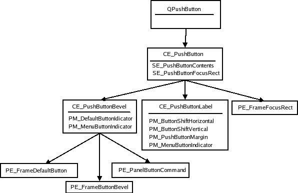
The layout of the buttons, with regard to element bounds, varies from style to style. This makes it difficult to show conceptual images of this. Also, elements may - even be intended to - have the same bounds; the PE_PushButtonBevel, for instance, is used in QCommonStyle to draw the elements that it contains: PE_FrameDefaultButton, PE_FrameButtonBevel, and PE_PanelButtonCommand, all of which have the same bounds in common style. PE_PushButtonBevel is also responsible for drawing the menu indicator (QCommonStyle draws PE_IndicatorArrowDown).
An image of a push button in the Java style that shows the bounding rectangles of the elements is given below. Colors are used to separate the bounding rectangles in the image; they do not fill any other purpose. This is also true for similar images for the other widgets.
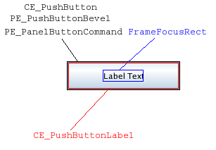
The Java style, as well as all other styles implemented in Qt, does not use PE_FrameButtonBevel. It is usual that a button with a PE_DefaultFrame adjusts the PE_PanelButtonCommand's rectangle by PM_ButtonDefaultIndicator. The CE_PushButtonLabel is found by adjusting the rect by PM_DefaultFrameWidth.
We will now examine the style option for push buttons - QStyleOptionButton. A table for the states that QPushButton can set on the style option follows:
| State | State Set When |
|---|---|
State_Sunken | Button is down or menu is pressed shown |
State_On | Button is checked |
State_Raised | Button is not flat and not pressed down |
Other members of QStyleOptionButton are:
| Member | Content |
|---|---|
| features | Flags of the QStyleOptionButton::ButtonFeatures enum, which describes various button properties (see enum) |
| icon | The buttons QIcon (if any) |
| iconSize | The QSize of the icon |
| text | a QString with the buttons text |
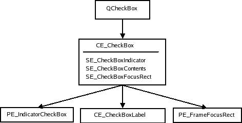
Check and Radio Buttons
The structures for radio and check buttons are identical. We show the structure using QCheckBox element and pixel metric names:
QStyleOptionButton is used as the style option for both check and radio buttons. We first give a table of the states that can be set in the option:
| State | State Set When |
|---|---|
State_sunken | The box is pressed down |
State_NoChange | The box is partially checked (for tri-state checkboxes.) |
State_On | The box is checked |
State_Off | The box is unchecked |
See Push Buttons for a table over other members in the QStyleOptionButton class.
Tabs
In Qt, QTabBar uses the style to draw its tabs. Tabs exist either in a QTabWidget, which contains a QTabBar, or as a separate bar. If the bar is not part of a tab widget, it draws its own base.
QTabBar lays out the tabs, so the style does not have control over tab placement. However, while laying out its tabs, the bar asks the style for PM_TabBarTabHSpace and PM_TabBarTabVSpace, which is extra width and height over the minimum size of the tab bar tab label (icon and text). The style can also further influence the tab size before it is laid out, as the tab bar asks for CT_TabBarTab. The bounding rectangle of the bar is decided by the tab widget when it is part of the widget (still considering CT_TabBarTab).
The tab bar is responsible for drawing the buttons that appear on the tab bar when all tabs do not fit. Their placement is not controlled by the style, but the buttons are QToolButtons and are therefore drawn by the style.
Here is the style structure for QTabWidget and QTabBar:
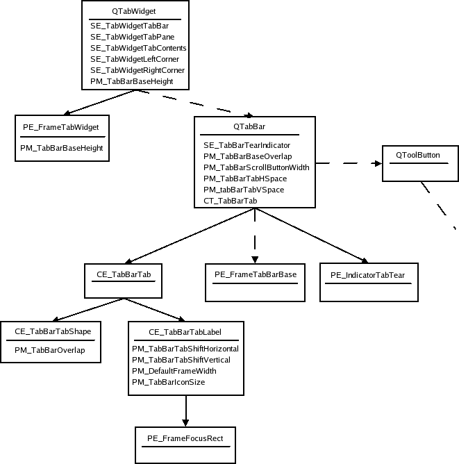
The dotted lines indicate that the QTabWidget contains a tab bar, but does not draw the tab bar itself. QTabBar only draws its base line when not part of a tab widget, and it keeps two tool buttons that scroll the bar when all tabs do not fit; see Tool Buttons for their element tree. Also note that since the buttons are children of the tab bar, they are drawn after the bar. The tabs' bounding rectangles overlap the base by PM_TabBarBaseOverlap.
Here is a tab widget in the Java style:
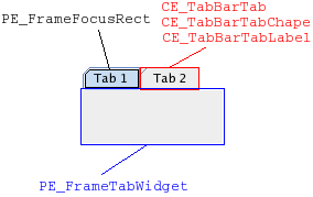
In the Java style, the tab bar shape and label have the same bounding rectangle as CE_TabBarTab. Notice that the tabs overlap with the tab widget frame. The base of the tab bar (if drawn) is the area where the tabs and frame overlap.
The style option for tabs (QStyleOptionTab) contains the necessary information for drawing tabs. The option contains the position of the tab in the tab bar, the position of the selected tab, the shape of the tab, the text, the icon, and the icon's size.
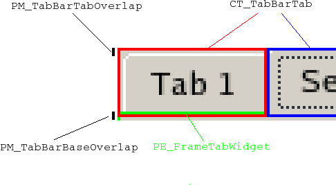
As the Java style tabs don't overlap, we also present an image of a tab widget in the common style. Note that if you want the tabs to overlap horizontally, you do that when drawing the tabs in CE_TabBarTabShape; the tabs bounding rectangles will not be altered by the tab bar. The tabs are drawn from left to right in a north tab bar shape, top to bottom in an east tab bar shape, etc. The selected tab is drawn last, so that it is easy to draw it over the other tabs (if it is to be bigger).
A table of the states a tab bar can set on its tabs follows:
| State | State Set When |
|---|---|
State_Sunken | The tab is pressed on with the mouse. |
State_Selected | If it is the current tab. |
State_HasFocus | The tab bar has focus and the tab is selected. |
Note that individual tabs may be disabled even if the tab bar is not. The tab will be active if the tab bar is active.
Here follows a table of QStyleOptionTab's members:
| Member | Content |
|---|---|
| cornerWidgets | Flags of the CornerWidget enum, which indicate if and which corner widgets the tab bar has. |
| icon | The QIcon of the tab. |
| iconSize | The QSize of the icon. |
| position | A TabPosition enum value that indicates the tab's position on the bar relative to the other tabs. |
| row | Holds which row the tab is in. |
| selectedPosition | A value of the SelectedPosition enum that indicates whether the selected tab is adjacent to or is the tab. |
| shape | A value of the QTabBar::Shape enum indicating whether the tab has rounded or triangular corners and the orientation of the tab. |
| text | The tab text. |
The frame for tab widgets use QStyleOptionTabWidgetFrame as style option. We list its members here. It does not have states set besides the common flags.
| Member | content |
|---|---|
| leftCornerWidgetSize | The QSize of the left corner widget (if any). |
| rightCornerWidgetSize | The QSize of the right corner widget (if any). |
| lineWidth | Holds the line with for drawing the panel. |
| midLineWith | This value is currently always 0. |
| shape | The shape of the tabs on the tab bar. |
| tabBarSize | The QSize of the tab bar. |
Scroll Bars
Here is the style structure for scrollbars:
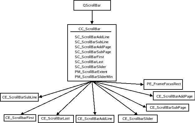
QScrollBar simply creates its style option and then draws CC_ScrollBar. Some styles draw the background of add page and sub page with PE_PanelButtonBevel, and also use indicator arrows to draw the arrows in the next and previous line indicators; we have not included these in the tree as their use is up to the individual style. The style's PM_MaximumDragDistance is the maximum distance in pixels the mouse can move from the bounds of the scroll bar and still move the handle.
Here is an image of a scrollbar in the Java style:
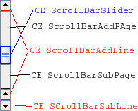
You may notice that the scrollbar is slightly different from Java's, as it has two line up indicators. We have done this to show that you can have two separate bounding rectangles for a single sub control. The scroll bar is an example of a widget that is entirely implemented by the Java style - QCommonStyle is not involved in the drawing.
We have a look at the different states a scroll bar can set on the style option:
| State | State Set When |
|---|---|
State_Horizontal | The scroll bar is horizontal. |
The style option of QScrollBar is QStyleOptionSlider. Its members are listed in the following table. The option is used by all QAbstractSliders; we only describe the members relevant for scroll bars here.
| Member | Content |
|---|---|
| maximum | The maximum value of the scroll bar. |
| minimum | The minimum value of the scroll bar. |
| notchTarget | The number of pixels between notches. |
| orientation | A value of the Qt::Orientation enum that specifies whether the scroll bar is vertical or horizontal. |
| pageStep | The number by which to increase or decrease the slider's value (relative to the size of the slider and its value range) on page steps. |
| singleStep | The number by which to increase or decrease the slider's value on single (or line) steps. |
| sliderValue | The value of the slider. |
| sliderPosition | The position of the slider handle. This is the same as sliderValue if the scroll bar is QAbstractSlider::tracking. If not, the scroll bar does not update its value before the mouse releases the handle. |
| upsideDown | Holds the direction in which the scroll bar increases its value. This is used instead of QStyleOption::direction for all abstract sliders. |
Sliders
When calculating the slider's size hint, PM_SliderThickness and PM_SliderLength are queried from the style. As with scroll bars, the QSlider only lets the user move the handle if the mouse is within PM_MaximumDragDistance from the slider bounds. When it draws itself, it creates the style option and calls drawComplexControl() with CC_Slider:
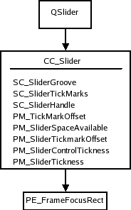
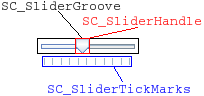
We also show a picture of a slider in the Java style. We show the bounding rectangles of the sub elements, as all drawing is done in CC_Slider.
QSlider uses QStyleOptionSlider as all QAbstractSliders do. We present a table with the members that affect QSlider:
| Member | Content |
|---|---|
| maximum | The maximum value of the slider. |
| minimum | The minimum value of the slider. |
| notchTarget | This is the number of pixels between each notch. |
| orientation | A Qt::Orientation enum value that indicates whether the slider is vertical or horizontal. |
| pageStep | The number by which to increase or decrease the slider's value on page steps. |
| singleStep | The number by which to increase or decrease the slider's value on single (or line) steps. |
| sliderValue | The value of the slider. |
| sliderPosition | The position of the slider given as a slider value. This will be equal to the sliderValue if the slider is tracking; if not, the slider's value will not change until the handle is released with the mouse. |
| upsideDown | This member is used instead of QStyleOption::direction for all abstract sliders. |
You should note that the slider does not use direction for reverse layouts; it uses upsideDown.
Spin Boxes
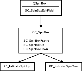
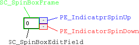
When QSpinBox paints itself, it creates a QStyleOptionSpinBox and asks the style to draw CC_SpinBox. The edit field is a line edit that is a child of the spin box. The dimensions of the field are calculated by the style with SC_SpinBoxEditField.
Here follows the style tree for spin boxes. It is not required that a style uses the button panel primitive to paint the indicator backgrounds. You can see an image below the tree showing the sub elements in QSpinBox in the Java style.
The QStyleOptionSpinBox, which is the style option for spin boxes. It can set the following states on the spin box:
| State | State Set When |
|---|---|
State_Sunken | Is set if one of the sub controls CC_SpinUp or CC_SpinDown is pressed on with the mouse. |
The rest of the members in the spin box style options are:
| Property | Function |
|---|---|
| frame | Boolean that is true if the spin box is to draw a frame. |
| buttonSymbols | Value of the ButtonSymbols enum that decides the symbol on the up/down buttons. |
| stepEnabled | A value of the StepEnabled enum, indicating which of the spin box buttons are pressed down. |
Title Bar
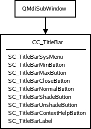
The title bar complex control, CC_TitleBar, is used to draw the title bars of internal windows in QMdiArea. It typically consists of a window title, and close, minimize, system menu, and maximize buttons. Some styles also provide buttons for shading the window, as well as a button for context sensitive help.
The bar is drawn in CC_TitleBar without using any sub elements. How the individual styles draw their buttons is up to them, but there are standard pixmaps for the buttons that the style should provide.
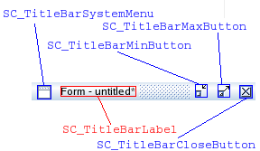
In an image over a title bar in the Java style, we show the bounding rectangles of the sub elements supported by the Java style (all of which are drawn with standard pixmaps). It is usual to draw the button backgrounds using PE_PanelButtonTool, but it's not mandatory.
The style option for title bars is QStyleOptionTitleBar. Its members are:
| Member | Content |
|---|---|
| icon | The title bar's icon. |
| text | The text for the title bar's label. |
| windowFlags | Flags of the Qt::WindowFlag enum. The window flags used by QMdiArea for window management. |
| titleBarState | This is the QWidget::windowState() of the window that contains the title bar. |
Combo Box
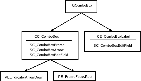
A QComboBox uses the style to draw the button and label of non-editable boxes with CC_ComboBox and CE_ComboBoxLabel.
The list that pops up when the user clicks on the combo box is drawn by a delegate, which we do not cover in this overview. You can, however, use the style to control the list's size and position with the sub element SC_ComboBoxListBoxPopup. The style also decides where the edit field for editable boxes should be with SC_ComboBoxEditField; the field itself is a QLineEdit that is a child of the combo box.
We show an image over a Java style combo box in which we have outlined its sub elements and sub element rectangles:
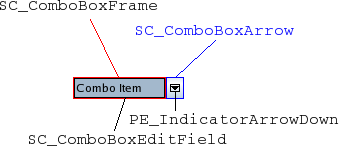
Java combo boxes do not use the focus rect; it changes its background color when it has focus. The SC_ComboBoxEdit field is used both by QComboBox to calculate the size of the edit field and the style for calculating the size of the combo box label.
The style option for combo boxes is QStyleOptionComboBox. It can set the following states:
| State | Set When |
|---|---|
State_Selected | The box is not editable and has focus. |
State_Sunken | SC_ComboBoxArrow is active. |
State_on | The container (list) of the box is visible. |
The style options other members are:
| Member | Content |
|---|---|
| currentIcon | The icon of the current (selected) item of the combo box. |
| currentText | The text of the current item in the box. |
| editable | Holds whether the combo box is editable or not. |
| frame | Holds whether the combo box has a frame or not. |
| iconSize | The size of the current items icon. |
| popupRect | The bounding rectangle of the combo box's popup list. |
Group Boxes
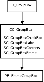
When calculating the size hint, QGroupBox fetches three pixel metrics from the style: PM_IndicatorWidth, PM_CheckBoxLabelSpacing, and PM_IndicatorHeight. QGroupBox has the following style element tree:
Qt does not impose restrictions on how the check box is drawn; the Java style draws it with CE_IndicatorCheckBox. See Check and Radio Buttons for the complete tree.
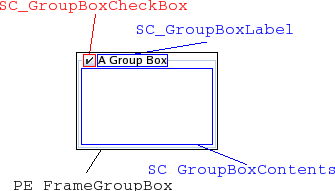
We also give an image of the widget with the sub controls and sub control rectangles drawn:
The style option for group boxes is QStyleOptionGroupBox. The following states can be set on it:
| State | Set When |
|---|---|
State_On | The check box is checked. |
State_Sunken | The check box is pressed down. |
State_Off | The check box is unchecked (or there is no check box). |
The remaining members of QStyleOptionGroupBox are:
| Member | Content |
|---|---|
| features | Flags of the QStyleOptionFrame::FrameFeatures enum describing the frame of the group box. |
| lineWidth | The line width with which to draw the panel. This is always 1. |
| text | The text of the group box. |
| textAlignment | The alignment of the group box title. |
| textColor | The QColor of the text. |
Splitters
As the structure of splitters are simple and do not contain any sub elements, we do not include any images of splitters. CE_Splitter does not use any other elements or metrics.
For its style option, the splitter uses the base class QStyleOption. It can set the following state flags on it:
| State | Set When |
|---|---|
State_Horizontal | Set if it is a horizontal splitter. |
QSplitter does not use initFrom() to set up its option; it sets the State_MouseOver and State_Disabled flags itself.
Progress Bar
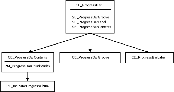
The CE_ProgressBar element is used by QProgressBar, and it is the only element used by this widget. We start with the style structure:
Here is a progress bar in the common style (the Java style bounding rectangles are equal):
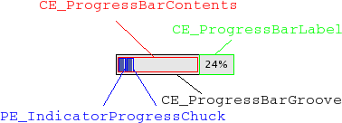
The style option for QProgressBar is QStyleOptionProgressBar. The bar does not set any state flags, but the other members of the option are:
| Member | Content |
|---|---|
| minimum | The minimum value of the bar. |
| maximum | The maximum value of the bar. |
| progress | The current value of the bar. |
| textAlignment | How the text is aligned in the label. |
| textVisible | Whether the label is drawn. |
| text | The label text. |
| orientation | Progress bars can be vertical or horizontal. |
| invertedAppearance | The progress is inverted (i.e., right to left in a horizontal bar). |
| bottomToTop | Boolean, that, if true, turns the label of vertical progress bars 90 degrees. |
Tool Buttons
Tool buttons exist either independently or as part of tool bars. They are drawn equally either way. The QToolButton draws only one style element: CC_ToolButton.
Below is a tree of the widget's style structure:
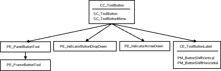
Note that PE_FrameButtonTool and PE_IndicatorArrowDown are included in the tree as the Java style draws them, but they can safely be omitted if you prefer it. The structure may also be different. QCommonStyle, for instance, draws both PE_IndicatorButtonDropDown and PE_IndicatorArrowDown in CE_ToolButton.
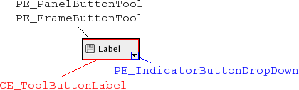
We also have an image of a tool button where we have outlined the sub element bounding rectangles and sub controls.
Here is the states table for tool buttons:
| State | Set When |
|---|---|
State_AutoRise | The tool button has the autoRise property set. |
State_Raised | The button is not sunken (i.e., by being checked or pressed on with the mouse). |
State_Sunken | The button is down. |
State_On | The button is checkable and checked. |
QStyleOptionToolButton also contains the following members:
| Member | Content |
|---|---|
| arrowType | A Qt::ArrowType enum value, which contains the direction of the buttons arrow (if an arrow is to be used in place of an icon). |
| features | Flags of the QStyleOptionToolButton::ButtonFeature enum describing if the button has an arrow, a menu, and/or has a popup-delay. |
| font | The QFont of the buttons label. |
| icon | The QIcon of the tool button. |
| iconSize | The icon size of the button's icon. |
| pos | The position of the button, as given by QWidget::pos() |
| text | The text of the button. |
| toolButtonStyle | A Qt::ToolButtonStyle enum value which decides whether the button shows the icon, the text, or both. |
Toolbars
Toolbars are part of the main window framework, and cooperate with the QMainWindow to which they belong while it builds its style option. A main window has 4 areas that toolbars can be placed in. They are positioned next to the four sides of the window (i.e., north, south, east and west). Within each area there can be more than one line of toolbars; a line consists of toolbars with equal orientation (vertical or horizontal) placed next to each other.
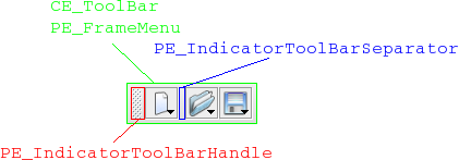
Toolbars in Qt consist of three elements: CE_ToolBar, PE_IndicatorToolBarHandle, and PE_IndicatorToolBarSeparator. It is QMainWindowLayout that calculates the bounding rectangles (i.e., position and size of the toolbars and their contents. The main window also uses the sizeHint() of the items in the toolbars when calculating the size of the bars.
Here is the element tree for QToolBar:
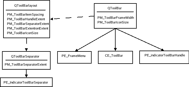
The dotted lines indicate that the QToolBar keeps an instance of QToolBarLayout and that QToolBarSeparators are kept by QToolBarLayout. When the toolbar is floating (i.e., has its own window) the PE_FrameMenu element is drawn, else QToolBar draws CE_ToolBar.
Here is an image of a toolbar in the Java style:
QToolBarSaparator uses QStyleOption for its style option. It sets the State_Horizontal flag if the toolbar it lives in is horizontal. Other than that, they use initFrom().
The style option for QToolBar is QStyleOptionToolBar. The only state flag set (besides the common flags) is State_Horizontal if the bar is horizontal (i.e., in the north or south toolbar area). The member variables of the style option are:
| Member | Content |
|---|---|
| features | Holds whether the bar is movable in a value of the ToolBarFeature, which is either Movable or None. |
| lineWidth | The width of the tool bar frame. |
| midLineWidth | This variable is currently not used and is always 0. |
| positionOfLine | The position of the toolbar line within the toolbar area to which it belongs. |
| positionWithinLine | The position of the toolbar within the toolbar line. |
| toolBarArea | The toolbar area in which the toolbar lives. |
Menus
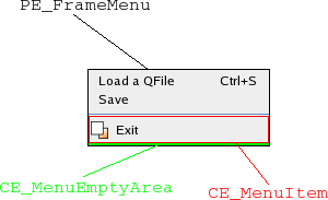
Menus in Qt are implemented in QMenu. The QMenu keeps a list of actions, which it draws as menu items. When QMenu receives paint events, it calculates the size of each menu item and draws them individually with CE_MenuItem. Menu items do not have a separate element for their label (contents), so all drawing is done in CE_MenuItem. The menu also draws the frame of the menu with PE_FrameMenu. It also draws CE_MenuScroller if the style supports scrolling. CE_MenuTearOff is drawn if the menu is too large for its bounding rectangle.
In the style structure tree, we also include QMenu as it also does styling related work. The bounding rectangles of menu items are calculated for the menu's size hint and when the menu is displayed or resized.
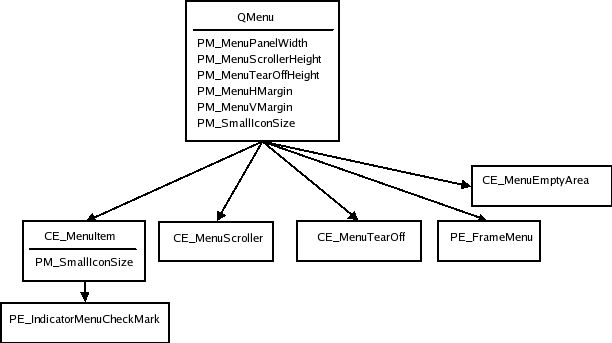
The CE_MenuScroller and CE_MenuTearOff elements are handled by QCommonStyle and are not shown unless the menu is too large to fit on the screen. PE_FrameMenu is only drawn for pop-up menus.
QMenu calculates rectangles based on its actions and calls CE_MenuItem and CE_MenuScroller if the style supports that.
It is also usual to use PE_IndicatorCheckBox (instead of using PE_IndicatorMenuCheckMark) and PE_IndicatorRadioButton for drawing checkable menu items; we have not included them in the style tree as this is optional and varies from style to style.
The style option for menu items is QStyleOptionMenuItem. The following tables describe its state flags and other members.
| State | Set When |
|---|---|
State_Selected | The mouse is over the action and the action is not a separator. |
State_Sunken | The mouse is pressed down on the menu item. |
State_DownArrow | Set if the menu item is a menu scroller and it scrolls the menu downwards. |
| Member | Content |
|---|---|
| checkType | A value of the CheckType enum, which is either NotCheckable, Exclusive, or NonExclusive. |
| checked | Boolean that is true if the menu item is checked. |
| font | The QFont to use for the menu item's text. |
| icon | The QIcon of the menu item. |
| maxIconWidth | The maximum width allowed for the icon. |
| menuHasCheckableItems | Boolean which is true if at least one item in the menu is checkable. |
| menuItemType | The type of the menu item. This a value of the MenuItemType. |
| menuRect | The bounding rectangle for the QMenu that the menu item lives in. |
| tabWidth | This is the distance between the text of the menu item and the shortcut. |
| text | The text of the menu item. |
The setup of the style option for CE_MenuTearOff and CE_MenuScroller also uses QStyleOptionMenuItem; they only set the menuRect variable in addition to the common settings with QStyleOption's initFrom().
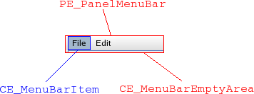
Menu Bar
QMenuBar uses the style to draw each menu bar item and the empty area of the menu bar. The pull-down menus themselves are QMenus (see Menus). The style element tree for the menu bar follows:
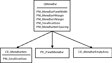
The panel and empty area are drawn after the menu items. The QPainter that the QMenuBar sends to the style has the bounding rectangles of the items clipped out (i.e., clip region), so you don't need to worry about drawing over the items. The pixel metrics in QMenuBar are used when the bounding rectangles of the menu bar items are calculated.
QStyleOptionMenuItem is used for menu bar items. The members that are used by QMenuBar are described in the following table:
| Member | Content |
|---|---|
| menuRect | The bounding rectangle of the entire menu bar to which the item belongs. |
| text | The text of the item. |
| icon | The icon of the menu item (it is not common that styles draw this icon). |
QStyleOptionMenuItem is also used for drawing CE_EmptyMenuBarArea.
QStyleOptionFrame is used for drawing the panel frame. The lineWidth is set to PM_MenuBarPanelWidth. The midLineWidth is currently always set to 0.
Item View Headers
It is the style that draws the headers of Qt's item views. The item views keep the dimensions on individual sections. Also note that the delegates may use the style to paint decorations and frames around items. QItemDelegate, for instance, draws PE_FrameFocusRect and PE_IndicatorItemViewItemCheck.
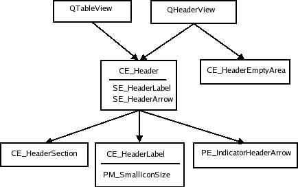
Here is a QTableWidget showing the bounding rects of a Java header:
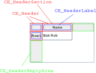
The QHeaderView uses CT_HeaderSection, PM_HeaderMargin and PM_HeaderGripMargin for size and hit test calculations. The PM_HeaderMarkSize is currently not used by Qt. QTableView draws the button in the top-left corner (i.e., the area where the vertical and horizontal headers intersect) as a CE_Header.
The style option for header views is QStyleOptionHeader. The view paints one header section at a time, so the data is for the section being drawn. Its contents are:
| Member | Content |
|---|---|
| icon | The icon of the header (for section that is being drawn). |
| iconAlignment | The alignment (Qt::Alignment) of the icon in the header. |
| orientation | A Qt::Orientation value deciding whether the header is the horizontal header above the view or the vertical header on the left. |
| position | A QStyleOptionHeader::SectionPosition value giving the header section's position relative to the other sections. |
| section | Holds the section that is being drawn. |
| selectedPosition | A QStyleOptionHeader::SelectedPosition value giving the selected section's position relative to the section that is being painted. |
| sortIndicator | A QStyleOptionHeader::SortIndicator value that describes the direction in which the section's sort indicator should be drawn. |
| text | The text of the currently drawn section. |
| textAlignment | The Qt::Alignment of the text within the header section. |
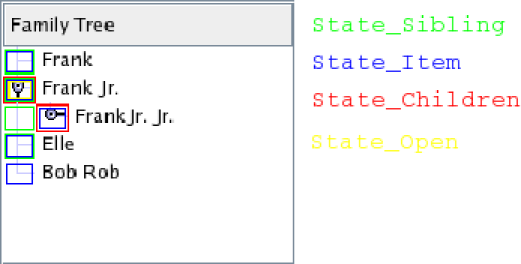
Tree Branch Indicators
The branch indicators in a tree view are drawn by the style with PE_IndicatorBranch. We think of indicators here as the indicators that describe the relationship of the nodes in the tree. The generic QStyleOption is sent to the style for drawing these elements. The various branch types are described by states. Since there is no specific style option, we simply present the states table:
| State | Set When |
|---|---|
State_Sibling | The node in the tree has a sibling (i.e., there is another node in the same column). |
State_Item | This branch indicator has an item. |
State_Children | The branch has children (i.e., a new sub-tree can be opened at the branch). |
State_Open | The branch indicator has an opened sub-tree. |
The tree view (and tree widget) use the style to draw the branches (nodes) of the tree.
QStyleOption is used as the style for PE_IndicatorBranch has state flags set depending on what type of branch it is.
Since there is no tree structure for branch indicators, we only present an image of a tree in the Java style. Each state is marked in the image with a rectangle in a specific color (i.e., the rectangles are not bounding rectangles). All combinations of states you must be aware of are represented in the image.
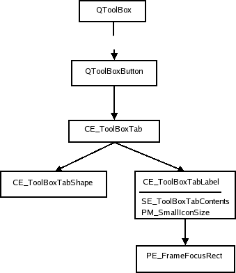
Tool Boxes
PM_SmallIconSize for sizeHints.
QToolBox is a container that keeps a collection of widgets. It has one tab for each widget and displays one of them at a time. The tool box lays the components it displays (the tool box buttons and selected widget) in a QVBoxLayout. The style tree for tool boxes looks like this:
We show an image of a tool box in the Plastique style:
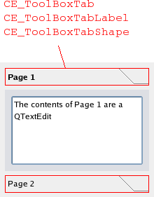
All elements have the same bounding rectangles in the Plastique style as well as the other built-in Qt styles.
The style option for tool boxes is QStyleOptionToolBox. It contains the text and icon of the tool box contents. The only state set by QToolBox is State_Sunken, which is set when the user presses a tab down with the mouse. The rest of the QStyleOptionToolBox members are:
| Member | Content |
|---|---|
| icon | The icon on the toolbox tab. |
| text | The text on the toolbox tab. |
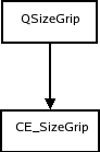
Size Grip
The size grip calculates its size hint with CT_SizeGrip. The pixel metric PM_SizeGripSize is currently unused by Qt. The element tree for an image in the Plastique style of QSizeGrip follows:
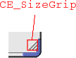
We show the size grip in QMainWindow's bottom right corner.
The size grip style option, QStyleOptionSizeGrip, has one member besides the common members from QStyleOption:
| Member | Content |
|---|---|
| corner | A Qt::Corner value that describes which corner in a window (or equivalent) the grip is located. |
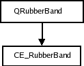
Rubber Band
The QRubberBand's style tree consists of two nodes.
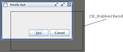
We present an image of a Java style window being moved in a QMdiArea with a rubber band:
The style option for rubber bands is QStyleOptionRubberBand. Its members are:
| Member | Content |
|---|---|
| opaque | Boolean that is true if the rubber band must be drawn in an opaque style (i.e., color). |
| shape | A QRubberBand::Shape enum value that holds the shape of the band (which is either a rectangle or a line). |
Dock Widgets
When the dock widget lays out its contents it asks the style for these pixel metrics: PM_DockWidgetSeparatorExtent, PM_DockWidgetTitleBarButtonMargin, PM_DockWidgetFrameWidth, and PM_DockWidgetTitleMargin. It also calculates the bounding rectangles of the float and close buttons with SE_DockWidgetCloseButton and SE_DockWidgetFloatButton.
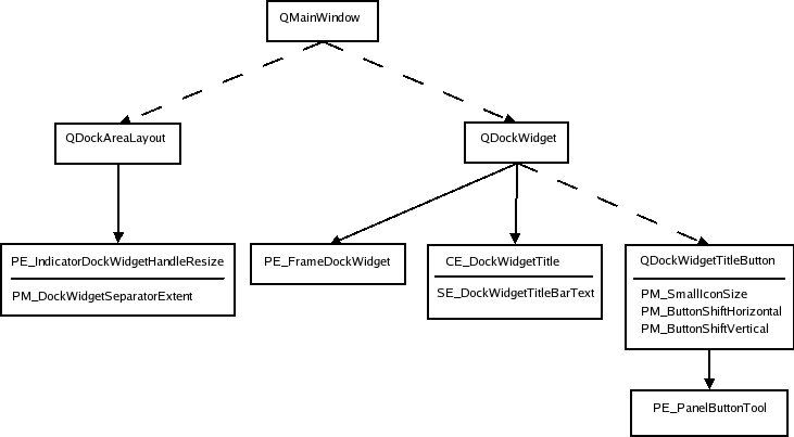
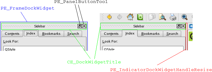
The dotted lines indicate that the sender keeps instances of the recipient of the arrow (i.e., it is not a style element to draw). The dock widget only draws PE_frameDockWidget when it is detached from its main window (i.e., it is a top level window). If it is docked it draws the indicator dock widget resize handle. We show a dock widget in both docked and floating state in the plastique style:
The style option is QStyleOptionDockWidget:
| Member | Content |
|---|---|
| closeable | Boolean that holds whether the dock window can be closed. |
| floatable | Boolean that holds whether the dock window can float (i.e., detach from the main window in which it lives). |
| movable | Boolean that holds whether the window is movable (i.e., can move to other dock widget areas). |
| title | The title text of the dock window. |
For the buttons, QStyleOptionButton is used (see Tool Buttons for content description). The dock widget resize handle has a plain QStyleOption.
© 2026 The Qt Company Ltd. Documentation contributions included herein are the copyrights of their respective owners. The documentation provided herein is licensed under the terms of the GNU Free Documentation License version 1.3 as published by the Free Software Foundation. Qt and respective logos are trademarks of The Qt Company Ltd. in Finland and/or other countries worldwide. All other trademarks are property of their respective owners.
