C
Item QML Type
A basic visual QML type. More...
Enumerations
Properties
- activeFocus : Item
(since Qt Quick Ultralite 2.9) - anchors
- anchors.baseline : AnchorLine
- anchors.baselineOffset : real
- anchors.bottom : AnchorLine
- anchors.bottomMargin : real
- anchors.centerIn : Item
- anchors.fill : Item
- anchors.horizontalCenter : AnchorLine
- anchors.horizontalCenterOffset : real
- anchors.left : AnchorLine
- anchors.leftMargin : real
- anchors.margins : real
- anchors.right : AnchorLine
- anchors.rightMargin : real
- anchors.top : AnchorLine
- anchors.topMargin : real
- anchors.verticalCenter : AnchorLine
- anchors.verticalCenterOffset : real
- clip : bool
- enabled : bool
- height : real
- implicitHeight : real
- implicitWidth : real
- opacity : real
- parent : Item
- state : string
- states : list<State>
- transitions : list<Transition>
- visible : bool
- width : real
- x : real
- y : real
- z : real
Methods
- Item childAt(real x, real y)
- void forceActiveFocus()
- point mapFromItem(Item item, point p)
- rect mapFromItem(Item item, rect r)
- point mapFromItem(Item item, real x, real y)
- rect mapFromItem(Item item, real x, real y, real width, real height)
- point mapToItem(Item item, point p)
- rect mapToItem(Item item, rect r)
- point mapToItem(Item item, real x, real y)
- rect mapToItem(Item item, real x, real y, real width, real height)
Detailed Description
The Item type is the base type for all visual items in Qt Quick.
All visual items in Qt Quick inherit from Item. Although an Item object has no visual appearance, it defines all the attributes that are common across visual items, such as x and y position, width and height, and anchoring.
The Item type can be useful for grouping several items under a single root visual item. For example:
import QtQuick 2.15

Item {
    Image {
        source: "qrc:/tile.png"
    }
    Image {
        x: 80
        width: 100
        height: 100
        source: "qrc:/tile.png"
    }
    Image {
        x: 190
        width: 100
        height: 100
        fillMode: Image.Tile
        source: "qrc:/tile.png"
    }
}
See also Item QML Type.
Enumeration Documentation
TransformOrigin
Provides a list of origins for a transformation.
| Constant | Description |
|---|---|
Item.TopLeft | Top-left corner of the item. |
Item.Top | Top of the item. |
Item.TopRight | Top-right corner of the item. |
Item.Left | Left of the item. |
Item.Center | Center of the item. |
Item.Right | Right of the item. |
Item.BottomLeft | Bottom-left corner of the item. |
Item.Bottom | Bottom of the item. |
Item.BottomRight | Bottom-right corner of the item. |
Property Documentation
activeFocus : Item [read-only, since Qt Quick Ultralite 2.9]
This read-only property indicates whether the item has active focus.
If activeFocus is true, this item is the one that currently receives keyboard input.
This property was introduced in Qt Quick Ultralite 2.9.
See also forceActiveFocus.
anchors group
anchors.baseline : AnchorLine
anchors.baselineOffset : real
anchors.bottom : AnchorLine
anchors.bottomMargin : real
anchors.centerIn : Item
anchors.fill : Item
anchors.horizontalCenter : AnchorLine
anchors.horizontalCenterOffset : real
anchors.left : AnchorLine
anchors.leftMargin : real
anchors.margins : real
anchors.right : AnchorLine
anchors.rightMargin : real
anchors.top : AnchorLine
anchors.topMargin : real
anchors.verticalCenter : AnchorLine
anchors.verticalCenterOffset : real
Anchors provide a way to position an item by specifying its relationship with other items.
Margins apply to top, bottom, left, right, and fill anchors. The anchors.margins property can be used to set all of the various margins at once, to the same value. It will not override a specific margin that has been previously set; to clear an explicit margin set its value to undefined. Note that margins are anchor-specific and are not applied if an item does not use anchors.
Offsets apply for horizontal center, vertical center, and baseline anchors.
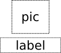
| Text anchored to Image, horizontally centered and vertically below, with a margin. |
| Left of Text anchored to right of Image, with a margin. The y property of both defaults to 0. |
anchors.fill provides a convenient way for one item to have the same geometry as another item, and is equivalent to connecting all four directional anchors.
To clear an anchor value, set it to undefined.
Note: You can only anchor an item to siblings or a parent.
For more information see Anchor Layouts.
clip : bool
This property holds whether clipping is enabled. The default clip value is false.
If clipping is enabled, an item will clip its own painting, as well as the painting of its children, to its bounding rectangle.
Note: The clip rectangle is always axis aligned. Using clip with transforms like Image::rotation is not supported.
Note: Text layout uses advance-based metrics for performance and does not attempt to be pixel-perfect with respect to the rendered ink bounds. As a result, glyph ink (for example due to overhang, bearings, or mark positioning) may extend slightly outside an explicitly requested item width. This is normally harmless, but when clip is enabled such rare overhang can become visible as cropped text. If strict visual containment is required, consider leaving a small extra margin in the clipping item (for example by clipping a slightly larger parent, or increasing the clip item's size and compensating with padding/anchors).
enabled : bool
This property holds whether the item receives touch events. By default this is true.
Setting this property directly affects the enabled value of child items. When set to false, the enabled values of all child items also become false. When set to true, the enabled values of child items are returned to true, unless they have explicitly been set to false.
See also visible.
Defines the item's position and size. The default value is 0.
The (x,y) position is relative to the parent.
Item { x: 100; y: 100; width: 100; height: 100 }Defines the natural width or height of the Item if no width or height is specified.
The default implicit size for most items is 0x0, however some items have an inherent implicit size which cannot be overridden, for example, Image and Text.
Setting the implicit size is useful for defining components that have a preferred size based on their content, for example:
// Label.qml
import QtQuick 2.15

Item {
    property alias icon: image.source
    property alias label: text.text
    implicitWidth: text.implicitWidth + image.implicitWidth
    implicitHeight: Math.max(text.implicitHeight, image.implicitHeight)
    Image { id: image }
    Text {
        id: text
        anchors.left: image.right; anchors.right: parent.right
        anchors.verticalCenter: parent.verticalCenter
    }
}
opacity : real
This property holds the opacity of the item. Opacity is specified as a number between 0.0 (fully transparent) and 1.0 (fully opaque). The default value is 1.0.
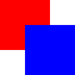
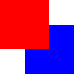
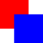
When this property is set, the specified opacity is also applied individually to child items. This may have an unintended effect in some circumstances. For example in the second set of rectangles below, the red rectangle has specified an opacity of 0.5, which affects the opacity of its blue child rectangle even though the child has not specified an opacity.
| |
|
Changing an item's opacity does not affect whether the item receives user input events. (In contrast, setting the visible or enabled property to false stops touch events.)
See also visible.
parent : Item
This read-only property holds the visual parent of the item.
See Visual parent for more details.
Note: As this property can be only read, it is impossible to change the visual parent of an item at runtime.
state : string
This property holds the name of the current state of the item.
If the item is in its default state, that is, no explicit state has been set, then this property holds an empty string. Likewise, you can return an item to its default state by setting this property to an empty string.
Note: This property only exists for the root Item in a .qml file.
See also Using States.
states : list<State>
This property holds the list of possible states for this item. To change the state of this item, set the state property to one of these states, or set the state property to an empty string to revert the item to its default state.
This property is specified as a list of State objects. For example, below is an item with "red_color" and "blue_color" states:
import QtQuick 2.15

Rectangle {
    id: root
    width: 100; height: 100

    states: [
        State {
            name: "red_color"
            PropertyChanges { root.color: "red" }
        },
        State {
            name: "blue_color"
            PropertyChanges { root.color: "blue" }
        }
    ]
}
See Using States and Animation and Transitions for more details on using states and transitions.
See also transitions.
transitions : list<Transition>
This property holds the list of transitions for this item. These define the transitions to be applied to the item whenever it changes its state.
This property is specified as a list of Transition objects. For example:
import QtQuick 2.15

Item {
    transitions: [
        Transition {
            //...
        },
        Transition {
            //...
        }
    ]
}
See Using States and Animation and Transitions for more details on using states and transitions.
See also states.
visible : bool
This property holds whether the item is visible. By default this is true.
Setting this property directly affects the visibility of child items. When set to false, the visible values of all child items also become false. When set to true, the visible values of child items are returned to true, unless they have explicitly been set to false.
If this property is set to false, the item will no longer receive touch events.
Note: This property does not change if this item moves off-screen, or if the opacity changes to 0.
z : real
Sets the stacking order of sibling items. By default the stacking order is 0.
Items with a higher stacking value are drawn on top of siblings with a lower stacking order. Items with the same stacking value are drawn bottom up in the order they appear. Items with a negative stacking value are drawn under their parent's content.
The following example shows the various effects of stacking order.
| Same z - later children above earlier children:
|
| Higher z on top:
|
| Same z - children above parents:
|
| Lower z below:
|
Method Documentation
Item childAt(real x, real y)
Returns the first visible child item found at point (x, y) within the coordinate system of this item.
Returns null if there is no such item.
void forceActiveFocus()
Forces active focus on the item.
point mapFromItem(Item item, real x, real y)
point mapFromItem(Item item, point p)
rect mapFromItem(Item item, real x, real y, real width, real height)
rect mapFromItem(Item item, rect r)
Maps the point (x, y) or rect (x, y, width, height), which is in the item's coordinate system, from this item's coordinate system, and returns a point or rect matching the mapped coordinate.
Warning: The transformations on Image, Text, and StaticText are ignored in the mapping since Qt Quick Ultralite applies them differently.
If the value of item is null, this maps the point or rect from the coordinate system of the root QML view.
point mapToItem(Item item, real x, real y)
point mapToItem(Item item, point p)
rect mapToItem(Item item, real x, real y, real width, real height)
rect mapToItem(Item item, rect r)
Maps the point (x, y) or rect (x, y, width, height), which is in the item's coordinate system, to this item's coordinate system, and returns a point or rect matching the mapped coordinate.
Warning: The transformations on Image, Text, and StaticText are ignored in the mapping since Qt Quick Ultralite applies them differently.
If the value of item is null, this maps the point or rect to the coordinate system of the root QML view.
Available under certain Qt licenses.
Find out more.

