C
Qt Quick Ultralite studio_components Example
Demonstrates how to use Qt Quick Ultralite Studio Components.
Overview
This example shows how to use Qt Quick Ultralite Studio Components.
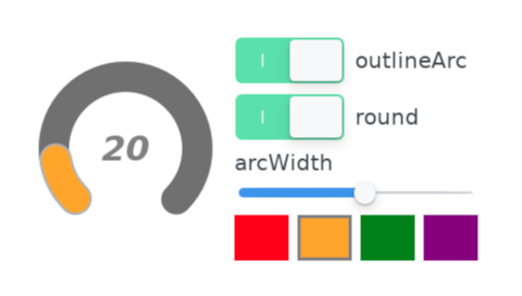
It draws a circular gauge using the ArcItem QML type and offers controls on the right-hand side to manipulate the gauge's appearance. If there is no user interaction for a certain period, the properties are updated automatically.

Target platforms
Project structure
Main Application
The main application window is defined in studio_components.qml
ArcItem Page
The ArcItemPage.qml has three parts, a circular gauge using ArcItem on the left-hand side, the controls on the right-hand side to change gauge's appearance, and timers to demonstrate it automatically.
The Gauge.qml uses two ArcItem instances to implement a circular gauge. The first one is for the background, with its minimum and maximum angle (in degrees) defined by the begin and end properties respectively.
ArcItem {
    id: bg
    anchors.centerIn: parent
    arcWidth: arc.arcWidth
    begin: root.beginAngle
    end: root.endAngle
    fillColor: "#707070"
    height: arc.width
    outlineArc: arc.outlineArc
    round: arc.round
    strokeWidth: 0
    strokeColor: Theme.backgroundArcStrokeColor
    width: root.width
}
The second one draws the actual level of the gauge's value. Its begin property has the same angle as the background arc, but the end property changes with the value of the gauge that ranges from 0 to 100. The areas are painted with gradient colors by gradient. The main color is specified by one of the colors on the right-hand side. The color in the gauge gradually changes to the darker color.
ArcItem {
    id: arc
    anchors.centerIn: parent
    arcWidth: 28
    begin: root.beginAngle
    end: root.valueAngle
    fillColor: "#00414a"
    height: arc.width
    outlineArc: true
    round: true
    strokeColor: Theme.foregroundArcStrokeColor
    strokeWidth: 2
    width: root.width

    gradient: LinearGradient {
        x1: 0
        y1: 20
        x2: 160
        y2: 140

        GradientStop {
            id: gradientStop1
            color: arc.fillColor
            position: 0.5
        }

        GradientStop {
            id: gradientStop2
            color: "#400006"
            position: 1
        }
    }
}
The arcWidth, fillColor, outlineArc, and round properties of the ArcItem are exposed as the properties of the Gauge component. The UI controls on the right-hand side let you change these properties.
property alias arcWidth: arc.arcWidth
property alias fillColor: arc.fillColor
property alias fillDarkColor: gradientStop2.color
property alias outlineArc: arc.outlineArc
property alias round: arc.round
If there is no user activity for a certain period, the timer emits predefined signals to change the exposed properties of the ArcItem. Whenever the user touches the controls, the timer resets.
Limitations
When exporting the application using qmlprojectexporter, use the --selector command-line argument to apply the "transparent" file selector when exporting for these platforms:
qmlprojectexporter --selector transparent examples/studio_components/mcu_studio_components.qmlprojectFiles:
Available under certain Qt licenses.
Find out more.

