PySide6.QtWidgets.QDialogButtonBox
- class QDialogButtonBox
The
QDialogButtonBoxclass is a widget that presents buttons in a layout that is appropriate to the current widget style.Details
Warning
This section contains snippets that were automatically translated from C++ to Python and may contain errors.
Dialogs and message boxes typically present buttons in a layout that conforms to the interface guidelines for that platform. Invariably, different platforms have different layouts for their dialogs.
QDialogButtonBoxallows a developer to add buttons to it and will automatically use the appropriate layout for the user’s desktop environment.Most buttons for a dialog follow certain roles. Such roles include:
Accepting or rejecting the dialog.
Asking for help.
Performing actions on the dialog itself (such as resetting fields or applying changes).
There can also be alternate ways of dismissing the dialog which may cause destructive results.
Most dialogs have buttons that can almost be considered standard (e.g. OK and Cancel buttons). It is sometimes convenient to create these buttons in a standard way.
There are a couple ways of using
QDialogButtonBox. One ways is to create the buttons (or button texts) yourself and add them to the button box, specifying their role.buttonBox = QDialogButtonBox(Qt.Vertical) buttonBox.addButton(findButton, QDialogButtonBox.ActionRole) buttonBox.addButton(moreButton, QDialogButtonBox.ActionRole)
Alternatively,
QDialogButtonBoxprovides several standard buttons (e.g. OK, Cancel, Save) that you can use. They exist as flags so you can OR them together in the constructor.buttonBox = QDialogButtonBox(QDialogButtonBox.StandardButton.Ok //! [1] //! [3] | QDialogButtonBox.StandardButton.Cancel) buttonBox.accepted.connect(self.accept) buttonBox.rejected.connect(self.reject)You can mix and match normal buttons and standard buttons.
Currently the buttons are laid out in the following way if the button box is horizontal:

GnomeLayoutHorizontalButton box laid out in horizontal
GnomeLayout
KdeLayoutHorizontalButton box laid out in horizontal
KdeLayout
MacLayoutHorizontalButton box laid out in horizontal
MacLayout
WinLayoutHorizontalButton box laid out in horizontal
WinLayoutThe buttons are laid out the following way if the button box is vertical:

GnomeLayoutVertical
KdeLayoutVertical
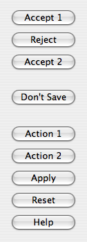
MacLayoutVertical
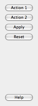
WinLayoutVerticalAdditionally, button boxes that contain only buttons with
ActionRoleorHelpRolecan be considered modeless and have an alternate look on macOS:When a button is clicked in the button box, the
clicked()signal is emitted for the actual button is that is pressed. For convenience, if the button has anAcceptRole,RejectRole, orHelpRole, theaccepted(),rejected(), orhelpRequested()signals are emitted respectively.If you want a specific button to be default you need to call
setDefault()on it yourself. However, if there is no default button set and to preserve which button is the default button across platforms when using theautoDefaultproperty, the first push button with the accept role is made the default button when theQDialogButtonBoxis shown,See also
Synopsis
Properties
centerButtonsᅟ- Whether the buttons in the button box are centeredorientationᅟ- The orientation of the button boxstandardButtonsᅟ- Collection of standard buttons in the button box
Methods
def
__init__()def
addButton()def
button()def
buttonRole()def
buttons()def
centerButtons()def
clear()def
orientation()def
removeButton()def
setOrientation()def
standardButton()
Signals
def
accepted()def
clicked()def
helpRequested()def
rejected()
Note
This documentation may contain snippets that were automatically translated from C++ to Python. We always welcome contributions to the snippet translation. If you see an issue with the translation, you can also let us know by creating a ticket on https:/bugreports.qt.io/projects/PYSIDE
- class ButtonRole
This enum describes the roles that can be used to describe buttons in the button box. Combinations of these roles are as flags used to describe different aspects of their behavior.
Constant
Description
QDialogButtonBox.ButtonRole.InvalidRole
The button is invalid.
QDialogButtonBox.ButtonRole.AcceptRole
Clicking the button causes the dialog to be accepted (e.g. OK).
QDialogButtonBox.ButtonRole.RejectRole
Clicking the button causes the dialog to be rejected (e.g. Cancel).
QDialogButtonBox.ButtonRole.DestructiveRole
Clicking the button causes a destructive change (e.g. for Discarding Changes) and closes the dialog.
QDialogButtonBox.ButtonRole.ActionRole
Clicking the button causes changes to the elements within the dialog.
QDialogButtonBox.ButtonRole.HelpRole
The button can be clicked to request help.
QDialogButtonBox.ButtonRole.YesRole
The button is a “Yes”-like button.
QDialogButtonBox.ButtonRole.NoRole
The button is a “No”-like button.
QDialogButtonBox.ButtonRole.ApplyRole
The button applies current changes.
QDialogButtonBox.ButtonRole.ResetRole
The button resets the dialog’s fields to default values.
See also
- class StandardButton
(inherits
enum.Flag) These enums describe flags for standard buttons. Each button has a definedButtonRole.Constant
Description
QDialogButtonBox.StandardButton.Ok
An “OK” button defined with the
AcceptRole.QDialogButtonBox.StandardButton.Open
An “Open” button defined with the
AcceptRole.QDialogButtonBox.StandardButton.Save
A “Save” button defined with the
AcceptRole.QDialogButtonBox.StandardButton.Cancel
A “Cancel” button defined with the
RejectRole.QDialogButtonBox.StandardButton.Close
A “Close” button defined with the
RejectRole.QDialogButtonBox.StandardButton.Discard
A “Discard” or “Don’t Save” button, depending on the platform, defined with the
DestructiveRole.QDialogButtonBox.StandardButton.Apply
An “Apply” button defined with the
ApplyRole.QDialogButtonBox.StandardButton.Reset
A “Reset” button defined with the
ResetRole.QDialogButtonBox.StandardButton.RestoreDefaults
A “Restore Defaults” button defined with the
ResetRole.QDialogButtonBox.StandardButton.Help
A “Help” button defined with the
HelpRole.QDialogButtonBox.StandardButton.SaveAll
A “Save All” button defined with the
AcceptRole.QDialogButtonBox.StandardButton.Yes
A “Yes” button defined with the
YesRole.QDialogButtonBox.StandardButton.YesToAll
A “Yes to All” button defined with the
YesRole.QDialogButtonBox.StandardButton.No
A “No” button defined with the
NoRole.QDialogButtonBox.StandardButton.NoToAll
A “No to All” button defined with the
NoRole.QDialogButtonBox.StandardButton.Abort
An “Abort” button defined with the
RejectRole.QDialogButtonBox.StandardButton.Retry
A “Retry” button defined with the
AcceptRole.QDialogButtonBox.StandardButton.Ignore
An “Ignore” button defined with the
AcceptRole.QDialogButtonBox.StandardButton.NoButton
An invalid button.
See also
- class ButtonLayout
This enum describes the layout policy to be used when arranging the buttons contained in the button box.
Constant
Description
QDialogButtonBox.ButtonLayout.WinLayout
Use a policy appropriate for applications on Windows.
QDialogButtonBox.ButtonLayout.MacLayout
Use a policy appropriate for applications on macOS.
QDialogButtonBox.ButtonLayout.KdeLayout
Use a policy appropriate for applications on KDE.
QDialogButtonBox.ButtonLayout.GnomeLayout
Use a policy appropriate for applications on GNOME.
QDialogButtonBox.ButtonLayout.AndroidLayout
Use a policy appropriate for applications on Android. This enum value was added in Qt 5.10.
The button layout is specified by the
current style. However, on the X11 platform, it may be influenced by the desktop environment.
Note
Properties can be used directly when
from __feature__ import true_propertyis used or via accessor functions otherwise.- property centerButtonsᅟ: bool
This property holds whether the buttons in the button box are centered.
By default, this property is
false. This behavior is appropriate for most types of dialogs. A notable exception is message boxes on most platforms (e.g. Windows), where the button box is centered horizontally.See also
- Access functions:
- property orientationᅟ: Qt.Orientation
This property holds the orientation of the button box.
By default, the orientation is horizontal (i.e. the buttons are laid out side by side). The possible orientations are Qt::Horizontal and Qt::Vertical.
- Access functions:
- property standardButtonsᅟ: Combination of QDialogButtonBox.StandardButton
This property holds collection of standard buttons in the button box.
This property controls which standard buttons are used by the button box.
See also
- Access functions:
Constructs an empty, horizontal button box with the given
parent.See also
- __init__(buttons[, parent=None])
- Parameters:
buttons – Combination of
StandardButtonparent –
QWidget
Constructs a horizontal button box with the given
parent, containing the standard buttons specified bybuttons.See also
- __init__(orientation[, parent=None])
- Parameters:
orientation –
Orientationparent –
QWidget
Constructs an empty button box with the given
orientationandparent.See also
- __init__(buttons, orientation[, parent=None])
- Parameters:
buttons – Combination of
StandardButtonorientation –
Orientationparent –
QWidget
Constructs a button box with the given
orientationandparent, containing the standard buttons specified bybuttons.See also
- accepted()
This signal is emitted when a button inside the button box is clicked, as long as it was defined with the
AcceptRoleorYesRole.See also
- addButton(button)
- Parameters:
button –
StandardButton- Return type:
Adds a standard
buttonto the button box if it is valid to do so, and returns a push button. Ifbuttonis invalid, it is not added to the button box, and zero is returned.See also
- addButton(button, role)
- Parameters:
button –
QAbstractButtonrole –
ButtonRole
Adds the given
buttonto the button box with the specifiedrole. If the role is invalid, the button is not added.If the button has already been added, it is removed and added again with the new role.
- addButton(text, role)
- Parameters:
text – str
role –
ButtonRole
- Return type:
Creates a push button with the given
text, adds it to the button box for the specifiedrole, and returns the corresponding push button. Ifroleis invalid, no button is created, and zero is returned.See also
- button(which)
- Parameters:
which –
StandardButton- Return type:
Returns the
QPushButtoncorresponding to the standard buttonwhich, orNoneif the standard button doesn’t exist in this button box.See also
- buttonRole(button)
- Parameters:
button –
QAbstractButton- Return type:
Returns the button role for the specified
button. This function returnsInvalidRoleifbuttonisNoneor has not been added to the button box.See also
- buttons()
- Return type:
.list of QAbstractButton
Returns a list of all buttons that have been added to the button box.
See also
- centerButtons()
- Return type:
bool
See also
Getter of property
centerButtonsᅟ.- clear()
Clears the button box, deleting all buttons within it.
See also
- clicked(button)
- Parameters:
button –
QAbstractButton
This signal is emitted when a button inside the button box is clicked. The specific button that was pressed is specified by
button.See also
- helpRequested()
This signal is emitted when a button inside the button box is clicked, as long as it was defined with the
HelpRole.See also
- orientation()
- Return type:
See also
Getter of property
orientationᅟ.- rejected()
This signal is emitted when a button inside the button box is clicked, as long as it was defined with the
RejectRoleorNoRole.See also
- removeButton(button)
- Parameters:
button –
QAbstractButton
Removes
buttonfrom the button box without deleting it and sets its parent to zero.See also
- setCenterButtons(center)
- Parameters:
center – bool
See also
Setter of property
centerButtonsᅟ.- setOrientation(orientation)
- Parameters:
orientation –
Orientation
See also
Setter of property
orientationᅟ.- setStandardButtons(buttons)
- Parameters:
buttons – Combination of
StandardButton
See also
Setter of property
standardButtonsᅟ.- standardButton(button)
- Parameters:
button –
QAbstractButton- Return type:
Returns the standard button enum value corresponding to the given
button, orNoButtonif the givenbuttonisn’t a standard button.See also
- standardButtons()
- Return type:
Combination of
StandardButton
See also
Getter of property
standardButtonsᅟ.
 Screenshot of modeless horizontal
  Screenshot of modeless vertical