Login UI: Positioning
Illustrates how to position UI components on pages using anchors and positioners.
Login UI: Positioning is the second of the Qt Design Studio Login UI tutorials, which build on each other to illustrate how to create a simple UI with some basic UI components, such as pages, buttons, and entry fields.
This tutorial describes how to position the UI components on pages to create a scalable UI. Use anchors and positioners to ensure that the layout is responsive and all the UI components stay in their proper places when you resize the UI on the desktop or on devices with different screen sizes.
The starting point for this tutorial is the completed Login UI: Components project. You can download the project here.
Additionally, you can download the completed project of this tutorial here.
Changing the component hierarchy
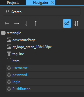
You can only anchor components to their parent and sibling components. First, to make the entry fields and the buttons sibling components to other page elements, drag them from adventurePage to rectangle in the Navigator view (press and hold the Shift or Ctrl key for multiple selection).
Next, anchor the static elements to the UI.
Anchoring UI components
Anchor the static page elements, meaning the background image (adventurePage), the logo (qt_logo_green_128x128px), and the tag line (tagLine), to the page.
To preview the changes that you make, select the run dropdown menu from the top toolbar, and then select Live Preview, or select Alt+P.
To edit the main page, first select Screen01.ui.qml in the Projects view.
Then, to anchor the components in your UI:
- Select adventurePage in Navigator to display its properties in the Properties view.
- In Properties > Layout, select the
 anchor button to anchor adventurePage to its parent in the Target field. This attaches the background image to the rectangle on all sides.
Note: Selecting the anchor button should automatically select the four buttons on the left side of it. If it doesn't, select
 on the 2D view toolbar to refresh the 2D view.
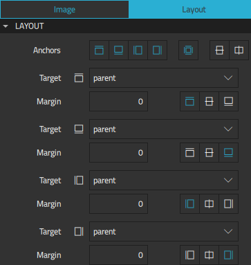
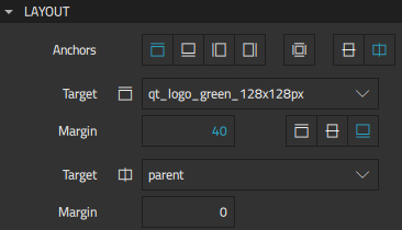
- Select qt_logo_green_128x128px in Navigator.
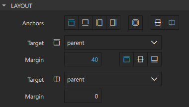
- In Properties > Layout, set:
- Anchors to
 and
and  .
. - Target to parent to anchor the logo to its parent.
- Margin to 40, and select to anchor the logo to the top of the target.
This attaches the logo to the rectangle at the top while keeping its horizontal center aligned with that of the rectangle.
- Anchors to
- Select tagLine in Navigator.
- In Properties > Layout, set:
- Anchors to and .
- Target to qt_logo_green_128x128px to anchor the tag line to the logo.
- Margin to 40, and select
 to anchor the tag line to the bottom of the target.
This attaches the tag line to the bottom of the logo while keeping its horizontal center aligned with that of the rectangle.
Note: You can anchor component instances to their parent and sibling components. If a component is not listed in the Target field dropdown menu, check that the component is located in the correct place in the component hierarchy in Navigator. For more information, see Arranging components.
- Anchors to
- Select File > Save or select Ctrl+S to save your changes.
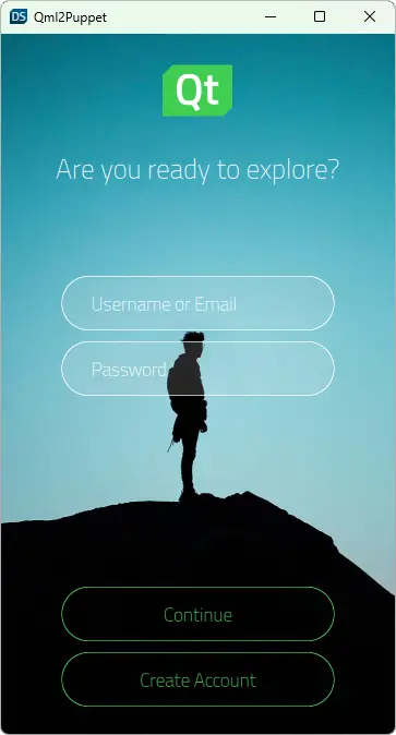
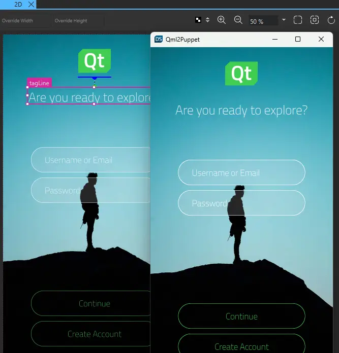
Your page should now look something like this in the 2D view and Live Preview:
Using column positioners
Next, position the entry fields and buttons in columns to learn another method of positioning components. Then, anchor the columns to the page, so that their positions adapt to any screen size changes.
To position the fields and buttons as columns:
- Select username and password in Navigator (press and hold the Shift or Ctrl key for multiple selection), and right-click either of them to open a context menu.
- Select Positioner > Column Positioner to position the fields on top of each other in the 2D view.
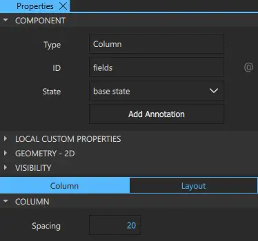
- Select the column in Navigator and change its ID to fields in Properties.
- In Column > Spacing, set the spacing between the fields to 20.
- Select login and createAccount, and then select Positioner > Column Positioner to position them in a column.
- Select the new column, change its ID to buttons, and set the spacing between the buttons to 20, as above.
Now, anchor the field and button columns to the page:
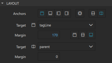
- Select fields in Navigator.
- In Properties > Layout, set:
- Anchors to and .
- Target to tagLine to anchor the entry fields to the tag line.
- Margin to 170 and select to anchor the entry fields to the bottom of the target.
This attaches the entry fields to the bottom of the tag line while keeping its horizontal center aligned with that of the rectangle.
- Anchors to
- Select buttons in Navigator.
- In Properties > Layout, set:
- Anchors to and .
- Target to parent to anchor the entry fields to the rectangle.
- Margin to 50, and select to anchor the entry fields to the bottom of the target.
This attaches the buttons to the bottom of the rectangle while keeping its horizontal center aligned with that of the rectangle.
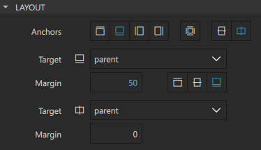
- Anchors to
- Select File > Save or select Ctrl+S to save your changes.
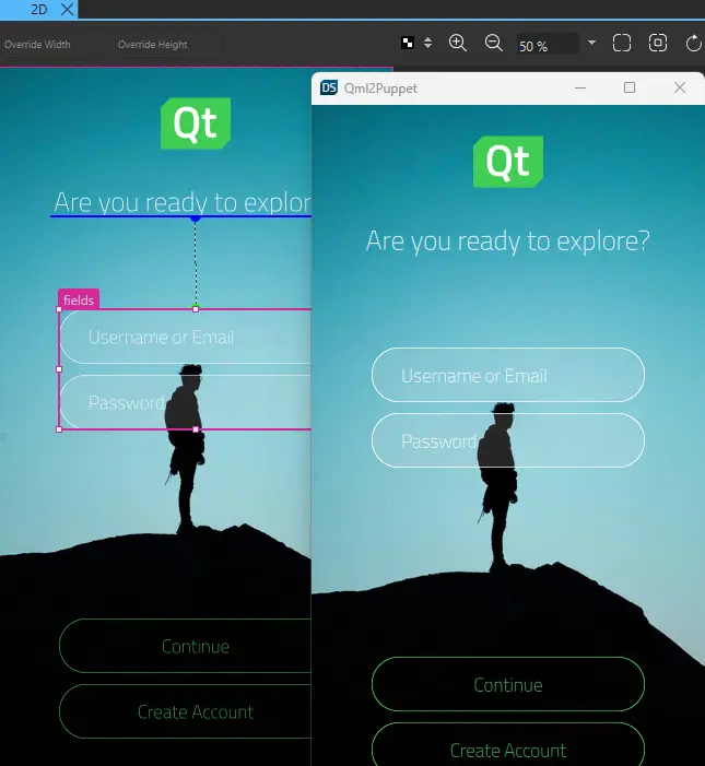
The second iteration of your UI is now ready and should look something like this in the 2D view and Live Preview:
Next steps
To learn how to add a second page and move to it from the main page, see the next tutorial in the series, Login UI: States.
Files:
See also Positioning with anchors, Using positioners, and Using layouts.
Available under certain Qt licenses.
Find out more.
