Login UI: Components
Illustrates how to use wizard templates to create a simple UI that contains a text label, images, and push buttons.
Login UI: Components is the first of the Qt Design Studio Login UI tutorials, which build on each other to illustrate how to create a simple UI with some basic UI components, such as pages, buttons, and entry fields.
This tutorial describes how to use the Qt Design Studio wizard templates to create a project and a button UI control, and how to modify the files generated by the wizard templates to design a UI.
You can download the completed project from here.
Creating the UI project
For the purposes of this tutorial, use the empty wizard template to create the UI project. For other purposes, use one of the wizard templates for creating UIs optimized for mobile platforms or launcher applications. For more information see Creating projects.
To create a project using the empty wizard template:
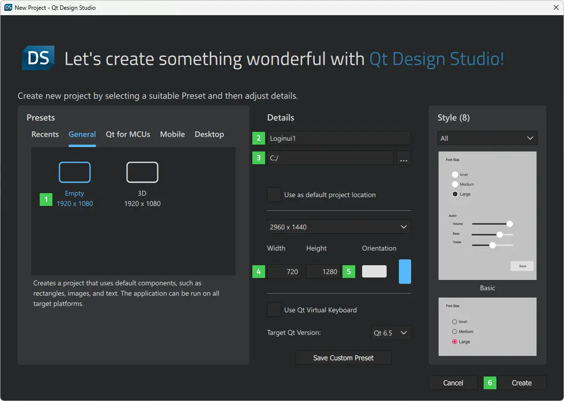
- Select File > New Project.
- In the Presets tab, select General > Empty (1).
- In the Details tab:
- Enter Loginui1 as the name (2) for the project. Keep in mind that projects cannot be easily renamed later.
- Select the path (3) for the project files. You can move project folders later.
- Set Width to 720 and Height to 1280 (4). You can change the screen size later in Properties.
- Select Create (5) to create the project.
Your project should now look something like this in the Projects view:
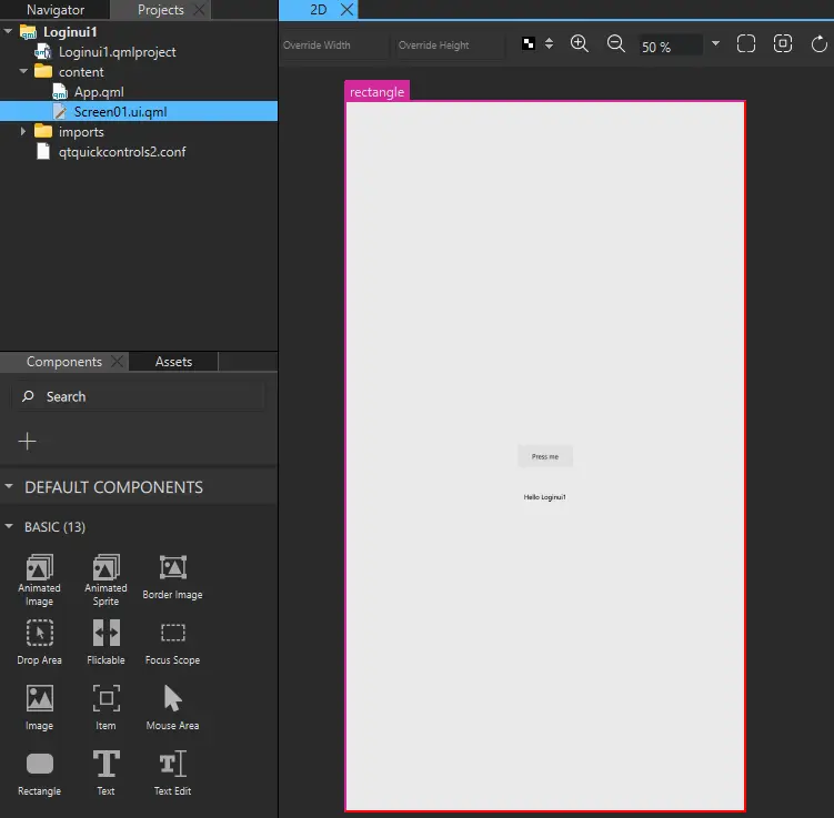
The wizard constructs the Screen01 component using a rectangle component as the background, a Button, and a Text component that displays some text.
Note: The visibility of views depends on the selection of views on the selected workspace, so your Qt Design Studio might look somewhat different from the image above. To open and close views, select View > Views. For more information about arranging the Qt Design Studio workspace, see Workspaces.
Remove the button and the text component from the UI to have a clean workspace. Add button and text components later in this tutorial as instructed.
To remove the button, select it and select Backspace. Repeat for the text component.
Next, edit the values of the properties of the component instances to create the main page of the UI.
Creating the main page
After creating the new project and setting up a clean workspace, you are now ready to create the main page of your UI. First, download a logo, a background image, and a custom font and import them to Qt Design Studio as assets. Then, use these assets to add a background image, a logo, and a tag line to your main page.
Download the logo and the background image from here:
- qt_logo_green_128x128px.png
- Background image (adventurePage.jpg)
Photo by Benjamin DeYoung on Unsplash.
Download the Titillium Web ExtraLight font from here or use Arial as a substitute.
To add the assets:
- Select Assets >
 (If you can't see the Assets view, select View > Views > Assets.)
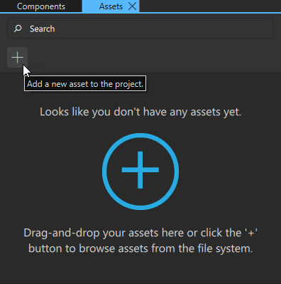
- Select the asset files, and then select Open.
- In the Add Resources dialog, select the location for saving the files.
- Select OK.
Alternatively, drag the asset files from the file browser to the Fonts or Images tab in the Assets view.
To preview the changes that you make, select the run dropdown menu from the top toolbar, and then select Live Preview, or select Alt+P.
Note: If you can't see the changes that you make in the 2D view, select  on the 2D view toolbar to refresh the 2D view.
The Screen01.ui.qml file, that the wizard template created for you, should be open. If it is not, you can double-click it in the Projects view to open it.
To modify the Screen01 component in the 2D view:
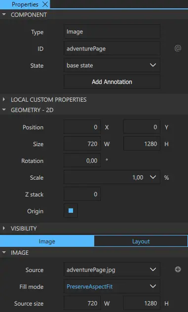
- Drag the background image (1) from Assets to the 2D view (2). Use the guidelines (3) to drag the background image so that it covers the whole 2D view.
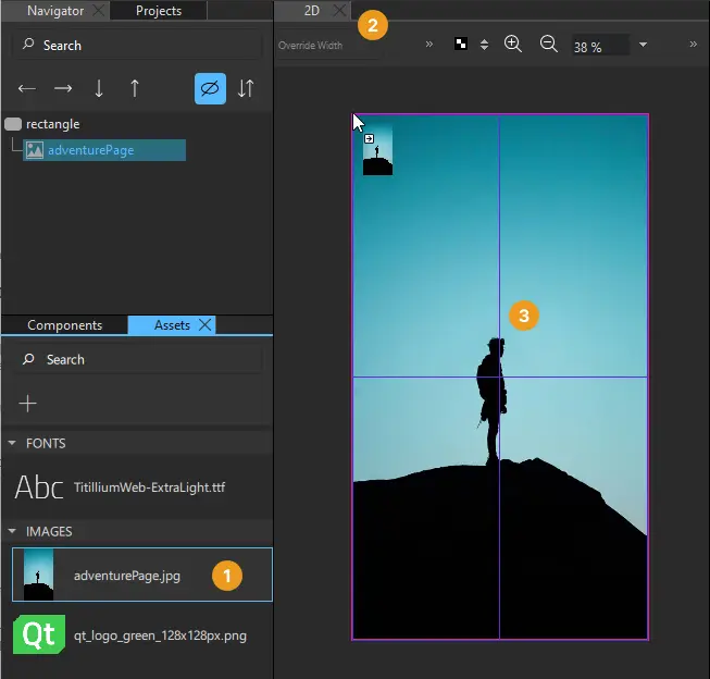
Adding an image to the 2D view creates an Image component to your project, which appears under rectangle in Navigator. The component is created with the path to the image file set as the value of Properties > Image > Source.
- Drag the Qt logo from Assets to the background image in the 2D view. Use the guidelines to drag the logo precisely to the top horizontal center of the background image.
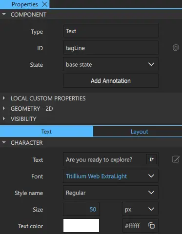
- Drag a Text component from Components > Default Components > Basic below the logo image in the 2D view.
- Select the Text component to edit the text properties in the Properties view:
- In Component > ID, enter the ID tagLine.
- In Character > Text, enter the tag line: Are you ready to explore?.
- In Character > Font, select Titillium Web.
- In Style name, enter ExtraLight.
- In Character > Size, set font size of the tag line to 50 px.
- In Character > Text color, set the text color to white (#ffffff).
- Drag the tagline to the horizontal center below the logo using the guidelines.
- Select File > Save or Ctrl+S to save your changes.
Your UI should now look something like this in the 2D view and Live Preview:
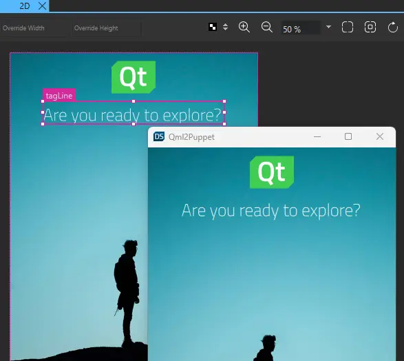
Resize the Live Preview window to see the whole screen.
You are now ready to add push buttons to your UI.
Creating a Push Button
Next, you use another wizard template to create a push button and add it to the UI. The wizard template creates a reusable button component that appears in Components > My Components. You can drag it to the 2D view and modify its properties in the Properties view to change its appearance and functionality.
If you cannot use the wizard template nor the preset button controls to create the kind of push button that you want, you can create your button from scratch using default components. For more information, see Creating buttons and Creating scalable buttons and borders.
To create a push button by using the wizard template:
- Select File > New File > Qt Quick Controls > Custom Button > Choose.
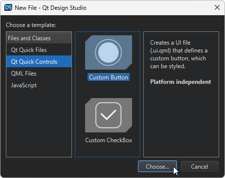
- In the Component name field, enter a name for your button component: EntryField.
- Select Finish (or Done on macOS) to create the button UI file,
EntryField.ui.qml.
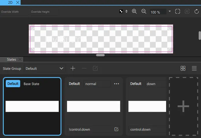
Your button should now look something like this:
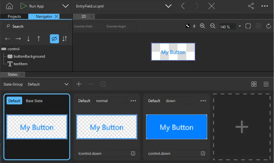
Next, change the appearance of the EntryField component by modifying its properties.
Styling the button
To style your new button, edit the properties of the EntryField component. To make the changes apply to all the EntryField instances, you must make them in the EntryField.ui.qml file.
The Custom Button wizard template adds a normal state and a down state to change the button background and the text color when the button is clicked. Now, change the colors in all states. When you make changes to the button in the Base State, they are automatically applied to the other states. However, the property values that have been explicitly changed in the normal or down state are not changed automatically, and you have to either reset them to the Base State or set them separately in that state.
To change the button property values:
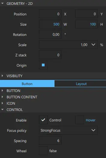
- Select control in Navigator to display its properties in Properties.
- In Geometry - 2D > Size, set button width (W) to 500 and height (H) to 100, to match the width of the tag line.
- In the Control section, clear the Hover checkbox because you don't want the hover effect for the button.
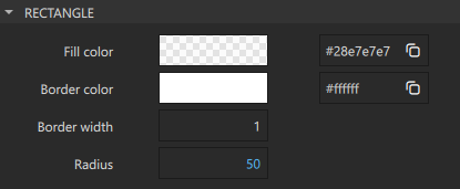
- Select buttonBackground in Navigator to display its properties in Properties.
- In Properties > Rectangle, set:
- Fill color to transparent light gray (#28e7e7e7). You can also use the color picker to set the color.
- Border color to white (#ffffff).
- Radius to 50 to give the button rounded corners.
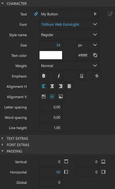
- Select textItem in Navigator to display its properties in Properties.
- In Properties > Character, set:
- Font to Titillium Web
- Style name to ExtraLight.
- Size to 34 px.
- Text color to white (#ffffff).
- Alignment H to left to align the text horizontally to the left.
- Alignment V to center to align the text vertically to the center.
- In Properties > Padding > Horizontal > Left, set the padding in the field between background border and text to 50.
- In the States view, select the normal state and repeat the changes in the background color and text properties, as necessary. Repeat for the down state.
- Select File > Save or select Ctrl+S to save your changes.
Your button should now look something like this:
Note: Do not edit the value of Text in the Character property because this breaks the connection, and prevents any later changes in Button Content > Text.
Next, add two instances of the EntryField component to the Screen01 component and modify their properties.
Adding entry fields to the UI
To add two entry fields to the UI and modify their properties:
- Double-click
Screen01.ui.qmlin Projects to open it in the 2D view. - Drag two EntryField components (1) from Components > My Components below the tagline in the 2D view. Use the guidelines (2) to align the buttons directly below the tagline.
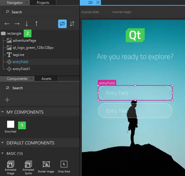
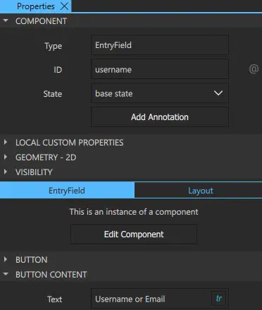
- Select the first EntryField button in the 2D view or Navigator to modify it in Properties.
- In Component > ID, enter username.
- In Button Content > Text, enter Username or Email and select tr to mark the text translatable.
- Select the second EntryField, and change its ID to password and text to Password. Again, mark the text translatable.
- Select File > Save or select Ctrl+S to save your changes.
Next, create another button that you can use in your UI.
Creating another button
You need to create another button for your UI. This time, you want to center-align the text of the buttons and use brighter colors for them, so you create a second button component as instructed in Creating a Push Button. This time you call it PushButton.
To make the changes apply to all the PushButton instances, you must make them in the PushButton.ui.qml file.
To change the button property values:
- Select control in Navigator to display its properties in Properties.
- In Geometry - 2D > Size, set button width (W) to 500 and height (H) to 100.
- In the Control section, clear the Hover checkbox because you don't want the hover effect for the button.
- Select buttonBackground in Navigator to display its properties in Properties.
- In Properties > Rectangle, set:
- Border color to the green used in the logo (#41cd52).
- Radius to 50 to give the button rounded corners.
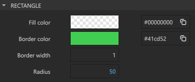
- Select textItem in Navigator to display its properties in Properties.
- In Properties > Character, set:
- Font to Titillium Web
- Style name to ExtraLight..
- Size to 34 px.
- Text color to (#41cd52).
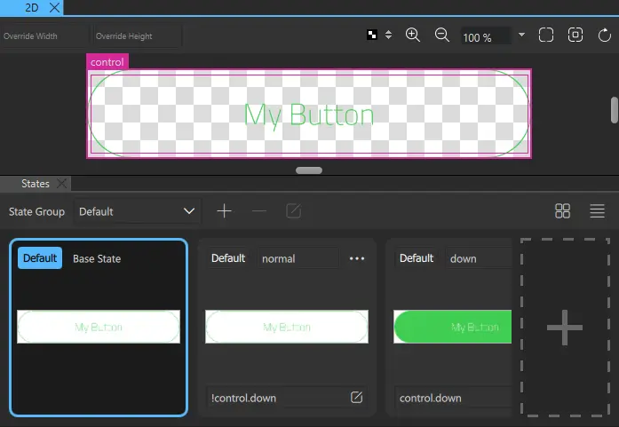
- In the States view, select the normal state and repeat the changes, as necessary.
- Repeat for the down state. However, in Rectangle > Fill color, set the color to green (#41cd52) to turn the button background green when the button is pressed down. Also, in Text > Character > Text color, keep the text color as white (#ffffff).
- Select File > Save or select Ctrl+S to save your changes.
Your button should now look something like this in Base State:
Next, add two buttons to the UI as s the final step in this tutorial.
Adding push buttons to the UI
To add two buttons to the UI and modify their properties:
- Select the file dropdown menu (1) from the top toolbar, and then select
Screen01.ui.qmlto open it in the 2D view. - Drag two PushButton components (2) from Components > My Components to the bottom of the background image in the 2D view. Use the guidelines (3) to align the push buttons horizontally with the entry fields.
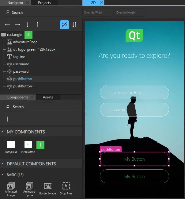
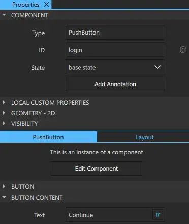
- Select the first PushButton in Navigator or the 2D view to modify it in Properties.
- In Component > ID, enter login.
- In Button Content > Text, enter Continue and select tr to mark the text translatable.
- Select the second PushButton and change its ID to createAccount and text label to Create Account. Again, mark the text translatable.
- Select File > Save or select Ctrl+S to save your changes.
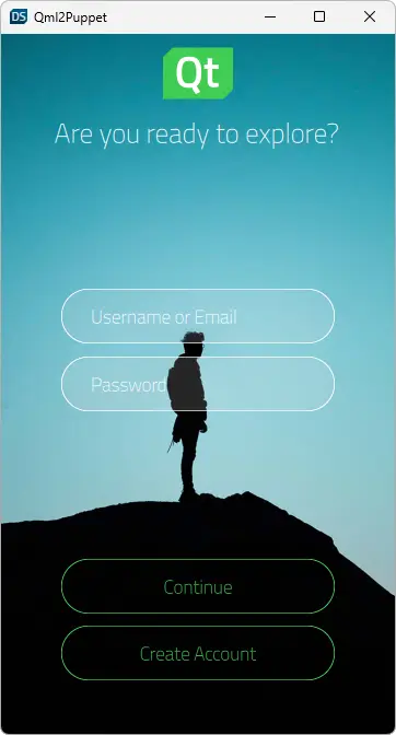
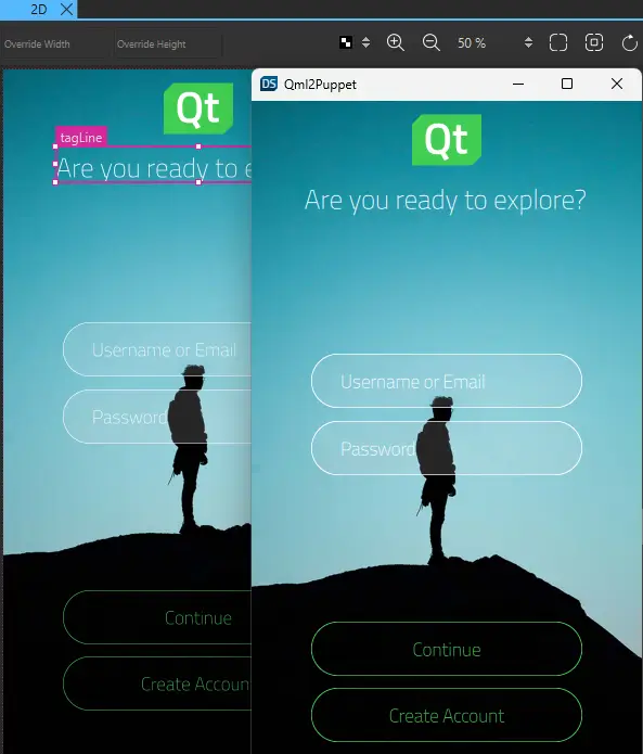
The first iteration of your UI is now ready and should now look something like this in the 2D view and Live Preview:
Next steps
To learn how to add more UI controls and position them on the page using anchors and layouts so that the UI is scalable, see the next tutorial in the series, Login UI: Positioning.
For a more advanced example of creating a menu button and using it to construct a button bar, see Side Menu.
Files:
- Loginui1/Loginui1.qmlproject
- Loginui1/content/EntryField.ui.qml
- Loginui1/content/PushButton.ui.qml
- Loginui1/content/Screen01.ui.qml
- Loginui1/imports/loginui1/Constants.qml
- Loginui1/imports/loginui1/EventListModel.qml
- Loginui1/imports/loginui1/EventListSimulator.qml
- Loginui1/imports/loginui1/qmldir
Images:
See also Creating projects, Rectangle, Text, Images, and Use Case - Visual Elements In QML.
Available under certain Qt licenses.
Find out more.
