Animations
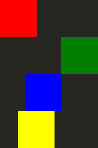
Example of how to include animations in QML applications
Qt Quick provides the ability to animate properties. Animating properties allows property values to move through intermediate values instead of immediately changing to the target value. To animate the position of an item, you can animate the properties that control the item’s position, x and y for example, so that the item’s position changes each frame on the way to the target position.
Fluid UIs
QML was designed to facilitate the creation of fluid UIs. These are user interfaces where the UI components animate instead of appearing, disappearing, or jumping abruptly. Qt Quick provides two simple ways to have UI components move with animation instead of instantly appearing at their new location.
States and transitions
Qt Quick allows you to declare various UI states in State objects. These states are comprised of property changes from a base state, and can be a useful way of organizing your UI logic. Transitions are objects you can associate with an item to define how its properties will animate when they change due to a state change.
States and transitions for an item can be declared with the Item::states and Item::transitions properties. States are declared inside the states list property of an item, usually the root item of the component. Transitions defined on the same item are used to animate the changes in the state. Here is an example.
Item {
    id: container
    width: 320
    height: 120

    Rectangle {
        id: rect
        color: "red"
        width: 120
        height: 120

        TapHandler {
            onTapped: container.state === '' ? container.state = 'other' : container.state = ''
        }
    }
    states: [
        // This adds a second state to the container where the rectangle is farther to the right

        State { name: "other"

            PropertyChanges {
                target: rect
                x: 200
            }
        }
    ]
    transitions: [
        // This adds a transition that defaults to applying to all state changes

        Transition {

            // This applies a default NumberAnimation to any changes a state change makes to x or y properties
            NumberAnimation { properties: "x,y" }
        }
    ]
}
Animating property changes.
Behaviors can be used to specify an animation for a property to use when it changes. This is then applied to all changes, regardless of their source. The following example animates a button moving around the screen using behaviors.
Item {
    width: 320
    height: 120

    Rectangle {
        color: "green"
        width: 120
        height: 120

        // This is the behavior, and it applies a NumberAnimation to any attempt to set the x property
        Behavior on x {

            NumberAnimation {
                //This specifies how long the animation takes
                duration: 600
                //This selects an easing curve to interpolate with, the default is Easing.Linear
                easing.type: Easing.OutBounce
            }
        }

        TapHandler {
            onTapped: parent.x == 0 ? parent.x = 200 : parent.x = 0
        }
    }
}
Other animations
Not all animations have to be tied to a specific property or state. You can also create animations more generally, and specify target items and properties inside the animation. Here are some examples of different ways to do this:
Item {
    width: 320
    height: 120

    Rectangle {
        color: "blue"
        width: 120
        height: 120

        // By setting this SequentialAnimation on x, it and animations within it will automatically animate
        // the x property of this element
        SequentialAnimation on x {
            id: xAnim
            // Animations on properties start running by default
            running: false
            loops: Animation.Infinite // The animation is set to loop indefinitely
            NumberAnimation { from: 0; to: 200; duration: 500; easing.type: Easing.InOutQuad }
            NumberAnimation { from: 200; to: 0; duration: 500; easing.type: Easing.InOutQuad }
            PauseAnimation { duration: 250 } // This puts a bit of time between the loop
        }

        TapHandler {
            // The animation starts running when you click within the rectangle
            onTapped: xAnim.running = true
        }
    }
}
Item {
    width: 320
    height: 120

    Rectangle {
        id: rectangle
        color: "yellow"
        width: 120
        height: 120

        TapHandler {
            // The animation starts running when you click within the rectangle
            onTapped: anim.running = true;
        }
    }

    // This animation specifically targets the Rectangle's properties to animate
    SequentialAnimation {
        id: anim
        // Animations on their own are not running by default
        // The default number of loops is one, restart the animation to see it again

        NumberAnimation { target: rectangle; property: "x"; from: 0; to: 200; duration: 500 }

        NumberAnimation { target: rectangle; property: "x"; from: 200; to: 0; duration: 500 }
    }
}
More information about animations can be found on the Important Concepts in Qt Quick - States, Transitions and Animations page.