Qt Quick Controls - StyleKit
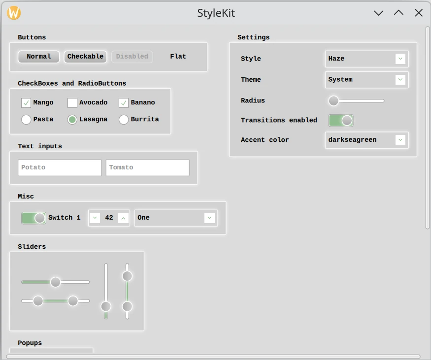
A PySide6 application that demonstrates the analogous example in Qt StyleKit Example.
This example shows how to style Qt Quick Controls applications using Qt Labs StyleKit.
It includes several styles that each demonstrate different aspects of styling:
Plain- A minimal style with only the basicsHaze- An advanced style with multiple themesVitrum- A style targeting VR environments
The example demonstrates, among other things, how to:
Implement and switch between different styles.
Implement support for light and dark themes, as well as additional themes such as high-contrast.
Use StyleVariation to provide alternative styling for parts of the application.
Apply shader-based visual effects to the controls.
Build custom controls using CustomControl and StyleReader.
Interact with a style at runtime, for example to change the theme or adjust style properties like the background radius.
"""
PySide6 port of StyleKit Quick Controls example from Qt v6.x
"""
import sys
from pathlib import Path
from PySide6.QtGui import QGuiApplication
from PySide6.QtQml import QQmlApplicationEngine

if __name__ == '__main__':
    app = QGuiApplication(sys.argv)
    app.setOrganizationName("QtProject")
    app.setApplicationName("StyleKit")
    engine = QQmlApplicationEngine()

    engine.addImportPath(Path(__file__).parent)
    engine.loadFromModule("StyleKitControlsExample", "Main")

    if not engine.rootObjects():
        sys.exit(-1)

    exit_code = app.exec()
    del engine
    sys.exit(exit_code)
import QtQuick
import QtQuick.Layouts
import Qt.labs.StyleKit
import "styles"
ApplicationWindow {
id: app
width: 1048
height: 800
visible: true
title: qsTr("StyleKit")
// Set the initial style:
StyleKit.style: hazeStyle
// Instantiate the available styles. The user can switch between them
// at runtime, and each style provides its own set of themes.
Haze { id: hazeStyle }
Vitrum { id: vitrumStyle }
Plain { id: plainStyle }
Fusion { id: fusionStyle }
property real spacing: 10
StyleKit.transitionsEnabled: transitionsEnabled.checked
menuBar: MenuBar {
id: appMenuBar
Menu {
title: qsTr("File")
Action { text: qsTr("New...") }
Action { text: qsTr("Open...") }
Action { text: qsTr("Save") }
Action { text: qsTr("Save As...") }
MenuSeparator { }
Action {
text: qsTr("Quit")
onTriggered: Qt.exit(0)
shortcut: StandardKey.Quit
}
}
Menu {
title: qsTr("Edit")
Action { text: qsTr("Cut") }
Action { text: qsTr("Copy") }
Action { text: qsTr("Paste") }
}
Menu {
title: qsTr("Help")
Action { text: qsTr("About") }
}
}
ScrollView {
id: scrollView
anchors.fill: parent
contentHeight: content.height + 40
ColumnLayout {
id: content
x: 10
y: app.spacing * 2
transformOrigin: Item.TopLeft
spacing: app.spacing * 2
GroupBox {
title: "Buttons"
ColumnLayout {
RowLayout {
spacing: app.spacing
Button {
text: "Normal"
}
Button {
text: "Checkable"
checkable: true
}
Button {
text: "Disabled"
enabled: false
}
}
RowLayout {
spacing: app.spacing
Button {
text: "Flat"
flat: true
checkable: true
}
RoundButton {
text: "Round"
}
DelayButton {
text: qsTr("DelayButton")
}
}
}
}
GroupBox {
title: "CheckBoxes and RadioButtons"
GridLayout {
rowSpacing: app.spacing
columnSpacing: app.spacing
columns: 3
CheckBox {
text: "Mango"
checked: true
}
CheckBox {
text: "Avocado"
}
CheckBox {
text: "Banano"
checked: true
}
RadioButton {
text: "Pasta"
}
RadioButton {
text: "Lasagna"
checked: true
}
RadioButton {
text: "Burrita"
}
}
}
GroupBox {
title: "Text inputs"
RowLayout {
spacing: app.spacing
TextField {
id: tf1
placeholderText: "Potato"
}
TextField {
id: tf2
placeholderText: "Tomato"
}
}
}
GroupBox {
title: "Misc"
GridLayout {
rowSpacing: app.spacing
columnSpacing: app.spacing
columns: 3
Switch {
checked: true
text: "Switch 1"
}
SpinBox {
id: spinBox1
value: 42
}
ComboBox {
id: comboBox1
model: ["One", "February", "Aramis", "Winter", "Friday"]
}
}
}
GroupBox {
title: "Sliders"
RowLayout {
spacing: app.spacing
ColumnLayout {
Slider {
id: slider1
from: 0
to: 10
value: 5
}
RangeSlider {
id: rangeSlider1
from: 0
to: 10
first.value: 2
second.value: 8
}
}
Slider {
id: slider2
from: 0
to: 10
value: 2
orientation: Qt.Vertical
}
RangeSlider {
id: rangeSlider2
from: 0
to: 10
first.value: 2
second.value: 8
orientation: Qt.Vertical
}
}
}
GroupBox {
title: "Dials"
RowLayout {
spacing: app.spacing * 2
ColumnLayout {
Dial {
id: dialCircular
from: 0
to: 10
value: 5
inputMode: Dial.Circular
}
Label {
text: "Circular"
Layout.alignment: Qt.AlignHCenter
}
}
ColumnLayout {
Dial {
id: dialHorizontal
from: 0
to: 10
value: 5
inputMode: Dial.Horizontal
}
Label {
text: "Horizontal"
Layout.alignment: Qt.AlignHCenter
}
}
ColumnLayout {
Dial {
id: dialVertical
from: 0
to: 10
value: 5
inputMode: Dial.Vertical
}
Label {
text: "Vertical"
Layout.alignment: Qt.AlignHCenter
}
}
}
}
GroupBox {
title: "Popups"
RowLayout {
spacing: app.spacing
Button {
text: "Open Popup"
onClicked: popup.open()
}
}
}
GroupBox {
title: "Variations"
StyleVariation.variations: ["mini"]
ColumnLayout {
spacing: app.spacing * 2
Text {
visible: StyleKit.style === hazeStyle
text: "These controls are affected by an Instance Variation named 'mini'"
}
RowLayout {
spacing: app.spacing
TextField {
placeholderText: "Mini zucchini"
}
Switch {
checked: true
}
Button {
// This button will be affected by both an "alert" and a "mini" variation
StyleVariation.variations: ["alert"]
text: "Alert!"
}
CheckBox {
text: "Baninis"
checked: true
}
Slider {
value: 0.5
}
}
Frame {
Layout.preferredHeight: 120
Layout.fillWidth: true
Column {
spacing: 20
anchors.fill: parent
Text {
visible: StyleKit.style === hazeStyle
anchors.horizontalCenter: parent.horizontalCenter
text: "Frame also has a Type Variation that affects Button"
}
Button {
anchors.horizontalCenter: parent.horizontalCenter
text: "Button"
}
}
}
}
}
GroupBox {
title: "Custom controls"
RowLayout {
spacing: app.spacing
CustomButtonImplementation {}
CustomButtonImplementation {}
}
}
}
// Settings menu
GroupBox {
id: menu
anchors.right: parent.right
anchors.rightMargin: 10
contentWidth: menuContents.implicitWidth
contentHeight: menuContents.implicitHeight
title: "Settings"
y: app.spacing * 2
GridLayout {
id: menuContents
columns: 2
rowSpacing: app.spacing
columnSpacing: app.spacing
Label { text: "Style" }
ComboBox {
id: styleSelector
textRole: "text"
valueRole: "value"
currentValue: StyleKit.style
model: [
{ value: hazeStyle, text: "Haze" },
{ value: plainStyle, text: "Plain" },
{ value: vitrumStyle, text: "Vitrum" },
{ value: fusionStyle, text: "Fusion" }
]
onCurrentTextChanged: {
StyleKit.style = model[currentIndex].value;
themeSelector.currentValue = StyleKit.style.themeName
themeSelector.model = StyleKit.style.availableThemeNames
}
Component.onCompleted: {
themeSelector.currentValue = StyleKit.style.themeName
themeSelector.model = StyleKit.style.availableThemeNames
}
}
Label { text: "Theme" }
ComboBox {
id: themeSelector
onCurrentTextChanged: StyleKit.style.themeName = currentText
}
Label { text: "Radius" }
Slider {
Layout.maximumWidth: 150
from: 0
to: 20
value: StyleKit.style.control.background.radius
onValueChanged: {
// Ensure we don't set the value if the style already has the same value
// set, or if that value is out-of-range WRT the slider. In both cases,
// this would lead to a binding loop.
let styleValue = StyleKit.style.control.background.radius
if (styleValue === value || styleValue < from || styleValue > to)
return
StyleKit.style.abstractButton.background.radius = value
StyleKit.style.groupBox.background.radius = value
}
}
Label { text: "Transitions enabled" }
Switch {
id: transitionsEnabled
checked: true
}
Label { text: "Accent color" }
ComboBox {
id: accentColor
model: ["darkseagreen", "plum", "sandybrown", "slateblue"]
onCurrentTextChanged: app.palette.accent = currentText
}
}
}
}
Popup {
id: popup
anchors.centerIn: parent
closePolicy: Popup.NoAutoClose
popupType: Popup.Window
ColumnLayout {
anchors.centerIn: parent
spacing: app.spacing * 2
Label {
text: qsTr("A Label in a Popup")
Layout.alignment: Qt.AlignHCenter
}
Button {
text: qsTr("Close Popup")
Layout.alignment: Qt.AlignHCenter
Layout.fillWidth: false
onClicked: popup.close()
}
}
}
// In addition to Qt Quick Controls, it's also possible to
// define and style your own custom controls.
component CustomButtonImplementation : Rectangle {
implicitWidth: fancyButton.background.width + fancyButton.leftPadding + fancyButton.rightPadding
implicitHeight: fancyButton.background.height + fancyButton.topPadding + fancyButton.bottomPadding
radius: fancyButton.background.radius
border.color: fancyButton.background.border.color
border.width: fancyButton.background.border.width
color: fancyButton.background.color
scale: fancyButton.background.scale
StyleReader {
id: fancyButton
controlType: hazeStyle.fancyButton
hovered: hoverHandler.hovered
pressed: tapHandler.pressed
palette: app.palette
}
Text {
anchors.centerIn: parent
font.pixelSize: 15
text: "Custom Button"
}
HoverHandler {
id: hoverHandler
}
TapHandler {
id: tapHandler
onTapped: {
// Change the background color of all controls whose
// controlType matches fancyButton.type.
let fancyButtons = StyleKit.style.theme.getControlStyle(fancyButton.type)
if (fancyButtons) // Only the Haze style defines a fancyButton
fancyButtons.background.color = "yellowgreen"
}
}
}
}
import QtQuick
import Qt.labs.StyleKit
Style {
id: style
fonts {
system {
family: "Courier New"
pointSize: 12
}
textField.bold: true
label.bold: true
}
control {
// 'control' is the fallback for all the controls. Any properties that are not
// overridden by a specific control underneath will be read from here instead.
padding: 8
background {
// Disable drop shadow on the background by default, and enable it per
// control type below instead
shadow.visible: false
}
handle {
width: 25
height: 25
radius: 25
gradient: Gradient {
GradientStop { position: 0.0; color: Qt.alpha("black", 0.0)}
GradientStop { position: 1.0; color: Qt.alpha("black", 0.2)}
}
shadow {
opacity: 0.8
scale: 1.1
}
}
indicator {
foreground.margins: 2
}
transition: Transition {
StyleAnimation {
animateColors: true
animateBackgroundShadow: true
animateHandleShadow: true
duration: 300
}
}
hovered {
// For this style, we don't want to show any transitions when entering or while inside
// the 'hovered' state. This makes the control light up immediately when hovered, but
// fade out more slowly when returning to the 'normal' state. We therefore override
// 'transition' and set it to null.
transition: null
}
}
abstractButton {
// 'abstractButton' is the fallback for all button types such as 'button', 'checkBox',
// 'radioButton', 'switch', etc. This is a good place to style the properties they all
// have in common. Any properties not set here will fall back to those defined in 'control'.
background {
width: 100
height: 30
opacity: 0.8
radius: 8
shadow {
visible: true
opacity: 0.8
scale: 1.1
}
gradient: Gradient {
GradientStop { position: 0.0; color: Qt.alpha("black", 0.0)}
GradientStop { position: 1.0; color: Qt.alpha("black", 0.2)}
}
}
}
button {
// Here you can override the style for a Button. The properties you set here apply only
// to a Button, not to for example a CheckBox. Any properties not set here will fall back
// to those defined in 'abstractButton'.
pressed {
background.scale: 0.95
}
}
delayButton {
padding: 0
indicator {
radius: 8
foreground {
margins: 0
radius: 8
}
}
}
flatButton {
background.gradient: null
}
checkBox {
transition: Transition {
NumberAnimation {
// Using a StyleAnimation for transitions is optional. A StyleAnimation can be
// used in parallel with other animations, or not used at all. Here we choose to use
// a NumberAnimation instead to animate the 'checked' image so that it bounces.
properties: "indicator.foreground.leftMargin, indicator.foreground.rightMargin"
+ ", indicator.foreground.topMargin, indicator.foreground.bottomMargin"
easing.type: Easing.OutBounce
duration: 500
}
}
hovered {
transition: null
indicator.foreground.margins: -15
}
}
comboBox {
background.width: 200
pressed.background.scale: 1.0
}
dial {
handle.width: 15
handle.height: 15
indicator.foreground.margins: 0
}
pane {
// 'pane' is the fallback for all pane based controls, such as 'frame' and 'groupBox'.
// Any properties not set here will fall back to those defined in 'control'.
spacing: 5
padding: 20
background {
border.width: 0
width: 200
height: 200
shadow.visible: false
}
}
groupBox {
background.topMargin: 20
background.height: 30
text.bold: true
}
menu {
background.width: 120
}
menuBar {
padding: 1
background.height: 30
}
menuBarItem {
text.bold: true
background {
height: 30
width: 30
}
transition: null
}
menuItem {
padding: 4
background.height: 20
transition: null
}
menuSeparator {
padding: 4
background {
width: 120
height: 1
border.width: 0
}
indicator {
height: 1
width: 120
border.width: 0
foreground.margins: 0
foreground.visible: false
}
}
radioButton {
indicator {
foreground {
margins: 4
radius: 25 / 2
border.width: 0
}
}
}
roundButton {
background.radius: 255
}
scrollBar {
padding: 2
background.visible: false
}
scrollIndicator {
padding: 0
indicator.foreground.margins: 0
}
slider {
background.width: 180
indicator {
height: 8
radius: 8
foreground {
radius: 8
}
}
vertical {
background {
width: 50
height: 150
}
indicator {
width: 8
}
}
}
spinBox {
padding: 4
background {
width: 100
scale: 1
}
indicator.height: 24
}
switchControl {
indicator {
width: 60
height: 30
radius: 5
foreground.radius: 4
}
handle {
leftMargin: 3
rightMargin: 3
}
}
textInput {
// 'textInput' is the fallback for all text based controls, such as 'textField', 'textArea',
// and 'searchField'. Any properties not set here will fall back to those defined in 'control'.
background {
width: 200
}
}
// You can define one or more StyleVariations that can be enabled from the
// application using the attached 'StyleVariation.variations' property.
// Inside a variation, you list the controls that should receive alternative
// styling when the variation is active. Any properties defined in a variation
// override those set in the Style or Theme.
//
// For example, if you set "StyleVariation.variations: ['mini']" on a GroupBox
// in the application, all controls inside that GroupBox will be affected.
// Exactly which controls are impacted depends on which ones you style inside
// the variation.
StyleVariation {
name: "mini"
control {
padding: 2
background {
height: 15
}
indicator {
width: 15
height: 15
}
handle {
width: 15
height: 15
}
}
textInput {
background.width: 100
}
abstractButton.background {
width: 60
}
switchControl {
background.width: 40
indicator.width: 40
indicator.height: 20
}
slider {
background.width: 100
indicator.height: 8
}
pane {
padding: 20
spacing: 5
}
}
/* You can also set one or more StyleVariations on a control type. Unlike Instance
* variations—which apply only to specific control instances—type variations are applied
* to *all* instances of a control type without requiring the application to use attached
* properties.
*
* In this example, we specify that all Buttons that are children of a Frame
* should receive alternative styling, differentiating them from other Buttons. */
frame {
background {
border.width: 1
}
variations: StyleVariation {
button.background {
radius: 0
color: palette.accent
shadow.visible: false
}
}
}
/* Because 'groupBox' falls back to 'frame', any StyleVariation applied to a frame
* is automatically inherited by a groupBox as well. Since I in this example only want the
* different styling on frames, not group boxes, I can simply unset the variation
* for group boxes. */
groupBox.variations: []
readonly property int fancyButton: 0
CustomControl {
// You can also define your own custom control types and pair them with custom
// implementations in your app. Here we provide a base configuration for a control
// named 'fancyButton', and then override it in the themes to apply colors. Any
// properties not set here will fall back to those defined in 'control'.
// The 'controlType' can be any number between 0 and 100000.
controlType: fancyButton
background {
width: 120
height: 30
radius: 0
}
}
// A style can have any number of themes. The ones assigned to 'light' and 'dark'
// will be applied according to the current system theme if 'themeName' is set to
// "System" (the default). Setting the current themeName for a style is usually done
// from the application rather than from within the style itself.
//
// Within a theme, you can override any properties that should have different values
// when the theme is applied. Typically, a style configures structural properties
// such as width, height, padding, and radii, while a theme specifies colors. However,
// this is not a limitation — any properties can be overridden by a theme. Properties
// not set in the theme will fall back to those defined in the style.
light: Theme {
applicationWindow {
background.color: "gainsboro"
}
control {
background {
color: "lightgray"
border.color: "white"
shadow.color: "white"
}
handle {
color: "lightgray"
shadow.color: "white"
border.color: "white"
}
indicator {
color: "white"
foreground.image.color: palette.accent
}
checked {
background.shadow.color: "white"
background.color: "blue"
}
focused {
background.border.color: "white"
background.shadow.color: "white"
}
hovered {
handle {
shadow.color: "white"
shadow.scale: 1.6
border.color: "lightgray"
}
}
disabled {
background {
opacity: 0.4
gradient: null
}
}
}
abstractButton {
background {
shadow.scale: 1.05
}
hovered.background {
color: palette.accent
border.color: "white"
shadow.color: "white"
shadow.scale: 1.4
}
checked {
background.color: palette.accent
}
}
delayButton {
indicator.color: "transparent"
}
comboBox {
hovered.background {
color: palette.accent
border.color: "white"
shadow.color: "white"
shadow.scale: 1.4
}
}
itemDelegate {
padding: 4
background.height: 40
hovered.background.color: palette.accent
}
menuBarItem {
hovered.background.color: palette.accent
}
menuItem {
hovered.background.color: palette.accent
}
pane {
background.color: Qt.darker("gainsboro", 1.05)
}
textField {
background {
shadow.scale: 0
border.color: "darkgray"
color: "white"
}
hovered.background {
border.color: "lightgray"
shadow.scale: 1.1
}
focused {
background.border.color: palette.accent
background.border.width: 2
}
focused.hovered {
background.border.color: palette.accent
}
}
scrollIndicator {
indicator.foreground.color: "white"
}
StyleVariation {
name: "alert"
abstractButton.background {
color: "orchid"
border.color: "orchid"
shadow.color: "orchid"
}
}
CustomControl {
controlType: fancyButton
background {
color: "tan"
}
}
// In a theme, you can also configure the theme palettes. These palettes act as
// the base palettes for the entire application. The theme palettes in Qt Quick
// are a combination of colors fetched from the operating system (including the
// currently active OS theme) and any colors you override in the 'palettes'
// section below.
//
// Because of this, StyleKit styles do not bind colors to the palette by default
// (except for the accent color). Otherwise, the style’s appearance would vary
// across platforms, since each platform defines its own palette—unless you
// explicitly override all palette colors here. If you do want palette-based
// behavior, you can bind properties to palette colors, e.g.:
// 'button.text.color: palette.textColor'.
palettes {
system.window: "gainsboro"
textField.text: "#4e4e4e"
spinBox.highlight: "lightgray"
button {
buttonText: "black"
highlightedText: "black"
brightText: "#4e4e4e"
disabled.buttonText: "#4e4e4e"
disabled.highlightedText: "#4e4e4e"
}
}
}
dark: Theme {
applicationWindow {
background.color: "#544e52"
}
control {
text.color: "lightgray"
background {
border.color: "#3d373b"
shadow.color: "#555555"
color: "#8e848a"
}
handle {
color: "#8e848a"
border.color: Qt.darker("#544e52", 1.5)
shadow.color: "#808080"
}
indicator {
color: Qt.darker("#8e848a", 1.6)
}
hovered {
handle {
shadow.color: "white"
}
}
}
abstractButton {
checked {
background.color: palette.accent
}
disabled {
background {
opacity: 0.3
shadow.color: "transparent"
}
checked.background.color: "green"
}
focused {
background {
border.color: "white"
shadow.color: "white"
color: "#bbbbbb"
}
}
hovered {
background {
border.color: "white"
color: palette.accent
shadow.color: "white"
shadow.scale: 1.1
shadow.blur: 20
}
}
}
delayButton {
indicator.color: "transparent"
}
comboBox {
hovered {
background {
border.color: "white"
color: palette.accent
shadow.color: "white"
shadow.scale: 1.1
shadow.blur: 20
}
}
}
itemDelegate {
hovered.background.color: palette.accent
}
menu {
background.color: '#433e41'
}
menuBar {
background.color: '#433e41'
}
menuBarItem {
background.color: "#433e41"
hovered.background.color: palette.accent
}
menuSeparator {
background.color: "#433e41"
}
menuItem {
background.color: "#433e41"
hovered.background.color: palette.accent
}
textInput {
background.color: "white"
}
scrollBar {
indicator.foreground.color: "white"
}
slider {
indicator.foreground.color: palette.accent
}
pane {
/* The controls change background color on states like hover, but panes
* should not. Override the property here to disable that behavior for panes. */
background.color: Qt.lighter("#544e52", 1.3)
background.border.color: "#3d373b"
}
StyleVariation {
name: "alert"
abstractButton.background {
color: "orchid"
border.color: "orchid"
shadow.color: "orchid"
}
}
CustomControl {
controlType: fancyButton
background {
color: "thistle"
}
}
palettes {
system.window: "#544e52"
textField.text: "black"
spinBox.highlight: "blue"
button {
buttonText: "white"
highlightedText: "white"
brightText: "white"
disabled.buttonText: "darkgray"
disabled.highlightedText: "darkgray"
}
}
}
// In addition to 'light' and 'dark', you can define as many themes as you want.
// You can switch between them from the application, for example using:
// 'StyleKit.style.themeName: "HighContrast"'.
CustomTheme {
name: "HighContrast"
theme: Theme {
control {
transition: null
background {
height: 40
shadow.color: "transparent"
color: "lightgray"
border.color: "black"
border.width: 2
gradient: null
}
indicator {
width: 30
height: 30
color: "ghostwhite"
border.color: "black"
foreground.margins: 4
foreground.color: "black"
foreground.image.color: "ghostwhite"
}
handle {
border.color: "black"
border.width: 2
width: 30
height: 30
radius: 30
gradient: null
}
text.bold: true
hovered {
background.border.width: 4
indicator.border.width: 4
handle.border.width: 4
}
checked {
background.border.width: 6
}
disabled {
background.color: "white"
}
}
abstractButton {
background.color: "ghostwhite"
}
delayButton {
indicator {
color: "transparent"
foreground.margins: 0
}
checked.text.color: "white"
}
dial {
handle.width: 15
handle.height: 15
indicator {
width: 60
height: 60
foreground.margins: 0
}
}
textInput {
background.color: "white"
}
slider {
indicator {
width: 180
height: 12
color: "ghostwhite"
border.width: 1
foreground.color: "black"
}
vertical {
background {
width: 12
height: 180
}
indicator {
width: 12
height: 180
}
}
}
radioButton {
indicator.radius: 255
indicator.foreground.radius: 255
}
switchControl {
background {
color: "ghostwhite"
border.width: 2
}
indicator {
radius: 16
margins: 0
border.width: 2
width: 60
height: 40
foreground.color: "transparent"
}
handle {
width: 20
height: 30
border.width: 2
color: "white"
margins: 6
radius: 0
topLeftRadius: 18
bottomLeftRadius: 18
}
hovered {
indicator.border.width: 4
}
checked {
handle {
color: "black"
radius: 0
topRightRadius: 18
bottomRightRadius: 18
}
}
}
spinBox {
indicator.color: "black"
indicator.foreground.image.color: "white"
hovered.background.border.width: 6
}
itemDelegate {
background.border.width: 0
hovered.background.border.width: 2
hovered.text.bold: true
}
scrollBar {
background.width: 15
background.height: 15
indicator.width: 15
indicator.height: 15
indicator.border.width: 3
indicator.foreground.margins: 3
indicator.foreground.color: "lightgray"
}
menu {
background.color: "black"
}
menuBar {
background.color: "black"
}
menuBarItem {
text.color: "white"
background.color: "black"
hovered.background.color: "white"
hovered.text.color: "black"
}
menuSeparator {
background.color: "black"
background.height: 1
indicator.height: 1
indicator.border.width: 0
}
menuItem {
text.color: "white"
text.padding: 6
background.color: "black"
hovered.background.color: "white"
hovered.text.color: "black"
}
palettes {
system.window: "white"
textField.text: "black"
button {
buttonText: "black"
highlightedText: "black"
brightText: "black"
disabled.buttonText: "white"
disabled.highlightedText: "white"
}
}
}
}
CustomTheme {
name: "Green"
theme: Theme {
applicationWindow {
background.color: "#8da28d"
}
control {
background {
border.color: "#547454"
shadow.color: "darkseagreen"
color: "#a0c0a0"
}
handle {
border.color: "#547454"
shadow.color: "darkseagreen"
color: "#a0c0a0"
}
indicator {
color: "white"
border.color: "#547454"
foreground.color: "white"
}
text {
color: "#1c261c"
bold: true
}
hovered {
background {
color: "#ecefec"
border.color: "#ecefec"
shadow.color: "white"
}
handle {
color: "#ecefec"
border.color: "#ecefec"
shadow.color: "white"
}
}
checked {
indicator {
foreground.color: "#678367"
foreground.image.color: "#678367"
}
}
disabled {
background {
color: "#80a080"
shadow.color: "transparent"
}
}
}
checkBox {
indicator.foreground.color: "transparent"
}
comboBox {
indicator.color: "transparent"
indicator.foreground.color: "transparent"
indicator.foreground.image.color: "white"
}
delayButton {
indicator.color: "transparent"
}
pane {
background.color: "#a0b1a0"
background.border.color: "#415a41"
}
scrollIndicator {
indicator.foreground.color: "white"
}
spinBox {
indicator.color: "transparent"
indicator.foreground.color: "transparent"
indicator.foreground.image.color: "white"
}
switchControl {
indicator.foreground.color: "white"
checked.indicator.foreground.color: "#678367"
}
textInput {
background.color: "white"
}
menuBar {
background.color: "#8da28d"
}
menuBarItem {
background.color: "#8da28d"
hovered.background.color: "white"
}
menuSeparator {
background.color: "#a0c0a0"
}
StyleVariation {
name: "alert"
abstractButton.background {
color: "lime"
border.color: "lime"
shadow.color: "lime"
}
}
palettes {
system.window: "#547454"
textField.text: "green"
textField.placeholderText: "#678367"
checkBox.buttonText: "white"
button {
buttonText: "black"
highlightedText: "white"
disabled.buttonText: "lightgray"
disabled.highlightedText: "lightgray"
}
}
}
}
CustomTheme {
name: "Empty Theme"
theme: Theme {}
}
}
import QtQuick
import Qt.labs.StyleKit

Style {
    control {
        // We start by styling a control in its 'normal' state
        leftPadding: 20
        rightPadding: 20

        background {
            border.color: palette.accent
            radius: 4
        }

        handle {
            color: palette.accent.lighter(1.2)
        }

        hovered {
            // Here we override some of the properties for the 'hovered' state. The ones
            // we don't set here will fall back to be read from the 'normal' state.
            handle.color: palette.accent.darker(1.2)
        }

        hovered.pressed {
            // The states can also be nested. Since 'hovered.pressed' is more specific
            // than 'hovered', the former will be read first if the same property is set
            // in multiple states.
            background {
                color: palette.accent.darker(1.2)
                scale: 0.95
            }
        }

        checked {
            text.color: "white"
            background {
                color: palette.accent.darker(1.2)
                scale: 0.95
            }
        }

        checked.hovered {
            background.color: palette.accent
        }

        checked.hovered.pressed {
            background.color: palette.accent.darker(1.2)
        }

        transition: Transition {
           ColorAnimation {
                properties: "background.color"
                duration: 100
           }
        }
    }

    abstractButton {
        // After styling what is common to all the controls in the 'control' section
        // above, we now override and set properties that should be specific to only
        // some of the controls.
        // In this style, we want to show the background for all button types, such as
        // 'button', 'checkBox', 'radioButton', etc, so we set 'background.visible: true'.
        // By default, the background is normally hidden for most controls.
        background {
            visible: true
            shadow {
                color: "darkgray"
                horizontalOffset: 2
                verticalOffset: 2
            }
        }
        hovered.background.color: palette.accent
    }

    delayButton {
        padding: 0
        indicator {
            radius: 4
            foreground {
                radius: 4
                color: palette.accent.lighter(1.2)
            }
        }
        checked.indicator.foreground.color: palette.accent.darker(1.2)
    }

    itemDelegate {
        // We don't want the menu items in a ComboBox to fade, so we override and unset
        // the transition previously set for all controls in the 'control' section.
        transition: null
        background.radius: 0
        background.color: Qt.alpha(palette.accent, 0)
        hovered {
            background.color: palette.accent
            text.color: "white"
        }
    }

    menuBar {
        padding: 0
    }

    menuBarItem {
        background.color: Qt.alpha(palette.accent, 0)
        hovered.background.color: palette.accent
    }

    menu {
        padding: 2
    }

    menuItem {
        background.color: Qt.alpha(palette.accent, 0)
        hovered.background.color: palette.accent
    }

    menuSeparator {
        indicator.color: palette.accent
    }

    popup {
        // Remove padding so that item delegates span the full width
        padding: 0
    }

    roundButton {
        background.radius: 255
    }

    scrollBar {
        // Hide the background, showing only the groove and handle
        background.visible: false
        padding: 0
    }

    scrollIndicator {
        padding: 2
    }

    pane {
        /* The controls change background color on states like hover, but panes
         * should not. Override the property here to disable that behavior for panes. */
        background.color: "white"
    }

    applicationWindow {
        background.color: "whitesmoke"
    }
}
import QtQuick
import Qt.labs.StyleKit

Style {
    id: style

    component ColorSet : QtObject {
        property color normal
        property color muted
        property color subtle
    }

    property MyTheme myTheme: theme as MyTheme

    component MyTheme : Theme {
        property ColorSet neutralBackground
        property ColorSet neutralStroke
        property ColorSet neutralForeground
        property ColorSet accentBackground
        property ColorSet accentStroke
        property ColorSet accentForeground // on-accent

        property real controlHeight: 50
        property color windowColor: "#f7f7f7"
        property color shadowColor: "#404040"

        palettes {
            system.window: windowColor
            textField {
                text: neutralForeground.normal
                disabled.text: neutralForeground.muted
            }

            checkBox.buttonText: neutralForeground.normal
            button {
                buttonText: neutralForeground.normal
                highlightedText: neutralForeground.normal
                brightText: neutralForeground.normal //????
                disabled.buttonText: neutralForeground.subtle
                disabled.highlightedText: neutralForeground.subtle
            }
        }
    }

    Gradient {
        id: faintHorizontalGradient
        orientation: Gradient.Horizontal
        GradientStop { position: 0.0; color: Qt.alpha("black", 0.0)}
        GradientStop { position: 1.0; color: Qt.alpha("black", 0.1)}
    }

    Gradient {
        id: faintVerticalGradient
        orientation: Gradient.Vertical
        GradientStop { position: 0.0; color: Qt.alpha("black", 0.0)}
        GradientStop { position: 1.0; color: Qt.alpha("black", 0.1)}
    }

    Gradient {
        id: strongHorizontalGradient
        orientation: Gradient.Horizontal
        GradientStop { position: 0.0; color: Qt.alpha("black", 0.0)}
        GradientStop { position: 1.0; color: Qt.alpha("black", 0.4)}
    }

    Gradient {
        id: strongVerticalGradient
        orientation: Gradient.Vertical
        GradientStop { position: 0.0; color: Qt.alpha("black", 0.0)}
        GradientStop { position: 1.0; color: Qt.alpha("black", 0.4)}
    }

    applicationWindow {
        background.color: myTheme.windowColor
    }

    control {
        leftPadding: 10
        topPadding: 5
        rightPadding: 10
        bottomPadding: 5

        background {
            height: myTheme.controlHeight
            color: myTheme.neutralBackground.normal
        }

        vertical {
            background.gradient: faintHorizontalGradient
            indicator.gradient: faintHorizontalGradient
        }

        handle {
            width: 36
            height: 36
            radius: 18
            border.width: 2
            border.color: myTheme.neutralStroke.normal
            color: myTheme.accentForeground.normal
        }

        indicator {
            height: myTheme.controlHeight
            radius: 25
            border.width: 3
            border.color: myTheme.neutralStroke.normal
            color: myTheme.neutralBackground.normal
            foreground {
                radius: 25
                gradient: strongVerticalGradient
                border.width: 3
                border.color: myTheme.accentStroke.normal
                color: myTheme.accentBackground.normal
            }
        }

        hovered {
            handle.border.width: 5
        }
    }

    abstractButton {
        background {
            width: 100
            radius: 255
            border.width: 2
            border.color: myTheme.neutralStroke.normal
            color: myTheme.neutralBackground.normal
            gradient: faintVerticalGradient

            shadow {
                opacity: 0.25
                scale: 1.05
                verticalOffset: 2.5
                horizontalOffset: 2
                color: myTheme.shadowColor
                blur: 5
            }
        }

        hovered {
            background.color: myTheme.neutralBackground.muted
            checked.background.color: myTheme.accentBackground.muted
        }

        pressed {
            background.scale: 0.95
        }

        checked {
            background {
                color: myTheme.accentBackground.normal
                border.color: myTheme.accentStroke.normal
            }
        }

        disabled {
            background {
                color: myTheme.neutralBackground.subtle
                border.color: myTheme.neutralStroke.subtle
                shadow.color: "transparent"
            }
        }
    }

    delayButton {
        padding: 0
        indicator {
            color: "transparent"
            border.width: 0
        }
    }

    pane {
        padding: 20
        background.delegate: null
    }

    scrollIndicator {
        padding: 2
        background.height: 6
        indicator.height: 6
        vertical {
            background.width: 6
            indicator.width: 6
        }
    }

    scrollBar {
        padding: 2
        background.height: 20
        background.visible: false
        indicator.height: 20
        vertical {
            background.width: 20
            indicator.width: 20
        }
    }

    checkBox {
        indicator {
            width: 35
            height: 35
            radius: 4
            border.width: 1.5
            foreground {
                radius: 4
                border.width: 1.5
                image.color: myTheme.accentForeground.normal
                color: myTheme.accentBackground.normal
            }
        }
    }

    dial {
        indicator {
            width: 184
            height: 184
            radius: 255
            foreground {
                width: 8
                height: 8
            }
        }
    }

    radioButton {
        indicator {
            width: 35
            height: 35
            radius: width / 2
            border.width: 1.5
            foreground {
                margins: 4
                radius: width / 2
                border.width: 0
                //image.color: myTheme.activeHighlight
                color: myTheme.accentBackground.normal
                gradient: faintVerticalGradient
            }
        }
        checked {
            indicator.border.color: myTheme.accentStroke.normal
        }
    }

    roundButton {
        background.radius: 255
    }

    popup {
        padding: 2
        topPadding: 10
        bottomPadding: 10
    }

    comboBox {
        background {
            width: 200
            height: myTheme.controlHeight
            radius: myTheme.controlHeight / 2
            border.color: myTheme.neutralStroke.normal
            color: myTheme.neutralBackground.normal
        }
        indicator {
            height: myTheme.controlHeight / 6
            color: "transparent"
            border.width: 0
            foreground {
                margins: 4
                color: "transparent"
                border.width: 0
                gradient: null
                image.color: myTheme.neutralStroke.subtle
            }
        }
    }

    spinBox {
        background {
            radius: myTheme.controlHeight / 2
        }
        indicator {
            radius: 0
            color: "transparent"
            border.width: 0
            foreground.gradient: null
            foreground.color: "transparent"
            foreground.image.color: myTheme.accentStroke.normal
            foreground.border.width: 0
            foreground.width: 20
            foreground.height: 20
        }
    }

    textField {
        background {
            radius: 9999999999
            width: 200
            height: myTheme.controlHeight
            border.color: myTheme.neutralStroke.normal
            color: myTheme.neutralBackground.normal
        }
        hovered.background.color: myTheme.neutralBackground.muted
        focused.background.border.color: myTheme.accentStroke.normal
    }

    slider {
        spacing: 26
        background.width: 180
        indicator.foreground.minimumWidth: 50
        indicator.foreground.margins: 2
        handle {
            leftMargin: 8
            rightMargin: 8
        }
        vertical {
            background {
                height: 180
                width: myTheme.controlHeight
            }
            indicator {
                width: myTheme.controlHeight
                foreground.minimumWidth: 0
                foreground.minimumHeight: 50
            }
            handle {
                leftMargin: 0
                rightMargin: 0
                topMargin: 8
                bottomMargin: 8
            }
        }
    }

    switchControl {
        spacing: 8
        indicator {
            width: 80
            height: myTheme.controlHeight
            foreground.visible: false
        }
        handle {
            leftMargin: 8
            rightMargin: 8
        }
        checked {
            indicator {
                color: myTheme.accentBackground.normal
                border.color: myTheme.accentStroke.normal
                gradient: strongVerticalGradient
            }
        }
    }

    flatButton {
        hovered.background.visible: true
        checked.background.visible: true
        hovered.background.color: myTheme.neutralBackground.muted
        checked.background.color: myTheme.accentBackground.normal
        hovered.checked.background.color: myTheme.accentBackground.muted
    }

    itemDelegate {
        hovered.background.color: myTheme.accentBackground.normal
    }

    menu {
        padding: 2
        topPadding: 10
        bottomPadding: 10
        background.width: 100
    }

    menuBar {
        padding: 2
        background.height: 30
    }

    menuBarItem {
        padding: 2
        background.width: 100
        background.height: 30
        hovered.background.color: myTheme.accentBackground.normal
    }

    menuItem {
        padding: 2
        text.padding: 4
        background.height: 30
        indicator.height: 30
        hovered.background.color: myTheme.accentBackground.normal
    }

    menuSeparator {
        padding: 4

        background {
            width: 100
            height: 0
            color: "transparent"
            border.width: 0
        }

        indicator {
            height: 1
            width: 100
            color: myTheme.neutralStroke.normal
            border.width: 0

            foreground.margins: 0
            foreground.visible: false
        }
    }

    // THEMES

    light: MyTheme {
        windowColor: "#EFF5F5F5" // #F5F5F5 · 92% #EF
        shadowColor: "#AEAEAE"

        accentBackground: ColorSet {
            normal: "#8671EC"
            muted: "#B7ABF4"
            subtle: "#D9D2F9"
        }
        accentStroke: ColorSet {
            normal: "#4530B0"
            muted: "#654FD4"
            subtle: "#8671EC"
        }
        accentForeground: ColorSet {
            normal: "#FFFFFF"
            muted: "#909090"
            subtle: "#B7ABF4"
        }

        neutralBackground:  ColorSet {
            normal: "#FFFFFF" //#FFFFFF · 78% #C7
            muted: "#FCFCFC" //#FCFCFC · 92% #EF
            subtle: "#E3E3E3" //#E3E3E3 · 94% #F0
        }
        neutralStroke: ColorSet {
            normal: "#CDCDCD"
            muted: "#AEAEAE"
            subtle: "#BEBEBE"
        }
        neutralForeground: ColorSet {
            normal: "#000000"
            muted: "#2D2D2D"
            subtle: "#A9A9A9"
        }
    }

    dark: MyTheme {
        windowColor: "#EF444444" // #222222 · 92% #EF
        shadowColor: "#000"

        accentBackground: ColorSet {
            normal: "#654FD4"
            muted: "#4530B0"
            subtle: "#361EAB"
        }
        accentStroke: ColorSet {
            normal: "#654FD4"
            muted: "#654FD4"
            subtle: "#8671EC"
        }
        accentForeground: ColorSet {
            normal: "#E0E0E0"
            muted: "#A9A9A9"
            subtle: "#654FD4"
        }

        neutralBackground:  ColorSet {
            normal: "#434343" //#434343 · 78% #C7
            muted: "#636363" // #636363 · 92% #EF
            subtle: "#545454" //#545454 · 94% #F0
        }
        neutralStroke: ColorSet {
            normal: "#A9A9A9"
            muted: "#545454"
            subtle: "#3B3B3B"
        }
        neutralForeground: ColorSet {
            normal: "#FFFFFF"
            muted: "#BEBEBE"
            subtle: "#353535"
        }
    }

    CustomTheme {
        name: "Green"
        theme: MyTheme {
                windowColor: "#f0f4fbf4"

            accentBackground: ColorSet {
                normal: "green"
                muted: Qt.lighter("green")
                subtle: Qt.lighter("green", 2)
            }
            accentStroke: ColorSet {
                normal: "darkgreen"
                muted: Qt.lighter("darkgreen")
                subtle: Qt.lighter("darkgreen", 2)
            }
            accentForeground: ColorSet {
                normal: "#FFFFFF"
                muted: "#909090"
                subtle: "#B7ABF4"
            }

            neutralBackground:  ColorSet {
                normal: "#C7EEFFEE"
                muted: "#EFF0FCF0"
                subtle: "#F0E0F0E0"
            }
            neutralStroke: ColorSet {
                normal: "#CDDDCD"
                muted: "#AEBEAE"
                subtle: "#BECEBE"
            }
            neutralForeground: ColorSet {
                normal: "#000000"
                muted: "#2D2D2D"
                subtle: "#A9A9A9"
            }
        }
    }
}