StyleKit Custom Delegates Example
A PySide6 application that demonstrates the analogous example in Qt StyleKit Custom Delegates Example.
This example shows how to extend Qt Labs StyleKit styling with custom delegates that allow you to render a style beyond what the default rendering provides.
It demonstrates how to:
Create overlay delegates by subclassing StyledItem and placing custom items on top of the standard delegate rendering.
Create underlay delegates using a plain Item with delegateStyle and control properties, embedding a StyledItem on top for the standard look.
Pass per-state data to a custom delegate using the data property.
Apply shader-based visual effects using ShaderEffect and ShaderEffectSource in combination with StyledItem.
Implement a custom shadow delegate to replace the built-in shadow rendering.
Pass static configuration to a delegate via regular QML properties (e.g. distinguishing the first and second handle of a RangeSlider.
Note
This example requires Qt Shader Tools module.
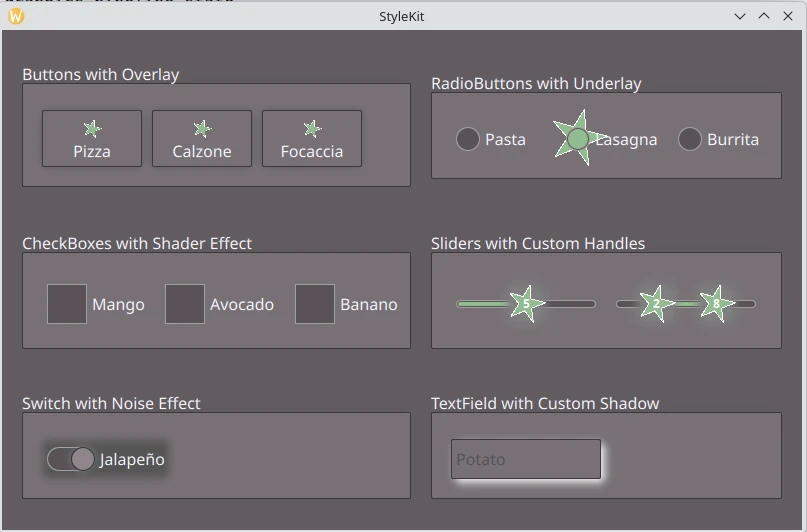
"""
PySide6 port of StyleKit Custom Delegates Example example from Qt v6.x
"""
import sys
from pathlib import Path
from PySide6.QtGui import QGuiApplication
from PySide6.QtQml import QQmlApplicationEngine

import rc_stylekitcustomdelegates  # noqa: F401


if __name__ == '__main__':
    app = QGuiApplication(sys.argv)
    app.setOrganizationName("QtProject")
    app.setApplicationName("StyleKitCustomExample")
    engine = QQmlApplicationEngine()

    engine.addImportPath(Path(__file__).parent)
    engine.loadFromModule("StyleKitCustomExampleModule", "Main")

    if not engine.rootObjects():
        sys.exit(-1)

    exit_code = app.exec()
    del engine
    sys.exit(exit_code)
#version 440
precision highp float;

layout(location = 0) in vec2 qt_TexCoord0;
layout(location = 0) out vec4 fragColor;

layout(binding = 1) uniform sampler2D source;

layout(std140, binding = 0) uniform buf {
    mat4 qt_Matrix;         // reserved
    float qt_Opacity;               // reserved
    vec2 sourceItemSize;    // The size of the input item. The source is divided into a grid of cells.
    vec4 borderColor;       // The color of the border (to be masked away). Set to transparent to ignore.
    vec4 particleColor;     // The color of the noise particle
    float borderMaskEnabled;        // Enabled mask or not. If the bg and border color is the same, set this to 0
    float borderMaskThreshold;      // The threshold for determining if a pixel belongs to the border (taking anti-aliasing into account)
    float particleSize;     // The size of a dust particle (aka the cell size in the grid)
    float particleOpacity;          // The particleOpacity of the particle
    float particleDensity;  // The threshold deciding if a particle (aka cell in the grid) should be visible or not
    float time;                     // time, for animating the noise
} args;

float random(vec2 st, float t) {
    vec2 offsetSt = st + t;
    return fract(sin(dot(offsetSt.xy, vec2(12.9898, 78.233))) * 43758.5453123);
}

void main() {
    vec4 sourceColor = texture(source, qt_TexCoord0);
    vec2 pixelCoord = qt_TexCoord0 * args.sourceItemSize;
    vec2 noiseCoord = floor(pixelCoord / args.particleSize);
    float randomValue = random(noiseCoord, args.time);
    float noiseMix = step(randomValue, args.particleDensity);

    float calculatedBorderMask = step(args.borderMaskThreshold, distance(sourceColor.rgba, args.borderColor.rgba));
    float borderMask = mix(1.0, calculatedBorderMask, args.borderMaskEnabled);
    float finalMask = sourceColor.a * borderMask;
    float finalAlpha = sourceColor.a * args.qt_Opacity;
    float maskedNoiseAlpha = noiseMix * args.particleOpacity * finalMask;

    vec3 blendedColor = mix(sourceColor.rgb, args.particleColor.rgb, maskedNoiseAlpha);
    vec3 preMultipliedColor = blendedColor * args.qt_Opacity;

    fragColor = vec4(preMultipliedColor, finalAlpha);
}
#version 440

layout(location = 0) in vec2 qt_TexCoord0;
layout(location = 0) out vec4 fragColor;

layout(binding = 1) uniform sampler2D sourceItem;

layout(std140, binding = 0) uniform buf {
    mat4 qt_Matrix;      // reserved
    float qt_Opacity;    // reserved
    float amplitude;
    float frequency;
    float time;
} args;

void main()
{
    vec2 p = sin(args.time + args.frequency * qt_TexCoord0);
    fragColor = texture(sourceItem, qt_TexCoord0 + args.amplitude * vec2(p.y, -p.x)) * args.qt_Opacity;
}
import QtQuick
import QtQuick.Shapes
import QtQuick.Effects
import QtQuick.Templates as T
import Qt.labs.StyleKit

Style {

    /******************************************************************
     * Defining some helper types for the custom delegates further down
     ******************************************************************/

    component Star : Shape {
        id: star
        ShapePath {
            fillColor: star.palette.accent
            scale: Qt.size(star.width, star.height)
            PathMove { x: 0.50; y: 0.00 }
            PathLine { x: 0.59; y: 0.35 }
            PathLine { x: 0.97; y: 0.35 }
            PathLine { x: 0.66; y: 0.57 }
            PathLine { x: 0.78; y: 0.91 }
            PathLine { x: 0.50; y: 0.70 }
            PathLine { x: 0.22; y: 0.91 }
            PathLine { x: 0.34; y: 0.57 }
            PathLine { x: 0.03; y: 0.35 }
            PathLine { x: 0.41; y: 0.35 }
            PathLine { x: 0.50; y: 0.00 }
        }
        NumberAnimation on rotation {
            loops: Animation.Infinite
            from: 0
            to: 359
            duration: 20000
        }
    }

    component OverlayData: QtObject {
        property real overlayScale: 1
    }

    /******************************************************************
     * Define custom delegates. These replace the default StyledItem
     * for selected controls in the style definition below.
     ******************************************************************/

    component OverlayDelegate : StyledItem {
        /* Using StyledItem as the base type is the easiest approach when creating
         * a custom delegate. A StyledItem will draw the delegate as configured by
         * the style, and give you the opportunity to place your own items on top. */
        id: delegate
        width: parent.width
        height: parent.height

        Star {
            width: 40
            height: 40
            anchors.centerIn: parent
            anchors.verticalCenterOffset: -10
            scale: delegate.delegateStyle.data.overlayScale
            Behavior on scale {
                NumberAnimation {
                    duration: 300
                    easing.type: Easing.OutBounce
                }
            }
        }
    }

    component UnderlayDelegate : Item {
        /* Custom delegates that don't inherit from StyledItem needs to define
         * 'delegateStyle' and 'control' properties, which are assinged to by StyleKit.
         * Use 'delegateStyle' to bind to style attributes like color, radius, and opacity.
         * Use 'control' to access the Quick Control the owns the delegate. */
        id: delegate
        required property DelegateStyle delegateStyle
        required property QtObject control

        implicitWidth: delegateStyle.width
        implicitHeight: delegateStyle.height
        width: parent.width
        height: parent.height

        Star {
            visible: delegate.control.checked
            anchors.centerIn: parent
            anchors.verticalCenterOffset: -1
            width: 60
            height: 60
        }

        StyledItem {
            // Embed a StyledItem to render the standard delegate on top
            delegateStyle: delegate.delegateStyle
        }
    }

    component SliderHandle : Item {
        id: sliderHandle

        implicitWidth: delegateStyle.width
        implicitHeight: delegateStyle.height
        width: parent.width
        height: parent.height

        /* Unlike the 'data' property, which varies per state, you can use regular
         * QML properties to pass static information to a delegate. Here, 'isFirstHandle'
         * distinguishes the first from the second handle in a RangeSlider, and
         * 'control' gives access to the slider's current value(s). */
        required property DelegateStyle delegateStyle
        required property QtObject control
        property bool isFirstHandle: false

        Star {
            anchors.centerIn: parent
            width: parent.width
            height: parent.height
        }

        Text {
            color: "white"
            anchors.centerIn: parent
            font.pixelSize: 12
            font.bold: true
            text: {
                if (sliderHandle.control instanceof T.RangeSlider) {
                    if (sliderHandle.isFirstHandle)
                        return sliderHandle.control.first.value.toFixed(0)
                    else
                        return sliderHandle.control.second.value.toFixed(0)
                }

                return sliderHandle.control.value.toFixed(0)
            }
        }
    }

    component NoiseDelegate : ShaderEffect {
        /* Use graphical effects in combination with StyledItem to create more
         * complex delegate appearances. In this delegate, we create a noise overlay. */
        implicitWidth: unifiedSourceItem.implicitWidth
        implicitHeight: unifiedSourceItem.implicitHeight
        width: parent.width
        height: parent.height

        required property DelegateStyle delegateStyle

        // The following properties are used by the shader (noise.frag)
        property size sourceItemSize: Qt.size(unifiedSourceItem.width, unifiedSourceItem.height)
        property color borderColor: delegateStyle.border.color
        property real borderMaskEnabled: 1
        property real borderMaskThreshold: 0.001
        property real particleDensity: 0.1
        property real particleSize: 1
        property color particleColor: "black"
        property Item source: ShaderEffectSource { live: true; sourceItem: unifiedSourceItem }
        property real particleOpacity: 0.4
        property real time

        // Note: noise.frag is compiled to noise.qsb from CMakeLists.txt
        fragmentShader: "qrc:/effects/noise.qsb"

        NumberAnimation on time {
            loops: Animation.Infinite
            from: 0
            to: Math.PI * 2
            duration: 1000
        }

        StyledItem {
            id: unifiedSourceItem
            delegateStyle: parent.delegateStyle
            width: parent.width
            height: parent.height
            visible: false
            rotation: 0.0
            scale: 1.0
        }
    }

    component TwinklingStar : ShaderEffect {
        id: twinklingStar
        implicitWidth: delegateStyle.width
        implicitHeight: delegateStyle.height
        width: parent.width
        height: parent.height
        visible: delegateStyle.visible

        required property DelegateStyle delegateStyle

        // The following properties are used by the shader (wave.frag)
        property real amplitude: 0.04 * 0.5
        property real frequency: 10
        property real time

        NumberAnimation on time {
            loops: Animation.Infinite
            from: 0
            to: Math.PI * 2
            duration: 600
        }

        // Note: wave.frag is compiled to wave.qsb from CMakeLists.txt
        fragmentShader: "qrc:/effects/wave.qsb"

        property Item sourceItem: ShaderEffectSource {
            sourceItem: Star {
                width: twinklingStar.width
                height: twinklingStar.height
                visible: false
            }
        }
    }

    component CustomShadowDelegate : RectangularShadow {
        required property QtObject control
        required property DelegateStyle delegateStyle

        width: parent.width
        height: parent.height
        color: delegateStyle.shadow.color
        opacity: delegateStyle.shadow.opacity
        blur: delegateStyle.shadow.blur
        scale: delegateStyle.shadow.scale
        radius: delegateStyle.radius
        visible: delegateStyle.visible && delegateStyle.shadow.visible
        offset: Qt.vector2d(
                    delegateStyle.shadow.horizontalOffset,
                    delegateStyle.shadow.verticalOffset)
    }

    /******************************************************************
     * Define the style, assigning the custom delegates above to specific
     * controls in place of the default StyledItem:
     ******************************************************************/

    applicationWindow {
        background.color: '#625c60'
    }

    control {
        text.color: "ghostwhite"
        background {
            border.color: "#3d373b"
            shadow.color: "#555555"
            color: '#787176'
        }

        handle {
            color: "#8e848a"
            border.color: Qt.darker("#544e52", 1.5)
            shadow.color: "#808080"
        }

        indicator {
            color: Qt.darker("#8e848a", 1.6)
            foreground.margins: 2
        }
    }

    button {
        // Make some room above the button text for the star shape
        topPadding: 30
        background.delegate: OverlayDelegate{}
        // Use the 'data' property to pass custom, per-state information to a custom delegate
        background.data: OverlayData { overlayScale: 0.5 }
        hovered.background.data: OverlayData { overlayScale: 1.8 }
        pressed.background.data: OverlayData { overlayScale: 1.6 }
        checked.background.data: OverlayData { overlayScale: 1.4 }
    }

    checkBox {
        indicator {
            width: 40
            height: 40
            foreground.delegate: TwinklingStar {}
        }
    }

    radioButton {
        indicator.delegate: UnderlayDelegate {}
    }

    slider {
        handle.width: 40
        handle.height: 40
        handle.delegate: SliderHandle { isFirstHandle: true }
        handle.second.delegate: SliderHandle { isFirstHandle: false }
    }

    textField {
        background {
            shadow.verticalOffset: 4
            shadow.horizontalOffset: 4
            shadow.color: "white"
            shadow.delegate: CustomShadowDelegate {}
        }
    }

    switchControl {
        background.visible: true
        checked {
            background.delegate: NoiseDelegate {}
            indicator.foreground.delegate: NoiseDelegate {}
        }
    }

    frame {
        padding: 20
    }
}
import QtQuick
import QtQuick.Layouts
import Qt.labs.StyleKit

ApplicationWindow {
    id: app
    width: 800
    height: 500
    visible: true
    title: qsTr("StyleKit")

    palette.accent: "darkseagreen"
    StyleKit.style: CustomDelegatesStyle {}

    GridLayout {
        id: controls
        anchors.fill: parent
        anchors.margins: 20
        columns: 2
        columnSpacing: 20
        rowSpacing: 20

        GroupBox {
            title: "Buttons with Overlay"
            Layout.fillWidth: true
            clip: true
            RowLayout {
                spacing: 10
                Button { text: "Pizza" }
                Button { text: "Calzone" }
                Button { text: "Focaccia" }
            }
        }

        GroupBox {
            title: "RadioButtons with Underlay"
            Layout.fillWidth: true
            clip: true
            RowLayout {
                spacing: 10
                RadioButton { text: "Pasta" }
                RadioButton { text: "Lasagna"; checked: true }
                RadioButton { text: "Burrita" }
            }
        }

        GroupBox {
            title: "CheckBoxes with Shader Effect"
            Layout.fillWidth: true
            clip: true
            RowLayout {
                spacing: 10
                CheckBox { text: "Mango"; checked: true }
                CheckBox { text: "Avocado" }
                CheckBox { text: "Banano"; checked: true }
            }
        }

        GroupBox {
            title: "Sliders with Custom Handles"
            Layout.fillWidth: true
            clip: true
            RowLayout {
                spacing: 10
                Slider { from: 0; to: 10; value: 5 }
                RangeSlider { from: 0; to: 10; first.value: 2; second.value: 8 }
            }
        }

        GroupBox {
            title: "Switch with Noise Effect"
            Layout.fillWidth: true
            clip: true
            RowLayout {
                Switch { checked: true; text: "Jalapeño" }
            }
        }

        GroupBox {
            title: "TextField with Custom Shadow"
            Layout.fillWidth: true
            clip: true
            RowLayout {
                TextField { placeholderText: "Potato" }
            }
        }
    }
}
module StyleKitCustomExampleModule
Main 1.0 Main.qml
CustomDelegatesStyle 1.0 CustomDelegatesStyle.qml
<!DOCTYPE RCC><RCC version="1.0">
<qresource>
  <file alias="effects/noise.qsb">shaders/prebuilt/noise.qsb</file>
  <file alias="effects/wave.qsb">shaders/prebuilt/wave.qsb</file>
</qresource>
</RCC>