StyleKit Widgets Example
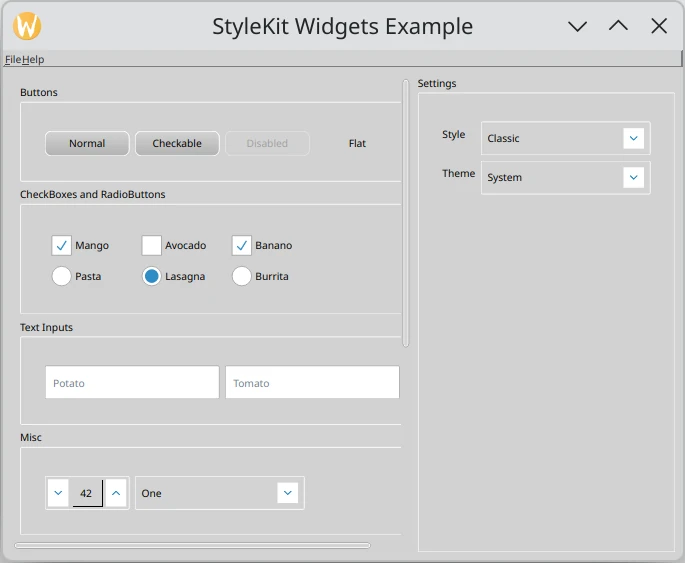
This example shows how to style a Qt Widgets application with Qt Labs StyleKit. It demonstrates how to apply QML-defined styles to standard
QtWidgetscontrols usingQStyleKitStyle, and how to switch between styles and themes at runtime.The example includes three styles:
Classic - A gradient-based style with multiple themes including light, dark, high-contrast, and green.
Flat - A flat, Material Design-inspired style with light and dark themes.
Neon - A cyberpunk-inspired dark style with neon accent colors.
The example demonstrates how to:
Apply a
QStyleKitStyleto aQApplication.Switch between QML-defined styles at runtime using
setStylePath().Switch between themes within a style using
setThemeName().Organize widgets into labeled sections using
QGroupBox.
import sys

from PySide6.QtLabsStyleKit import QStyleKitStyle
from PySide6.QtWidgets import (QApplication, QButtonGroup, QCheckBox, QComboBox,
                               QFormLayout, QGridLayout, QGroupBox, QHBoxLayout,
                               QLineEdit, QMainWindow, QProgressBar, QPushButton,
                               QRadioButton, QScrollArea, QSizePolicy, QSlider, QSpinBox,
                               QVBoxLayout, QWidget)
from PySide6.QtCore import Qt, QSignalBlocker, Slot
from PySide6.QtGui import QIcon, QKeySequence

import rc_stylekitwidgets  # noqa: F401


PRESETS = [("Classic", ":/ClassicStyle.qml"),
           ("Flat", ":/FlatStyle.qml"),
           ("Neon", ":/NeonStyle.qml")]


class StyleControl(QGroupBox):
    def __init__(self, parent=None):
        super().__init__("Settings", parent)

        style = QApplication.style()
        self.m_style = style if isinstance(style, QStyleKitStyle) else None

        self.setSizePolicy(QSizePolicy.Policy.Fixed, QSizePolicy.Policy.Preferred)
        settings_layout = QFormLayout(self)

        self.m_theme_combo = QComboBox()
        self.m_style_path_combo = QComboBox()

        for preset in PRESETS:
            self.m_style_path_combo.addItem(preset[0], preset[1])
        self.m_style_path_combo.setCurrentIndex(0)

        settings_layout.addRow("Style", self.m_style_path_combo)
        settings_layout.addRow("Theme", self.m_theme_combo)

        if self.m_style is not None:
            self._refresh_themes()
        else:
            self.setEnabled(False)

        self.m_style_path_combo.activated.connect(self._style_path_combo_activated)
        self.m_theme_combo.activated.connect(self._theme_combo_activated)

    def _refresh_themes(self):
        names = self.m_style.themeNames()
        current = self.m_style.themeName()
        with QSignalBlocker(self.m_theme_combo):
            self.m_theme_combo.clear()
            self.m_theme_combo.addItems(names)
            idx = self.m_theme_combo.findText(current)
            if idx >= 0:
                self.m_theme_combo.setCurrentIndex(idx)

    def _set_style_path(self, path: str):
        self.m_style.setStylePath(path)
        self._refresh_themes()

    @Slot(int)
    def _style_path_combo_activated(self, index: int):
        data = self.m_style_path_combo.itemData(index)
        self._set_style_path(data or self.m_style_path_combo.itemText(index))

    @Slot(int)
    def _theme_combo_activated(self, _index: int):
        self.m_style.setThemeName(self.m_theme_combo.currentText())


class MainWindow(QMainWindow):
    def __init__(self):
        super().__init__()
        menu_bar = self.menuBar()
        menu_bar.setNativeMenuBar(False)
        file_menu = menu_bar.addMenu("&File")
        file_menu.addAction(QIcon.fromTheme(QIcon.ThemeIcon.ApplicationExit), "Quit",
                            QKeySequence(QKeySequence.StandardKey.Quit), self.close)
        help_menu = menu_bar.addMenu("&Help")
        help_menu.addAction(QIcon.fromTheme(QIcon.ThemeIcon.HelpAbout), "About Qt",
                            QKeySequence(QKeySequence.StandardKey.HelpContents),
                            QApplication.aboutQt)

        scroll_area = QScrollArea()
        scroll_area.setWidgetResizable(True)
        scroll_area.setSizePolicy(QSizePolicy.Policy.Expanding, QSizePolicy.Policy.Expanding)

        scroll_widget = QWidget()
        scroll_area.setWidget(scroll_widget)

        content_layout = QVBoxLayout(scroll_widget)
        content_layout.setAlignment(Qt.AlignmentFlag.AlignTop)

        # Buttons
        buttons_group = QGroupBox("Buttons")
        buttons_layout = QHBoxLayout(buttons_group)
        normal_button = QPushButton("Normal")
        checkable_button = QPushButton("Checkable")
        checkable_button.setCheckable(True)
        disabled_button = QPushButton("Disabled")
        disabled_button.setEnabled(False)
        flat_button = QPushButton("Flat")
        flat_button.setFlat(True)
        buttons_layout.addWidget(normal_button)
        buttons_layout.addWidget(checkable_button)
        buttons_layout.addWidget(disabled_button)
        buttons_layout.addWidget(flat_button)
        buttons_layout.addStretch()
        content_layout.addWidget(buttons_group)

        # CheckBoxes and RadioButtons
        check_radio_group = QGroupBox("CheckBoxes and RadioButtons")
        check_radio_layout = QGridLayout(check_radio_group)
        check_radio_layout.setColumnStretch(3, 1)

        check_box1 = QCheckBox("Mango")
        check_box1.setChecked(True)
        check_box2 = QCheckBox("Avocado")
        check_box3 = QCheckBox("Banano")
        check_box3.setChecked(True)

        radio_button1 = QRadioButton("Pasta")
        radio_button2 = QRadioButton("Lasagna")
        radio_button2.setChecked(True)
        radio_button3 = QRadioButton("Burrita")

        radio_group = QButtonGroup(scroll_widget)
        radio_group.addButton(radio_button1)
        radio_group.addButton(radio_button2)
        radio_group.addButton(radio_button3)

        check_radio_layout.addWidget(check_box1, 0, 0)
        check_radio_layout.addWidget(check_box2, 0, 1)
        check_radio_layout.addWidget(check_box3, 0, 2)
        check_radio_layout.addWidget(radio_button1, 1, 0)
        check_radio_layout.addWidget(radio_button2, 1, 1)
        check_radio_layout.addWidget(radio_button3, 1, 2)
        content_layout.addWidget(check_radio_group)

        # Text Inputs
        text_inputs_group = QGroupBox("Text Inputs")
        text_inputs_layout = QHBoxLayout(text_inputs_group)
        line_edit1 = QLineEdit()
        line_edit1.setPlaceholderText("Potato")
        line_edit2 = QLineEdit()
        line_edit2.setPlaceholderText("Tomato")
        text_inputs_layout.addWidget(line_edit1)
        text_inputs_layout.addWidget(line_edit2)
        content_layout.addWidget(text_inputs_group)

        # Misc
        misc_group = QGroupBox("Misc")
        misc_layout = QHBoxLayout(misc_group)
        spin_box = QSpinBox()
        spin_box.setRange(0, 100)
        spin_box.setValue(42)
        combo_box = QComboBox()
        combo_box.addItems(["One", "February", "Aramis", "Winter", "Friday"])
        misc_layout.addWidget(spin_box)
        misc_layout.addWidget(combo_box)
        misc_layout.addStretch()
        content_layout.addWidget(misc_group)

        # Sliders
        sliders_group = QGroupBox("Sliders")
        sliders_group.setMinimumHeight(250)
        sliders_layout = QHBoxLayout(sliders_group)
        slider = QSlider(Qt.Orientation.Horizontal)
        slider.setRange(0, 100)
        slider.setValue(50)
        vertical_slider = QSlider(Qt.Orientation.Vertical)
        vertical_slider.setRange(0, 100)
        vertical_slider.setValue(30)
        sliders_layout.addWidget(slider)
        sliders_layout.addWidget(vertical_slider)
        sliders_layout.addStretch()
        content_layout.addWidget(sliders_group)

        # Progress Bar
        progress_group = QGroupBox("Progress Bar")
        progress_layout = QHBoxLayout(progress_group)
        progress_bar = QProgressBar()
        progress_bar.setRange(0, 100)
        progress_bar.setValue(20)
        progress_layout.addWidget(progress_bar)
        content_layout.addWidget(progress_group)

        central_widget = QWidget()
        central_layout = QHBoxLayout(central_widget)
        central_layout.addWidget(scroll_area)
        central_layout.addWidget(StyleControl(central_widget))
        self.setCentralWidget(central_widget)


if __name__ == "__main__":
    app = QApplication(sys.argv)

    style = QStyleKitStyle(PRESETS[0][1])
    if not any(arg == "-style" for arg in sys.argv[1:]):
        QApplication.setStyle(style)

    window = MainWindow()
    window.setWindowTitle("StyleKit Widgets Example")
    window.resize(800, 600)

    window.show()

    sys.exit(app.exec())
import QtQuick
import Qt.labs.StyleKit
Style {
id: style
control {
// 'control' is the fallback for all the controls. Any properties that are not
// overridden by a specific control underneath will be read from here instead.
leftPadding: 8
topPadding: 2
rightPadding: 8
bottomPadding: 2
handle {
width: 25
height: 25
radius: 25
gradient: Gradient {
GradientStop { position: 0.0; color: Qt.alpha("black", 0.0)}
GradientStop { position: 1.0; color: Qt.alpha("black", 0.2)}
}
}
indicator {
foreground.margins: 2
}
transition: Transition {
StyleAnimation {
animateColors: true
duration: 300
}
}
hovered {
transition: null
}
}
abstractButton {
// 'abstractButton' is the fallback for all button types such as 'button', 'checkBox',
// 'radioButton', etc. This is a good place to style the properties they all
// have in common. Any properties not set here will fall back to those defined in 'control'.
background {
width: 100
height: 30
opacity: 0.8
radius: 8
gradient: Gradient {
GradientStop { position: 0.0; color: Qt.alpha("black", 0.0)}
GradientStop { position: 1.0; color: Qt.alpha("black", 0.2)}
}
}
}
flatButton {
background.gradient: null
}
checkBox {
transition: Transition {
NumberAnimation {
properties: "indicator.foreground.leftMargin, indicator.foreground.rightMargin"
+ ", indicator.foreground.topMargin, indicator.foreground.bottomMargin"
easing.type: Easing.OutBounce
duration: 500
}
}
hovered {
transition: null
indicator.foreground.margins: -15
}
}
comboBox {
background.width: 200
}
pane {
// 'pane' is the fallback for all pane based controls, such as 'frame' and 'groupBox'.
// Any properties not set here will fall back to those defined in 'control'.
spacing: 5
padding: 20
background {
border.width: 0
width: 200
height: 200
}
}
groupBox {
background.topMargin: 20
background.height: 30
background.border.width: 1
}
radioButton {
indicator {
foreground {
margins: 4
radius: 25 / 2
border.width: 0
}
}
}
scrollBar {
padding: 2
background.visible: false
indicator.width: 8
indicator.height: 8
indicator.radius: 8
indicator.foreground.radius: 8
}
slider {
background.width: 180
indicator {
height: 8
radius: 8
foreground {
radius: 8
}
}
vertical {
background.width: 40
background.height: 180
indicator.width: 8
}
}
spinBox {
padding: 4
background.width: 100
indicator.height: 24
}
textInput {
// 'textInput' is the fallback for all text based controls, such as 'textField', 'textArea'.
// Any properties not set here will fall back to those defined in 'control'.
background {
width: 200
}
}
// A style can have any number of themes. The ones assigned to 'light' and 'dark'
// will be applied according to the current system theme if 'themeName' is set to
// "System" (the default). Setting the current themeName for a style is usually done
// from the application rather than from within the style itself.
//
// Within a theme, you can override any properties that should have different values
// when the theme is applied. Typically, a style configures structural properties
// such as implicit size, padding, and radii, while a theme specifies colors. However,
// this is not a limitation — any properties can be overridden by a theme. Properties
// not set in the theme will fall back to those defined in the style.
light: Theme {
applicationWindow {
background.color: palette.window
}
control {
background {
color: "lightgray"
border.color: "white"
}
handle {
color: "lightgray"
border.color: "white"
}
indicator {
color: "white"
foreground.image.color: palette.accent
}
checked {
background.color: "blue"
}
focused {
background.border.color: "white"
}
hovered {
background {
color: palette.accent
border.color: "white"
}
handle {
border.color: "lightgray"
}
}
disabled {
background {
opacity: 0.4
gradient: null
}
}
}
abstractButton {
hovered.background {
color: palette.accent
}
checked {
background.color: palette.accent
}
}
pane {
background.color: Qt.darker("gainsboro", 1.05)
}
groupBox {
background.border.color: "white"
}
textField {
text.color: palette.text
background {
border.color: "darkgray"
color: "white"
}
hovered.background {
border.color: "lightgray"
}
focused {
background.border.color: palette.accent
background.border.width: 2
}
focused.hovered {
background.border.color: palette.accent
}
}
}
dark: Theme {
applicationWindow {
background.color: "#544e52"
}
control {
text.color: "lightgray"
background {
border.color: "#3d373b"
color: "#8e848a"
}
handle {
color: "#8e848a"
border.color: Qt.darker("#544e52", 1.5)
}
indicator {
color: Qt.darker("#8e848a", 1.6)
}
hovered {
background {
border.color: "white"
color: palette.accent
}
}
}
abstractButton {
checked {
background.color: palette.accent
}
disabled {
background {
opacity: 0.3
}
checked.background.color: "green"
}
focused {
background {
border.color: "white"
color: "#bbbbbb"
}
}
}
textInput {
background.color: "white"
}
scrollBar {
indicator.foreground.color: "white"
}
slider {
indicator.foreground.color: palette.accent
}
pane {
background.color: Qt.lighter("#544e52", 1.3)
background.border.color: "#3d373b"
}
palettes {
system.window: "#544e52"
textField.text: "black"
spinBox.highlight: "blue"
button {
buttonText: "white"
highlightedText: "white"
brightText: "white"
disabled.buttonText: "darkgray"
disabled.highlightedText: "darkgray"
}
}
}
// In addition to 'light' and 'dark', you can define as many themes as you want.
// You can switch between them from the application, for example using:
// 'StyleKit.style.themeName: "HighContrast"'.
CustomTheme {
name: "HighContrast"
theme: Theme {
control {
transition: null
background {
height: 40
color: "lightgray"
border.color: "black"
border.width: 2
gradient: null
}
indicator {
width: 30
height: 30
color: "ghostwhite"
border.color: "black"
foreground.margins: 4
foreground.color: "black"
foreground.image.color: "ghostwhite"
}
handle {
border.color: "black"
border.width: 2
width: 30
height: 30
radius: 30
gradient: null
}
hovered {
background.border.width: 4
indicator.border.width: 4
handle.border.width: 4
}
checked {
background.border.width: 6
}
disabled {
background.color: "white"
}
}
abstractButton {
background.color: "ghostwhite"
}
textInput {
background.color: "white"
}
slider {
indicator {
width: 180
height: 12
color: "ghostwhite"
border.width: 1
foreground.color: "black"
}
vertical {
indicator.width: 12
indicator.height: 180
}
}
radioButton {
indicator.radius: 255
indicator.foreground.radius: 255
}
spinBox {
indicator.color: "black"
indicator.foreground.image.color: "white"
hovered.background.border.width: 6
}
itemDelegate {
background.border.width: 0
hovered.background.border.width: 2
hovered.text.bold: false
}
scrollBar {
background.width: 15
background.height: 15
indicator.width: 15
indicator.height: 15
indicator.border.width: 3
indicator.foreground.margins: 3
indicator.foreground.color: "lightgray"
}
palettes {
system.window: "white"
textField.text: "black"
button {
buttonText: "black"
highlightedText: "black"
brightText: "black"
disabled.buttonText: "white"
disabled.highlightedText: "white"
}
}
}
}
CustomTheme {
name: "Green"
theme: Theme {
applicationWindow {
background.color: "#8da28d"
}
control {
background {
border.color: "#547454"
color: "#a0c0a0"
}
handle {
border.color: "#547454"
color: "#a0c0a0"
}
indicator {
color: "white"
border.color: "#547454"
foreground.color: "white"
}
text {
color: "#1c261c"
bold: true
}
hovered {
background {
color: "#ecefec"
border.color: "#ecefec"
}
handle {
color: "#ecefec"
border.color: "#ecefec"
}
}
checked {
indicator {
foreground.color: "#678367"
foreground.image.color: "#678367"
}
}
disabled {
background {
color: "#80a080"
}
}
}
checkBox {
indicator.foreground.color: "transparent"
}
comboBox {
indicator.color: "transparent"
indicator.foreground.color: "transparent"
indicator.foreground.image.color: "white"
}
pane {
background.color: "#a0b1a0"
background.border.color: "#415a41"
}
scrollIndicator {
indicator.foreground.color: "white"
}
spinBox {
indicator.color: "transparent"
indicator.foreground.color: "transparent"
indicator.foreground.image.color: "white"
}
textInput {
background.color: "white"
}
palettes {
system.window: "#547454"
textField.text: "green"
textField.placeholderText: "#678367"
checkBox.buttonText: "white"
button {
buttonText: "black"
highlightedText: "white"
disabled.buttonText: "lightgray"
disabled.highlightedText: "lightgray"
}
}
}
}
}
import QtQuick
import Qt.labs.StyleKit

Style {
    id: style

    fonts {
        system {
            family: "Helvetica"
            pointSize: 11
        }
    }

    control {
        leftPadding: 10
        topPadding: 4
        rightPadding: 10
        bottomPadding: 4

        background {
            radius: 0
            border.width: 1
            gradient: null
        }

        handle {
            width: 18
            height: 18
            radius: 0
            border.width: 1
            gradient: null
        }

        indicator {
            border.width: 1
            foreground.margins: 3
        }

        transition: Transition {
            StyleAnimation {
                animateColors: true
                duration: 120
            }
        }
    }

    abstractButton {
        background {
            width: 100
            height: 28
        }
    }

    flatButton {
        background.border.width: 0
    }

    checkBox {
        indicator {
            width: 18
            height: 18
        }
    }

    radioButton {
        indicator {
            width: 18
            height: 18
            radius: 9
            foreground.radius: 9
        }
    }

    menuItem {
        background.border.width: 0
    }

    menuBarItem {
        background.border.width: 0
        hovered.background.border.width: 1
    }

    slider {
        background.width: 180
        indicator {
            height: 4
            radius: 0
            foreground {
                radius: 0
                margins: 0
            }
        }
        vertical {
            background.height: 180
            background.width: 40
            indicator.width: 4
        }
    }

    spinBox {
        padding: 4
        background.width: 100
    }

    textInput {
        background.width: 200
    }

    pane {
        padding: 12
        background {
            border.width: 1
        }
    }

    scrollBar {
        background.visible: false
    }

    light: Theme {
        applicationWindow.background.color: "#f5f5f5"

        control {
            text.color: "#222222"
            background {
                color: "#ffffff"
                border.color: "#cccccc"
            }
            handle {
                color: "#ffffff"
                border.color: "#999999"
            }
            indicator {
                color: "#ffffff"
                border.color: "#999999"
                foreground.color: "#1976d2"
                foreground.image.color: "#ffffff"
            }
            checked {
                background.color: "#1976d2"
                indicator.color: "#1976d2"
            }
            hovered {
                background.color: "#eeeeee"
                background.border.color: "#1976d2"
            }
            focused.background.border.color: "#1976d2"
            disabled.background.opacity: 0.4
        }

        abstractButton {
            checked.background.color: "#1976d2"
            hovered.background.color: "#e3f2fd"
        }

        textInput {
            background.color: "#ffffff"
            focused.background.border.color: "#1976d2"
        }

        slider {
            indicator.color: "#c8c8c8"
            indicator.foreground.color: "#1976d2"
        }

        switchControl {
            indicator {
                color: "#cccccc"
                foreground.color: "transparent"
            }
            checked.indicator.color: "#1976d2"
        }

        pane.background.color: "#ffffff"
    }

    dark: Theme {
        applicationWindow.background.color: "#1e1e1e"

        control {
            text.color: "#e0e0e0"
            background {
                color: "#2d2d2d"
                border.color: "#444444"
            }
            handle {
                color: "#3a3a3a"
                border.color: "#555555"
            }
            indicator {
                color: "#2d2d2d"
                border.color: "#666666"
                foreground.color: "#64b5f6"
                foreground.image.color: "#1e1e1e"
            }
            checked {
                background.color: "#64b5f6"
                indicator.color: "#64b5f6"
            }
            hovered {
                background.color: "#3a3a3a"
                background.border.color: "#64b5f6"
            }
            focused.background.border.color: "#64b5f6"
            disabled.background.opacity: 0.3
        }

        abstractButton {
            checked.background.color: "#64b5f6"
            hovered.background.color: "#3a3a3a"
        }

        textInput {
            background.color: "#2d2d2d"
            focused.background.border.color: "#64b5f6"
        }

        slider {
            indicator.color: "#4a4a4a"
            indicator.foreground.color: "#64b5f6"
        }

        switchControl {
            indicator {
                color: "#444444"
                foreground.color: "transparent"
            }
            checked.indicator.color: "#64b5f6"
        }

        pane.background.color: "#2d2d2d"

        palettes {
            system.window: "#1e1e1e"
            textField.text: "#e0e0e0"
            button {
                buttonText: "#e0e0e0"
                highlightedText: "#1e1e1e"
            }
        }
    }
}
import QtQuick
import Qt.labs.StyleKit

Style {
    id: style

    control {
        leftPadding: 12
        topPadding: 4
        rightPadding: 12
        bottomPadding: 4

        background {
            radius: 2
            border.width: 2
        }

        handle {
            width: 20
            height: 20
            radius: 2
            border.width: 2
        }

        indicator {
            border.width: 2
            foreground.margins: 3
        }

        transition: Transition {
            StyleAnimation {
                animateColors: true
                duration: 200
            }
        }
    }

    abstractButton {
        background {
            width: 110
            height: 32
        }
    }

    flatButton {
        background.border.width: 0
    }

    checkBox {
        indicator {
            width: 20
            height: 20
        }
    }

    radioButton {
        indicator {
            width: 20
            height: 20
            radius: 10
            foreground.radius: 10
        }
    }

    menuItem {
        background.border.width: 0
    }

    menuBarItem {
        background.border.width: 0
        hovered.background.border.width: 2
    }

    slider {
        background.width: 180
        indicator {
            height: 6
            radius: 0
            foreground {
                radius: 0
                margins: 0
            }
        }
        vertical {
            background.height: 180
            background.width: 40
            indicator.width: 6
        }
    }

    spinBox {
        padding: 4
        background.width: 110
    }

    textInput {
        background {
            width: 220
            radius: 0
        }
    }

    pane {
        padding: 14
        background {
            radius: 2
            border.width: 2
        }
    }

    scrollBar {
        background.visible: false
    }

    dark: Theme {
        applicationWindow.background.color: "#0a0a14"

        control {
            text.color: "#00ffd0"
            background {
                color: "#14142a"
                border.color: "#00ffd0"
            }
            handle {
                color: "#1a1a35"
                border.color: "#ff2bd6"
            }
            indicator {
                color: "#14142a"
                border.color: "#00ffd0"
                foreground.color: "#00ffd0"
                foreground.image.color: "#0a0a14"
            }
            checked {
                background.color: "#00ffd0"
                indicator.color: "#00ffd0"
            }
            hovered {
                background.border.color: "#ff2bd6"
            }
            focused {
                background.border.color: "#ffe600"
            }
            disabled {
                background {
                    opacity: 0.3
                }
            }
        }

        abstractButton {
            background.color: "#1a1a35"
            checked.background.color: "#00ffd0"
            hovered.background.color: "#28284f"
        }

        menuItem {
            hovered.background.color: "#28284f"
        }

        textInput {
            background.color: "#14142a"
            focused.background.border.color: "#ffe600"
        }

        slider {
            indicator.color: "#303080"
            indicator.foreground.color: "#00ffd0"
        }

        switchControl {
            indicator {
                color: "#1a1a35"
                foreground.color: "transparent"
            }
            checked.indicator.color: "#00ffd0"
        }

        pane {
            background.color: "#14142a"
            background.border.color: "#ff2bd6"
        }
    }

    light: Theme {
        applicationWindow.background.color: "#f0f0ff"

        control {
            text.color: "#3a2bd6"
            background {
                color: "#ffffff"
                border.color: "#3a2bd6"
            }
            handle {
                color: "#ffffff"
                border.color: "#ff2bd6"
            }
            indicator {
                color: "#ffffff"
                border.color: "#3a2bd6"
                foreground.color: "#3a2bd6"
                foreground.image.color: "#ffffff"
            }
            checked {
                background.color: "#3a2bd6"
                indicator.color: "#3a2bd6"
            }
            hovered {
                background.border.color: "#ff2bd6"
            }
            focused {
                background.border.color: "#00b894"
            }
            disabled.background.opacity: 0.4
        }

        abstractButton {
            background.color: "#e6e0ff"
            checked.background.color: "#3a2bd6"
            hovered.background.color: "#d0c4ff"
        }

        menuItem {
            hovered.background.color: "#d0c4ff"
        }

        textInput {
            background.color: "#ffffff"
            focused.background.border.color: "#00b894"
        }

        slider {
            indicator.color: "#e6e0ff"
            indicator.foreground.color: "#3a2bd6"
        }

        switchControl {
            indicator {
                color: "#e6e0ff"
                foreground.color: "transparent"
            }
            checked.indicator.color: "#3a2bd6"
        }

        pane {
            background.color: "#ffffff"
            background.border.color: "#ff2bd6"
        }

        palettes {
            system.window: "#f0f0ff"
            textField.text: "#3a2bd6"
            button {
                buttonText: "#3a2bd6"
                highlightedText: "#ffffff"
                brightText: "#00b894"
                disabled.buttonText: "#aaaacc"
            }
        }
    }
}
<RCC>
    <qresource prefix="/">
        <file>ClassicStyle.qml</file>
        <file>FlatStyle.qml</file>
        <file>NeonStyle.qml</file>
    </qresource>
</RCC>