Warning
This section contains snippets that were automatically translated from C++ to Python and may contain errors.
Styling a Checkbox: A Walkthrough
How a QCheckBox is drawn, from its paint event through QCommonStyle to a custom indicator in a proxy style.
This page follows a checkbox from the moment it receives a paint event to the moment the style finishes painting. It shows how the widget builds its style option, how QCommonStyle breaks the element into parts, and how a QProxyStyle replaces one of those parts. Most widgets follow the same structure, so the same reading strategy works for them: find the style option the widget builds, find the elements it draws, and read the QCommonStyle implementation of those elements.
The widget builds a style option
QCheckBox uses QStyleOptionButton . Its initStyleOption() function fills the option out like this, slightly simplified:
        opt.initFrom(q)
        if down:
            opt.state |= QStyle.State_Sunken
        if tristate and noChange:
            opt.state |= QStyle.State_NoChange
else:
            opt.state |= checked if QStyle.State_On else QStyle.State_Off
        if q.testAttribute(Qt.WA_Hover) and q.underMouse():
            if hovering:
                opt.state |= QStyle.State_MouseOver
else:
                opt.state = ~QStyle.State_MouseOver

        opt.text = text
        opt.icon = icon
        opt.iconSize = q.iconSize()
initFrom() sets the information that every widget shares. Its implementation amounts to this:
state = QStyle.State_None
if widget.isEnabled():
    state |= QStyle.State_Enabled
if widget.hasFocus():
    state |= QStyle.State_HasFocus
if widget.window().testAttribute(Qt.WA_KeyboardFocusChange):
    state |= QStyle.State_KeyboardFocusChange
if widget.underMouse():
    state |= QStyle.State_MouseOver
if widget.window().isActiveWindow():
    state |= QStyle.State_Active
direction = widget.layoutDirection()
rect = widget.rect()
palette = widget.palette()
fontMetrics = widget.fontMetrics()
State_Enabled is set when the widget is enabled, State_HasFocus when it has focus, State_KeyboardFocusChange when the user last changed focus with the keyboard, and State_Active when the widget’s window is the active window. State_MouseOver is set while the mouse cursor is over the widget. In addition to the state, initFrom() stores the layout direction, the widget’s rectangle, its palette, and its font metrics in the option.
QCheckBox then adds its own state. State_Sunken is set while the user presses the box, whether it’s checked or not. State_NoChange is set for a partially checked tristate box; otherwise State_On or State_Off reflects the check state. The option also carries the text, the icon, and the icon size. QCheckBox keeps State_MouseOver only while the widget has the WA_Hover attribute, which a style typically sets in polish() .
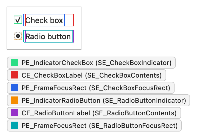
Suppose the user presses the checked checkbox in the following screenshot with the mouse while it has focus. The screenshot also shows a radio button, which uses the same structure with PE_IndicatorRadioButton and CE_RadioButtonLabel:
At that moment, its option has these state flags:
State flag
Set
State_SunkenYes
State_NoChangeNo
State_OnYes
State_OffNo
State_MouseOverYes
State_EnabledYes
State_HasFocusYes
State_KeyboardFocusChangeNo
State_ActiveYes
The widget asks the style to draw
QCheckBox paints itself in paintEvent() with a QStylePainter , which wraps the drawing functions of QStyle :
p = QStylePainter()
opt = QStyleOptionButton()
initStyleOption(opt)
p.drawControl(QStyle.CE_CheckBox, opt)
That’s all the widget does. Everything else happens in the style.
QCommonStyle breaks the element into parts
QCommonStyle handles CE_CheckBox by asking for the rectangles of its two subelements, SE_CheckBoxIndicator and SE_CheckBoxContents, and drawing an element into each. If the checkbox has focus, it also draws the focus frame:
subopt = btn
subopt.rect = subElementRect(QStyle.SE_CheckBoxIndicator, btn, widget)
proxy().drawPrimitive(QStyle.PE_IndicatorCheckBox, subopt, p, widget)
subopt.rect = subElementRect(QStyle.SE_CheckBoxContents, btn, widget)
proxy().drawControl(QStyle.CE_CheckBoxLabel, subopt, p, widget)
if btn.state  State_HasFocus:
    fropt = QStyleOptionFocusRect()
    fropt.QStyleOption.operator=(btn)
    fropt.rect = subElementRect(QStyle.SE_CheckBoxFocusRect, btn, widget)
    proxy().drawPrimitive(QStyle.PE_FrameFocusRect, fropt, p, widget)
Note the proxy() calls. A style always draws its child elements through proxy() so that a QProxyStyle wrapped around it gets the chance to override them.
CE_CheckBoxLabel is also implemented in QCommonStyle :
        btn = QStyleOptionButton(opt)
        alignment = visualAlignment(btn.direction, Qt.AlignmentFlag.AlignLeft | Qt.AlignmentFlag.AlignVCenter)
        if not proxy().styleHint(SH_UnderlineShortcut, btn, widget):
            alignment |= Qt.TextHideMnemonic
        pix = QPixmap()
        textRect = btn.rect
        if not btn.icon.isNull():
            dpr = p.device().devicePixelRatio()
            pix = btn.icon.pixmap(btn.iconSize, dpr,
                                    btn.state  State_Enabled if QIcon.Normal else QIcon.Disabled)
            proxy().drawItemPixmap(p, btn.rect, alignment, pix)
            if btn.direction == Qt.RightToLeft:
                textRect.setRight(textRect.right() - btn.iconSize.width() - 4)
else:
                textRect.setLeft(textRect.left() + btn.iconSize.width() + 4)

        if not btn.text.isEmpty():
            proxy().drawItemText(p, textRect, alignment | Qt.TextShowMnemonic,
                btn.palette, btn.state  State_Enabled, btn.text, QPalette.WindowText)
visualAlignment() adjusts the alignment for the layout direction. The style draws the icon, if there is one, and shrinks the remaining text rectangle accordingly. drawItemText() draws the text with the alignment, the layout direction, and the mnemonic taken into account, and it uses the palette to pick the text color. Drawing a label involves many details, and the base class handles them well, so a custom style rarely needs to reimplement it.
A proxy style replaces the indicator
The indicator, PE_IndicatorCheckBox, is where styles differ, so it’s the part to replace. The following QProxyStyle subclass draws a rounded indicator from the palette colors in the option and forwards every other element to the base style:
class CheckBoxStyle(QProxyStyle):

# public
    QProxyStyle.QProxyStyle = using()
    def drawPrimitive(element, option,):
                       QPainter painter, QWidget widget) override
def drawPrimitive(self, element, option,):
                                  QPainter painter, QWidget widget)

    if element != PE_IndicatorCheckBox:
        QProxyStyle.drawPrimitive(element, option, painter, widget)
        return

    enabled = option.state  State_Enabled
    QPalette.ColorGroup group = not enabled ? QPalette.Disabled

    super().__init__()
    QPalette palette = option.palette
    rect = option.rect.adjusted(1, 1, -1, -1)
    painter.save()
    painter.setRenderHint(QPainter.RenderHint.Antialiasing)
    # Frame and background: highlight the frame while the mouse hovers over
    # the indicator, and darken the background while it's pressed.
    frameColor = palette.color(group, QPalette.Mid)
    if enabled and (option.state  State_MouseOver):
        frameColor = palette.color(group, QPalette.Highlight)
    QPalette.ColorRole fillRole =
            option.state  State_Sunken if QPalette.Mid else QPalette.Base
    painter.setPen(frameColor)
    painter.setBrush(palette.brush(group, fillRole))
    painter.drawRoundedRect(rect, 2, 2)
    # Check mark for State_On, a filled square for the partially checked
    # State_NoChange, nothing for State_Off.
    inner = rect.adjusted(3, 3, -3, -3)
    if option.state  State_On:
        painter.setPen(QPen(palette.color(group, QPalette.Text), 2))
        painter.drawLine(inner.left(), inner.center().y(),
                          inner.center().x(), inner.bottom())
        painter.drawLine(inner.center().x(), inner.bottom(),
                          inner.right(), inner.top())
     elif option.state  State_NoChange:
        painter.fillRect(inner, palette.brush(group, QPalette.Text))

    painter.restore()
The implementation reads all of its information from the option. It picks the color group from State_Enabled and State_Active, highlights the frame while State_MouseOver is set, darkens the background while State_Sunken is set, and draws a check mark for State_On or a filled square for State_NoChange. Because every color comes from the palette, the indicator follows the application palette and works in both light and dark color schemes. It also saves and restores the painter, so the base class finds the painter in the state it expects.
The same indicator appears wherever the style draws PE_IndicatorCheckBox: in checkboxes, in checkable group boxes, and in item views that use it for check marks. That reuse is the reason primitive elements exist.
To use the style, install it before the application creates its widgets:
if __name__ == "__main__":

    QApplication.setStyle(CheckBoxStyle())
    app = QApplication([])
    box = QCheckBox("Send me updates")
    box.show()
    sys.exit(app.exec())
Apply the same reading to other widgets
To learn how a widget is drawn, you don’t have to read all of the code. It’s usually enough to know which style elements the widget draws, which states it sets, and what its style option contains. The widget builds an option and calls the style one or more times; the style draws the elements the widget asks for. Widget Style Reference lists exactly that for each widget.