Styling Menus and Item Views
The style elements, states, and options of menus, menu bars, item view headers, tree branch indicators, and item view items.
This page is part of the Widget Style Reference . For an explanation of the element trees, screenshots, and tables, see that page. The common state flags and members that every widget sets are listed in How a Style Draws a Widget .
Menus
QMenu keeps a list of actions and draws each as a menu item. On a paint event, it draws the panel of the menu, then each item with CE_MenuItem and a QStyleOptionMenuItem , and the frame last. Menu items have no separate label element, so CE_MenuItem draws the check mark, icon, text, shortcut, and submenu arrow.
PE_PanelMenu, the background
CE_MenuItem, once per action (PM_SmallIconSize)
PE_IndicatorMenuCheckMark, for a checked item. Many styles usePE_IndicatorCheckBoxandPE_IndicatorRadioButtoninstead.
PE_IndicatorArrowRightorPE_IndicatorArrowLeft, for an item that opens a submenu
CE_MenuScroller(PM_MenuScrollerHeight), when the menu is too tall for the screen andSH_Menu_Scrollableis set
CE_MenuTearoff(PM_MenuTearoffHeight), for atear-offmenu
PE_FrameMenu(PM_MenuPanelWidth), the frame, with aQStyleOptionFramewhoselineWidthisPM_MenuPanelWidth
CE_MenuEmptyArea, for the space not covered by items or frame
QMenu lays out the items itself, using PM_MenuHMargin, PM_MenuVMargin, PM_MenuPanelWidth, and PM_MenuDesktopFrameWidth. It also consults many SH_Menu_ hints, such as SH_Menu_SubMenuPopupDelay, SH_Menu_MouseTracking, and SH_Menu_Mask.
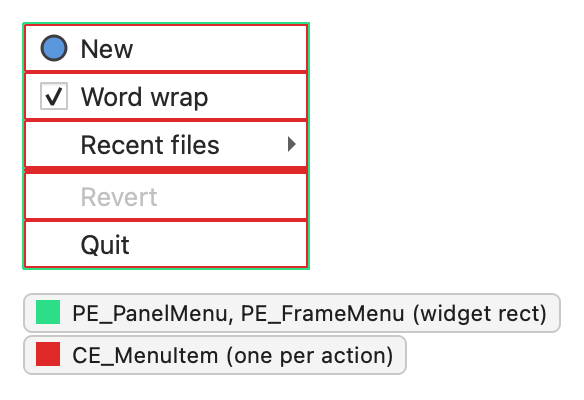
QMenu resets the state after calling initFrom() , so the items carry only State_Enabled, State_Active, and the flags in this table:
State
Set when
State_SelectedThe item is highlighted and isn’t a separator.
State_SunkenThe item is pressed.
State_DownArrowThe item is a scroller that scrolls the menu down.
State_EnabledThe action is enabled. Disabled actions clear this flag even when the menu is enabled.
The members of QStyleOptionMenuItem are:
Member
Description
menuItemType
A
MenuItemTypevalue: a normal item, the default item, a separator, a submenu, a scroller, a tear-off, a margin, or an empty area.checkType
A
CheckTypevalue: not checkable, exclusive, or non-exclusive.checked
Whether the item is checked.
menuHasCheckableItems
Whether at least one item in the menu is checkable, so that the style can reserve space for check marks.
menuRect
The rectangle of the whole menu.
text
The item text. A tab character separates the text from the shortcut.
icon
The item icon.
maxIconWidth
The width of the widest icon in the menu.
reservedShortcutWidth
The width reserved for the shortcut column.
font
The font of the item text.
For CE_MenuScroller and CE_MenuTearoff, the menu sets only menuItemType, checkType, maxIconWidth, and reservedShortcutWidth. CE_MenuEmptyArea also sets menuRect.
Menu bars
QMenuBar draws each menu title with CE_MenuBarItem and a QStyleOptionMenuItemV2 , the space after the last title with CE_MenuBarEmptyArea, and its panel with PE_PanelMenuBar and a QStyleOptionFrame . The drop-down menus are QMenu s; see Menus .
CE_MenuBarItem, once per menu (PM_SmallIconSize)
PE_PanelMenuBar(PM_MenuBarPanelWidth)
CE_MenuBarEmptyArea
The menu bar lays out the items with PM_MenuBarItemSpacing, PM_MenuBarHMargin, and PM_MenuBarVMargin, and sizes them with CT_MenuBarItem. The painter that QMenuBar passes for the panel is clipped to the four border strips, each PM_MenuBarPanelWidth wide, so the panel can only paint the border. The painter for the empty area is clipped to what the items and the border leave over. The bar consults SH_MenuBar_MouseTracking, SH_MenuBar_AltKeyNavigation, and SH_DrawMenuBarSeparator.
On macOS, QMenuBar uses the native menu bar by default and doesn’t draw anything. Call setNativeMenuBar() to make it use the style.
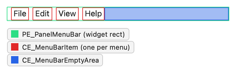
QMenuBar fills in the option itself rather than calling initFrom() . It sets State_Enabled when the bar is enabled, and these flags on the items:
State
Set when
State_SelectedThe item is highlighted.
State_SunkenThe item’s menu is open.
State_HasFocusThe menu bar has focus or has a current item.
State_MouseOverThe mouse is over the item.
The menu bar uses these members of QStyleOptionMenuItem :
Member
Description
menuRect
The rectangle of the whole menu bar.
text
The title of the menu.
icon
The icon of the menu. Few styles draw it.
For the panel, QStyleOptionFrame::lineWidth is set to PM_MenuBarPanelWidth and midLineWidth to 0.
Item view headers
QHeaderView draws each header section with CE_Header and a QStyleOptionHeaderV2 . QCommonStyle splits it into the section background, the label, and the sort indicator:
CE_Header, once per section (PM_HeaderMargin)
CE_HeaderSection
CE_HeaderLabel(SE_HeaderLabel)
PE_IndicatorHeaderArrow(SE_HeaderArrow,PM_HeaderMarkSize), for the sorted section
CE_HeaderEmptyArea, for the space after the last section
The header view sizes its sections with CT_HeaderSection and uses PM_HeaderGripMargin for the area in which the user can drag a section boundary. QTableView draws the button in the upper-left corner, where the two headers meet, as a CE_Header. The hint SH_Header_ArrowAlignment places the sort indicator.
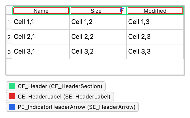
The header sets these state flags on a section:
State
Set when
State_RaisedAlways. The header sets it for every section.
State_HorizontalThis is the horizontal header above the view.
State_SunkenThe section is pressed, or the section is selected and
highlightSections()is on.
State_OnAn item in the section is selected and
highlightSections()is on.
State_MouseOverThe mouse is over the section. Set only when
sectionsClickable()is on.
The members of QStyleOptionHeader are:
Member
Description
section
The logical index of the section.
text
The section text.
textAlignment
The alignment of the text in the section.
icon
The section icon.
iconAlignment
The alignment of the icon in the section.
position
A
SectionPositionvalue: the section’s position relative to the other sections.selectedPosition
A
SelectedPositionvalue: the position of the selected section relative to this one.sortIndicator
A
SortIndicatorvalue: no indicator, or the direction of the sort arrow.orientation
Whether this is the horizontal header above the view or the vertical header beside it.
QStyleOptionHeaderV2 adds textElideMode, the elide mode for text that doesn’t fit, and isSectionDragTarget, which is set on the section that a dragged section is about to be dropped on.
Tree branch indicators
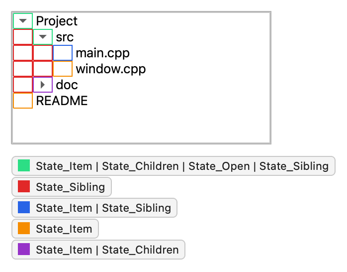
QTreeView draws the branch indicators, the lines and arrows that show the relationship between the nodes, with PE_IndicatorBranch. It draws one indicator per indentation level in front of each item, so a deeply nested item has several. The tree also draws the background of each row with PE_PanelItemViewRow and indents the levels by PM_TreeViewIndentation.
Both elements take a QStyleOptionViewItem , so a style can also read the row’s palette, font, and alternate-row feature flag. The kind of branch is encoded in the state flags:
State
Set when
State_ItemThe indicator belongs to the item in this row, rather than to an ancestor. Draw the horizontal connector here.
State_ChildrenThe item has children, so the indicator shows an expand or collapse arrow.
State_OpenThe item is expanded.
State_SiblingThe node at this level has a sibling below, so a vertical line continues downward.
An indicator with none of these flags is drawn for a level whose node has no sibling below; the style draws nothing there.
Item view items
Delegates paint the items in item views. Qt’s default delegate, QStyledItemDelegate , draws CE_ItemViewItem with a QStyleOptionViewItem and calculates the item size with CT_ItemViewItem, so a style controls how items look without an accompanying delegate. QCommonStyle splits the element into the background, the check indicator, the decoration, the text, and the focus frame:
CE_ItemViewItem
PE_PanelItemViewItem
PE_IndicatorItemViewItemCheck(SE_ItemViewItemCheckIndicator)The decoration, drawn with paint() (
SE_ItemViewItemDecoration)The text, laid out and drawn by
QCommonStylewith eliding and wrapping (SE_ItemViewItemText)
PE_FrameFocusRect(SE_ItemViewItemFocusRect)
The views consult item view hints such as SH_ItemView_ShowDecorationSelected, SH_ItemView_ActivateItemOnSingleClick, and SH_ItemView_ArrowKeysNavigateIntoChildren. To support data types or roles that QStyledItemDelegate doesn’t handle, write a custom delegate; see Model/View Programming .
The state flags and members of QStyleOptionViewItem are described in its class documentation; the most important are State_Selected, State_HasFocus, checkState, decorationPosition, displayAlignment, features, icon, text, and viewItemPosition.